kage
kage
notchpop.com

Design analysis
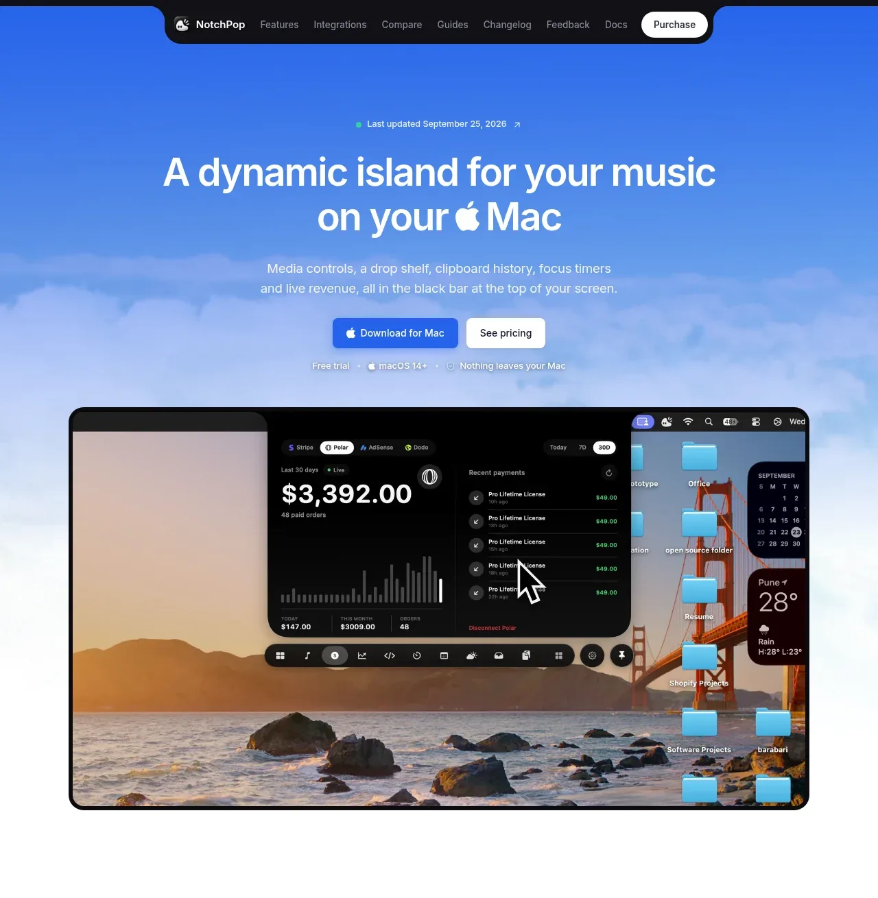
A sky-gradient hero drops straight into a full macOS desktop mockup, so the notch product is shown in context before any feature is explained. Below, the page alternates rhythm on white: a dense 3-column grid of twelve captioned notch recordings, a 2x2 bento of blue-gradient feature cards, six minimal caption cards, then a 4-column extensions list with a working toggle built into the heading. Dark near-black UI shots against white cards create the page's main contrast device, while pricing collapses to a single one-time card, a plain plus-icon FAQ and a light grey footer keep the closing sections quiet.
Prompt preview
## Reference images

Study these alongside the description below: hierarchy, rhythm, spacing, colour. Build for the product you are asked about, using this design language.

- Full page: https://kage-design-assets.t3.tigrisfiles.io/screenshots/notchpop/1c698f48-5c0e-4cfb-974b-c3c3cf38c197-1790316211358-full.webp
- Above the fold: https://kage-design-assets.t3.tigrisfiles.io/screenshots/notchpop/1c698f48-5c0e-4cfb-974b-c3c3cf38c197-1790316207354.webp
- Design on Kage: https://kage.design/designs/notchpop-landing-page

## Before you start
Ask the user what they are building, who it is for, and what brand assets they already have (product name, colours, type, app icon, screenshots or demo videos). Wait for the answers. Everything below is a design language to apply to *their* product — do not reproduce NotchPop's name, copy, imagery or icon.

## Page structure
1. **Floating pill nav** — a fully-rounded dark pill docked at the top centre over the hero: compact wordmark, 5–7 short text links, one high-contrast button on the right end.
2. **Hero** — sky/cloud gradient backdrop. Small status badge (green dot + 'last updated' line), 2-line display headline with one inline glyph inside the text, 2-line grey subcopy, primary + secondary buttons, a small trust meta row (trial · OS requirement · privacy claim), then a full-width macOS desktop mockup showing the product running in situ.
3. **Interactive demo** — centred 2-line section headline ('Don't take our word for it'), one sentence of instruction, a large interactive desktop mockup, and beneath it a row of tappable pill chips ('send an alert…') plus a one-line drag-and-drop hint.
4. **Feature recordings grid** — headline ('Every feature, in motion.') + one-line proof caption, then a 3-column masonry-style grid of ~12 cards. Each card is a dark screen-recording with a small grey caption underneath; cards are uniform white tiles with soft borders.
5. **Bento feature cards** — centred headline, then a 2x2 grid. Each card: rounded screenshot/gradient image on top, bold title and 2-line description below.
6. **'Quiet until it matters' cards** — centred headline + one sentence, then a 2x3 grid of slim cards: a notch-bar image strip at top, bold one-word title + short paragraph below.
7. **Extensions section** — headline with a working toggle switch embedded in the text, one paragraph, a text link, a 4-column grid of extension rows (icon + name + one-line description), then 3 trust cards (security, permissions, data source) with mock UI imagery.
8. **Big typographic statement** — app icon centred, followed by very large, very light grey display text stating the core interaction, and a smaller grey prompt line. Minimal, mostly whitespace.
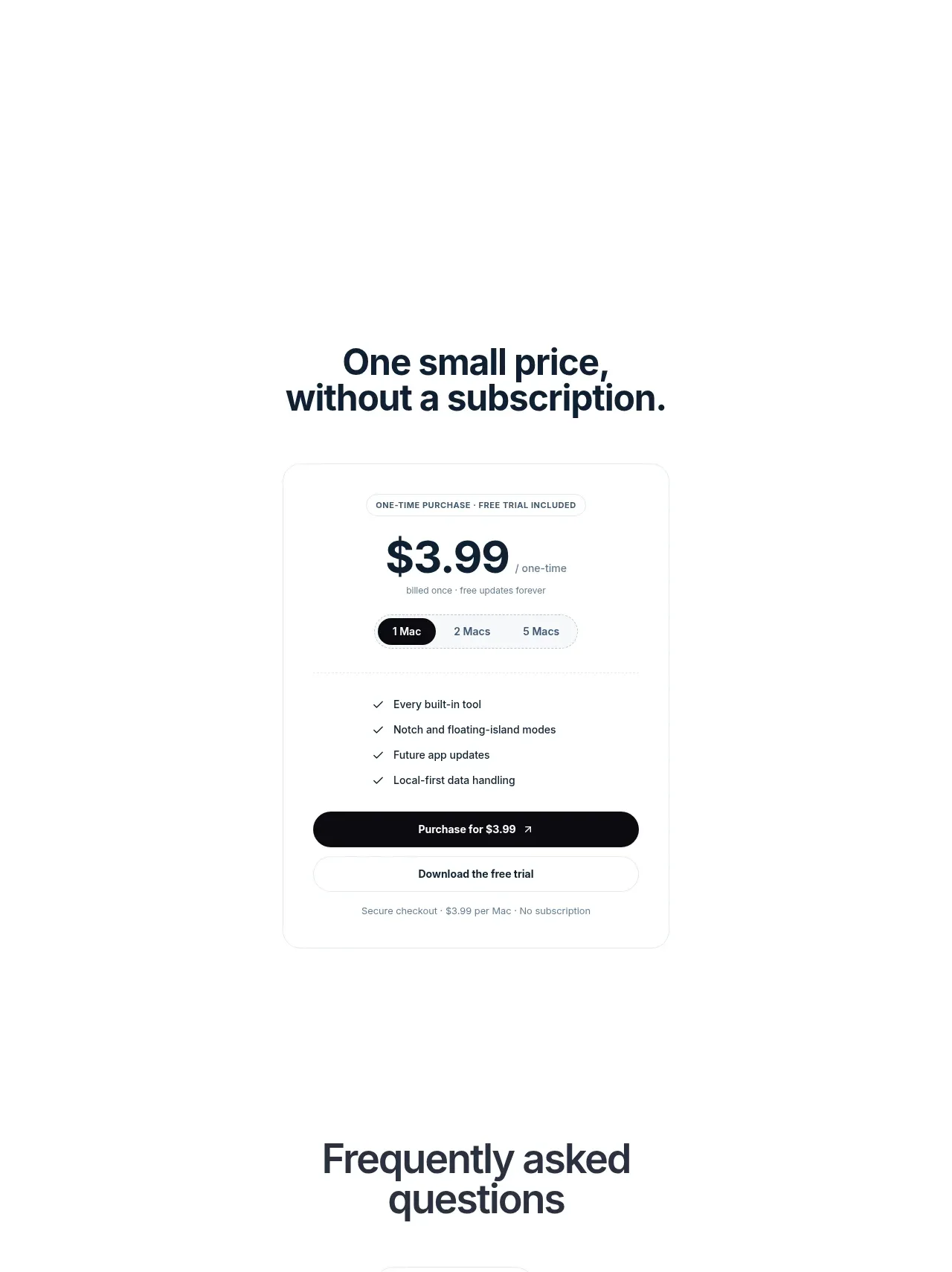
9. **Pricing** — headline ('One small price, without a subscription.'), then a single centred card: small caps label, huge price + '/one-time', 1/2/3-device pill selector, 4-item green-check list, dark purchase button, quiet secondary trial button, fine print.
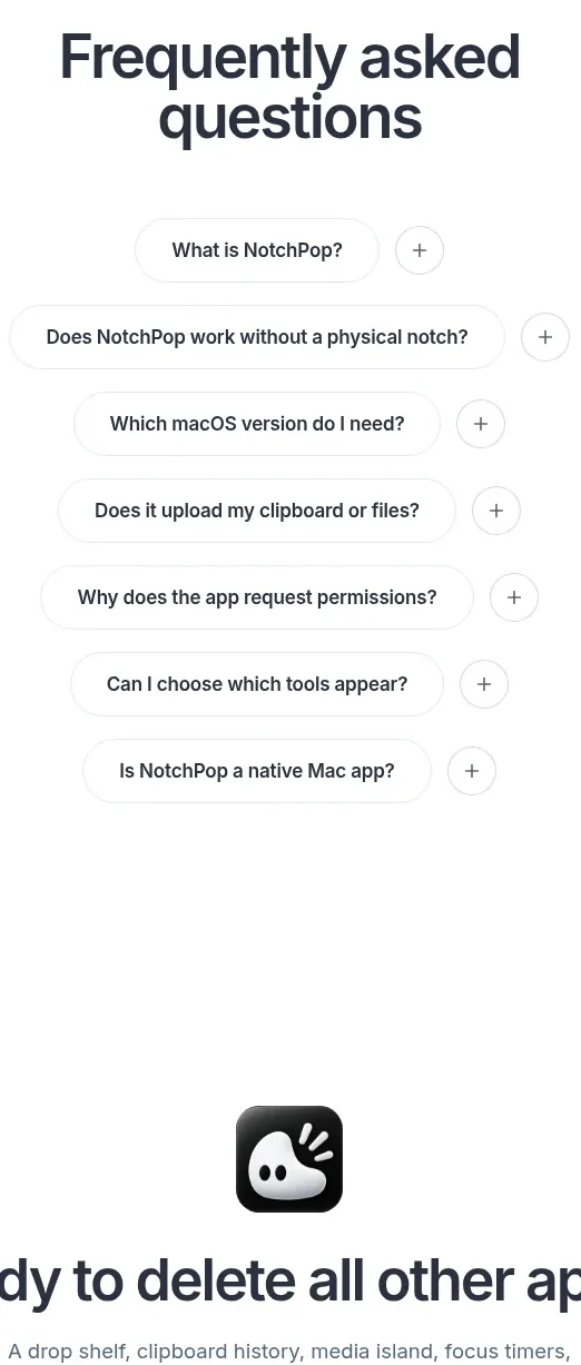
10. **FAQ** — centred headline, 7 stacked accordion rows, each with question text and a + icon on the right, separated by hairline borders.
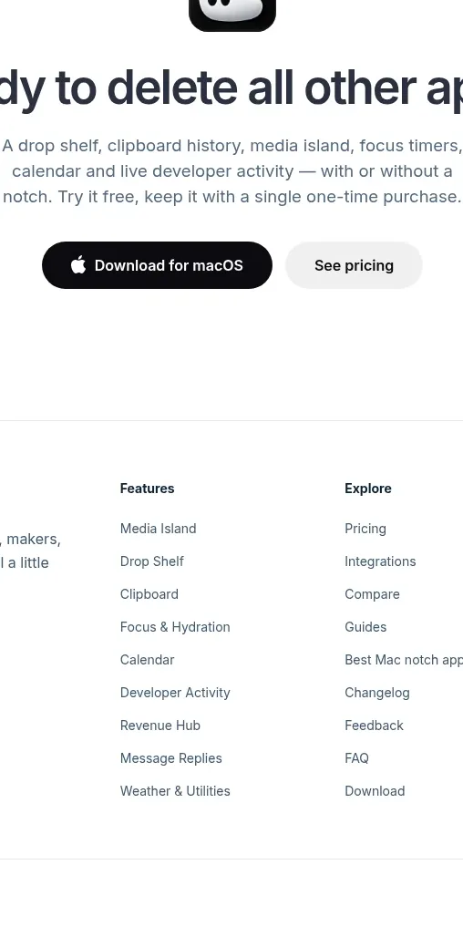
11. **Final CTA** — app icon, large 2-line headline, one paragraph, dark primary button + quiet secondary link.
12. **Footer** — light grey: brand blurb + contact + badge on the left; three link columns (Features, Explore, Legal); hairline bottom row with copyright and a small credit.

## Design language
- **Show the product in context first.** Hero and demo sections are full desktop mockups where the UI is genuinely running; marketing sections switch to cropped, captioned tiles. Alternate between these two registers down the page.
- **Hierarchy**: one centred 2-line headline per section (40–56px, semibold, -0.02em tracking), always followed by a single short grey sentence — never a paragraph block. Hero headline is larger (~64px) with an inline glyph treated as part of the type.
- **Rhythm & density**: hero → demo → dense 12-card grid → roomier 2x2 bento → slim 2x3 cards → list rows → typographic breather → pricing → FAQ → CTA. Density peaks in the recordings grid; whitespace peaks at the big statement and pricing. Generous ~120–160px vertical padding per section.
- **Colour**: white page background #FFFFFF; sky hero gradient from deep blue #2E7BE8 through #8FBFF2 to white cloud texture; accent Apple-blue #0A7CFF for primary buttons and links; near-black #0B0B0F for dark UI mockups and the dark purchase CTA; heading ink #1D1D1F; body grey #6E6E73; card borders #E8E8ED; green #34C759 reserved for checkmarks and status dots. Blue also appears as gradient fills inside feature-card imagery so sections feel related to the hero.
- **Type**: one geometric sans throughout (SF Pro / Inter). Scale: hero 64px bold, section heads 44px semibold, card titles 17–18px semibold, body 15px regular, captions 13px grey, labels 11px uppercase with letter-spacing.
- **Shape & surface**: fully-rounded pill for nav and chip rows; 16–20px radius on cards and mockups; hairline 1px borders over soft shadows (0 1px 2px rgba(0,0,0,.06), larger 0 20px 40px rgba(0,0,0,.12) only for hero mockups); dark imagery sits on white tiles so contrast comes from the screenshots, not decoration.
- **Motion & interaction**: hover = slight lift + shadow on cards; accordion rows expand with a rotating + icon; the heading toggle actually flips and swaps the grid content; alert chips are tappable and feed the demo mockup; buttons keep flat fills with no gradients except the sky hero itself.
- **Trust pattern**: every feature claim is paired with proof imagery, and privacy/security claims get their own three-card row near the end; pricing is a single card with a one-time price and a pill selector instead of tier columns.

## Never
Never use NotchPop's name, logo, app icon, tagline, headlines, FAQ copy or footer text. Never reuse its screenshots, macOS recordings, wallpaper photography, extension names or third-party logos. Never present the output as NotchPop — apply this layout language to the user's own product, brand and assets.
Components from this page
All components
 Floating product navigation
NotchPop · Navigation
Floating product navigation
NotchPop · Navigation
 Blue product hero with desktop preview
NotchPop · Hero
Blue product hero with desktop preview
NotchPop · Hero
 Interactive product demonstration
NotchPop · Feature grid
Interactive product demonstration
NotchPop · Feature grid
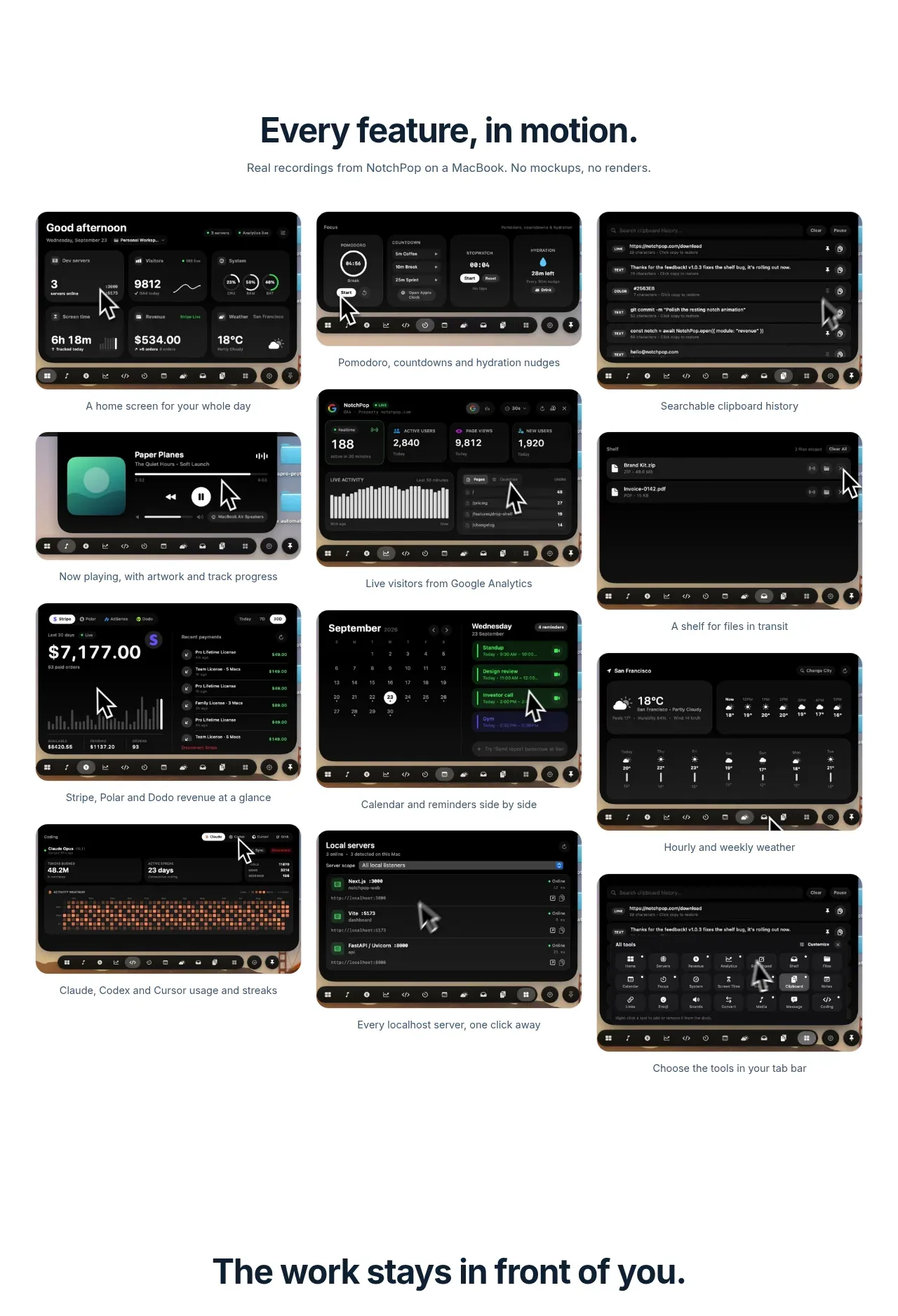 Full feature screenshot gallery
NotchPop · Gallery
Full feature screenshot gallery
NotchPop · Gallery
 Focused feature cards
NotchPop · Feature grid
Focused feature cards
NotchPop · Feature grid
 Quiet information cards
NotchPop · Feature grid
Quiet information cards
NotchPop · Feature grid
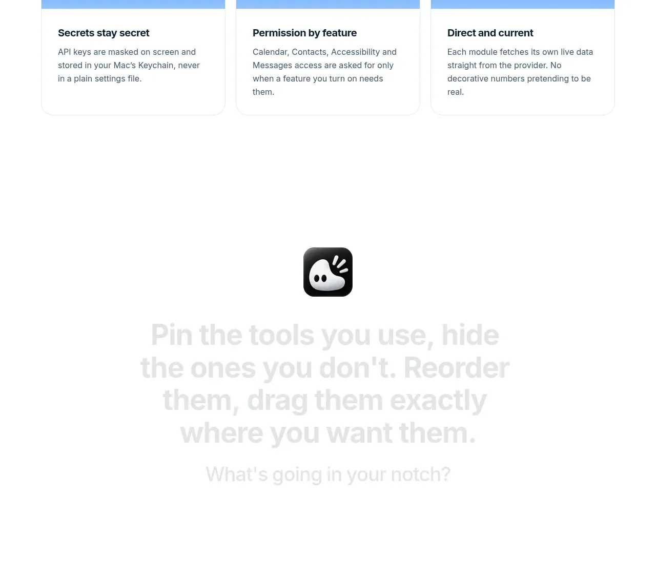 Extensions and integrations
NotchPop · Logo cloud
Extensions and integrations
NotchPop · Logo cloud
 Security and permissions cards
NotchPop · Feature grid
Security and permissions cards
NotchPop · Feature grid
 Visual closing product statement
NotchPop · Call to action
Visual closing product statement
NotchPop · Call to action
 One-time purchase pricing
NotchPop · Pricing table
One-time purchase pricing
NotchPop · Pricing table
 Frequently asked questions
NotchPop · FAQ
Frequently asked questions
NotchPop · FAQ