kage
kage
notchpop.com
Design analysis
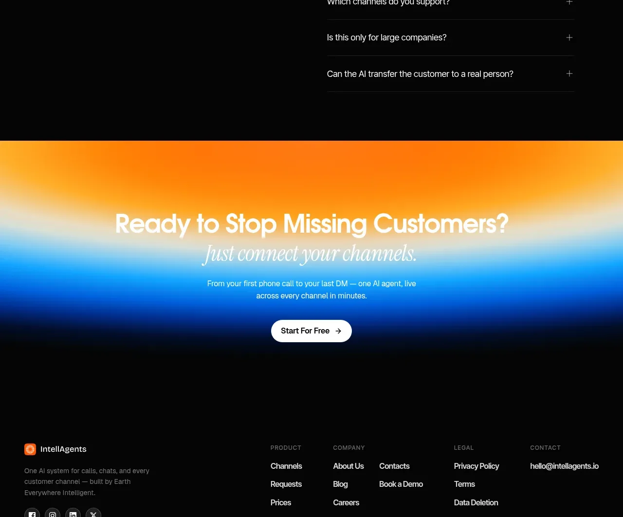
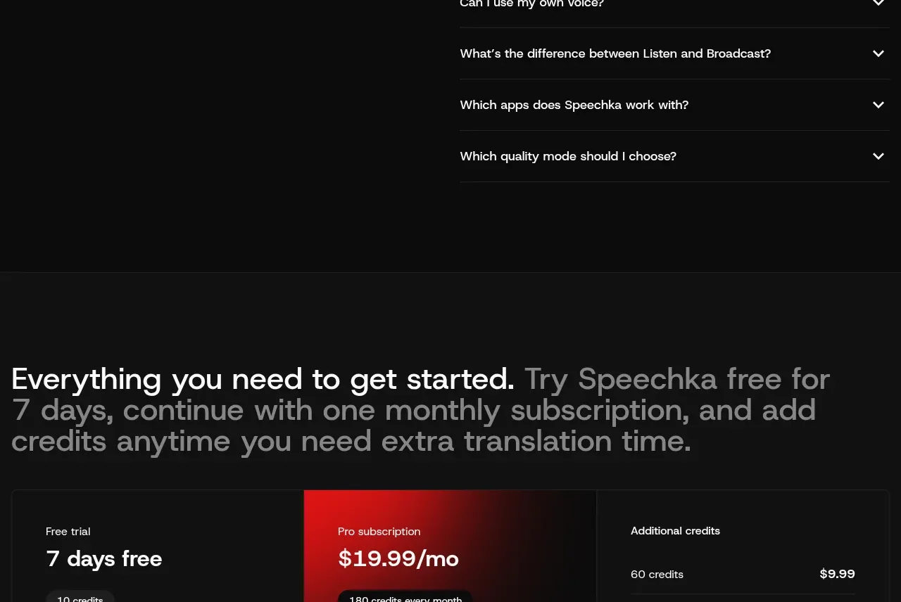
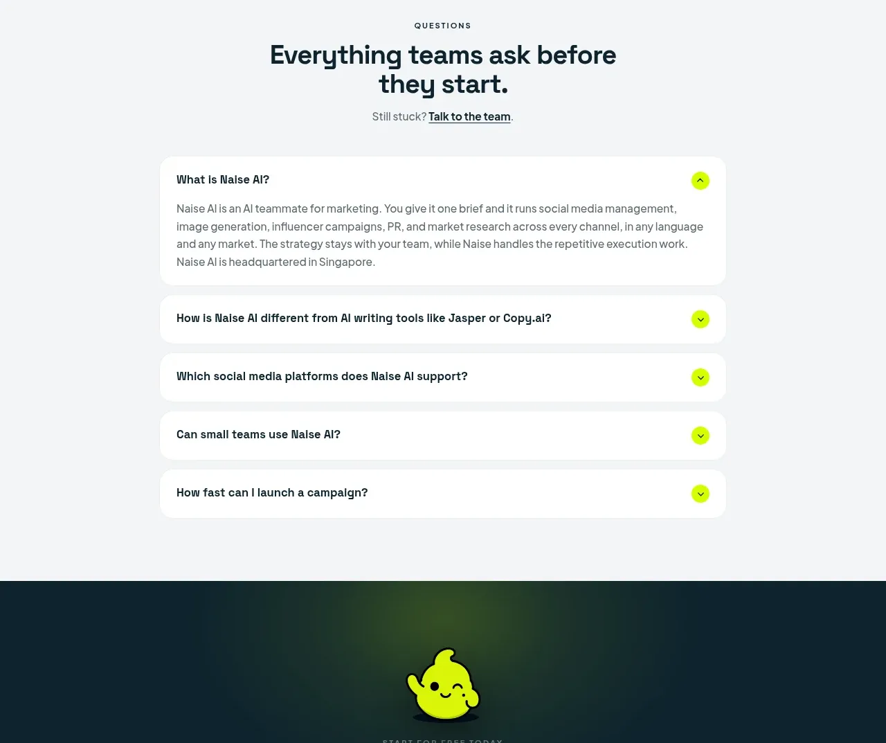
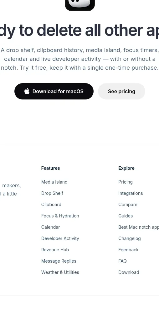
A compact FAQ section centers a large heading over a vertical list of pill-shaped accordion rows with plus controls.
Prompt preview
## Reference images

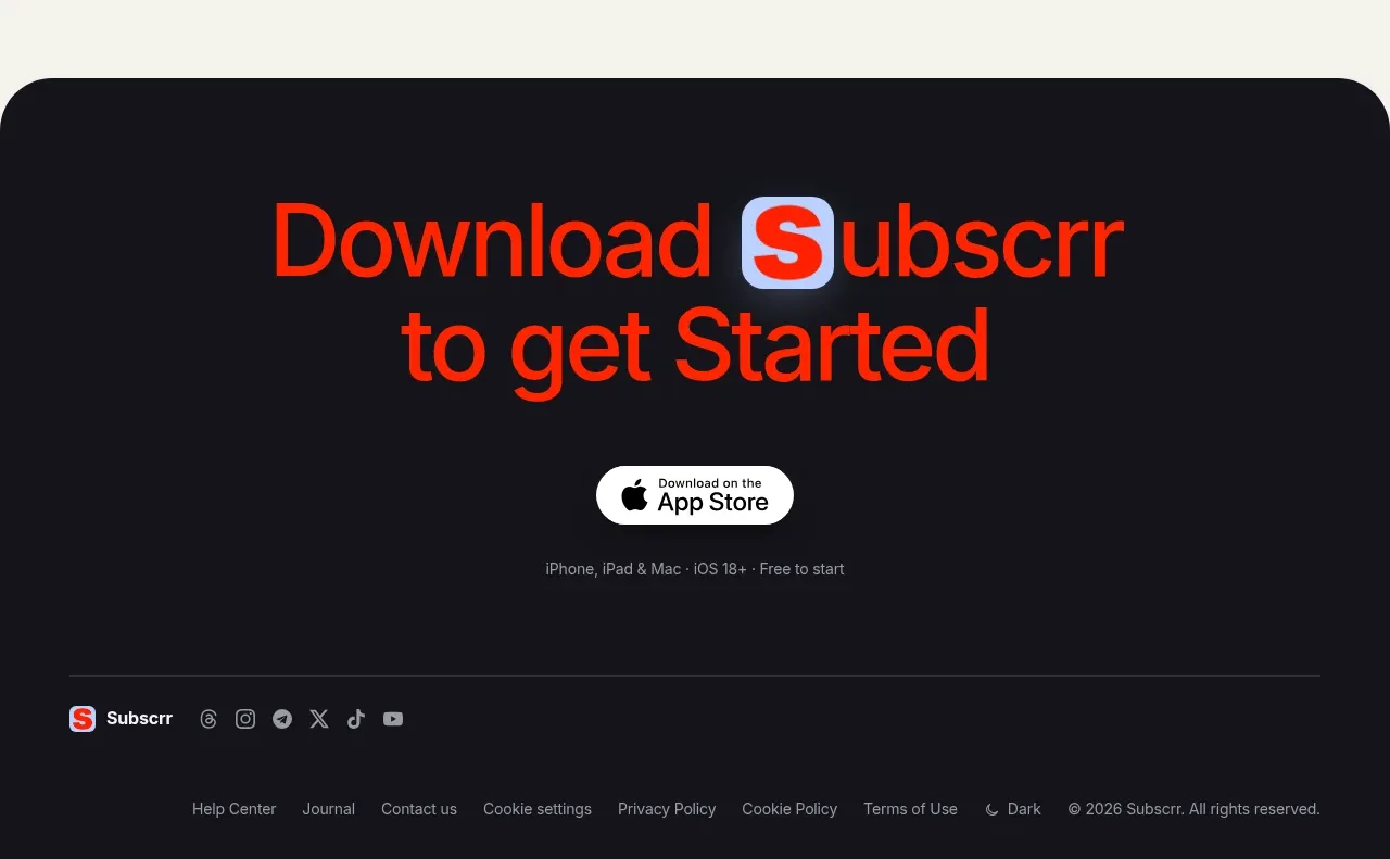
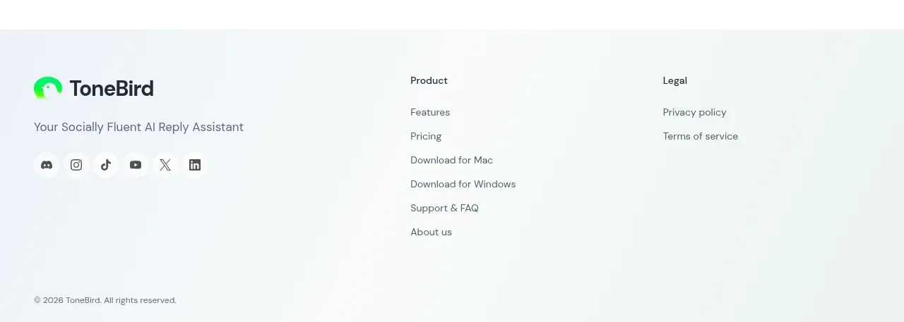
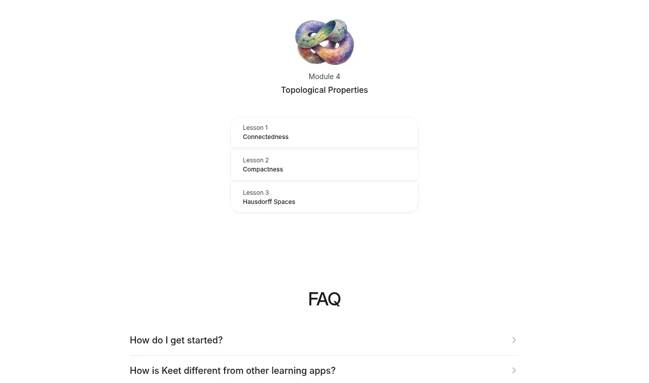
Study these alongside the description below: hierarchy, rhythm, spacing, colour. Build for the product you are asked about, using this design language.

- Component: https://kage-design-assets.t3.tigrisfiles.io/components/notchpop/1c698f48-5c0e-4cfb-974b-c3c3cf38c197-1790316298-10.webp
- Full page it was cut from: https://kage-design-assets.t3.tigrisfiles.io/screenshots/notchpop/1c698f48-5c0e-4cfb-974b-c3c3cf38c197-1790316211358-full.webp
- Component on Kage: https://kage.design/component/notchpop-faq

## Before you start
Ask what the user's product and brand are, then apply the principles below to that product rather than copying the reference.

Create a centered FAQ section with a two-line heading and a narrow accordion list beneath it. Each row should be a white or near-white pill/rounded rectangle with a very subtle border or shadow, 16–18px horizontal padding, and a plus button aligned at the far right. Use 14–16px dark text, generous 10–14px row gaps, and smooth height transitions when expanded. Only one item may open at a time unless the product requires otherwise. Ensure buttons have accessible labels, keyboard support, and a strong focus ring. Keep the section short and calm with ample surrounding whitespace.

Never: use logos, product names, copy, illustrations, or imagery from the reference.