kage
kage
notchpop.com
Design analysis
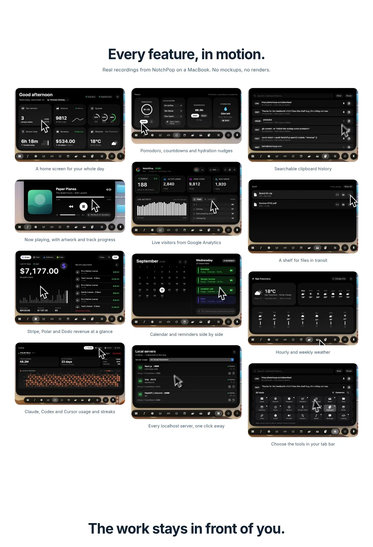
A dense three-column gallery presents many real interface screenshots, each with a short caption, making the breadth of the product immediately scannable.
Prompt preview
## Reference images

Study these alongside the description below: hierarchy, rhythm, spacing, colour. Build for the product you are asked about, using this design language.

- Component: https://kage-design-assets.t3.tigrisfiles.io/components/notchpop/1c698f48-5c0e-4cfb-974b-c3c3cf38c197-1790316295-3.webp
- Full page it was cut from: https://kage-design-assets.t3.tigrisfiles.io/screenshots/notchpop/1c698f48-5c0e-4cfb-974b-c3c3cf38c197-1790316211358-full.webp
- Component on Kage: https://kage.design/component/notchpop-gallery

## Before you start
Ask what the user's product and brand are, then apply the principles below to that product rather than copying the reference.

Create a feature gallery with a centered section heading and subtitle, followed by a responsive three-column grid of product screenshots. Each tile should contain a dark UI preview with a 10–14px radius and a concise centered caption beneath it. Maintain consistent image aspect ratios, 16–20px column gaps, and 28–36px row gaps. Use a white canvas, dark navy heading (#122333), gray captions (#59636d), and no heavy card chrome; the screenshots themselves provide visual weight. On mobile, collapse to one column and preserve the caption hierarchy. Add light hover scaling or a focusable gallery interaction without causing layout shift.

Never: use logos, product names, copy, illustrations, or imagery from the reference.