kage
kage
notion.com

Design analysis
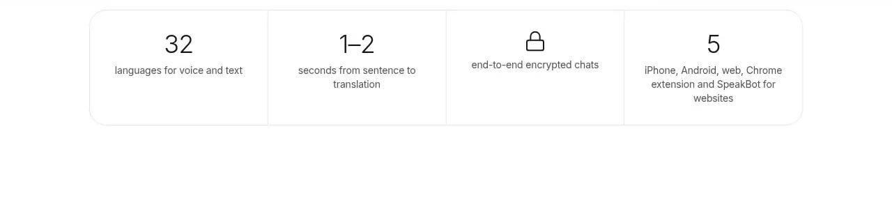
A slim, horizontally flowing credibility strip that uses repeated metrics, small icons, and generous spacing to create ambient trust without interrupting the page. Muted contrast and a shallow height keep it supportive rather than attention-seeking.
Prompt preview
## Reference images

Study these alongside the description below: hierarchy, rhythm, spacing, colour. Build for the product you are asked about, using this design language.

- Component: https://kage-design-assets.t3.tigrisfiles.io/components/notion-com/9e072824-4b09-4216-9cff-06c643793f91-1789060360-4.webp
- Full page it was cut from: https://kage-design-assets.t3.tigrisfiles.io/screenshots/notion-com/9e072824-4b09-4216-9cff-06c643793f91-1789060339-full.webp
- Component on Kage: https://kage.design/component/notion-stats

## Before you start
Ask the user what their product is, who it is for, and what brand personality, colours, typography, and proof points they want to use. Then apply the principles below to their product rather than reproducing any reference literally.

## Build a horizontal proof-point stats bar
Create a compact, full-width credibility strip for a modern software product. It should sit comfortably between larger page sections and communicate several concise facts—such as adoption, reach, recognition, community size, or customer outcomes—at a glance.

### Layout and alignment
- Use a full-bleed horizontal container with a very shallow height, approximately 72–96px on desktop.
- Keep the content on a single horizontal row with evenly distributed stat items; each item should have an icon followed by a short text label.
- Centre the row vertically and align icon/text pairs consistently along one baseline.
- Use a max-width content track of roughly 1180–1320px, while allowing the strip itself to reach the viewport edges.
- On narrow screens, preserve the horizontal rhythm with horizontal scrolling or a gently animated marquee; avoid wrapping into a dense multi-line block.
- Give each item enough horizontal padding to remain visually distinct, with no heavy dividers required.
- If the row overflows, ensure keyboard and touch users can access every item and respect `prefers-reduced-motion`.

### Typography hierarchy
- Use a neutral sans-serif or the product’s existing UI typeface.
- Set stat labels around 14–16px with medium or regular weight and approximately 1.3 line-height.
- Keep copy concise: one metric or claim per item, with the strongest numerical element naturally readable within the sentence.
- Avoid large display numerals; this component is a supporting trust signal, not a hero statistic section.
- Use subtle letter spacing only if it matches the brand; never make the labels feel like all-caps marketing badges.

### Icons and visual language
- Pair each claim with a small, simple monochrome icon sized about 18–20px.
- Use familiar symbols such as a globe, award, community, growth, or location mark, but choose icons that are relevant to the user’s actual proof points.
- Keep icon weight consistent and avoid decorative illustrations, badges, or oversized emoji.

### Colour, borders, and surface
- Use a very light neutral background, approximately `#F7F7F5` or `#FAFAF8`, against a white page—or adapt the values to the user’s brand neutrals.
- Use muted charcoal text around `#6B6B68` and slightly darker icon colour around `#8A8A86`; reserve stronger contrast for important accessible text.
- Add a subtle 1px top and/or bottom border around `#E9E9E5` when separation from adjacent sections is needed.
- Avoid shadows, gradients, loud accent colours, and card treatments.
- Keep corners square or use only a very small radius, approximately 0–8px, because the strip should read as part of the page structure rather than a floating component.

### Interaction and motion
- If the stats move horizontally, use slow, unobtrusive motion and pause on hover, focus, or touch interaction.
- Provide visible keyboard focus states for links or interactive items.
- Make any claims that link to evidence clearly discoverable without turning every item into a button.
- Include accessible labels for icons and sufficient colour contrast for all text.

### Never
- Never copy the reference’s logos, product names, wording, claims, icon choices, or exact item order.
- Never use reference-specific illustrations, imagery, branded symbols, or recognisable assets.
- Never invent unsupported customer numbers or accolades; use the user’s real proof points or clearly marked placeholder data.
- Never make the strip visually dominant with oversized type, saturated colour, strong shadows, or excessive animation.
- Never allow overflow to hide content from keyboard, screen-reader, or touch users.