kage
kage
ariso.ai
Design analysis
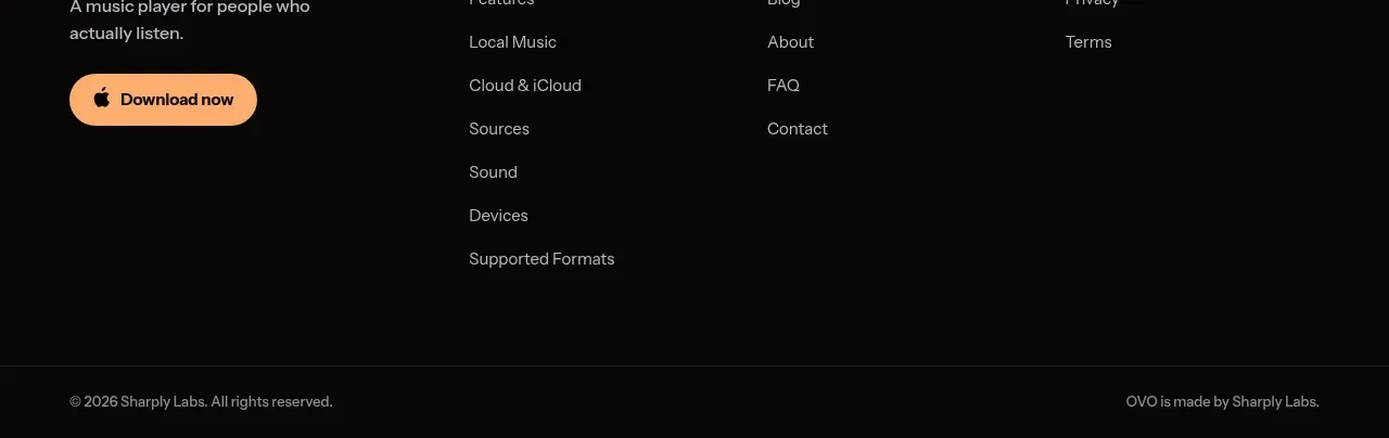
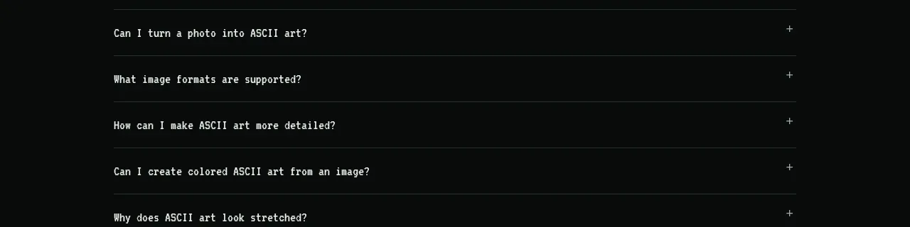
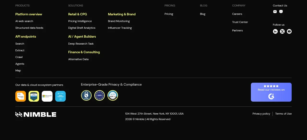
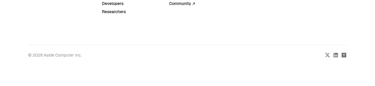
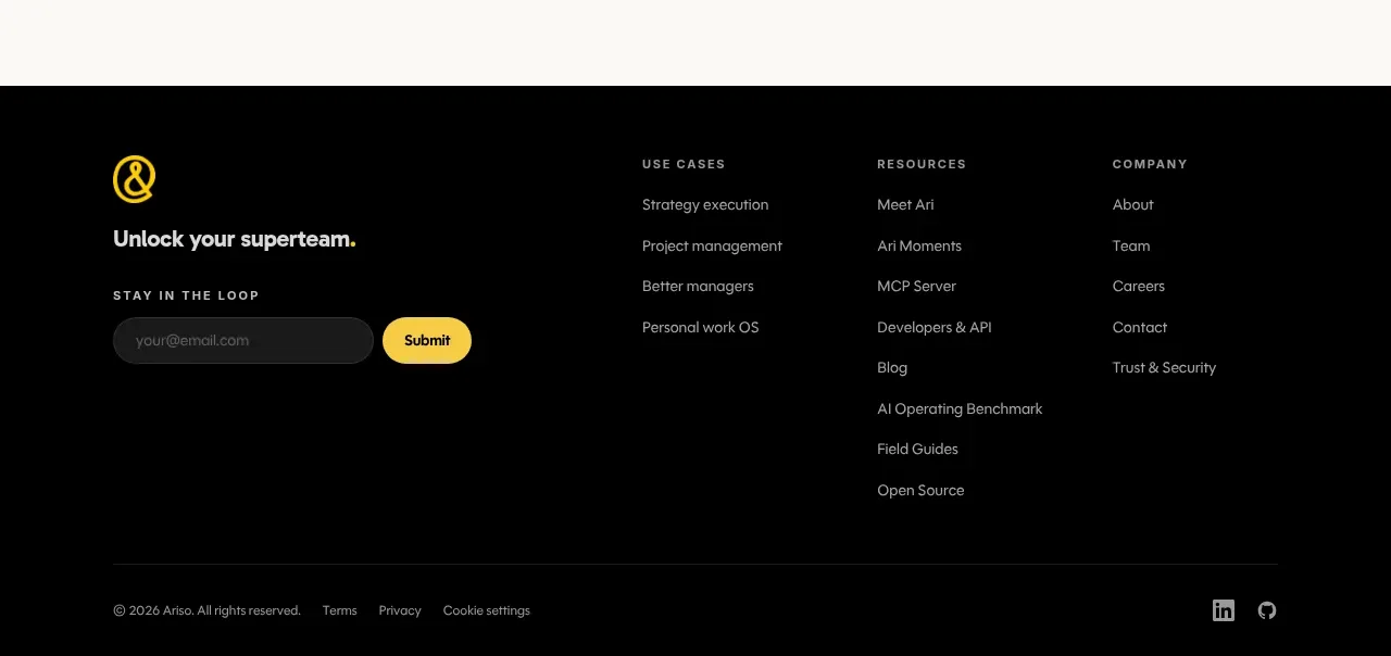
The dark footer combines brand reinforcement, an email signup, grouped navigation links, and a restrained legal/social bottom row for a complete endpoint.
Prompt preview
## Reference images

Study these alongside the description below: hierarchy, rhythm, spacing, colour. Build for the product you are asked about, using this design language.

- Component: https://kage-design-assets.t3.tigrisfiles.io/components/oats/88861292-7fec-4a47-8882-69e9dc773ed4-1789452064-7.webp
- Full page it was cut from: https://kage-design-assets.t3.tigrisfiles.io/screenshots/oats/88861292-7fec-4a47-8882-69e9dc773ed4-1789452033551-full.webp
- Component on Kage: https://kage.design/component/oats-footer

## Before you start
Ask what brand identity, legal links, resource categories, social channels, and newsletter strategy the user's product needs. Then construct an original footer around those requirements.

Build a dark multi-column footer with a top content area and a separated bottom legal row. On the left, place a simple brand treatment, a short value statement, and an email signup with a pill-shaped input and contrasting accent submit button. To the right, use two or three link columns with uppercase small labels and vertically spaced links. Add a thin divider, then a bottom row containing copyright, legal links, cookie preferences, and optional social icons. Use #080808 or #10100F background, #F2F1EA primary text, #98968E muted text, #F4D21F accent, and #292925 divider lines. Use 14px body links, 10–11px letter-spaced labels, 16px input radius, and generous 56–72px section padding. Ensure the footer remains readable and collapses into stacked groups on mobile.

Never: use the reference's logos, product names, copy, illustrations, or imagery.