kage
kage
ariso.ai
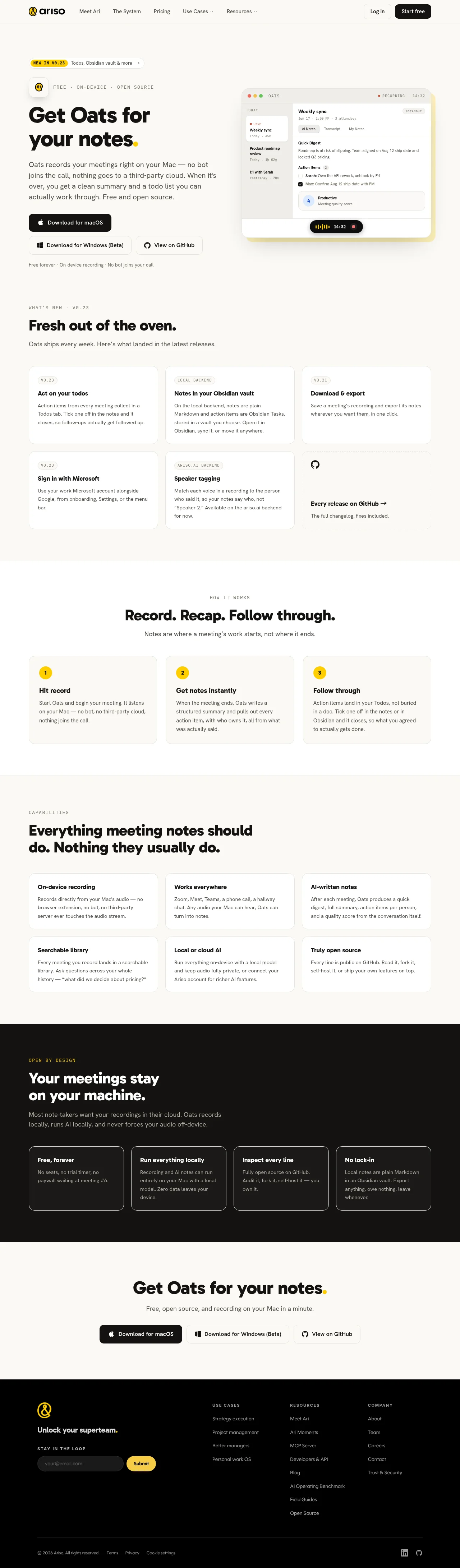
Design analysis
A warm cream-and-black landing page for a Mac meeting-notetaker, with a single yellow accent used sparingly for version badges, numbered steps and punctuation. The page alternates background bands — cream hero, lighter card sections, one full black privacy section — to create clear chapter rhythm. Hierarchy is driven by oversized geometric-sans headlines with yellow full-stop accents, small uppercase monospace eyebrow labels, and roomy 2–3 column card grids that tighten into a 4-column dark strip before a simple centred CTA.
Prompt preview
## Reference images

Study these alongside the description below: hierarchy, rhythm, spacing, colour. Build for the product you are asked about, using this design language.

- Full page: https://kage-design-assets.t3.tigrisfiles.io/screenshots/oats/88861292-7fec-4a47-8882-69e9dc773ed4-1789452033551-full.webp
- Above the fold: https://kage-design-assets.t3.tigrisfiles.io/screenshots/oats/88861292-7fec-4a47-8882-69e9dc773ed4-1789452030404.webp
- Design on Kage: https://kage.design/designs/oats-landing-page

# Build a landing page in the style of "Oats" (an on-device meeting notetaker)

## Before you start
Ask the user what product they are building, who it is for, and what brand assets they already have (name, colours, type). Wait for the answers. Apply everything below to their product — never to the reference.

## Page structure
1. **Sticky top nav**: small logo left, 4–5 text links (a couple with dropdown carets), text "Log in" link + solid black pill "Start free" button right.
2. **Hero (two columns, cream background)**: left column has a small "NEW IN V0.23" pill badge with arrow, an app icon beside an uppercase mono tagline ("FREE · ON-DEVICE · OPEN SOURCE"), a very large headline with a yellow full stop, a short paragraph, and three buttons stacked as a row (black primary "Download for macOS", two outlined secondary buttons). Small footnote line under buttons. Right column: a realistic screenshot/mockup of the app UI (sidebar of meetings, note detail with digest/action items, floating recording pill with timer).
3. **What's new section**: uppercase mono eyebrow, big left-aligned headline, subline, then a 3×2 grid of white cards. Each card has a small pill tag (version number or label), a bold title, and 2–3 lines of body. Last card is a GitHub CTA card with an icon, link and subtext.
4. **How it works (slightly lighter band, centred)**: uppercase mono eyebrow, large centred headline ("Record. Recap. Follow through." pattern), subline, then 3 numbered cards with yellow circular step numbers, bold titles and short body copy.
5. **Capabilities**: left-aligned eyebrow + two-line headline, then a 3×2 grid of white feature cards (bold title + 2–3 sentence body, no icons).
6. **Privacy band (full black)**: yellow mono eyebrow, big white headline, grey subline, then a 4-column row of bordered dark cards (white title + grey body).
7. **Final CTA (cream)**: huge centred headline with yellow full stop, one-line subtext, and the same three download/GitHub buttons.
8. **Footer (black)**: logo + wordmark tagline left with an email subscribe input and yellow submit button; three link columns (Use cases, Resources, Company); bottom bar with copyright, Terms/Privacy/Cookie links and social icons right.

## Design language
- Palette: warm cream/off-white background (#F5F2EA-ish), near-black text (#111), one saturated yellow accent (#F5C518-ish) used only for step numbers, badges, eyebrow labels on dark, and headline full stops. Dark sections use #0E0D0B with white titles and grey body text.
- Type: geometric sans (e.g. Poppins/DM Sans-like) for headlines, very large (64–80px hero) and tight; regular sans for body at ~15–16px with generous line-height; small uppercase monospace with wide letter-spacing for eyebrows and taglines. Bold weights carry hierarchy, not colour.
- Colour rhythm down the page: cream → white cards on cream → lighter band → cream → black band → cream → black footer. Alternating band backgrounds act as chapter breaks.
- Cards: white (or transparent-bordered on dark), 12–16px radius, hairline 1px borders, minimal or no shadow, ~24px internal padding. Grids of 3 with a final row that can include one CTA card instead of a feature.
- Buttons: solid black pill (primary), outlined pill (secondary); rounded-full radius everywhere including badges.
- Density: airy overall — large section padding (~120px), but card copy is compact (2–3 sentences max).
- Motion: minimal; pills with arrows imply hover movement, keep any animation subtle (150–200ms ease).
- Include a realistic product-UI mockup in the hero rather than abstract illustration.

## Never
Do not use the Ariso or Oats names, logos, copy, the oat icon, the yellow-flourish wordmark, or any of the screenshot's text or app UI content. Do not present the result as that product.
Components from this page
All components
 Minimal product navigation
Oats · Navigation
Minimal product navigation
Oats · Navigation
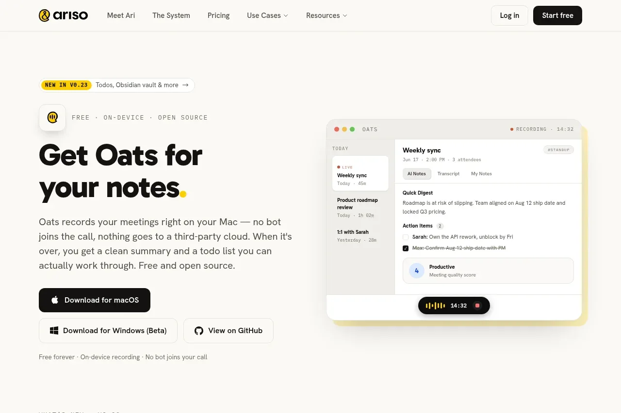 Product introduction hero
Oats · Hero
Product introduction hero
Oats · Hero
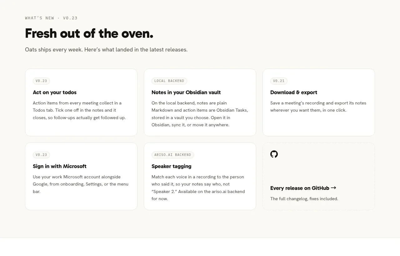 Latest product releases
Oats · Feature grid
Latest product releases
Oats · Feature grid
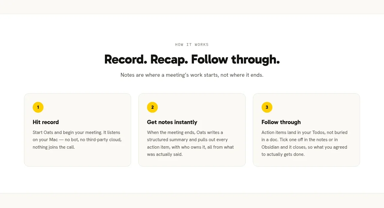 Three-step workflow
Oats · Feature grid
Three-step workflow
Oats · Feature grid
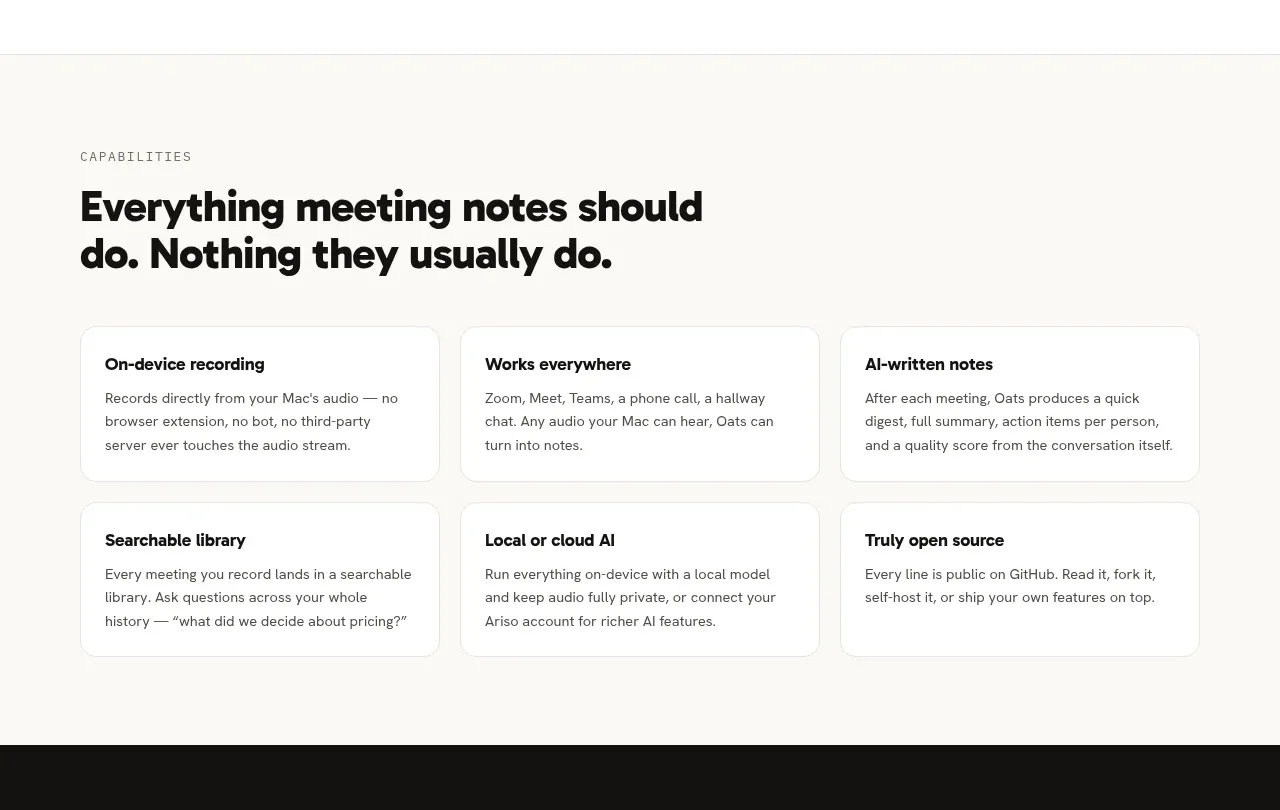 Capabilities overview
Oats · Feature grid
Capabilities overview
Oats · Feature grid
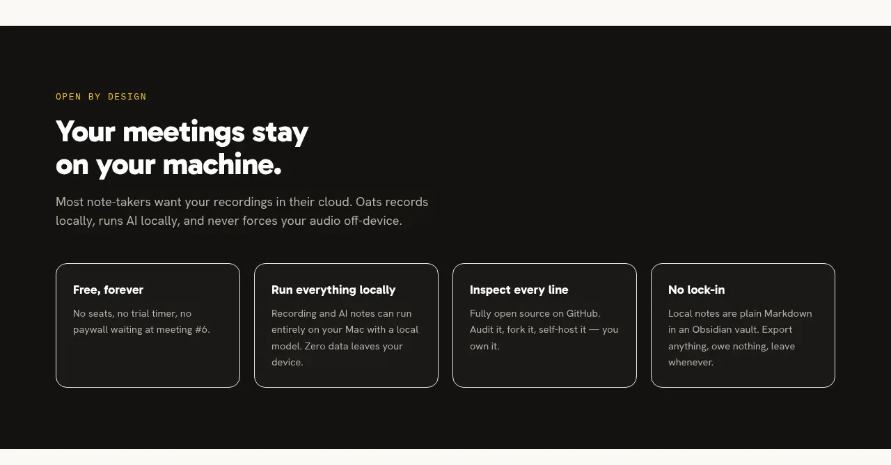 Privacy and openness principles
Oats · Feature grid
Privacy and openness principles
Oats · Feature grid
 Download call to action
Oats · Call to action
Download call to action
Oats · Call to action
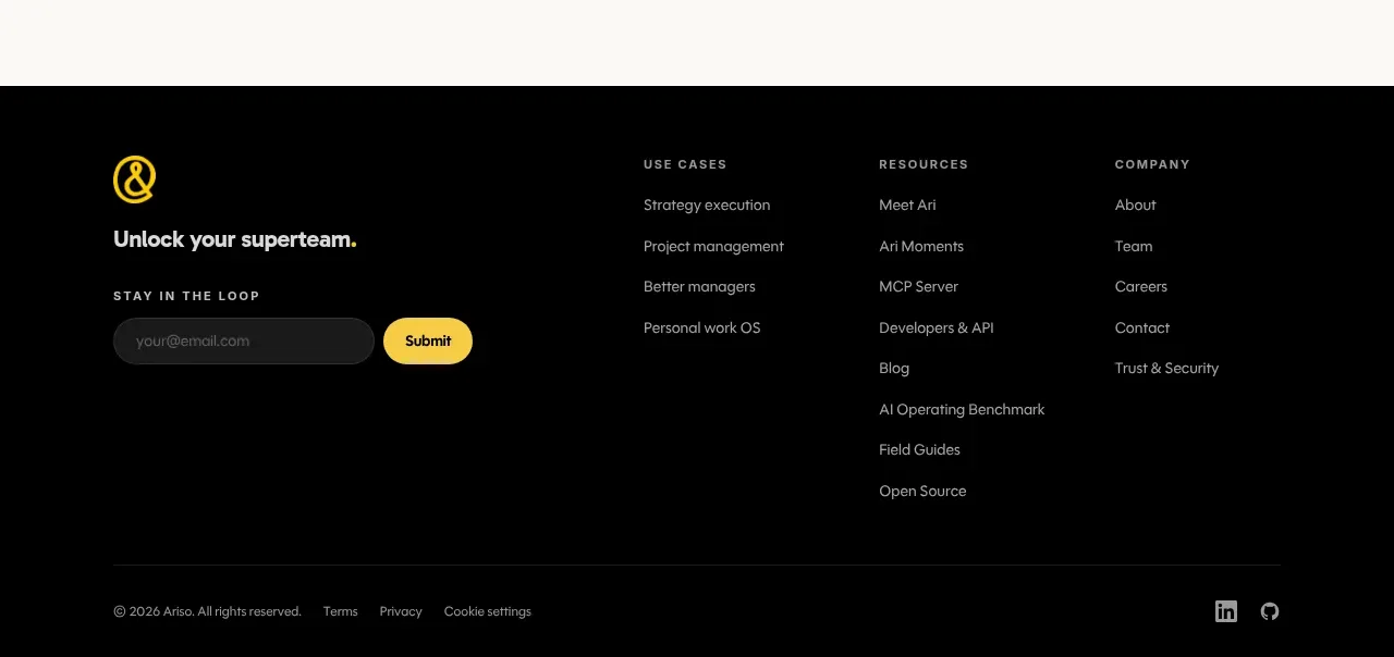 Multi-column product footer
Oats · Footer
Multi-column product footer
Oats · Footer