kage
kage
oku.club

Design analysis
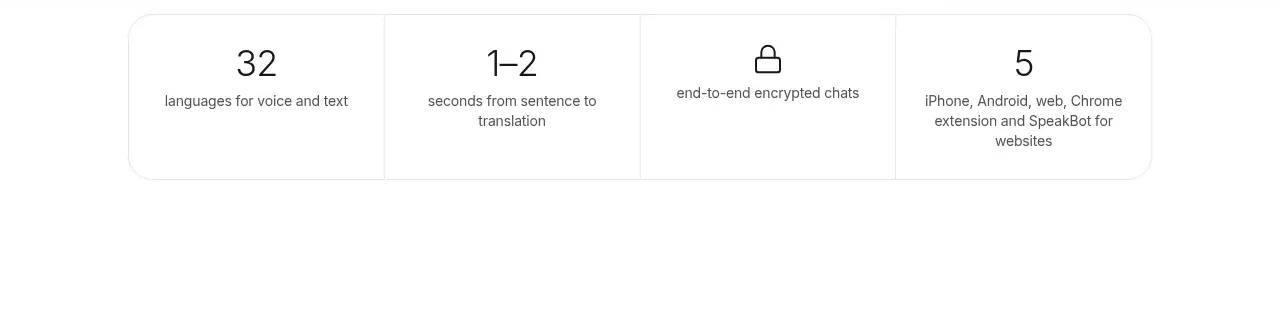
A standalone pale-gray panel introduces personal statistics and presents a wide dashboard screenshot as proof of the capability.
Prompt preview
## Reference images

Study these alongside the description below: hierarchy, rhythm, spacing, colour. Build for the product you are asked about, using this design language.

- Component: https://kage-design-assets.t3.tigrisfiles.io/components/oku-club/e710a983-c1d6-4177-b014-2738acd07d09-1789146243-3.webp
- Full page it was cut from: https://kage-design-assets.t3.tigrisfiles.io/screenshots/oku-club/e710a983-c1d6-4177-b014-2738acd07d09-1789146208773-full.webp
- Component on Kage: https://kage.design/component/oku-club-stats

## Before you start
Ask what meaningful metrics the user's product tracks and which user decision those metrics support. Ask for the brand's visual language before designing the component.

Create a focused product-proof section with a centered serif heading and a short explanatory line above a large dashboard or analytics preview. The panel should feel like a calm continuation of the feature story: muted background, generous top spacing, and a screenshot framed as the main evidence. If appropriate, include a small row of legible metric cards inside the preview, but do not overload the surrounding section with extra controls.

Use `#f4f4f4` for the section, `#ffffff` for the preview, near-black `#0a0a0a`, muted gray `#666666`, 12px radius, and 64–96px vertical padding. Keep the heading 30–36px, center aligned, and ensure the preview scales without becoming unreadable on mobile.

Never: use logos, product names, copy, illustrations, or imagery from the reference.