kage
kage
useomnia.com
Design analysis
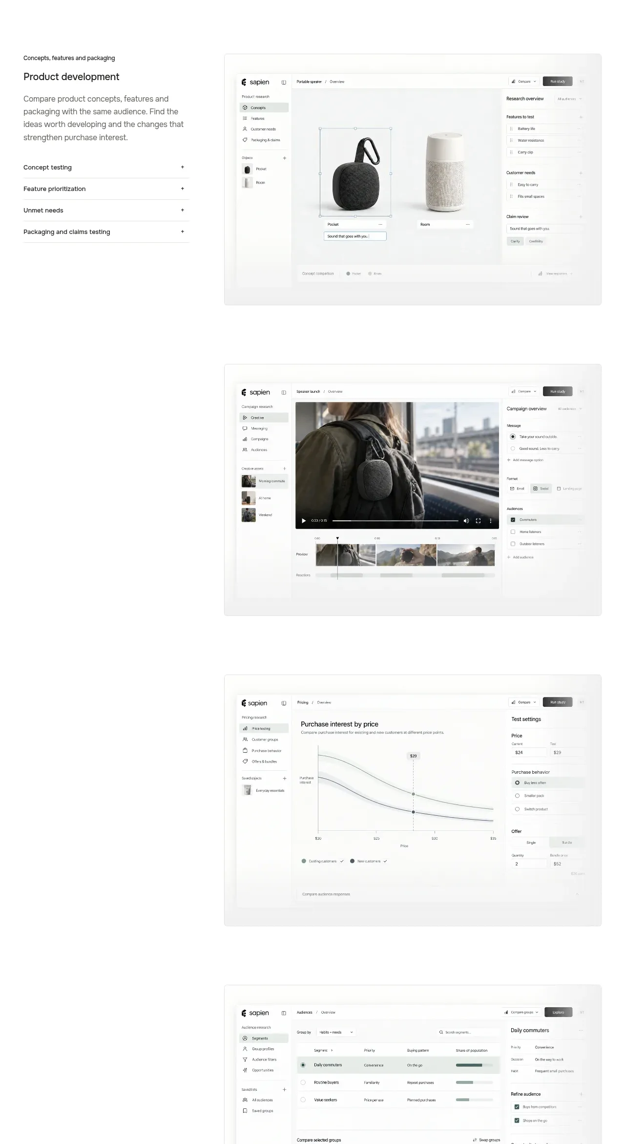
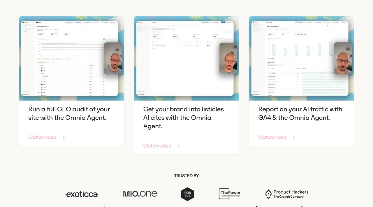
Three equal demo cards show product screenshots with concise outcomes and a lightweight watch-video link, creating a visual proof section.
Prompt preview
## Reference images

Study these alongside the description below: hierarchy, rhythm, spacing, colour. Build for the product you are asked about, using this design language.

- Component: https://kage-design-assets.t3.tigrisfiles.io/components/omnia-agent/49497126-f7d8-48a0-b56b-a26990811c92-1790920878-4.webp
- Full page it was cut from: https://kage-design-assets.t3.tigrisfiles.io/screenshots/omnia-agent/49497126-f7d8-48a0-b56b-a26990811c92-1790920840559-full.webp
- Component on Kage: https://kage.design/component/omnia-agent-gallery

## Before you start
Ask what the user's product and brand are, then apply these principles to that product rather than reproducing the reference.

Build a three-column product demonstration gallery. Start with a centered section heading, then use equal cards with rounded corners, a colorful but abstract frame behind a generic product UI preview, a clear outcome-oriented title, and a small text link with an arrow. Keep cards white with delicate borders and use an aspect ratio that makes the preview dominant. Add hover elevation and a play affordance if videos are available. The layout should collapse to a horizontal scroll or one-column stack on mobile.

Never: use the reference logo, product name, exact copy, illustrations, imagery, or branded assets.