kage
kage

Design analysis
A pastel-painted product page that sells an AI agent like a new hire, pairing a medium-weight serif display face with a compact sans body and small pink eyebrow labels. The page alternates airy type-led sections with dense card grids — most notably a 3×6 wall of near-identical integration cards, each with a painted pastel header strip, outlined capability tag pills and one-line copy. Persuasion escalates down the page: capability bento → integration proof → video demos → logo wall → star-rated testimonials with big-number result tiles → competitor comparison (own product on a pink painted card, the alternative flat and gray) → a pure-type trust trio → full-bleed painted CTA banner → FAQ accordion → pink footer scalloped with hand-drawn clouds.
Prompt preview
## Reference images

Study these alongside the description below: hierarchy, rhythm, spacing, colour. Build for the product you are asked about, using this design language.

- Full page: https://kage-design-assets.t3.tigrisfiles.io/screenshots/omnia-agent/49497126-f7d8-48a0-b56b-a26990811c92-1790920840559-full.webp
- Above the fold: https://kage-design-assets.t3.tigrisfiles.io/screenshots/omnia-agent/49497126-f7d8-48a0-b56b-a26990811c92-1790920836629.webp
- Design on Kage: https://kage.design/designs/omnia-agent-landing-page

## Before you start
Ask the user what they are building, who it is for, and what brand assets they already have (name, colours, type, any illustration style). Wait for the answers before writing any code. Everything below is a design language to apply to *their* product — do not rebuild the reference page.

## Page structure
1. **Sticky nav** — cream bar: wordmark left; centred menu with dropdowns (Product, Solutions, Pricing, Resources); right side an outlined "Log in" pill plus a solid black "Start Free Trial" pill.
2. **Hero** — all type, no imagery: small pink eyebrow label, a two-line serif display headline with a tiny hand-drawn doodle tucked onto the last word, then a one-sentence muted subcopy.
3. **Capability bento** — two rows of six white cards in an asymmetric 3-column grid. Each card: pink eyebrow category label, serif heading, 1–2 sentence body. Two cards open with a painted pastel illustration header, one uses a small line doodle, one is a pastel tile filled with partner logos. Vary spans and heights so the rows interlock.
4. **Integrations grid** — centred serif H2 ("Integrates with your existing tool stack") then a dense 3×6 grid of 18 near-identical cards. Card anatomy: pastel painted header strip showing [our mark → two-way connector → their mark], semibold name, two outlined tag pills (access level + auth method), one-line description. Small text, ~16px gaps.
5. **See it in action** — three cards: rounded product screenshot framed on a pastel splash, caption beneath, pink "Watch video →" link.
6. **Logo wall** — "TRUSTED BY" micro-label, two centred rows of monochrome customer logos, generous whitespace.
7. **Social proof** — three white cards with pink borders: black 5-star row, bold quote with key phrases in heavier weight, avatar + name + role. Below, a triptych of result tiles: huge stat number on painted yellow, a portrait photo tile, a quote on painted blue with a wordmark.
8. **Comparison split** — our product on a pink painted card with a doodle mark, an 8-item checkmark list and three tag pills at the bottom; the generic alternative on a flat grey card with muted dot bullets and zero accents. Centred outlined button underneath ("See full comparison").
9. **Trust trio** — centred two-line serif headline ("Powerful enough to act. Safe enough to trust" pattern) then three equal text columns, each a bold lead phrase + short paragraph. No cards, no icons — pure type.
10. **Final CTA banner** — full-width rounded panel with a painted pastel brush-stroke background, centred serif headline, black pill primary + white outlined pill secondary.
11. **FAQ** — centred serif heading, single-column accordion: question rows with hairline dividers and chevrons.
12. **Footer** — pink panel whose top edge is interrupted by hand-drawn cloud doodles sitting on the cream background; company blurb + copyright + social icons + language pill on the left, four link columns to the right, oversized illustrated mascot at the very bottom.

## Design language
- **Palette**: warm off-white base `#FAF9F6`; ink `#111111`; pink accent `#EC4899` for eyebrows, links and card borders; pastel paint fields in pink `#FBCFE8`, butter yellow `#FDE68A`, sky blue `#A8D8F0`. Pastels always appear as soft airbrushed *textures* (never flat blocks) and only on card headers, result tiles and the CTA banner — the page body stays calm cream.
- **Hierarchy rule**: every section opens with either a small pink eyebrow or a serif H2. Display headlines: medium-weight serif, tight leading, 40–72px; card titles serif 22–26px; body a geometric sans at 14–15px / 1.6 line-height.
- **Rhythm**: alternate dense and airy down the page — hero (airy) → bento (medium) → integrations (very dense, small type, tight gaps) → videos → logo wall (airy) → testimonials (medium) → comparison (medium) → trust trio (airy, type only) → CTA (bold, colourful) → FAQ (quiet) → footer (colourful). Inside dense sections repeat one card anatomy exactly; in airy sections vary composition.
- **Cards**: white surfaces, radius 20–24px, 1px `#ECEAE4` border, minimal shadow. Tag pills: 11px outlined capsules. Checkmarks in the accent colour; the competitor's list uses grey dots.
- **Buttons**: fully rounded pills — primary solid black with white text, secondary white with a 1px border. Inline links are accent-coloured with a trailing →.
- **Doodles**: small hand-drawn ink marks (hearts, sparkles, squiggles, clouds) as punctuation, never larger than ~60px and never load-bearing.
- **Comparison trick**: put your side on a painted, accent-coloured card and the alternative on a flat desaturated one — colour does the arguing before copy does.
- **Interaction**: subtle only — 2px hover lift on cards, underline on text links, chevron rotation in the accordion.
- **Photography**: real people appear only as testimonial avatars and result-tile portraits, cropped square with rounded corners.

## Never
- No Omnia wordmark, mascot, painted artwork, product names or copy from the reference ("Not another GEO tool", "95% of your GEO work", etc.).
- No customer logos from the reference (Iberia, Pleo, europapress, tuio, okticket, etc.) — use the user's real customers or a neutral placeholder wall.
- Do not clone the GEO/AI-visibility framing or the Claude comparison content; apply the visual language to whatever the user is building.
- Never present the result as the reference product or reuse its illustrations, icon doodles or hero screenshot.
Components from this page
All components
 Top navigation
Omnia Agent · Navigation
Top navigation
Omnia Agent · Navigation
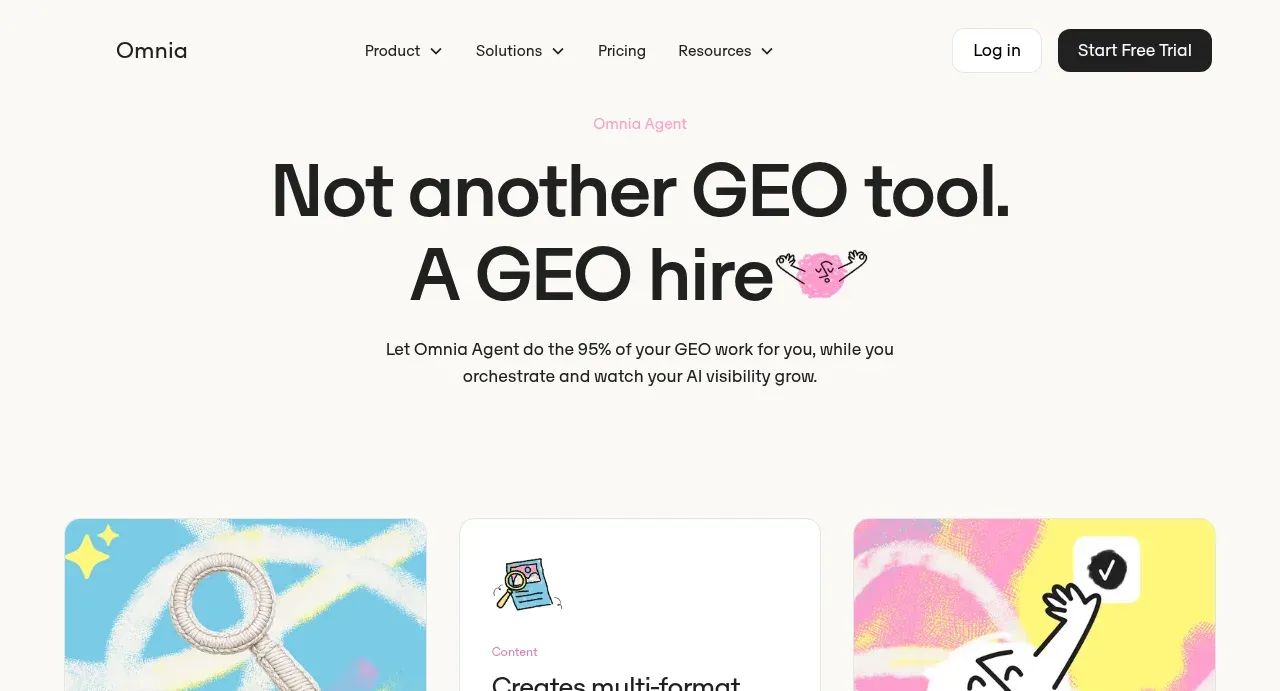 Agent positioning hero
Omnia Agent · Hero
Agent positioning hero
Omnia Agent · Hero
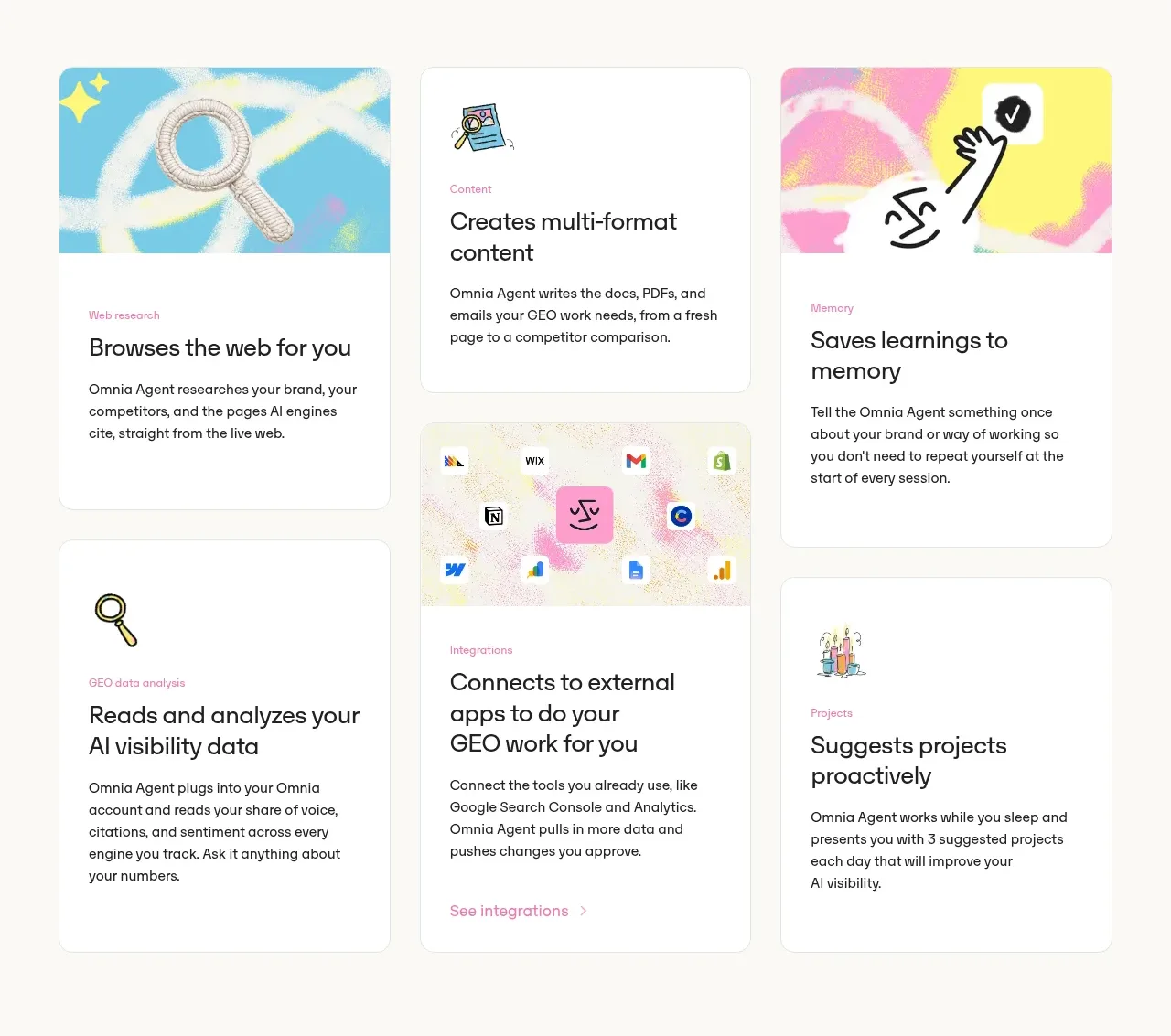 Agent capability cards
Omnia Agent · Feature grid
Agent capability cards
Omnia Agent · Feature grid
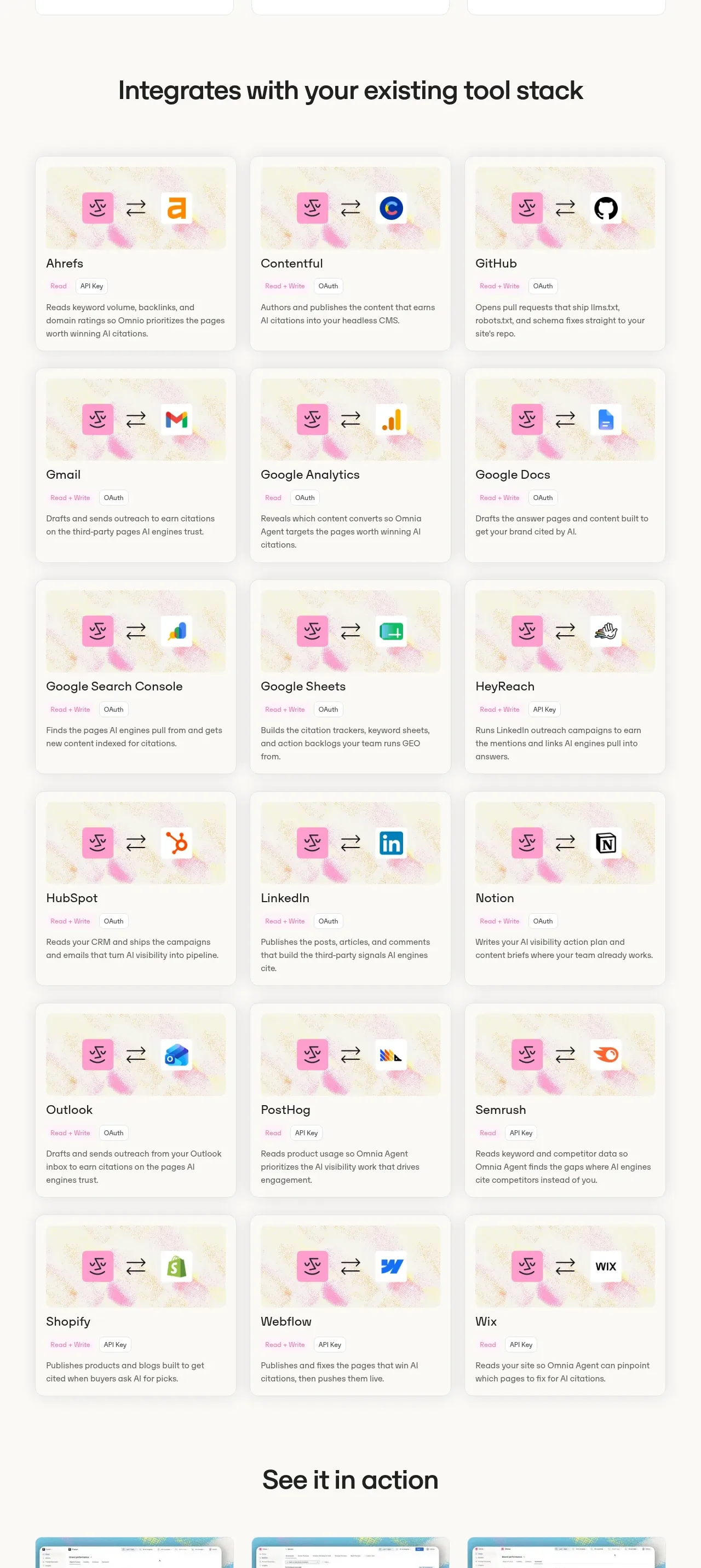 Integration directory
Omnia Agent · Feature grid
Integration directory
Omnia Agent · Feature grid
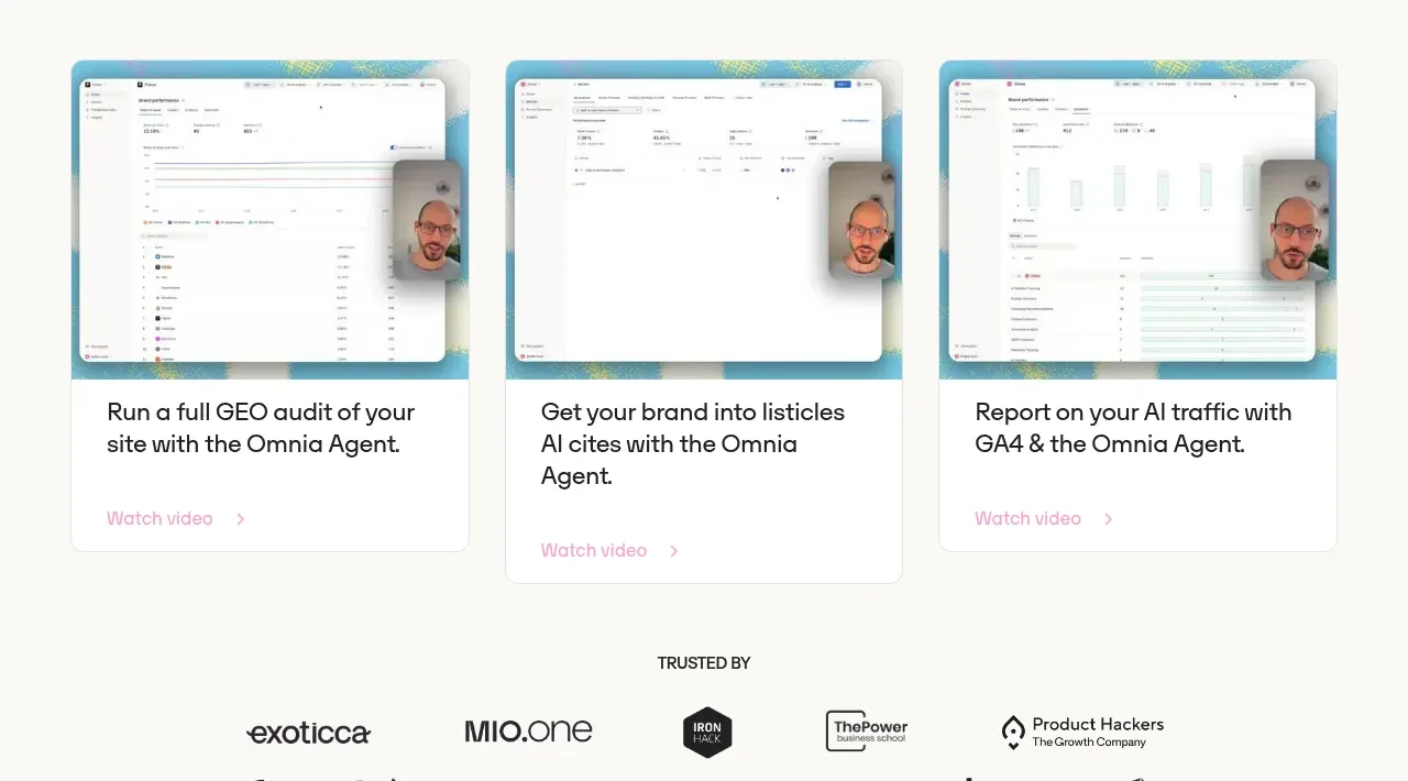 Product demos
Omnia Agent · Gallery
Product demos
Omnia Agent · Gallery
 Trusted by customer logos
Omnia Agent · Logo cloud
Trusted by customer logos
Omnia Agent · Logo cloud
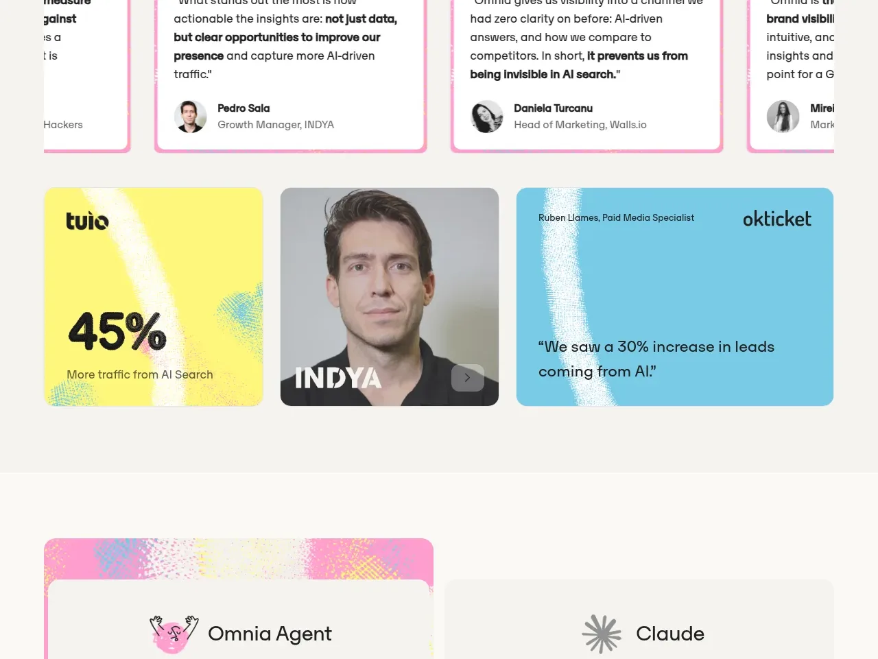 Customer proof and outcomes
Omnia Agent · Testimonials
Customer proof and outcomes
Omnia Agent · Testimonials
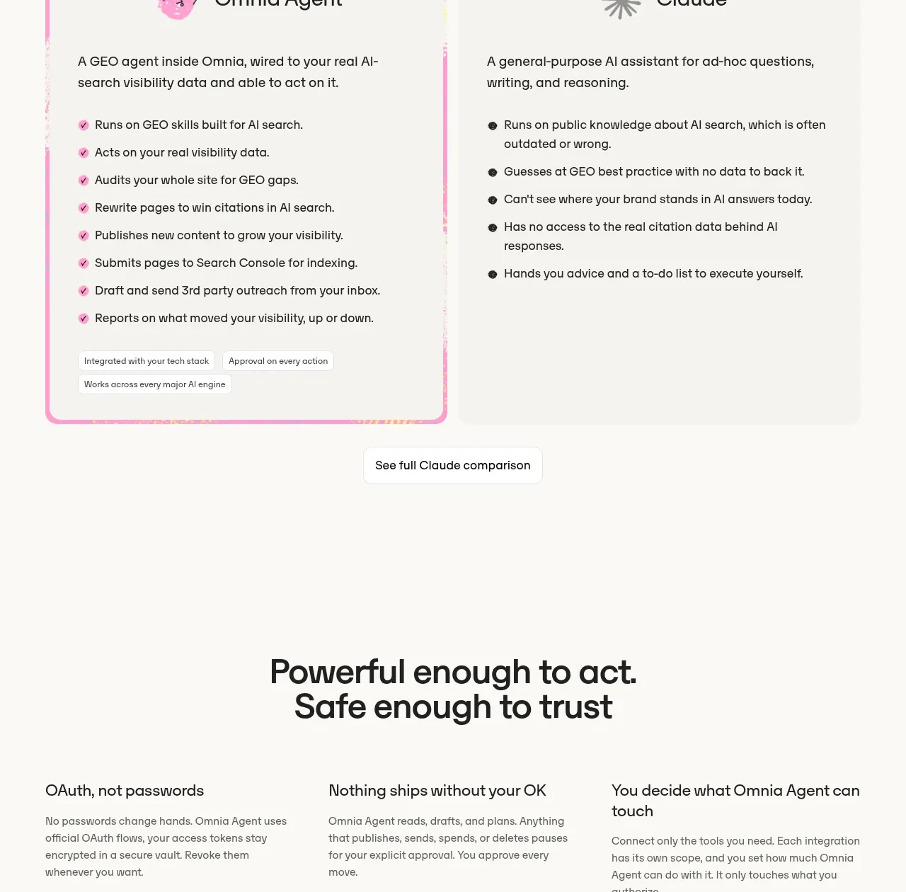 Agent versus general assistant comparison
Omnia Agent · Card
Agent versus general assistant comparison
Omnia Agent · Card
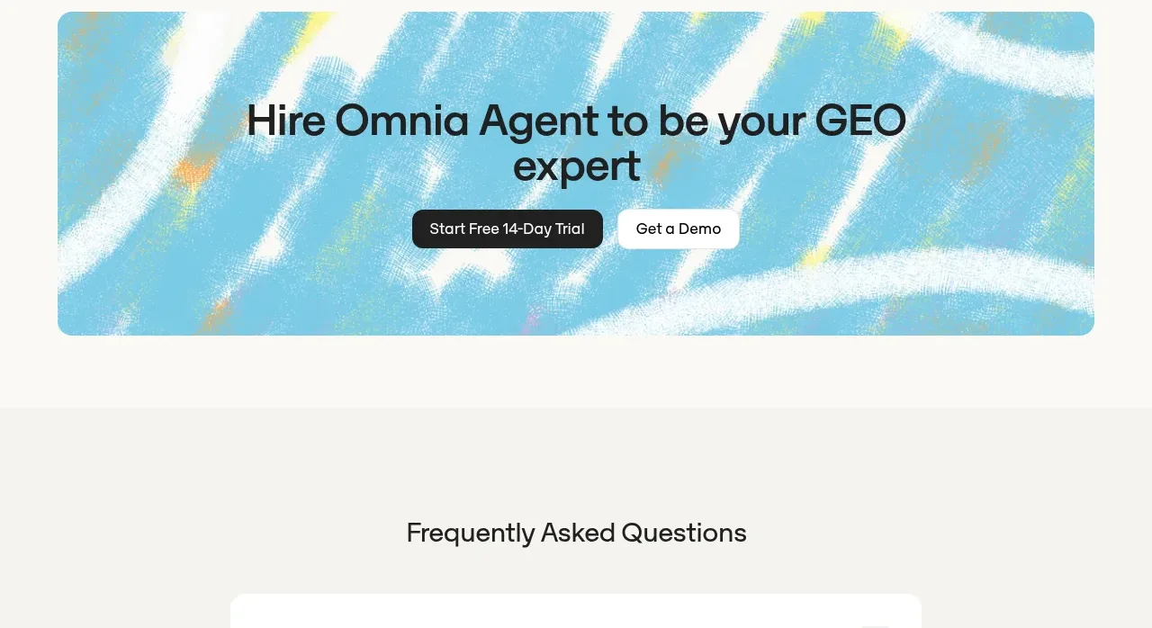 Safety and control principles
Omnia Agent · Stats
Safety and control principles
Omnia Agent · Stats
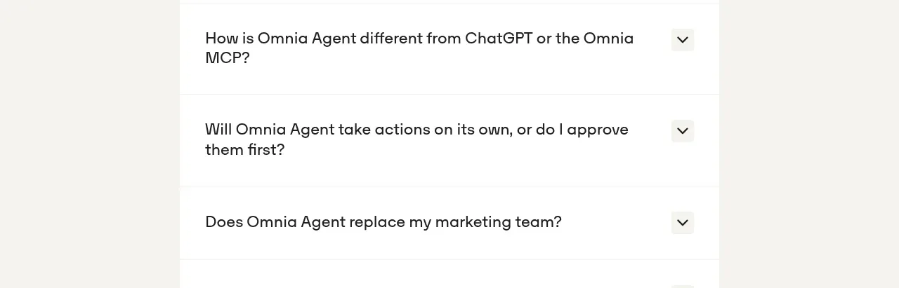 Trial conversion banner
Omnia Agent · Call to action
Trial conversion banner
Omnia Agent · Call to action
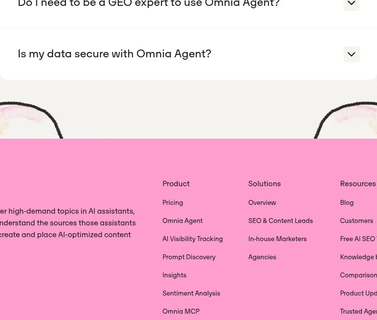 Frequently asked questions
Omnia Agent · FAQ
Frequently asked questions
Omnia Agent · FAQ
 Site footer
Omnia Agent · Footer
Site footer
Omnia Agent · Footer