 kage
kage
once-ui.com

Design analysis
A light bordered panel turns community proof into an invitation: a small avatar cluster and concise statement sit left while a pair of social/community figures occupy the right. Two low-key action buttons finish the panel.
Prompt preview
## Reference images

Study these alongside the description below: hierarchy, rhythm, spacing, colour. Build for the product you are asked about, using this design language.

- Component: https://kage-design-assets.t3.tigrisfiles.io/components/once-ui-2-0/5271e217-1d5e-4be9-a528-849fafbcb323-1790488914-4.webp
- Full page it was cut from: https://kage-design-assets.t3.tigrisfiles.io/screenshots/once-ui-2-0/5271e217-1d5e-4be9-a528-849fafbcb323-1790488895695-full.webp
- Component on Kage: https://kage.design/component/once-ui-2-0-cta

## Before you start
Ask what the user's product, audience, and brand are, then tailor this community invitation to them.

Build a wide, lightly bordered community CTA panel with a white background and a quiet horizontal divider treatment. Put a small overlapping avatar cluster, a short community heading, and one sentence of proof on the left. Add two compact outline or ghost buttons for relevant community destinations beneath the copy. Reserve the right side for an abstract people/community visual that can overlap the panel edge without dominating the text. Use #ffffff, #eeeeee, #111111, and muted #777777; use 14–16px copy, 12px buttons, 16px gaps, and 20px panel radius. On small screens stack the visual below the actions. Add hover and focus states to buttons.

Never: use the reference's logo, product name, exact copy, people imagery, avatars, or distinctive assets.
More components
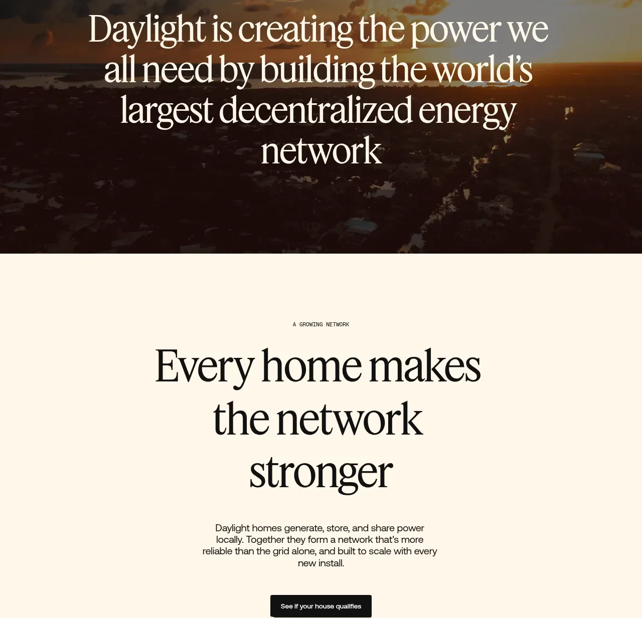
 Network growth CTA
godaylight.com · Call to action
Network growth CTA
godaylight.com · Call to action
 Split closing CTA
godaylight.com · Call to action
Split closing CTA
godaylight.com · Call to action

 Closing conversion banner
FastRouter.ai · Call to action
Closing conversion banner
FastRouter.ai · Call to action
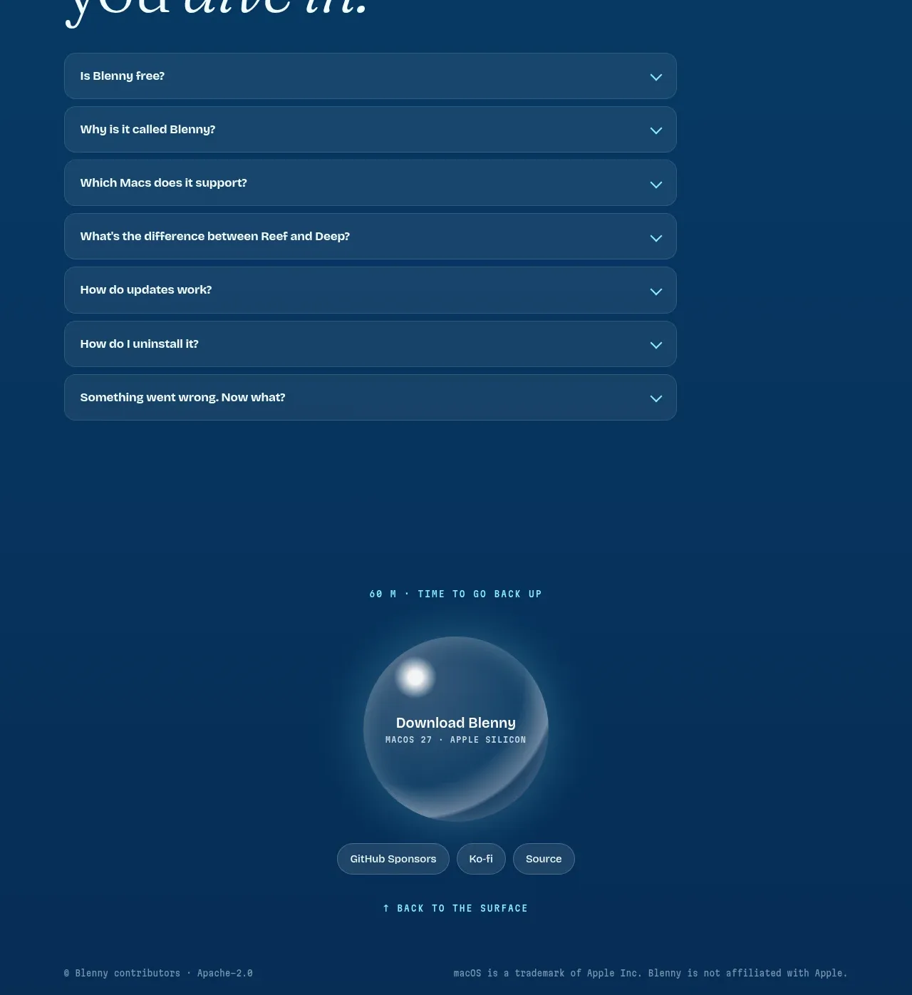
 Final download call to action
Blenny · Call to action
Final download call to action
Blenny · Call to action
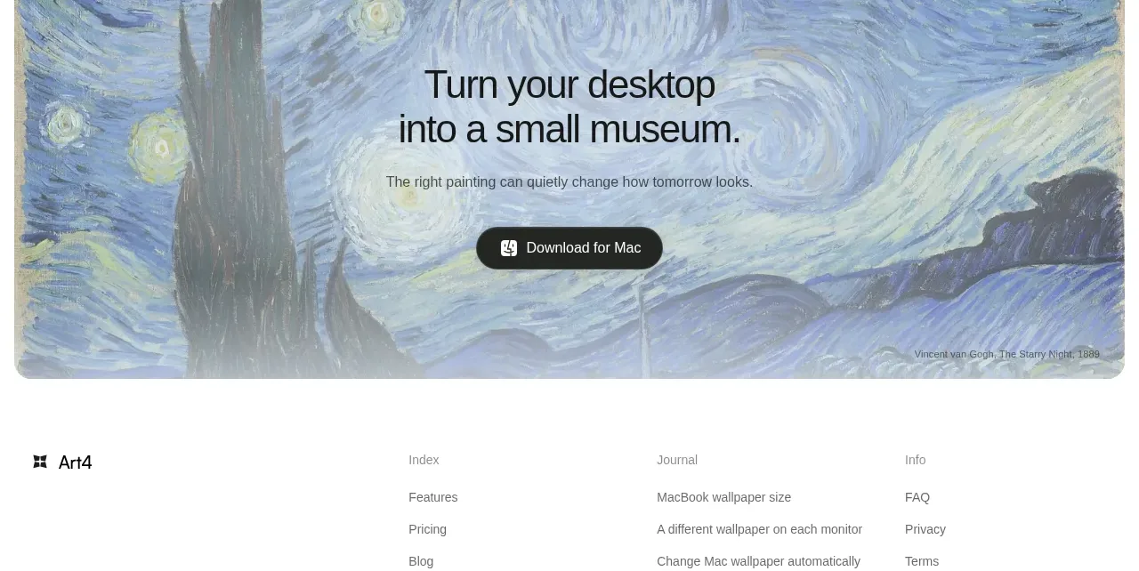
 Visual download call to action
Art4 · Call to action
Visual download call to action
Art4 · Call to action
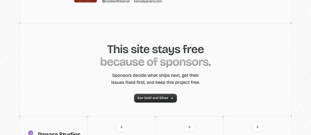
 Sponsor call to action
opensend.cc · Call to action
Sponsor call to action
opensend.cc · Call to action