kage
kage
once-ui.com
Design analysis
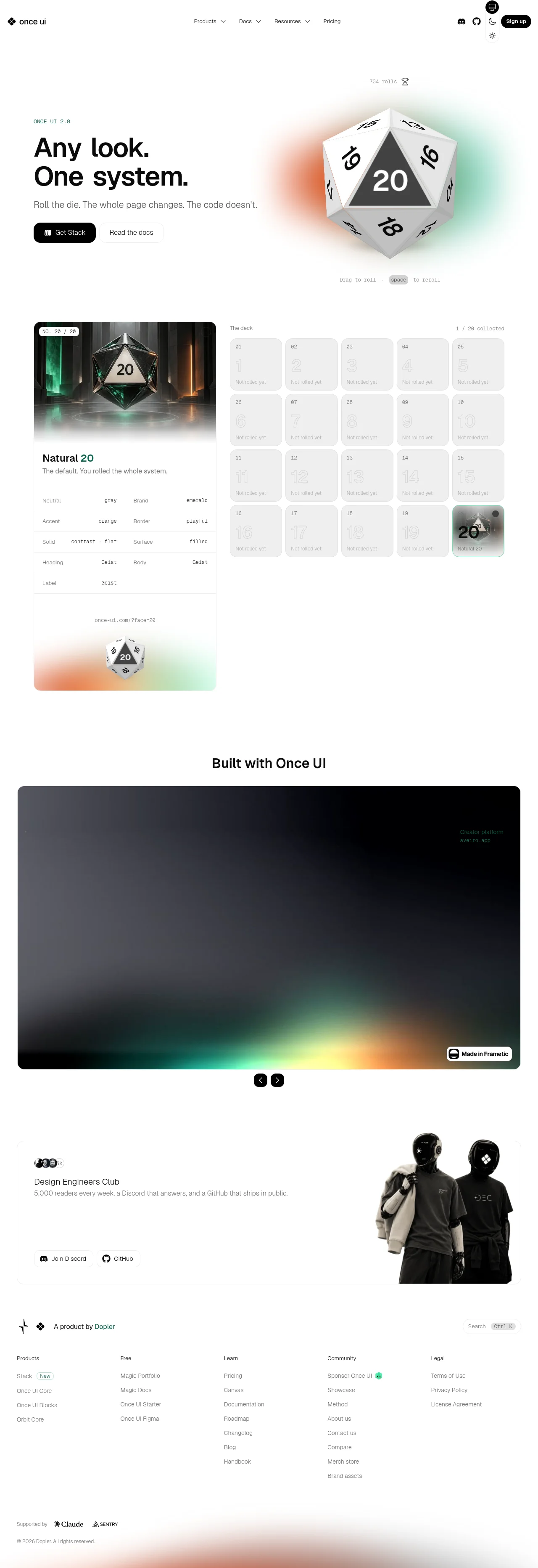
A white, system-driven landing page built around a gamified theme-demonstration: a 3D d20 die ("roll the die, the whole page changes") sits beside a huge black grotesque headline, with an orange-and-green ambient gradient halo softening the contrast. Below, a split demo pairs a collectible-card "roll result" (spec table of theme tokens in monospace) with a 5×4 deck grid of locked/unlocked rolls, giving the page a sparse, playful editorial rhythm that then compresses into full-bleed dark gradient showcase slides, a light community band with photographic cutouts, and a dense five-column footer. Colour stays restrained — black text on white with emerald and orange only as accents — letting the interactive gradient moments carry the energy.
Prompt preview
## Reference images

Study these alongside the description below: hierarchy, rhythm, spacing, colour. Build for the product you are asked about, using this design language.

- Full page: https://kage-design-assets.t3.tigrisfiles.io/screenshots/once-ui-2-0/5271e217-1d5e-4be9-a528-849fafbcb323-1790488895695-full.webp
- Above the fold: https://kage-design-assets.t3.tigrisfiles.io/screenshots/once-ui-2-0/5271e217-1d5e-4be9-a528-849fafbcb323-1790488890349.webp
- Design on Kage: https://kage.design/designs/once-ui-2-0-landing-page

## Before you start
Ask the user what they are building, who it is for, and what brand assets (name, colours, type) they already have. Wait for the answers. Everything below is applied to *their* product, not to the reference site.

## Page structure
- **Top nav**: slim white bar — wordmark left, four dropdown nav items centered (Products, Docs, Resources, Pricing), utility icons + dark pill "Sign up" button right. A floating theme/colour toggle chip sits top-right corner.
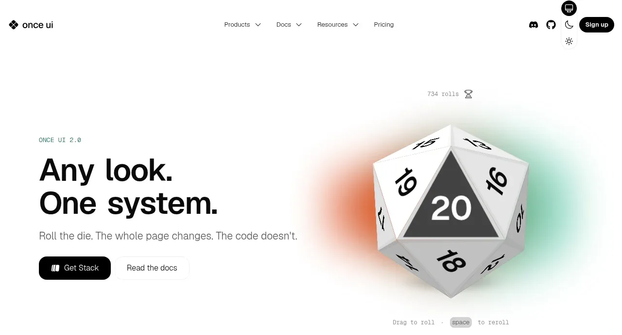
- **Hero**: two columns. Left: tiny monospace eyebrow label ("ONCE UI 2.0"), oversized two-line black sans headline ("Any look. / One system."), one grey subline, then a black pill primary CTA with icon and a bordered secondary CTA. Right: large interactive 3D d20 die over an orange→green ambient gradient blur, with a monospace counter ("734 rolls") above and interaction hint ("Drag to roll · space to roll") below. The die is the theme switcher — rolling re-themes the whole page.
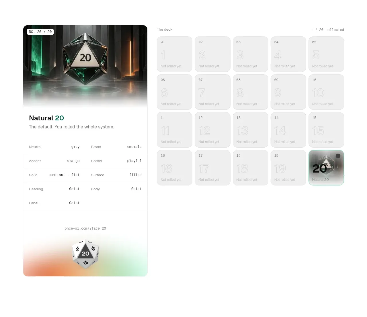
- **Roll demo section**: split layout. Left: a large rounded card showing the current "roll" — a dramatic themed 3D render on top, then a card body with the roll name, description, and a spec table of design tokens (Neutral, Brand, Accent, Border, Solid, Surface, Heading, Body, Label) rendered as monospace key–value rows with thin dividers, plus a shareable URL and small die graphic. Right: "The deck" — a 5×4 grid of numbered cards; locked ones are pale grey with ghost numbers ("Not rolled yet"), the collected one is filled with a themed image and progress counter ("1 / 20 collected") in the header row.
- **"Built with Once UI" section**: centered bold heading, then a full-width rounded dark showcase slide (big ambient gradient canvas with small corner labels and a "Made in ..." badge), with circular prev/next carousel buttons centered below.
- **Community section**: light rounded panel — left: avatar cluster, "Design Engineers Club" heading, one-line description, two outlined pill buttons (Discord, GitHub); right: duotone photograph of helmeted figures bleeding to the panel edge.
- **Footer**: brand row (logos, "A product by [company]", right-aligned search with ⌘K hint), then five link columns (Products with "New" chip, Free, Learn, Community, Legal), then bottom row with "Supported by" logos and copyright, over a faint gradient fade at the very bottom edge.

## Design language
- Near-white background (#f5f5f5–#fafafa), near-black text (#111). Accents only: emerald green and warm orange, used in gradients and tiny highlights — never as flat UI colour blocks.
- Hierarchy by extreme scale contrast: headline ~64–80px heavy sans (grotesque style, tight tracking, tight leading); body 16px grey; labels and metadata in small monospace, uppercase for eyebrows.
- Monospace is the signature secondary voice: counters, token tables, interaction hints, URL chips all use it, signalling "this is a system for engineers".
- Rounded geometry everywhere: cards and panels ~16–24px radius, pills for buttons, thin 1px light-grey dividers and borders; no drop shadows except subtle depth on stacked cards.
- Rhythm down the page: playful/sparse and interactive at top → dense data-grid in the demo → full-bleed dark showcase (a hard light-to-dark rhythm break) → light community band → dense utilitarian footer. Alternate white space and density rather than uniform sections.
- Gradients are ambient, not flat: soft blurred orange→green→yellow halos behind objects and at page edges; the showcase slides invert to dark backgrounds with glowing gradient sweeps.
- Buttons: solid black pill with white text for primary; white pill with 1px border for secondary. Small circular icon buttons for carousel controls.
- Motion: interactive hero object (draggable, keyboard-activatable), grid items that fill as state changes, carousel slides. Keep transitions smooth (~300ms) and make any state change visible in the surrounding UI.

## Never
- Do not copy the reference's name, wordmark, dice/d20 concept, "deck" collectible copy, club name, illustrations, photography, or exact spec-table labels.
- Never present the result as that product; apply the visual system to the user's own brand, content, and colour tokens.
Components from this page
All components
 Minimal site navigation
Once UI 2.0 · Navigation
Minimal site navigation
Once UI 2.0 · Navigation
 Interactive system hero
Once UI 2.0 · Hero
Interactive system hero
Once UI 2.0 · Hero
 System explorer and collection grid
Once UI 2.0 · Feature grid
System explorer and collection grid
Once UI 2.0 · Feature grid
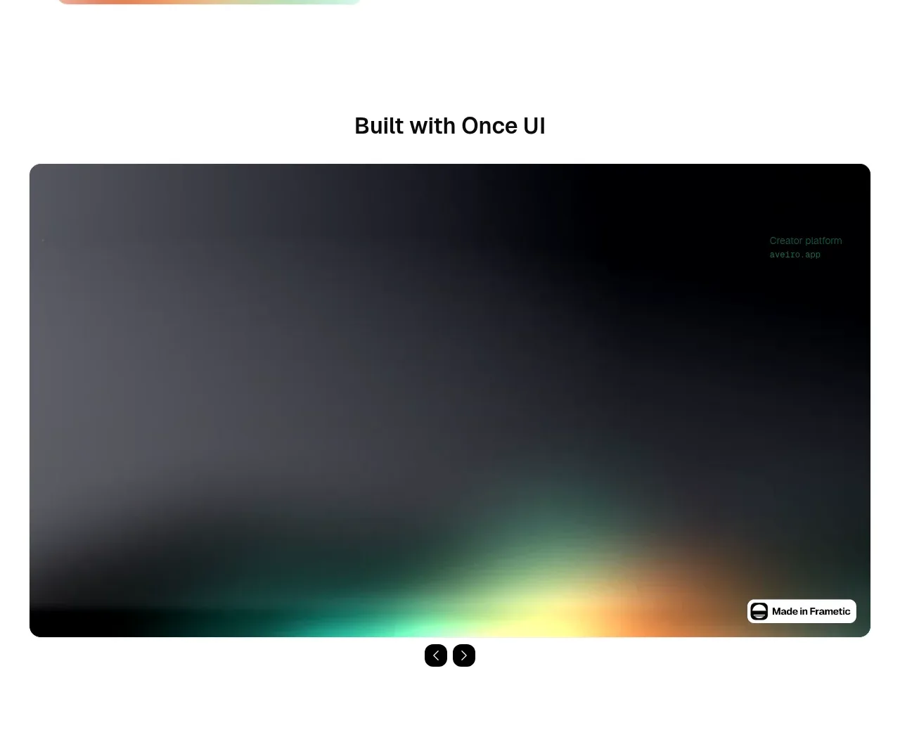 Built-with showcase gallery
Once UI 2.0 · Gallery
Built-with showcase gallery
Once UI 2.0 · Gallery
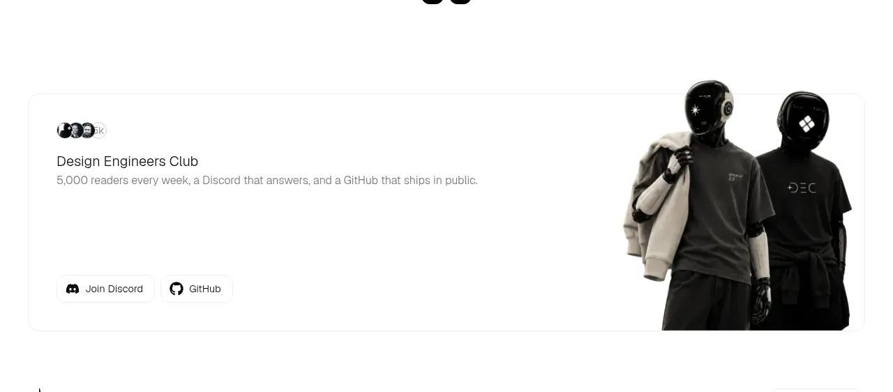 Community invitation panel
Once UI 2.0 · Call to action
Community invitation panel
Once UI 2.0 · Call to action
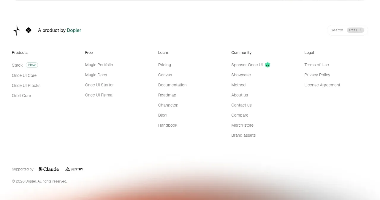 Multi-column resource footer
Once UI 2.0 · Footer
Multi-column resource footer
Once UI 2.0 · Footer