kage
kage
once-ui.com
Design analysis
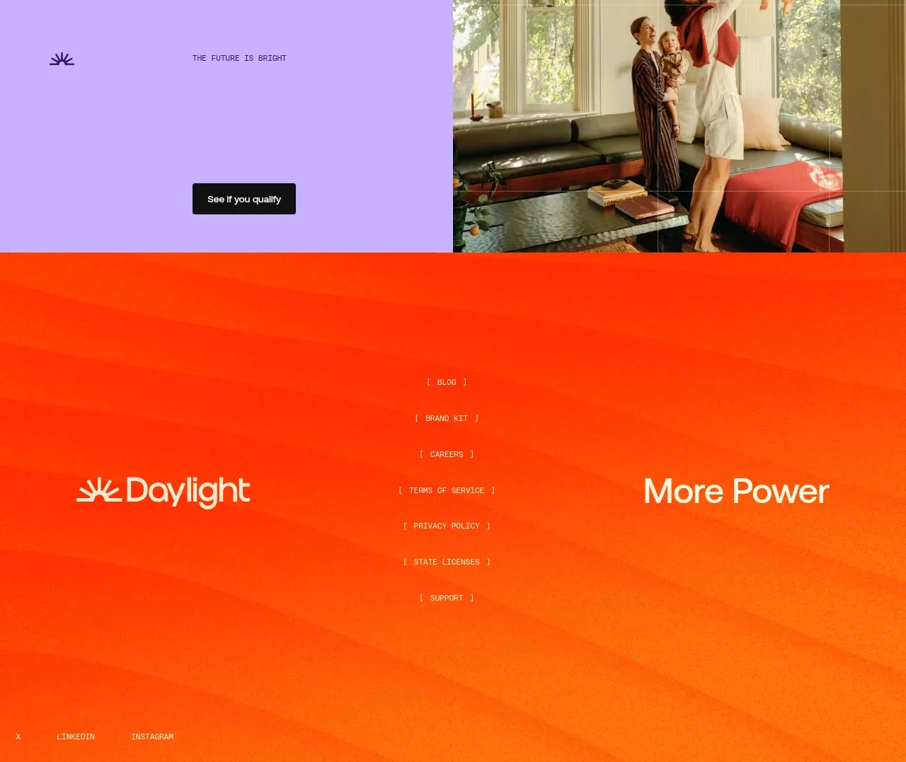
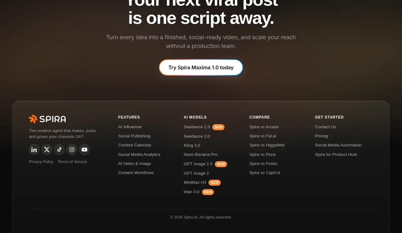
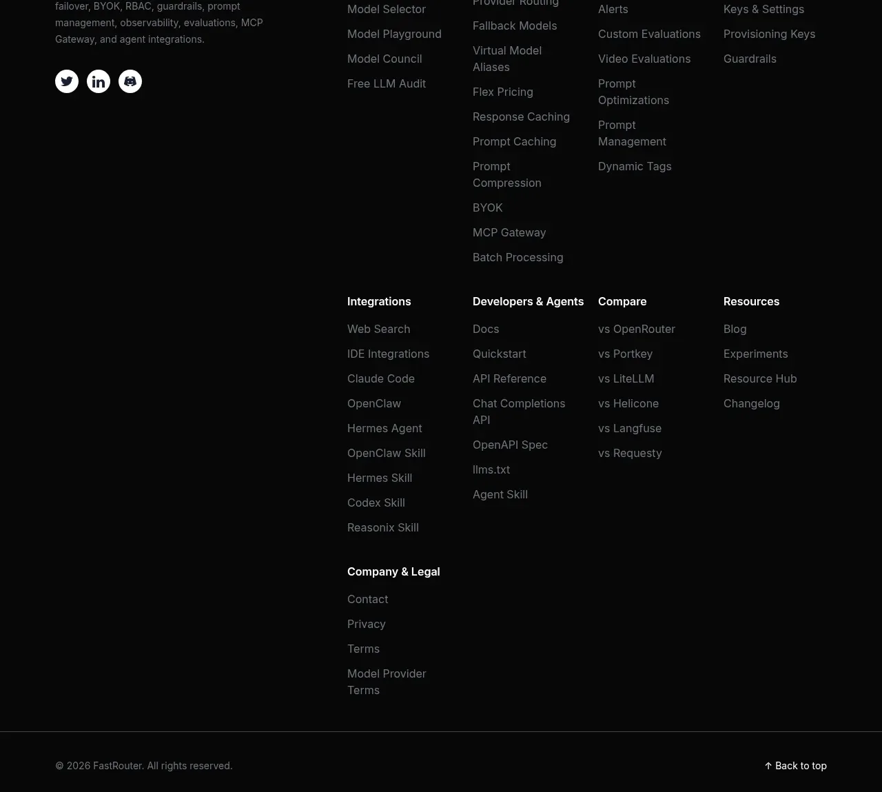
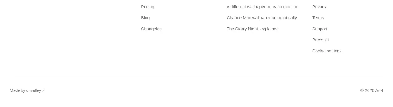
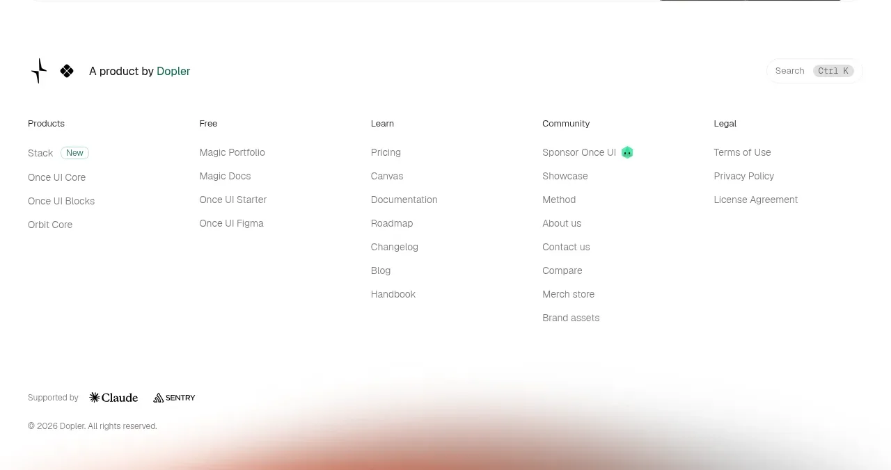
The footer begins with a small parent-company line, then organizes many links into clear columns for products, learning, community, and legal. A low-contrast bottom row handles partner marks, copyright, and utility search.
Prompt preview
## Reference images

Study these alongside the description below: hierarchy, rhythm, spacing, colour. Build for the product you are asked about, using this design language.

- Component: https://kage-design-assets.t3.tigrisfiles.io/components/once-ui-2-0/5271e217-1d5e-4be9-a528-849fafbcb323-1790488915-5.webp
- Full page it was cut from: https://kage-design-assets.t3.tigrisfiles.io/screenshots/once-ui-2-0/5271e217-1d5e-4be9-a528-849fafbcb323-1790488895695-full.webp
- Component on Kage: https://kage.design/component/once-ui-2-0-footer

## Before you start
Ask what the user's product, company, and brand are, then apply this information architecture to them.

Build a generous multi-column footer on white. Start with a compact brand/company statement, then arrange 4–5 link columns with small uppercase or semibold headings and vertically spaced muted links. Include groups for product, learning, community, and legal, but rename them for the user's information architecture. Use near-black #171717 for headings, #707070 for links, #eeeeee for separators, and plenty of horizontal and vertical whitespace. Add a bottom utility row with partner/support information, copyright, and a compact search affordance. Keep typography around 12–14px and use 8–14px row gaps. Make columns collapse into accordions or stacked groups on mobile, with clear focus states.

Never: use the reference's logo, product name, exact link labels, partner marks, imagery, or distinctive brand assets.