kage
kage
once-ui.com
Design analysis
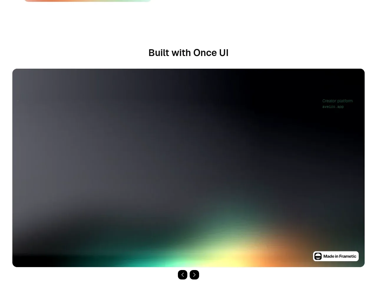
A centered section heading introduces a large dark rounded media panel with atmospheric gradients, a small attribution badge, and compact carousel controls below. The large media frame creates a strong visual pause after the dense explorer.
Prompt preview
## Reference images

Study these alongside the description below: hierarchy, rhythm, spacing, colour. Build for the product you are asked about, using this design language.

- Component: https://kage-design-assets.t3.tigrisfiles.io/components/once-ui-2-0/5271e217-1d5e-4be9-a528-849fafbcb323-1790488914-3.webp
- Full page it was cut from: https://kage-design-assets.t3.tigrisfiles.io/screenshots/once-ui-2-0/5271e217-1d5e-4be9-a528-849fafbcb323-1790488895695-full.webp
- Component on Kage: https://kage.design/component/once-ui-2-0-gallery

## Before you start
Ask what the user's product, audience, and brand are, then use these rules for a fresh showcase.

Build a centered showcase gallery with a short heading above a single large media frame. Use a 16–20px rounded rectangle with a deep near-black gradient background (#111217 to #030305), subtle blurred cyan, green, and amber light near the bottom, and an optional small attribution badge anchored in a corner. Keep the heading bold but restrained, with 24–28px type. Place two compact circular previous/next controls centered below the frame. The gallery should support swipe, keyboard arrows, focus states, and graceful image fallbacks; on mobile use a shorter aspect ratio and preserve the rounded frame. Keep surrounding space white and generous.

Never: use the reference's logo, product name, exact copy, video still, imagery, attribution, or brand assets.