kage
kage
openflowkit.com
Design analysis
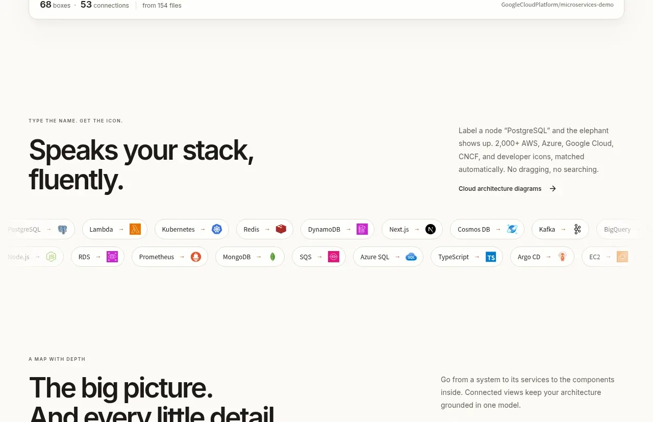
A short promise about understanding a user's stack is reinforced by a dense but orderly cloud of technology chips and icons.
Prompt preview
## Reference images

Study these alongside the description below: hierarchy, rhythm, spacing, colour. Build for the product you are asked about, using this design language.

- Component: https://kage-design-assets.t3.tigrisfiles.io/components/openflowkit-2/3de20331-4179-415d-a7ba-29915155b155-1791957761-5.webp
- Full page it was cut from: https://kage-design-assets.t3.tigrisfiles.io/screenshots/openflowkit-2/3de20331-4179-415d-a7ba-29915155b155-1791957697393-full.webp
- Component on Kage: https://kage.design/component/openflowkit-2-logo-cloud

## Before you start
Ask which platforms, languages, integrations, or file formats the user's product supports and which compatibility proof matters most.

Create a compatibility section with a two-column intro: a small eyebrow and bold 36–44px heading on the left, concise explanatory text and a link on the right. Under it, arrange a flexible cloud of compact rounded chips. Each chip should have a white or `#f5f4ef` fill, 1px `#e3e0d8` border, 999px radius, 12–13px text, and a small colored abstract icon or initial. Use a calm neutral palette with occasional orange, blue, green, and purple accents. Let chips wrap naturally across the width, with 8–12px gaps, and make each chip keyboard-focusable if interactive. Keep the section visually lighter than the product-demo sections.

Never use the reference's logo, product name, copy, brand marks, illustrations, imagery, or exact technology list.