kage
kage
alkera.ai
Design analysis
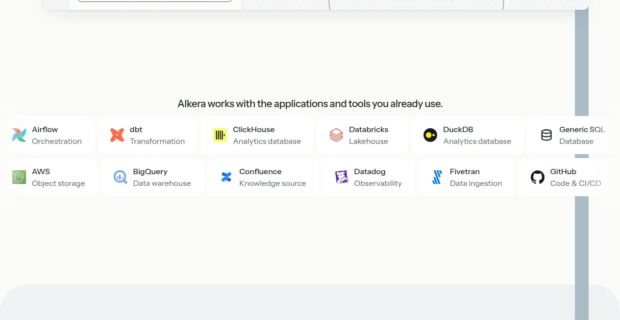
A centered integration statement sits above two neat rows of lightweight integration tiles. Each tile combines a small icon, a tool name, and a muted category label without overpowering the hero.
Prompt preview
## Reference images

Study these alongside the description below: hierarchy, rhythm, spacing, colour. Build for the product you are asked about, using this design language.

- Component: https://kage-design-assets.t3.tigrisfiles.io/components/databench-by-alkera/229e473d-7918-4538-a962-0aa359369c12-1791439388-2.webp
- Full page it was cut from: https://kage-design-assets.t3.tigrisfiles.io/screenshots/databench-by-alkera/229e473d-7918-4538-a962-0aa359369c12-1791439317723-full.webp
- Component on Kage: https://kage.design/component/databench-by-alkera-logo-cloud

## Before you start
Ask the user which integrations, ecosystems, or customer technologies matter to their product and what visual identity they use. Apply the structure to their own ecosystem with original assets.

Build an integrations logo cloud on a white background. Center a short sentence above the grid using 15–16px dark text. Below it, create two rows of evenly distributed tiles across a max-width container; each tile should have a small original icon or safe placeholder, a 13px semibold name, and an 11–12px muted descriptor. Use very subtle separators or shadows, lots of white space, and consistent tile heights. Avoid making the logos colorful enough to compete with the page; let the product content remain primary. On smaller screens, switch to a 2-column or horizontally scrollable layout.

Never: use logos, product names, copy, illustrations, or imagery from the reference.