kage
kage
context.dev
Design analysis
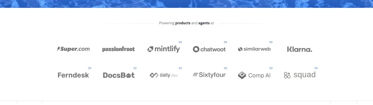
A small centered endorsement line introduces two rows of muted customer marks with ample whitespace.
Prompt preview
## Reference images

Study these alongside the description below: hierarchy, rhythm, spacing, colour. Build for the product you are asked about, using this design language.

- Component: https://kage-design-assets.t3.tigrisfiles.io/components/scrape-anything-by-context-dev/b0e64468-3924-45db-a4d8-d7cbe8044a77-1791871393-2.webp
- Full page it was cut from: https://kage-design-assets.t3.tigrisfiles.io/screenshots/scrape-anything-by-context-dev/b0e64468-3924-45db-a4d8-d7cbe8044a77-1791871314047-full.webp
- Component on Kage: https://kage.design/component/scrape-anything-by-context-logo-cloud

## Before you start
Ask what the user's product, audience, and brand are, then tailor the social-proof treatment accordingly.

Build a quiet customer-logo band between the hero and the product explanation. Center a small supporting sentence above two balanced rows of customer marks. Treat logos as monochrome or low-contrast placeholders, with consistent optical sizing, generous gaps, and enough whitespace that the section feels like evidence rather than an advertisement. Use a white background, #6B7280 muted marks, 12–14px intro text, and a max-width around 520px. On mobile, wrap into fewer columns or enable a subtle horizontal scroll without visible clutter.

Never: use logos, product names, copy, illustrations, or imagery from the reference.