kage
kage
botbus.io

Design analysis
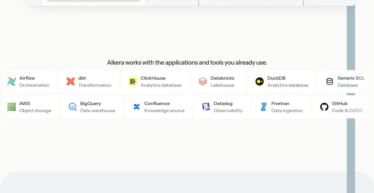
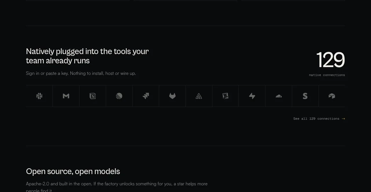
A narrow dark band follows the hero with a small “supported” label, a row of tool names/icons, and a contextual link, reassuring visitors about compatibility without interrupting the flow.
Prompt preview
## Reference images

Study these alongside the description below: hierarchy, rhythm, spacing, colour. Build for the product you are asked about, using this design language.

- Component: https://kage-design-assets.t3.tigrisfiles.io/components/botbus/3351c24c-0aff-40a1-9a6d-203e8c2d3da7-1791525845-2.webp
- Full page it was cut from: https://kage-design-assets.t3.tigrisfiles.io/screenshots/botbus/3351c24c-0aff-40a1-9a6d-203e8c2d3da7-1791525750475-full.webp
- Component on Kage: https://kage.design/component/botbus-logo-cloud

## Before you start
Ask what the user's product and brand are, then apply the principles below to that product rather than reproducing this reference.

Build a slim compatibility strip below the hero. Use a slightly differentiated near-black panel, a small uppercase eyebrow label, and a horizontally spaced row of supported platforms or integrations represented by simple monochrome icons and short names. Add one low-emphasis accent link at the far end for viewing or connecting another integration. Keep the row vertically centered, use 11–13px uppercase label text with letter spacing, 13–15px muted item text, and faint separators only if needed. Use an accent near #c4ad69 and avoid making the strip feel like a loud sponsor logo wall. Make it horizontally scrollable on narrow screens.

Never: use logos, product names, copy, illustrations, or imagery from the reference.