 kage
openship.io

Design analysis
A long, airy developer-platform landing page that alternates light editorial sections with two immersive dark panels — an architecture diagram and a huge 45-item capability index. Hierarchy is built almost entirely from type scale and a black/grey palette with no brand accent colour; the giant serif-italic-accented headlines ("Deploy anything. / Own everything.") set the tone, while dense two-column feature grids and a wide comparison table create rhythm changes from sparse to dense. Product UI mockups, curved pipeline diagrams and cards carry the narrative instead of photography, and a dark "Ready to ship?" closer mirrors the hero.
Prompt preview
## Reference images

Study these alongside the description below: hierarchy, rhythm, spacing, colour. Build for the product you are asked about, using this design language.

- Full page: https://kage-design-assets.t3.tigrisfiles.io/screenshots/openship-cloud/9519eed9-0239-434c-a94e-7bf81cfc26ba-1792562575709-full.webp
- Above the fold: https://kage-design-assets.t3.tigrisfiles.io/screenshots/openship-cloud/9519eed9-0239-434c-a94e-7bf81cfc26ba-1792562572173.webp
- Design on Kage: https://kage.design/designs/openship-cloud-landing-page

# Build a landing page in this style

## Before you start
Ask the user: what product are we building, who is it for, and what brand assets exist (name, colours, type, logo)? Wait for the answers. Everything below is a design language to apply to *their* product, not the reference site.

## Page structure
1. **Sticky top nav**: small logo left, centred text links (Features, Apps, Emails, Docs, Blog, Changelog, Pricing), GitHub link and a pill "Download" button right. Light background, thin bottom border.
2. **Hero**: centred two-line headline — bold sans first line, italic serif/lighter second line in grey ("Deploy anything. / Own everything."). Short centred paragraph below, then a black pill primary CTA plus a ghost secondary CTA.
3. **Stack strip**: small "designed for your favourite stack" eyebrow with a row of faint tech logos fading out at the edges.
4. **Product mockup**: large layered screenshot of the dashboard, slightly rotated/stacked cards, soft shadow, tilted dark side panels peeking behind.
5. **Dark architecture panel**: full-width rounded dark card. Centred heading "One system. Every layer." with an eyebrow, then a curved-node diagram (labelled chips connected by thin arcing lines converging on a central hub) and a small step pill row (push → build → ship → route) with a caption paragraph.
6. **How it works**: light section, big centred headline, then a vertical numbered list (01–05) — number in grey, bold step name, two-line description, thin hairline dividers.
7. **Deployment modes**: "Cloud, self-hosted, or both." headline, then three cards — outer cards light with big outlined numerals (01/03), the middle card inverted black ("Your servers") listing bullet points and a "Free & open source" footer; below, a two-column banner "Cloud ⇄ self-hosted. One click, any time." with body copy.
8. **App catalogue**: left column has eyebrow, big headline with italic accent word, paragraph and a pill button plus category chips; right column is a 3×3 grid of app cards (icon, name, one-line description, arrow) on white with hairline borders.
9. **Dark capabilities index**: full-width dark rounded panel. Centred heading "45 capabilities, one platform." then seven labelled groups (Deploy, Run, Connect, Data, Manage, Secure, Collaborate). Each group: big light serif/sans word on the left with a count, a 2-column grid of small dark rows (icon + title + one line + arrow) on the right.
10. **Transactional email section**: light, headline with grey second line, paragraph, numbered sub-points, and a dark terminal/email-client mockup on the right with status chips below it.
11. **Comparison table**: centred headline "Where we're genuinely different.", then a wide multi-column table — leftmost feature column plus columns for this product and named competitors, with check marks and short prose cells, hairline row dividers, sticky-looking header.
12. **Open-source section**: two-column — left headline with italic accents + paragraph + GitHub buttons; right a black card "Licensed under Apache 2.0" with keyword tags (Runs on, Telemetry, Dockfile, Standards).
13. **Final CTA**: dark rounded panel, huge centred "Ready to ship?", one-liner, black pill button + ghost secondary.
14. **Footer**: light, four link columns (Product, Developers, Company, Legal) plus a left brand blurb, bottom row with copyright and social icons.

## Design language
- Palette is near-monochrome: white `#fafafa`/`#ffffff` surfaces, near-black `#0a0a0a` text and inverted panels, mid-grey `#8a8a8a` for secondary text and hairlines `#e5e5e5`. Avoid any saturated brand accent; hierarchy comes from tone, not colour.
- Type: a geometric grotesque sans for everything, with a *lighter italic serif or italic sans* used as the second line of major headlines for contrast. Headline scale is very large (~72–96px), section intros ~48–56px, body 14–16px, meta text 11–12px uppercase eyebrows with letter-spacing.
- Rhythm alternates: airy centred statements → dense structured blocks (tables, grids, numbered lists) → airy again. Dark panels act as full-width "chapters" that break the light page roughly every third section.
- Shapes: large border radius (20–28px) on big dark panels and mockups, 10–14px on cards, fully rounded pills for buttons. No drop shadows except under the hero mockup stack; rely on 1px hairline borders elsewhere.
- Interactive elements: pill buttons (solid black primary, thin-bordered ghost secondary), cards with subtle hover lift and arrow affordances, small chevron/arrow icons consistently at the right edge of rows.
- Diagrams and mockups do the storytelling: curved connector-line architecture diagrams, labelled chips, and realistic dashboard screenshots with stacked/tilted layers. Build these with SVG curves and CSS transforms rather than stock imagery.
- Dense grids (feature rows, app cards, table cells) keep tight internal padding (12–16px) with hairline dividers instead of gaps, so density reads as craft not clutter.

## Never
No logos, wordmarks, product names, copy, illustrations, screenshots or icon sets from the reference site; never present the result as that product.
Components from this page
All components
 Top navigation
OpenShip Cloud · Navigation
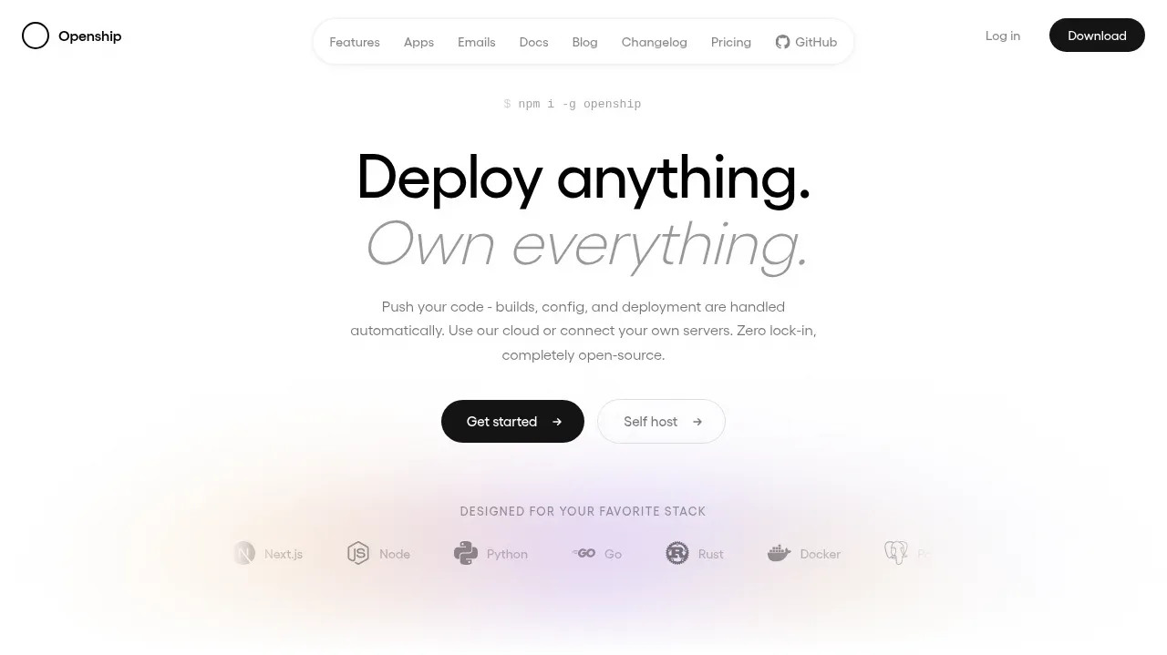 Deploy anything hero
OpenShip Cloud · Hero
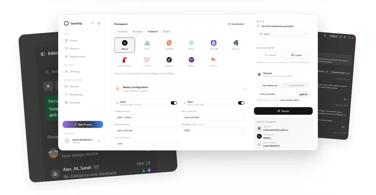 Product interface showcase
OpenShip Cloud · Gallery
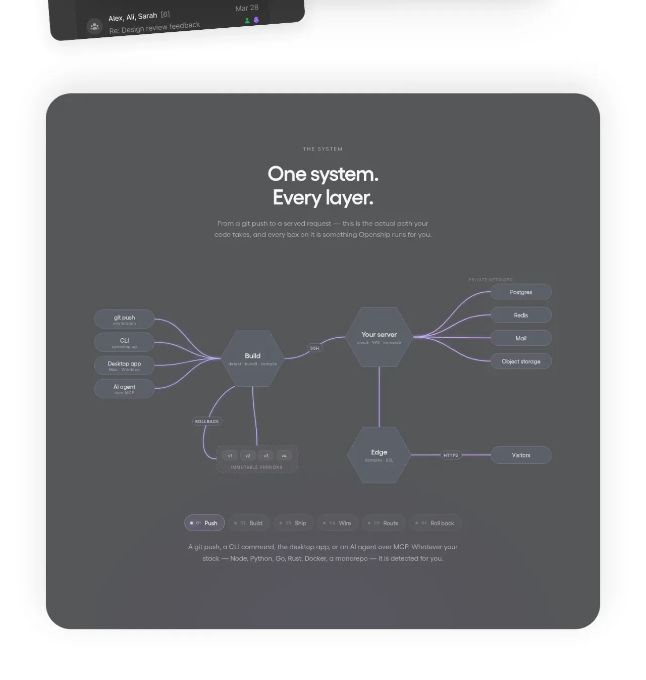 One system overview
OpenShip Cloud · Card
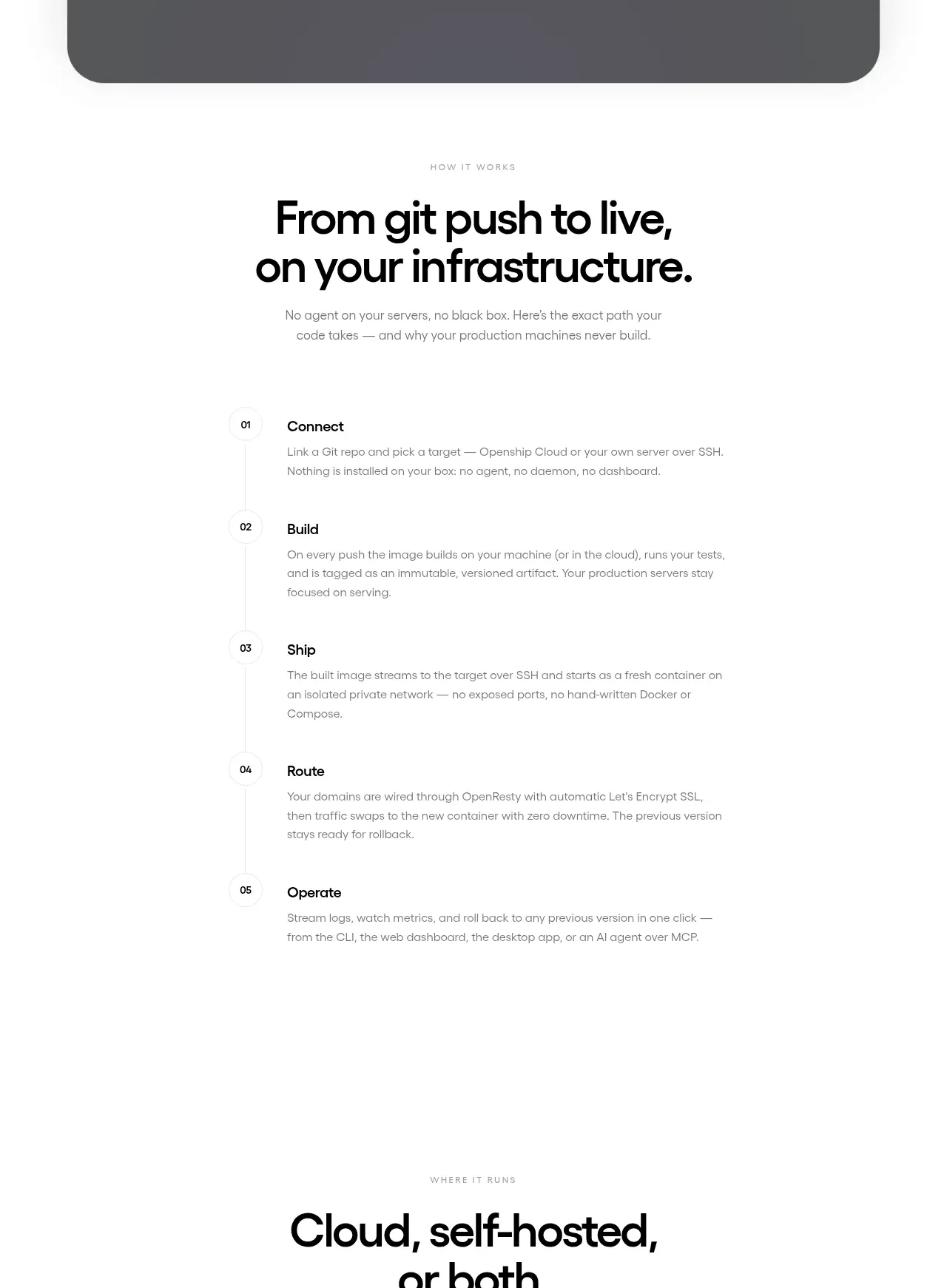 How it works
OpenShip Cloud · Feature grid
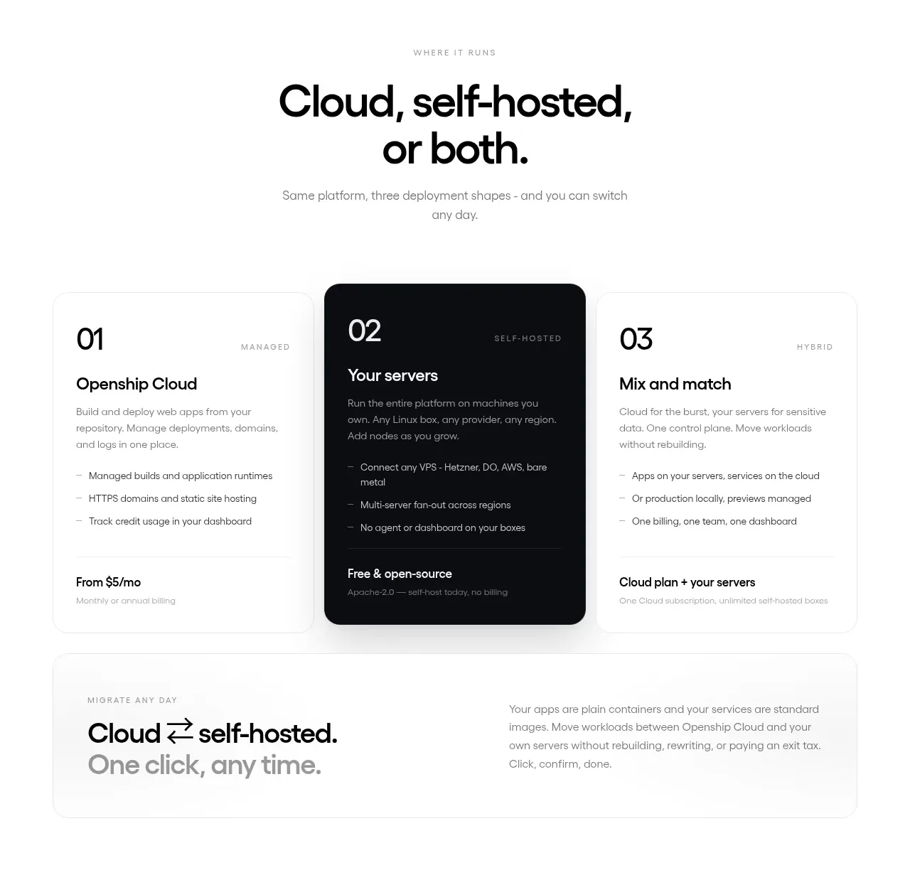 Deployment options
OpenShip Cloud · Pricing table
 Cloud to self-hosted switch
OpenShip Cloud · Call to action
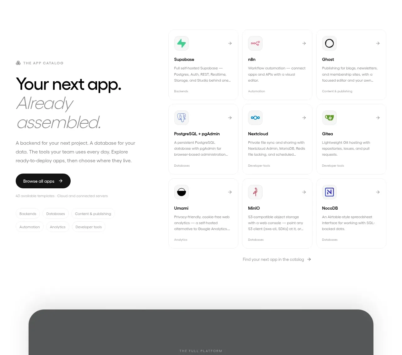 App catalog
OpenShip Cloud · Gallery
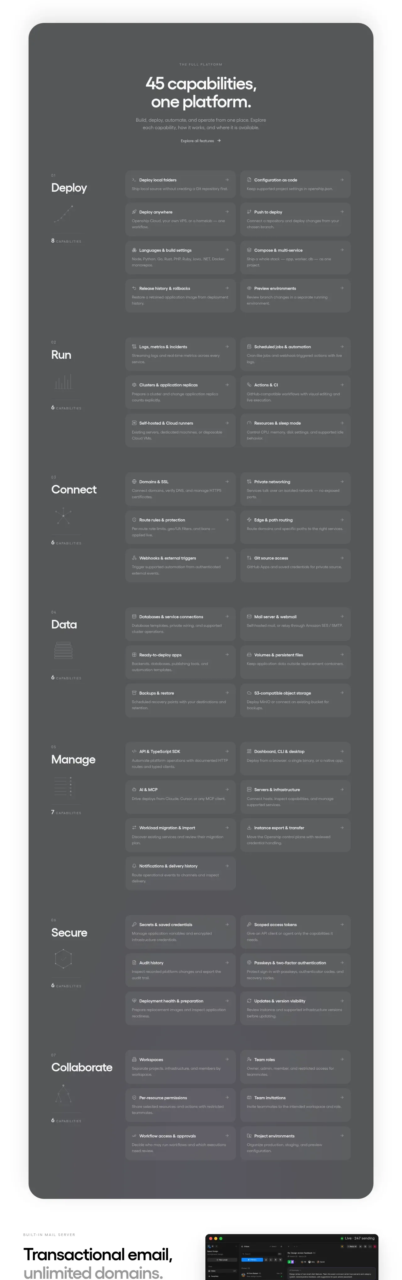 Platform capabilities
OpenShip Cloud · Feature grid
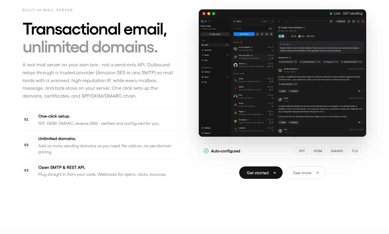 Transactional email feature
OpenShip Cloud · Feature grid
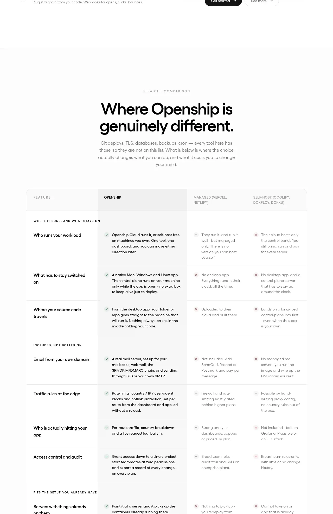 Competitive comparison
OpenShip Cloud · Table
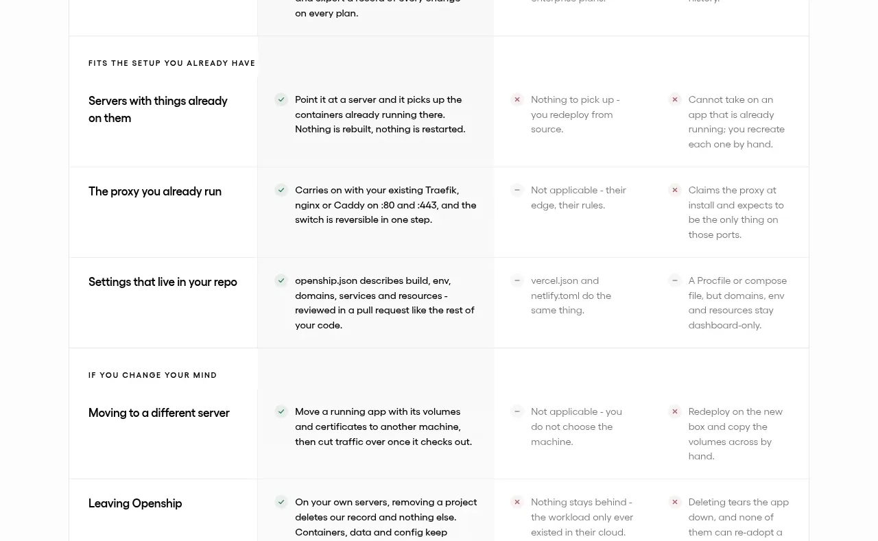 Open source and license
OpenShip Cloud · Card
Related designs
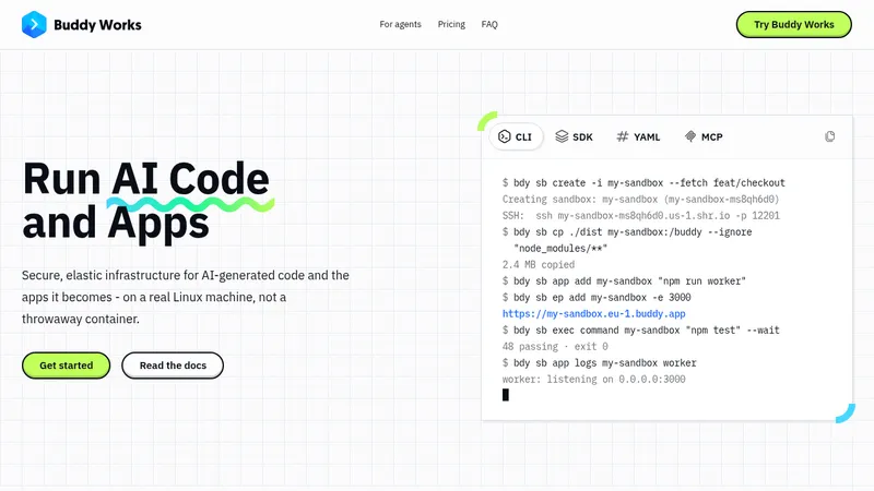

 AI Sandboxes by Buddy
Landing page · Cloud & infrastructure
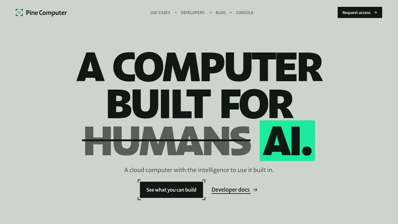

 Pine Computer
Landing page · Cloud & infrastructure
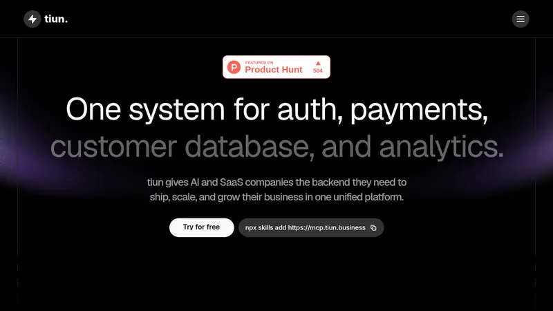

 tiun.
Landing page · Cloud & infrastructure
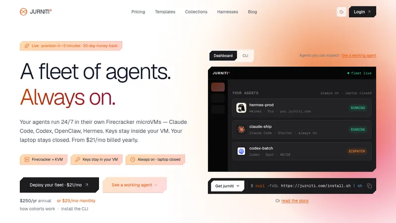

 jurniti
Landing page · Cloud & infrastructure


 cloudflare.com
Landing page · Cloud & infrastructure


 termsquad.com
Landing page · Cloud & infrastructure