 kage
kage
openwhispr.com
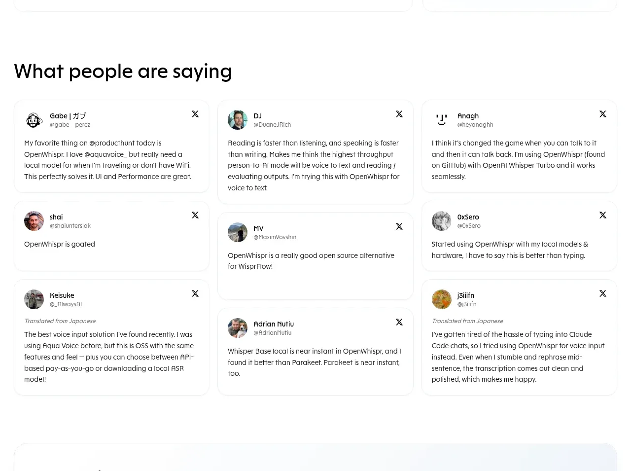
Design analysis
A large testimonial heading is followed by a three-column masonry-like collection of compact review cards with avatars, handles, close controls, and varied text lengths.
Prompt preview
## Reference images

Study these alongside the description below: hierarchy, rhythm, spacing, colour. Build for the product you are asked about, using this design language.

- Component: https://kage-design-assets.t3.tigrisfiles.io/components/openwhispr-for-ios/fdca984f-87fc-4407-a067-b1821a770c20-1791957716-4.webp
- Full page it was cut from: https://kage-design-assets.t3.tigrisfiles.io/screenshots/openwhispr-for-ios/fdca984f-87fc-4407-a067-b1821a770c20-1791957682462-full.webp
- Component on Kage: https://kage.design/component/openwhispr-for-ios-testimonials

## Before you start
Ask what the user's product, audience, and brand are, then apply the principles below to that product rather than reproducing this reference.

Build a testimonials section with a prominent left-aligned heading and a responsive three-column grid of customer quote cards. Cards may vary modestly in height to create a natural editorial rhythm, but align their columns cleanly. Include a small circular avatar placeholder, customer name and handle, an unobtrusive utility icon, and the quote. Use 16–18px card padding, 14–16px body text, 12px metadata, white backgrounds, #eef0f2 borders, 14px radius, and barely visible shadows. Keep the overall section airy with 40–64px gaps around the heading and 12–16px gaps between cards. On mobile, use one column and preserve readable quote width. Treat avatars as generic placeholders generated for the user's brand.

Never: use logos, product names, copy, illustrations, or imagery from the reference.
More components
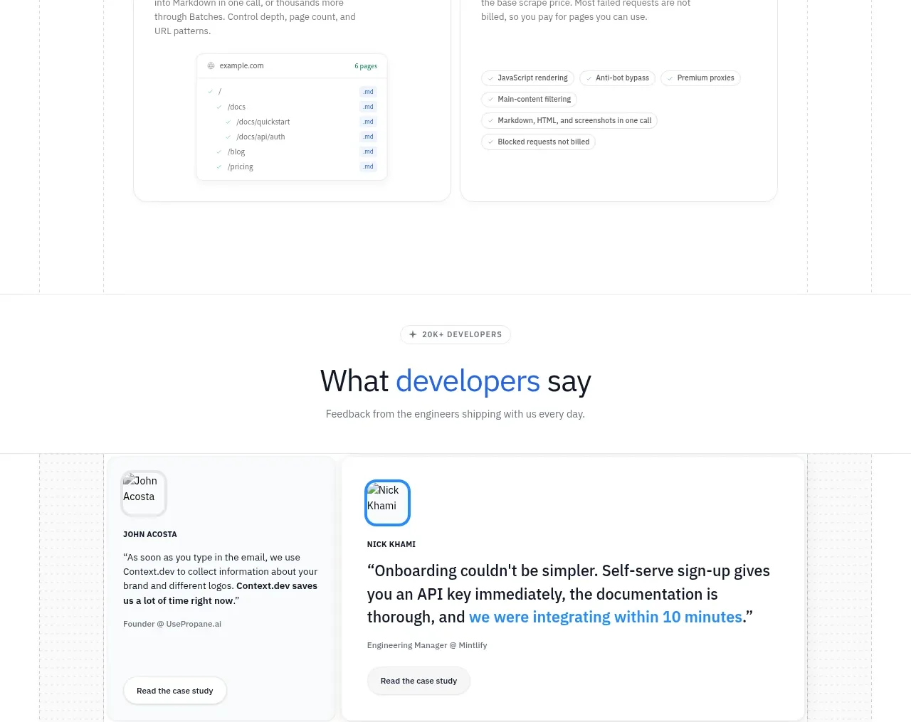
 Developer testimonials
Scrape Anything by Context.dev · Testimonials
Developer testimonials
Scrape Anything by Context.dev · Testimonials
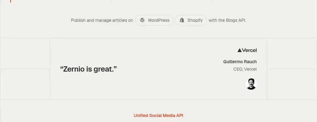
 Social API showcase and testimonial
Zernio · Testimonials
Social API showcase and testimonial
Zernio · Testimonials
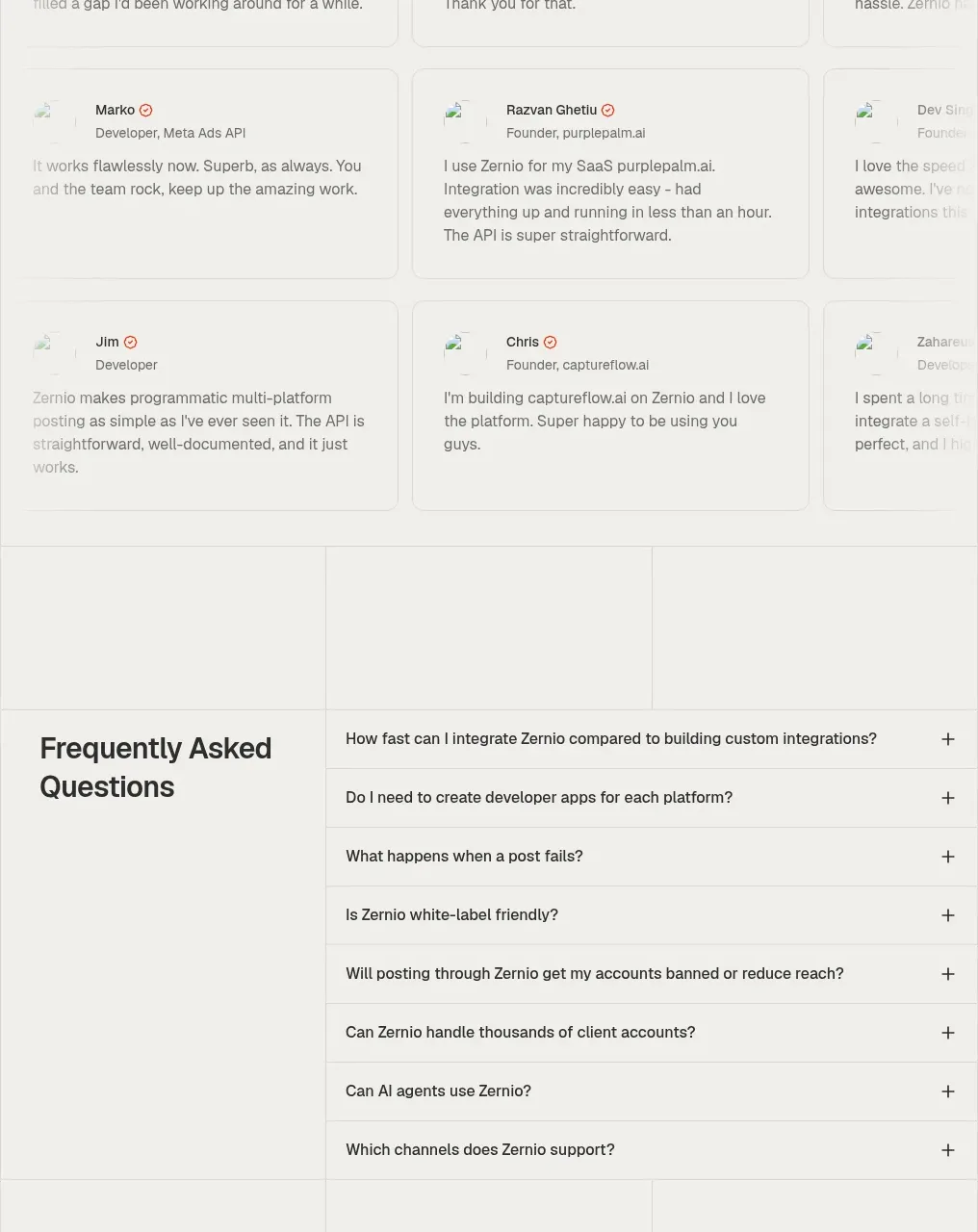 Developer testimonials grid
Zernio · Testimonials
Developer testimonials grid
Zernio · Testimonials
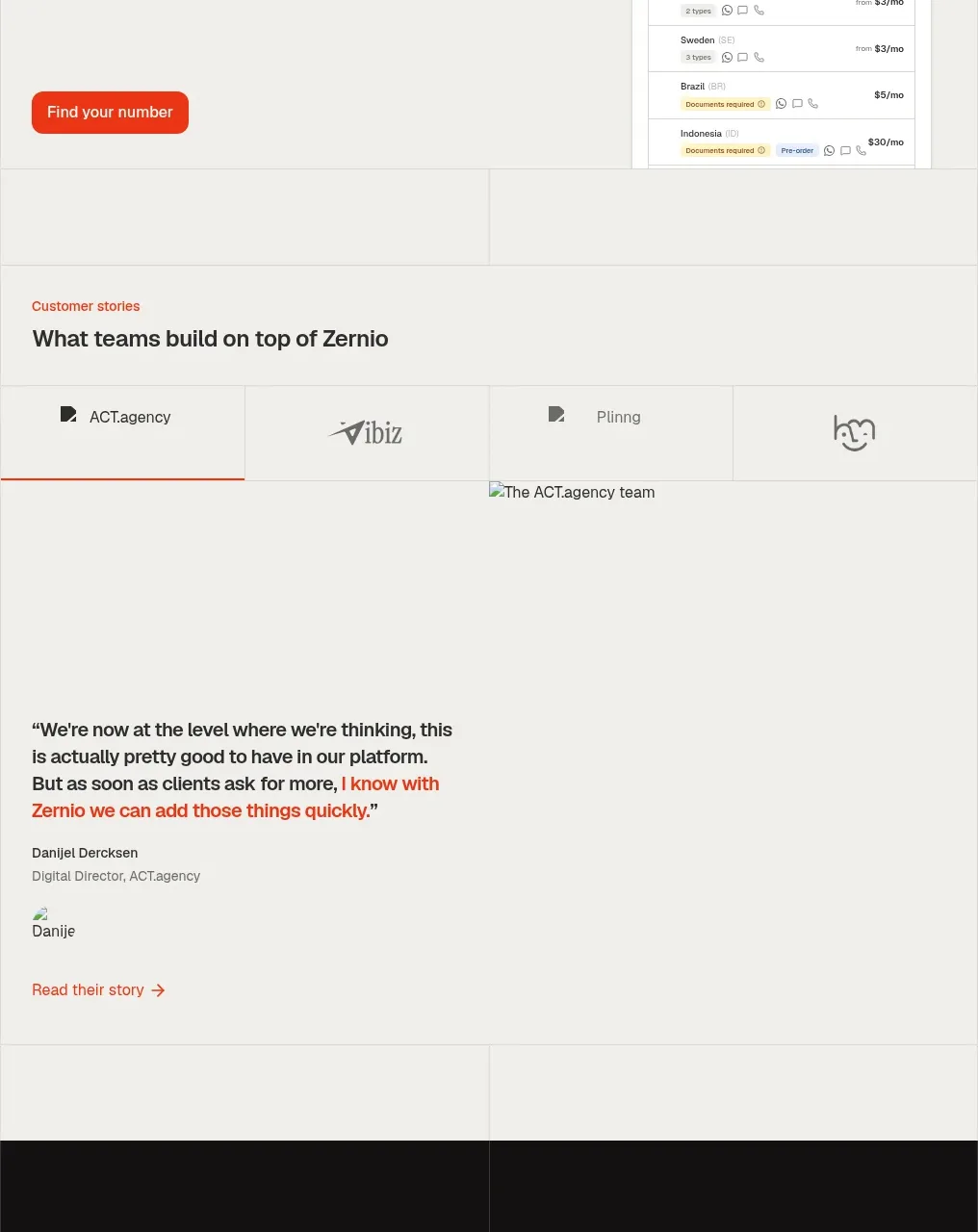 Customer stories
Zernio · Testimonials
Customer stories
Zernio · Testimonials
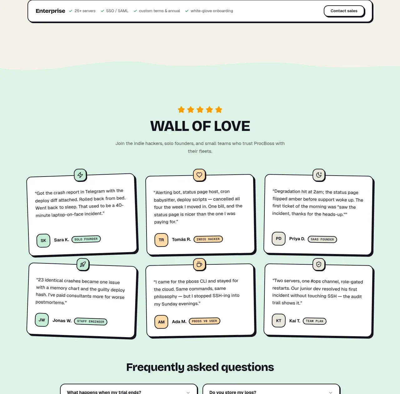
 Wall of love
ProcBoss · Testimonials
Wall of love
ProcBoss · Testimonials
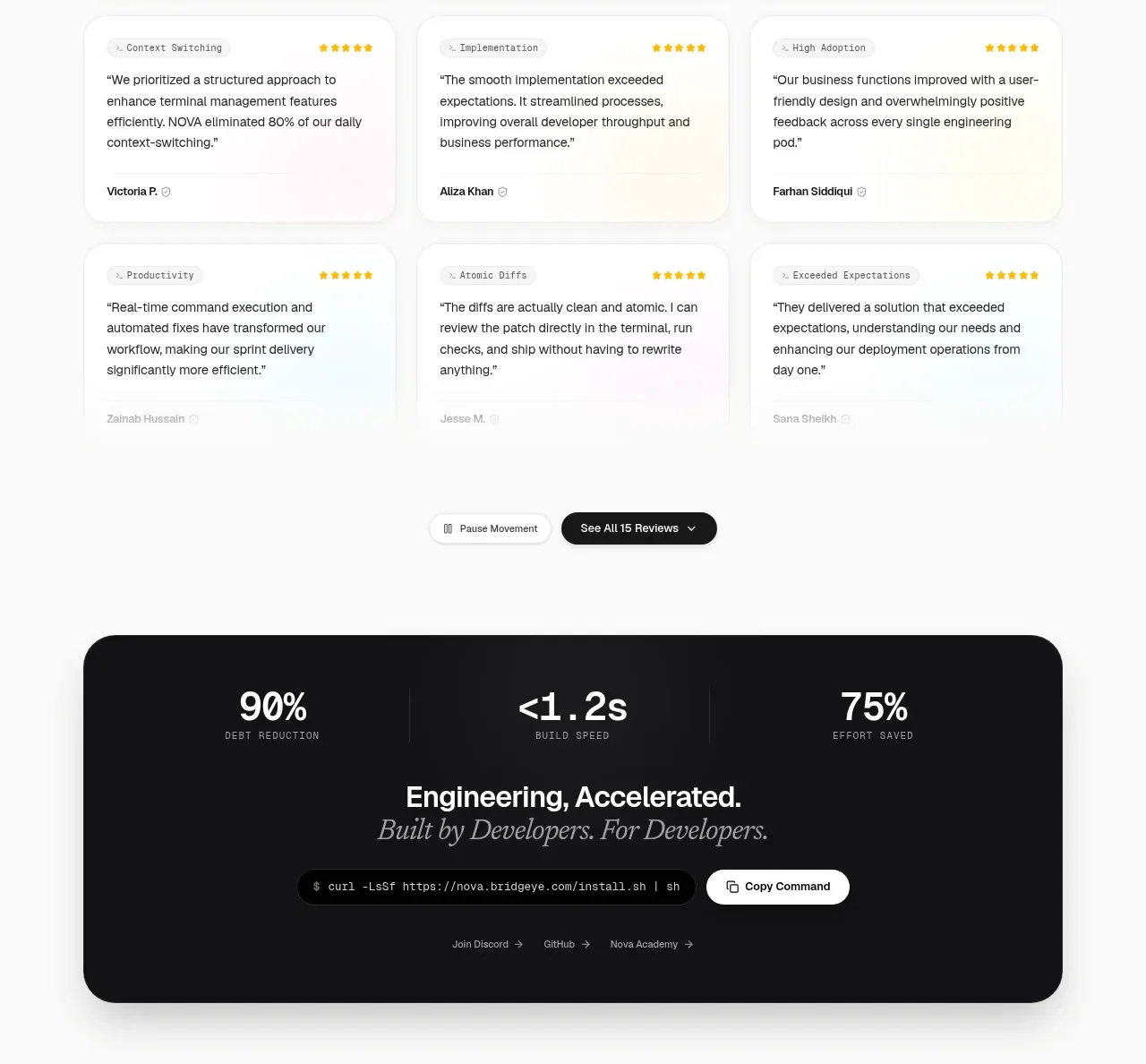
 Customer testimonial grid
NOVA CLI v1.0 · Testimonials
Customer testimonial grid
NOVA CLI v1.0 · Testimonials