kage
kage
Design analysis
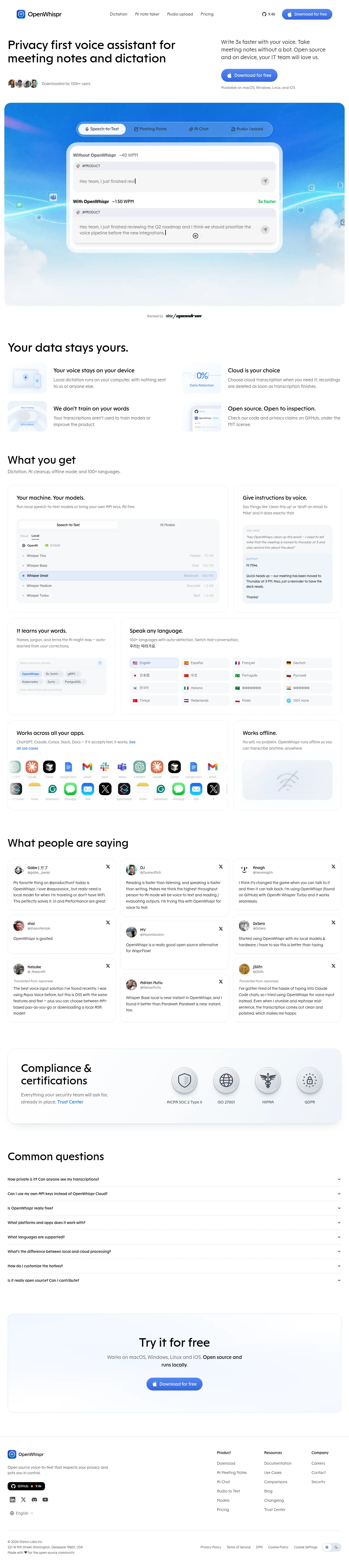
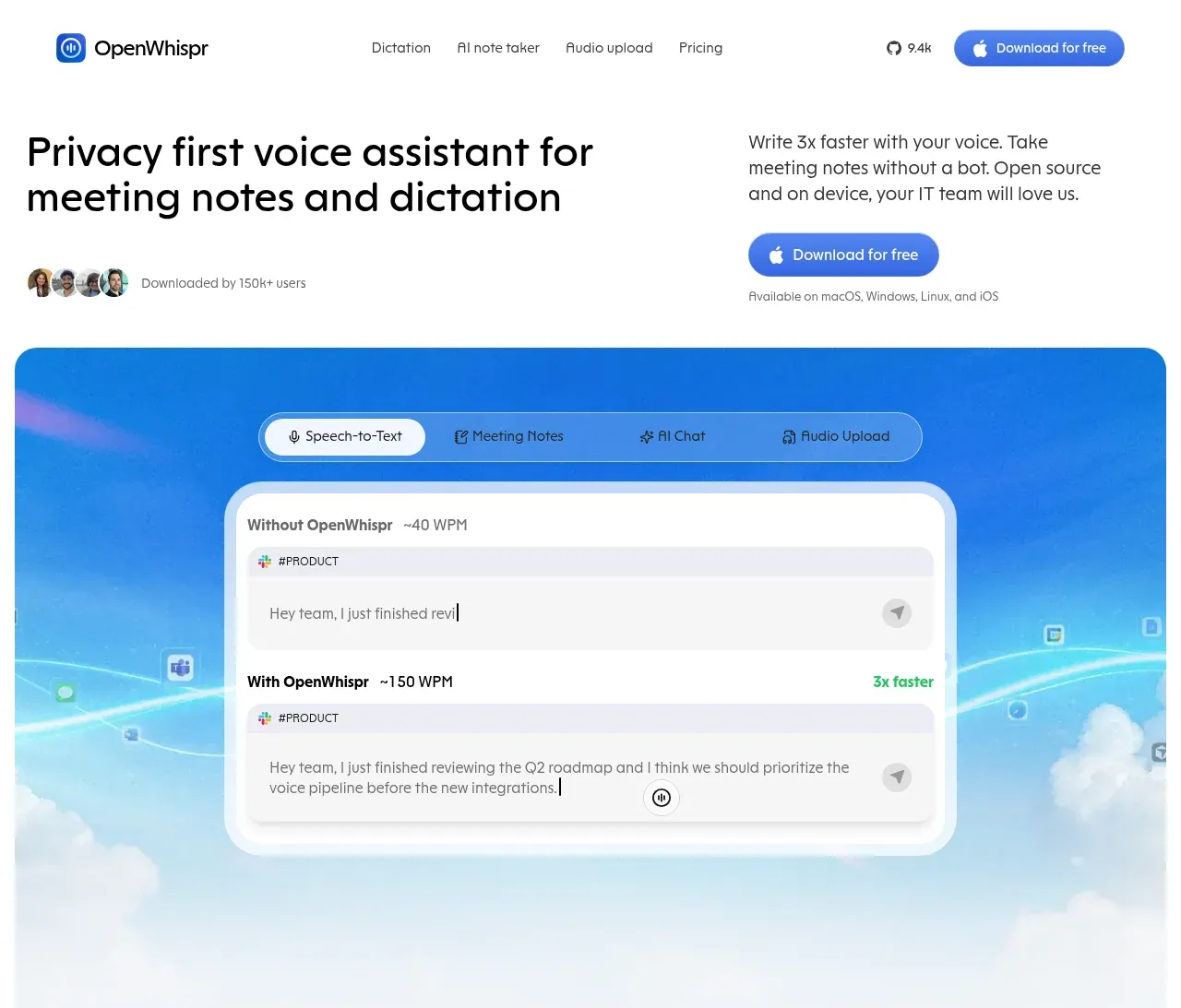
A light, Apple-inflected landing page for an on-device voice assistant. The hero pairs an oversized two-line headline with a right-aligned pitch and blue pill CTA, then drops into a full-width rounded panel of blue sky gradient holding a glassy tabbed demo card that proves the product claim (40 WPM vs 150 WPM comparison). Below, rhythm shifts from a quiet 2x2 privacy grid into a dense asymmetric bento of feature cards whose content is functional UI mockups (model pickers, chips, flag grids, app-icon rows) rather than illustrations. Social proof arrives as a bordered three-column masonry of real tweet cards, followed by a soft blue-gray compliance band with embossed 3D certification badges, a hairline-divided FAQ accordion, a calm centered CTA panel, and a structured four-column footer. Everything is white canvas, near-black type, one blue accent, generous radius and hairline borders.
Prompt preview
## Reference images

Study these alongside the description below: hierarchy, rhythm, spacing, colour. Build for the product you are asked about, using this design language.

- Full page: https://kage-design-assets.t3.tigrisfiles.io/screenshots/openwhispr-for-ios/fdca984f-87fc-4407-a067-b1821a770c20-1791957682462-full.webp
- Above the fold: https://kage-design-assets.t3.tigrisfiles.io/screenshots/openwhispr-for-ios/fdca984f-87fc-4407-a067-b1821a770c20-1791957679520.webp
- Design on Kage: https://kage.design/designs/openwhispr-for-ios-landing-page

# Privacy-first AI landing page

## Before you start
Ask the user what product they are building, who it is for, and what brand assets they already have (name, logo, colours, typeface). Wait for the answers. Everything below is a design language to apply to *their* product, not a template of the reference site.

## Page structure
1. **Sticky top nav**: logo left; 4–5 text links centred; right side shows a GitHub star count (with star icon) and a single blue pill "Download" button. Slim height, white background.
2. **Hero split**: left column holds a very large two-line headline plus a row of small avatar circles with a "downloaded by X users" caption; right column holds a short gray pitch paragraph, a blue pill CTA with platform icon, and a "available on…" platform line. Asymmetric ~55/45 split, lots of top padding.
3. **Hero demo panel**: full-width rounded container (24px+ radius) filled with a photographic blue-sky gradient (clouds, soft light streaks). Inside floats a glassy segmented tab bar (4 modes, first selected, translucent white) and one centered frosted-white card comparing "without the product" (short typed fragment, ~40 WPM) vs "with the product" (full dictated sentence, ~150 WPM, green speed badge). The panel bleeds to the page edges with margin.
4. **Backed-by strip**: single quiet centered line, "Backed by" + two small monochrome logos.
5. **Privacy grid ("Your data stays yours.")**: heading + a 2x2 grid; each cell = small soft-blue illustrated tile on the left, bold one-line claim + two-line gray explanation on the right. Airy spacing, no card borders here.
6. **Feature bento ("What you get")**: heading + one-line gray subtitle, then an asymmetric bento grid of white cards with hairline borders: one wide "hero" card containing a functional model-picker mockup (tabs, local/cloud toggle, selectable list rows with size/speed metadata); a tall side card with a voice-instruction → output chat mockup (YOU SAID / OUTPUT labels); then a row of smaller cards — a chips-input mockup, a flag+language grid with one selected row and real non-English sample text, an app-icon marquee in two rows, and a "works offline" card with a soft wifi-off illustration. Every card's content is a believable product UI, not abstract art.
7. **Testimonial masonry ("What people are saying")**: heading, then three columns of quote cards (small avatar, name, @handle, X/Twitter glyph top-right, plain gray body text). Cards have hairline borders, 16px radius, varied heights; some include a "Translated from …" italic note.
8. **Compliance band**: full-width soft blue-gray gradient rounded panel; left-aligned heading + one-line gray text with a blue link; right side shows four circular embossed 3D-style badge icons with small gray labels (certifications).
9. **FAQ accordion ("Common questions")**: plain list of 8 questions, each a row with bold 14px question left, chevron right, hairline divider between rows, generous vertical padding.
10. **Final CTA**: centered soft-blue rounded panel, large heading, two-line gray subtext, one blue pill button.
11. **Footer**: top area = logo + tagline + GitHub star button + social icons + language selector on the left, three link columns (Product / Resources / Company) on the right; bottom bar = copyright, address, legal links, cookie settings, light/dark toggle.

## Design language
- **Canvas and colour**: pure white page (#ffffff). One accent: iOS-like blue (#3b82f6 → #4285f4 range) reserved for CTAs, links, selected states and the hero sky. Neutrals carry everything else: near-black headings (#111827), gray-500 body (#6b7280), hairline borders (#e5e7eb). Soft blue-gray tints (#eaf1fa) only for the compliance and final-CTA bands. Green (#16a34a) appears exactly once, as a speed badge — success colour is scarce on purpose.
- **Type**: a single neutral sans (Inter-like) throughout. Scale by steps: hero headline ~56–64px medium with tight tracking and line-height ~1.1; section headings ~36–40px medium; card titles 18–20px semibold; body 14–16px regular gray; labels 11–12px uppercase gray. No serif, no display face — hierarchy comes from size and weight alone.
- **Radius and borders**: large radii everywhere — 24px+ for big panels, 16–20px for cards, fully pill buttons and tab bars. Borders are 1px hairlines; shadows are barely-there soft shadows that lift frosted hero cards only. No hard edges, no outlines heavier than 1px.
- **Hero treatment**: the one saturated moment on the page. A real photographic sky gradient sits inside the rounded panel; UI floating on it is translucent white with backdrop blur (glassmorphism) so text stays legible. The rest of the page is flat and quiet by contrast — this makes the demo the focal point.
- **Bento discipline**: grid is asymmetric — one wide anchor card, one tall card, then uniform smaller cards. Inside every card, show working interface (list rows with metadata, chips, selected states, flags, icon rows) at small but legible scale; the mockups themselves are the marketing.
- **Rhythm down the page**: airy hero → sparse privacy grid → dense bento → masonry social proof → soft full-width band → quiet FAQ list → soft CTA → structured footer. Alternate dense card sections with borderless text sections so the page breathes.
- **Interaction and motion**: minimal and restrained. Pill buttons darken slightly on hover; cards get a faint shadow lift; accordion rows expand; tab bars switch content. No parallax, no heavy animation.

## Never
- Do not use the OpenWhispr name, logo, wordmark, tagline, or any copy, testimonial text, or tweet content from the reference.
- Do not reproduce the exact app-icon set (ChatGPT, Claude, Cursor, Gmail, Slack, etc.) as branded logos — use the user's own or generic neutral glyphs.
- Do not reuse the specific certification names/badge artwork; if the user's product has certifications, use theirs.
- Do not copy the Whisper model list, the "3x faster" claim wording, or the backer logos; substitute the user's own real features, metrics and partners.
- Never present the result as the reference product.
Components from this page
All components
 Header navigation
OpenWhispr for iOS · Navigation
Header navigation
OpenWhispr for iOS · Navigation
 Privacy-first voice assistant hero
OpenWhispr for iOS · Hero
Privacy-first voice assistant hero
OpenWhispr for iOS · Hero
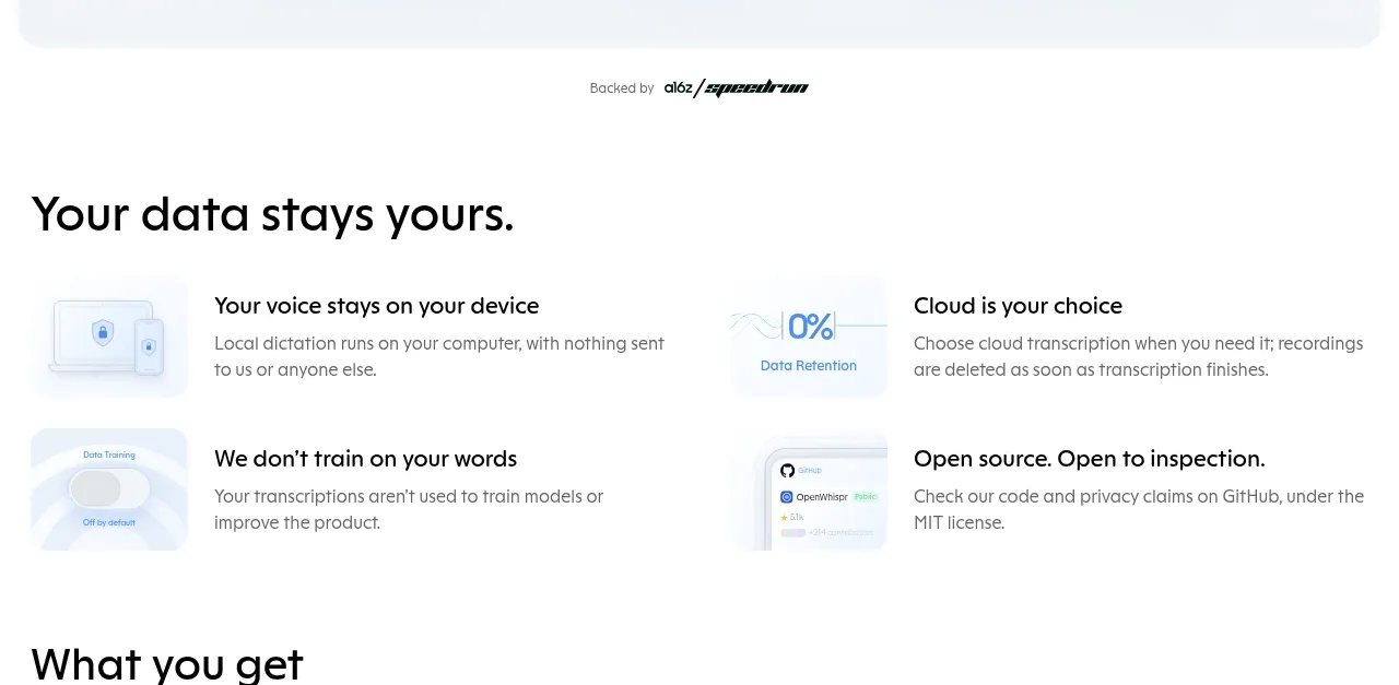 Privacy and ownership benefits
OpenWhispr for iOS · Feature grid
Privacy and ownership benefits
OpenWhispr for iOS · Feature grid
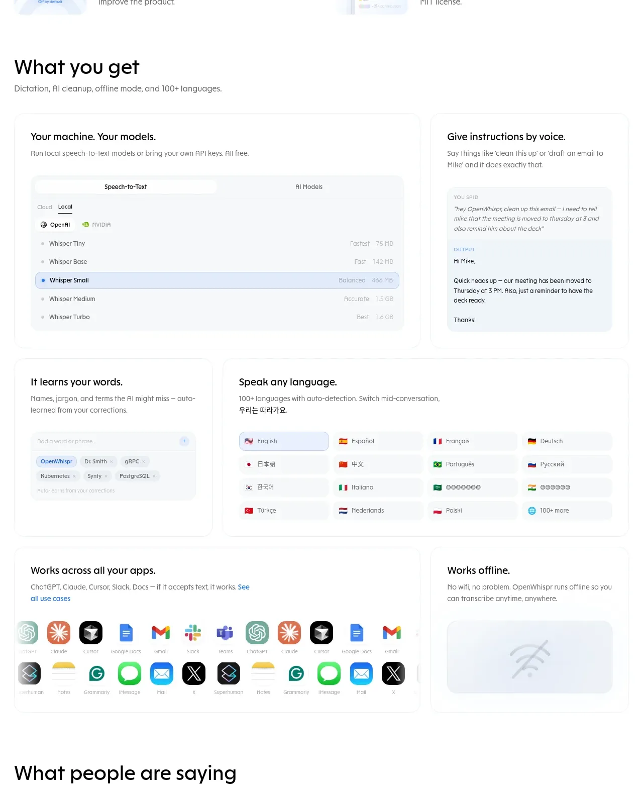 Product capabilities grid
OpenWhispr for iOS · Feature grid
Product capabilities grid
OpenWhispr for iOS · Feature grid
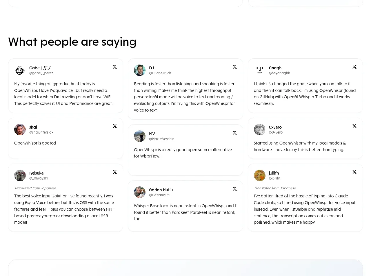 Customer testimonials
OpenWhispr for iOS · Testimonials
Customer testimonials
OpenWhispr for iOS · Testimonials
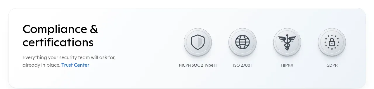 Compliance and certifications
OpenWhispr for iOS · Card
Compliance and certifications
OpenWhispr for iOS · Card
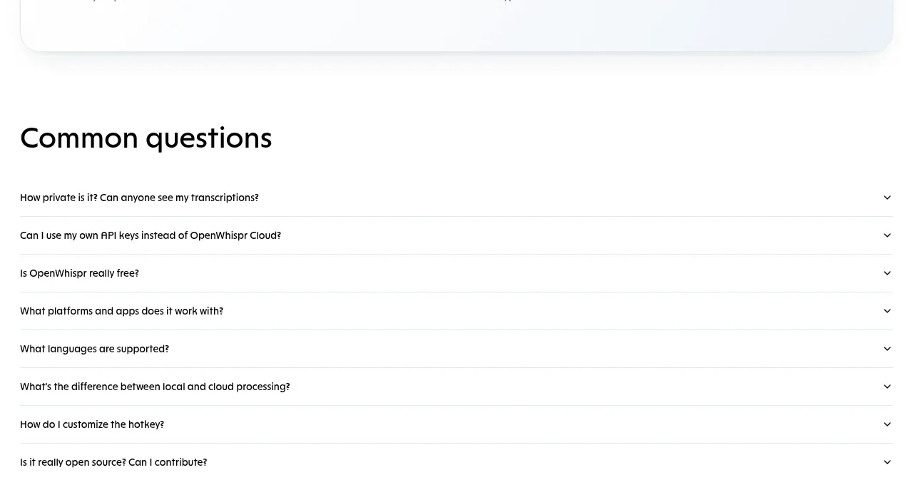 Common questions accordion
OpenWhispr for iOS · FAQ
Common questions accordion
OpenWhispr for iOS · FAQ
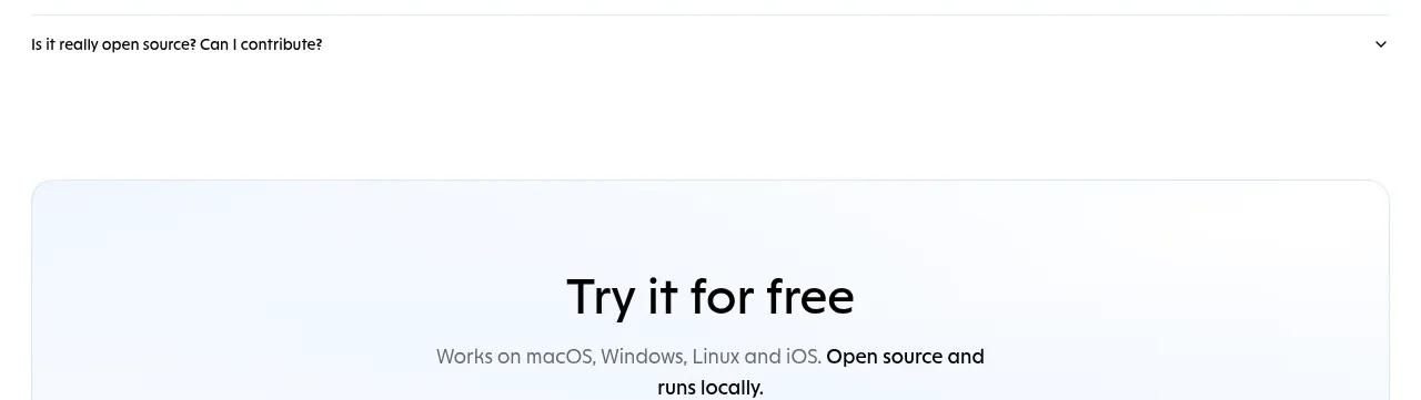 Free download call to action
OpenWhispr for iOS · Call to action
Free download call to action
OpenWhispr for iOS · Call to action
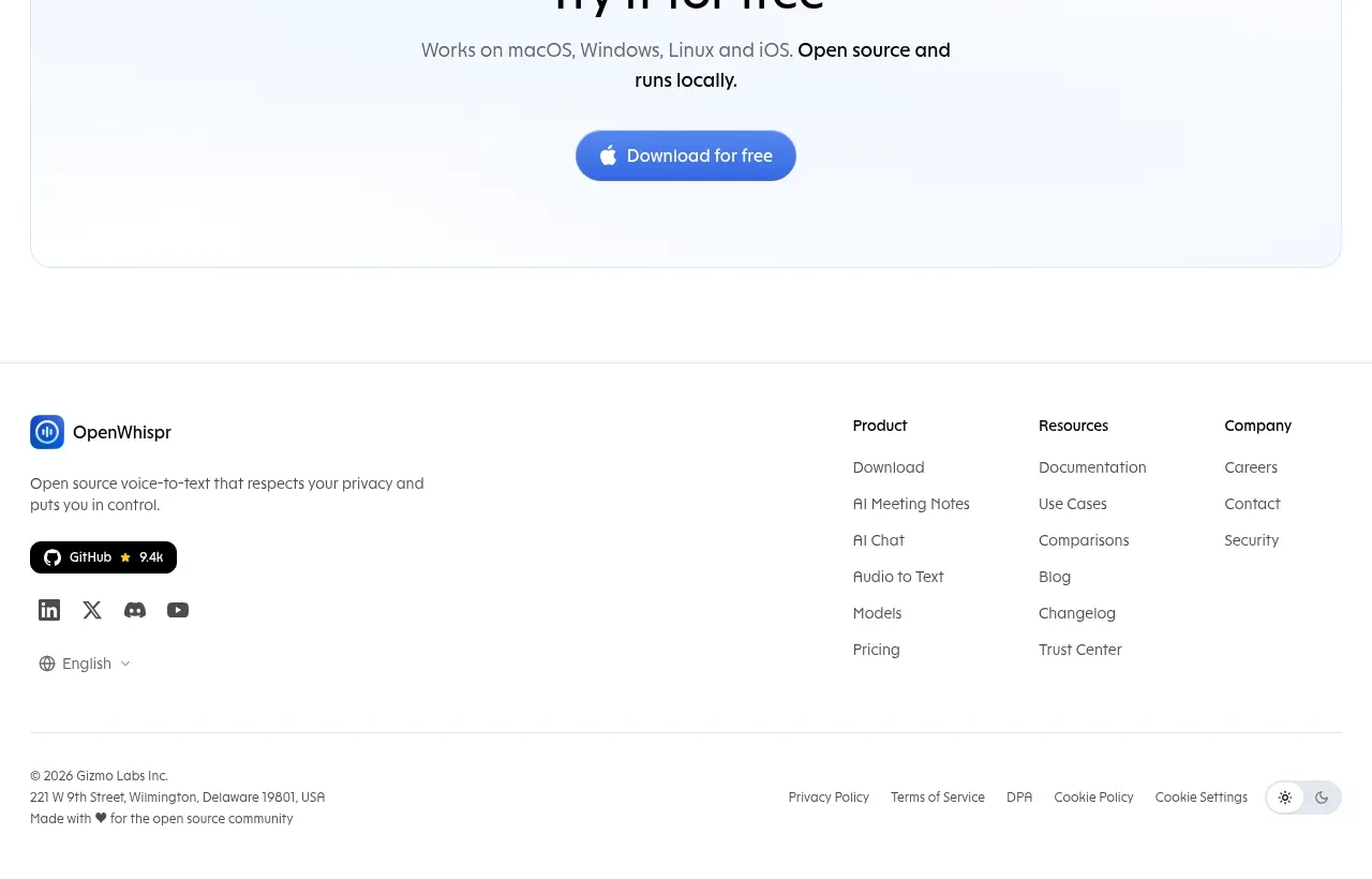 Site footer
OpenWhispr for iOS · Footer
Site footer
OpenWhispr for iOS · Footer