 kage
kage
runnova.ai
Design analysis
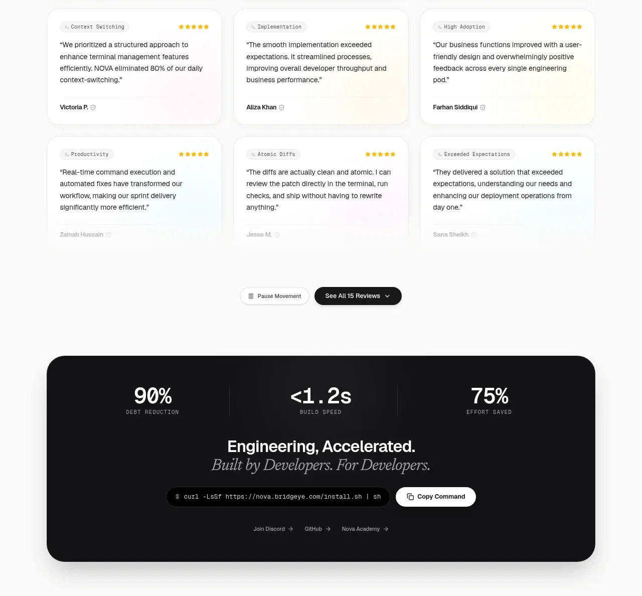
A heading and subtitle introduce a dense three-column, three-row review grid with lightweight metadata and restrained pastel card treatments.
Prompt preview
## Reference images

Study these alongside the description below: hierarchy, rhythm, spacing, colour. Build for the product you are asked about, using this design language.

- Component: https://kage-design-assets.t3.tigrisfiles.io/components/nova-cli-v1-0/f9d737a9-3081-4768-944e-79473fdb1d08-1791525759-6.webp
- Full page it was cut from: https://kage-design-assets.t3.tigrisfiles.io/screenshots/nova-cli-v1-0/f9d737a9-3081-4768-944e-79473fdb1d08-1791525679651-full.webp
- Component on Kage: https://kage.design/component/nova-cli-v1-0-testimonials

## Before you start
Ask who the user's customers are, what authentic outcomes they report, and whether names and avatars can be shown. Use only supplied or generated original testimonial content.

Build a testimonial section on an off-white background. Center a bold heading and a small muted subtitle, then place nine review cards in a three-column grid. Give cards white or very lightly tinted surfaces, 18–22px radius, 1px #ededed borders, soft shadows, and 24px padding. Each card should have optional category metadata, a short quote, and a small author row with name and verification indicator. Keep body text around 14px with 1.5 line height; make the grid breathe with 18–24px gaps. Add compact pause/show-all controls below as secondary actions. Stack to one column on mobile and support reduced motion.

Never use logos, product names, copy, illustrations, or imagery from the reference.
More components
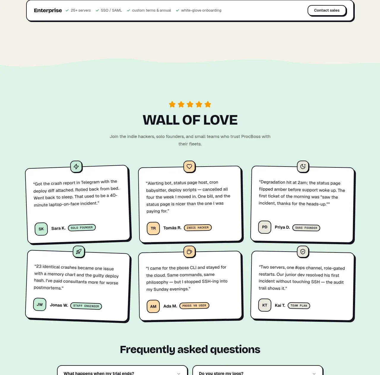
 Wall of love
ProcBoss · Testimonials
Wall of love
ProcBoss · Testimonials
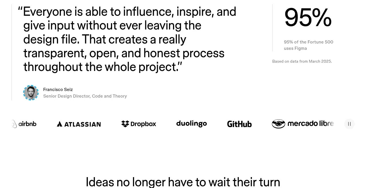
 Customer proof and adoption stats
Figma Agent · Testimonials
Customer proof and adoption stats
Figma Agent · Testimonials
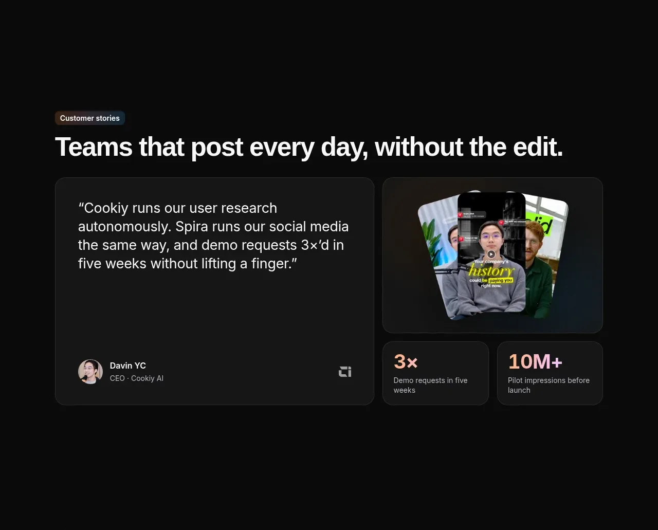
 Customer story and proof points
Spira Maxima · Testimonials
Customer story and proof points
Spira Maxima · Testimonials
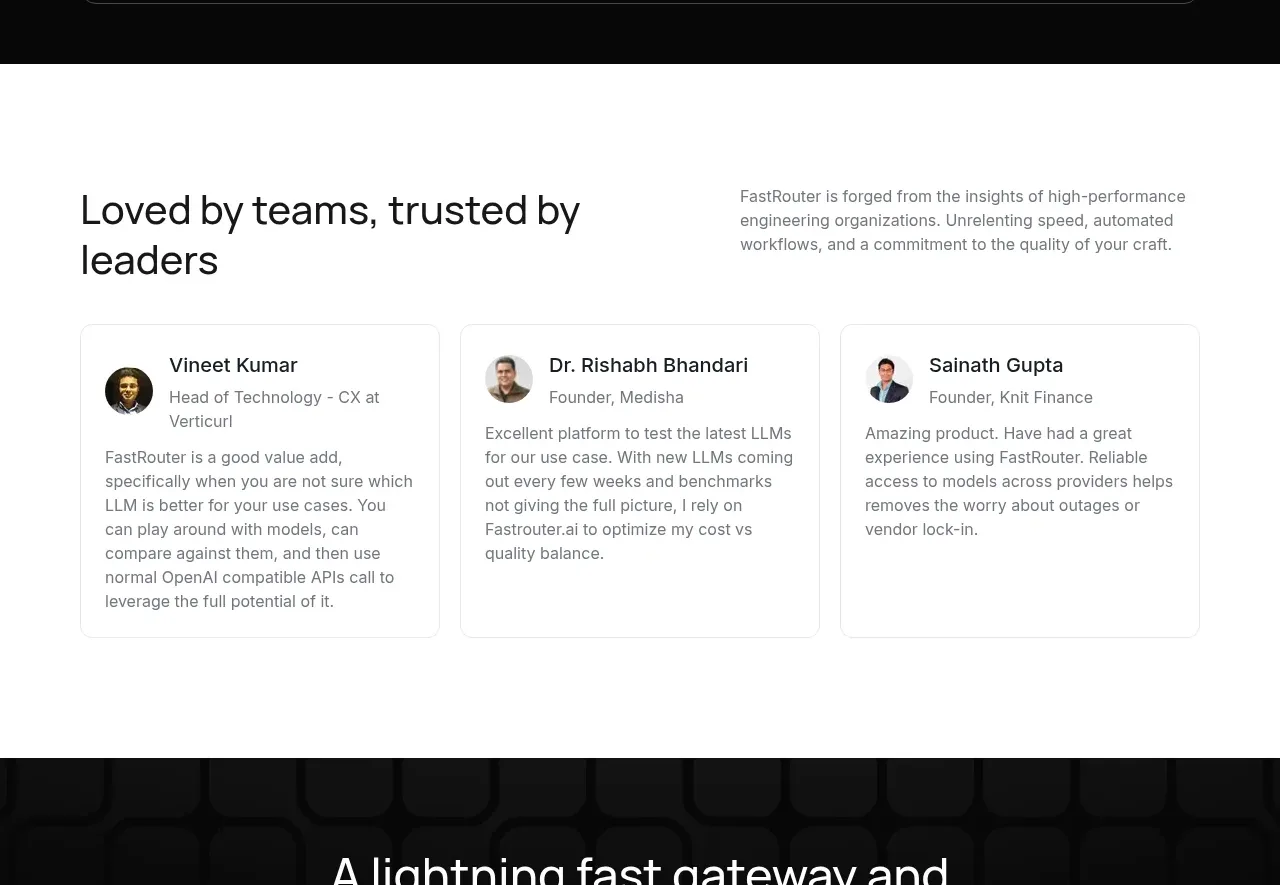
 Customer testimonial cards
FastRouter.ai · Testimonials
Customer testimonial cards
FastRouter.ai · Testimonials
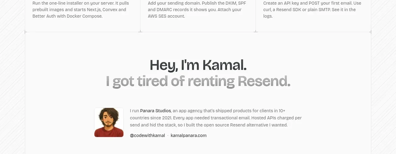
 Founder story
opensend.cc · Testimonials
Founder story
opensend.cc · Testimonials
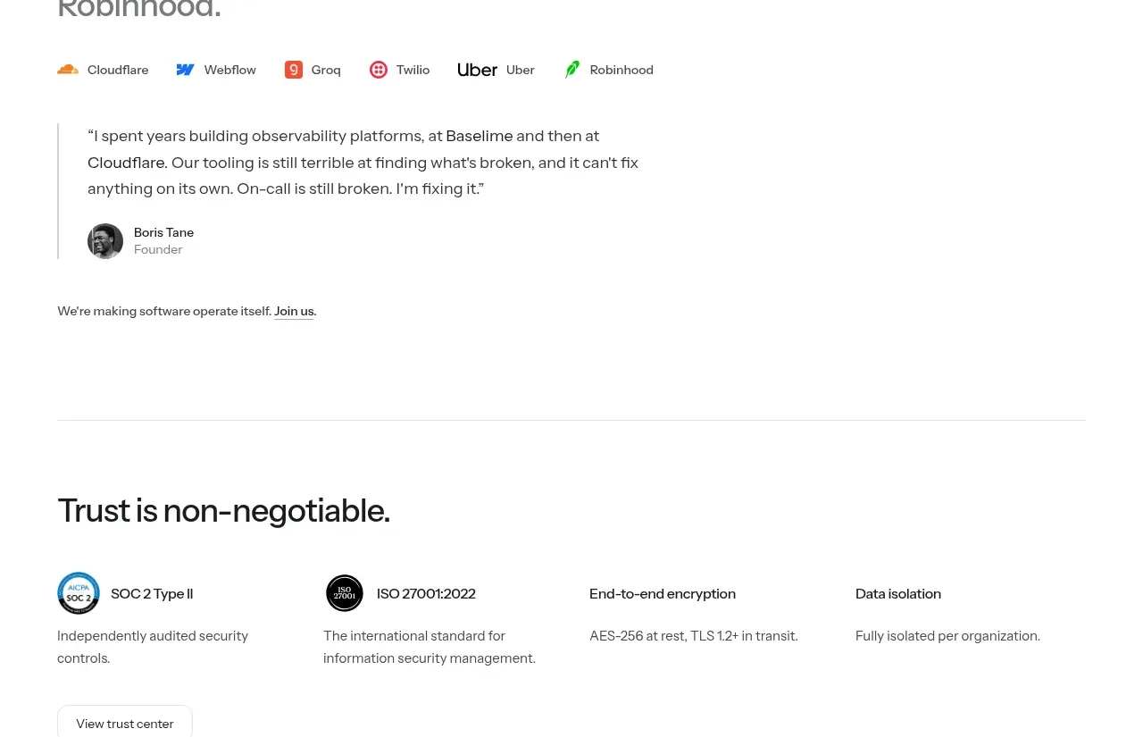
P
Founder testimonial
Polylane · Testimonials