 kage
kage
zernio.link
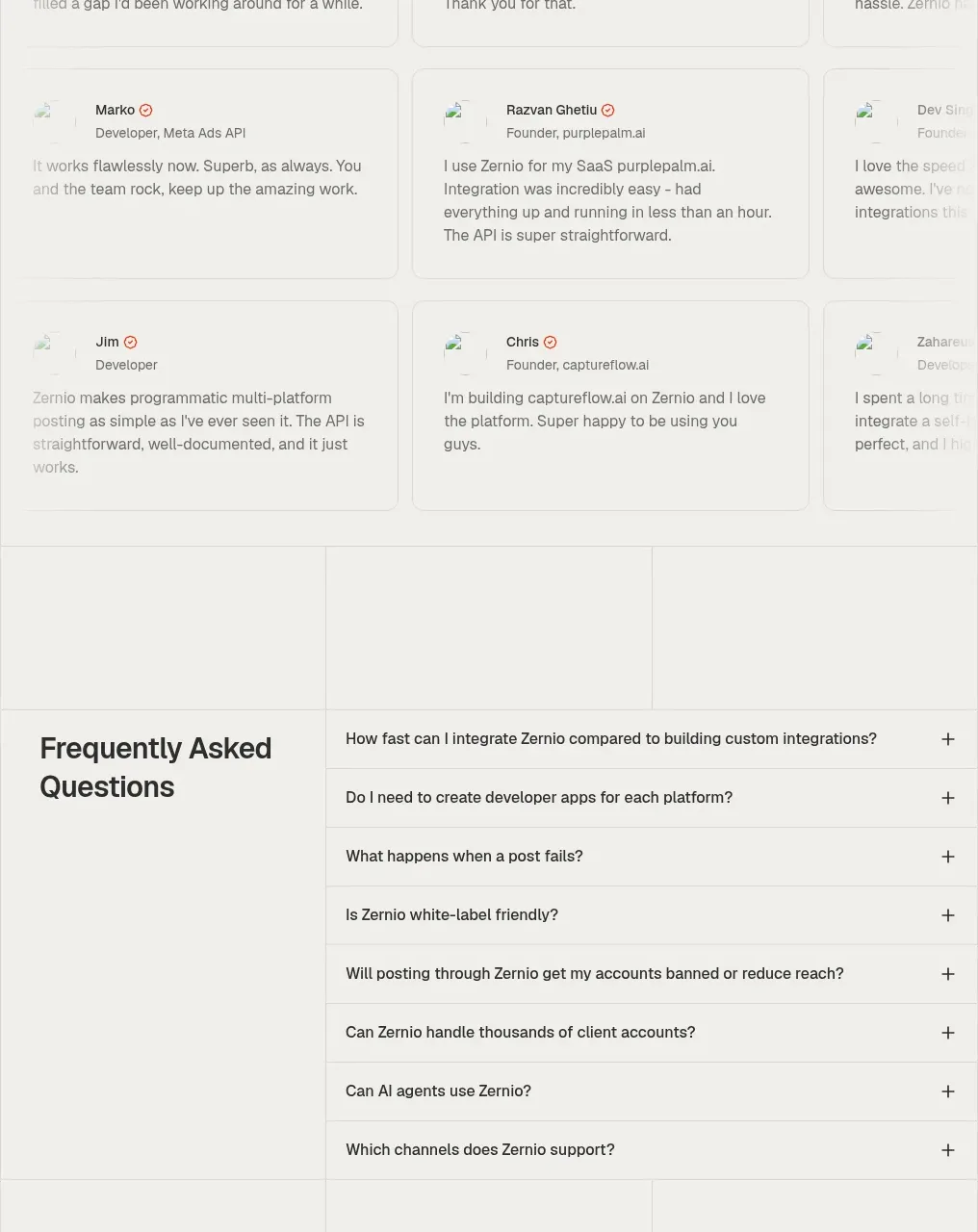
Design analysis
A centered heading introduces a dense multi-column grid of short developer testimonials in lightly bordered cards.
Prompt preview
## Reference images

Study these alongside the description below: hierarchy, rhythm, spacing, colour. Build for the product you are asked about, using this design language.

- Component: https://kage-design-assets.t3.tigrisfiles.io/components/zernio/c501b537-d018-43e7-982b-563c0d4d1135-1791612294-10.webp
- Full page it was cut from: https://kage-design-assets.t3.tigrisfiles.io/screenshots/zernio/c501b537-d018-43e7-982b-563c0d4d1135-1791612175252-full.webp
- Component on Kage: https://kage.design/component/zernio-testimonials-3

## Before you start
Ask what the user's product, audience, and brand are, then apply the following principles to that product rather than copying the reference.

Create a developer testimonial section with a centered eyebrow, heading, and short introduction. Below, arrange compact testimonial cards in a responsive three-column grid, each with a small avatar or neutral placeholder, name, role, and two-to-four-line quote. Keep cards visually consistent, use generous but compact internal padding, and avoid excessive shadows. Use off-white #f5f4f1, borders #e2e0db, near-black #292724, muted #77746f, and a warm accent for small verification marks. Make the grid collapse to one column on mobile and preserve equal card heights only when it improves scanning.

Never: use logos, product names, copy, illustrations, or imagery from the reference.
More components
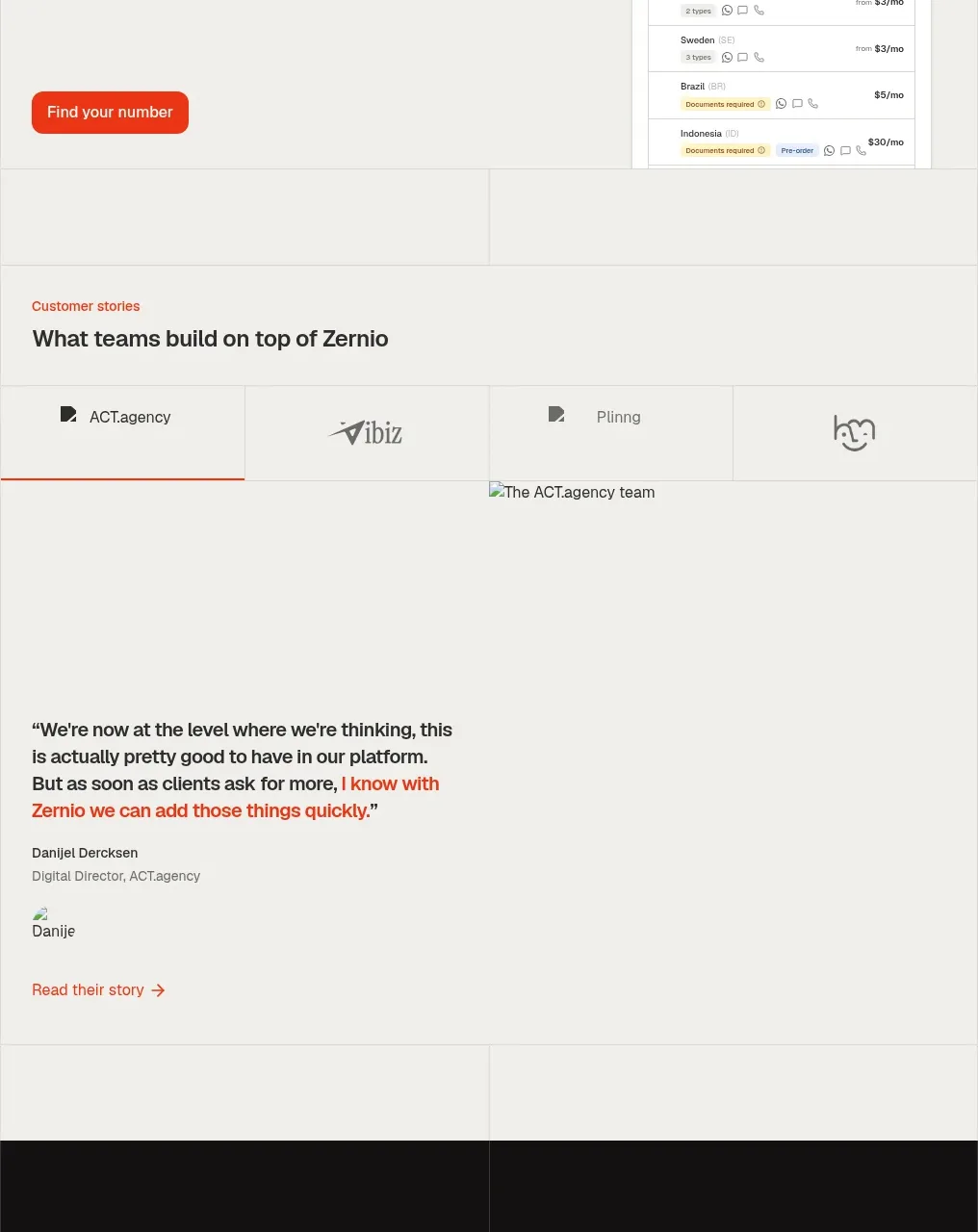
 Customer stories
Zernio · Testimonials
Customer stories
Zernio · Testimonials
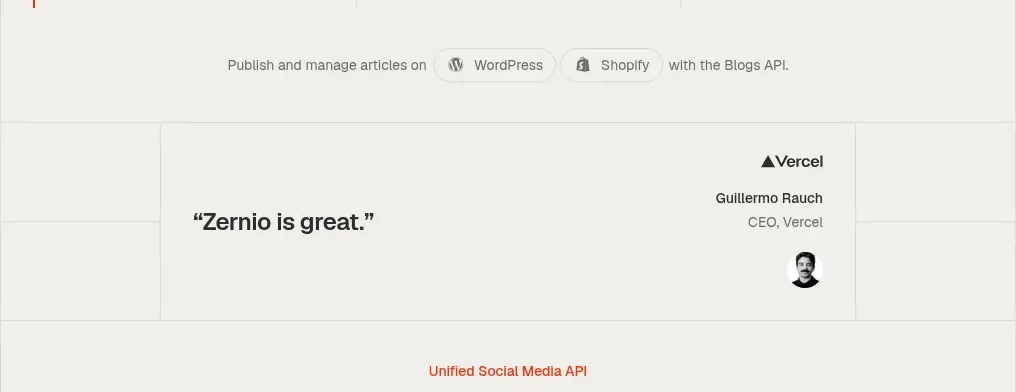 Social API showcase and testimonial
Zernio · Testimonials
Social API showcase and testimonial
Zernio · Testimonials
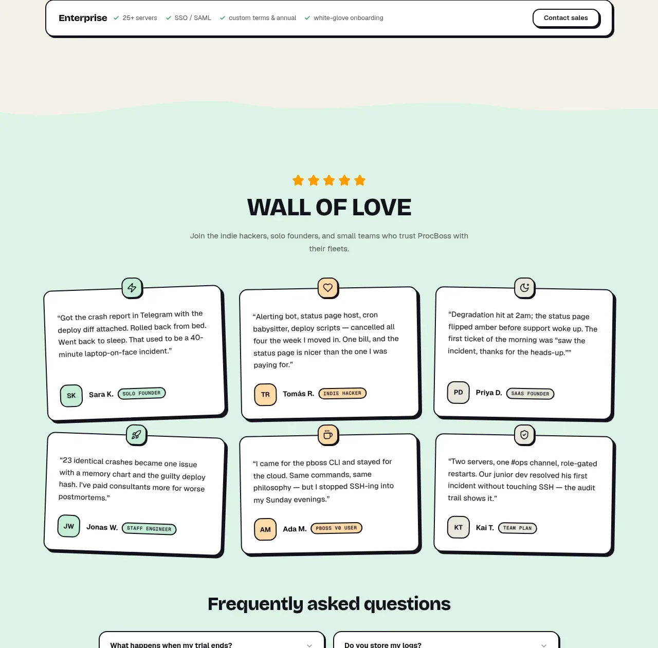
 Wall of love
ProcBoss · Testimonials
Wall of love
ProcBoss · Testimonials
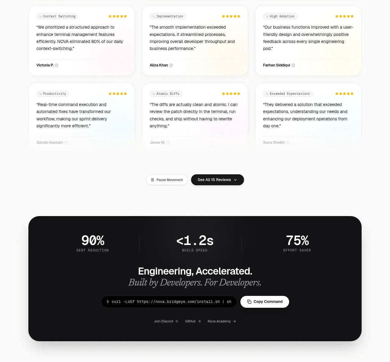
 Customer testimonial grid
NOVA CLI v1.0 · Testimonials
Customer testimonial grid
NOVA CLI v1.0 · Testimonials
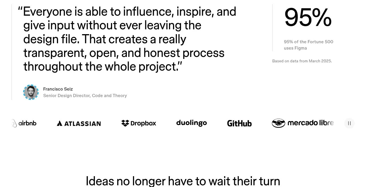
 Customer proof and adoption stats
Figma Agent · Testimonials
Customer proof and adoption stats
Figma Agent · Testimonials
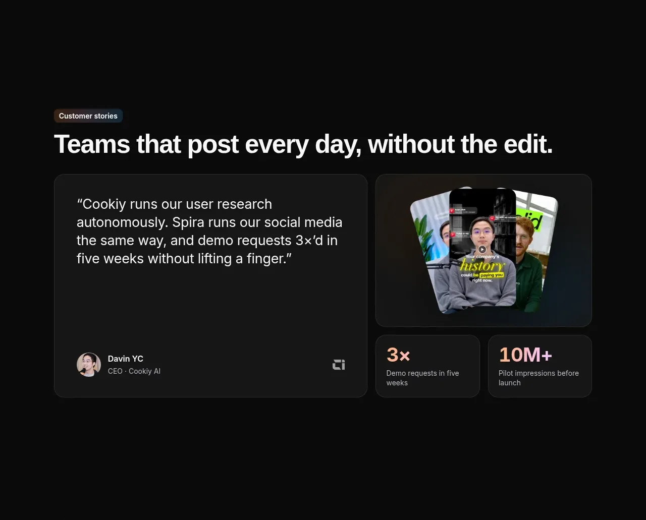
 Customer story and proof points
Spira Maxima · Testimonials
Customer story and proof points
Spira Maxima · Testimonials