 kage
kage
procboss.com
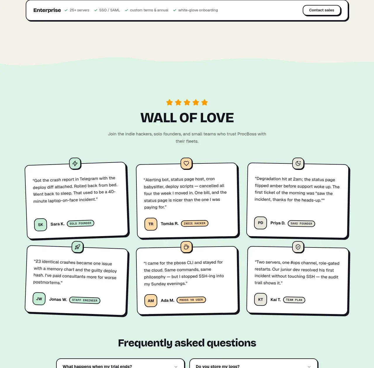
Design analysis
A mint social-proof section uses a celebratory rating, centered title, and six compact customer quote cards with identity chips arranged in a clean two-row grid.
Prompt preview
## Reference images

Study these alongside the description below: hierarchy, rhythm, spacing, colour. Build for the product you are asked about, using this design language.

- Component: https://kage-design-assets.t3.tigrisfiles.io/components/procboss/3737396f-2984-4e55-9600-739ab09d7da3-1791525908-8.webp
- Full page it was cut from: https://kage-design-assets.t3.tigrisfiles.io/screenshots/procboss/3737396f-2984-4e55-9600-739ab09d7da3-1791525801598-full.webp
- Component on Kage: https://kage.design/component/procboss-testimonials

## Before you start
Ask who the user's real customers are, what outcomes they can credibly praise, and whether names and roles may be shown. Use authentic, consented content.

Create a mint testimonials section with a centered five-star or rating marker, a bold “social proof” heading, and one short supporting sentence. Follow with a 3×2 grid of quote cards. Each card should contain a short specific quote, a small avatar substitute or initials tile, customer name and role, and an optional category chip. Use warm-white cards, dark 1–2px borders, 14–18px corners, small icon badges floating near the top edge, and restrained offset shadows. Keep quotes short enough for visual balance and stack cards on mobile. Avoid invented trust claims and preserve accessible text contrast.

Never copy the reference's logos, product names, copy, illustrations or imagery.
More components
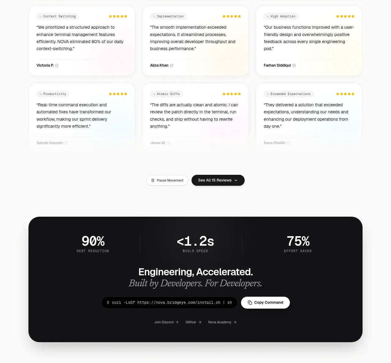
 Customer testimonial grid
NOVA CLI v1.0 · Testimonials
Customer testimonial grid
NOVA CLI v1.0 · Testimonials
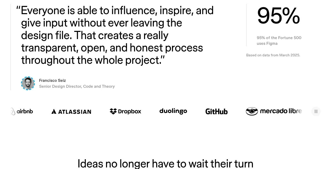
 Customer proof and adoption stats
Figma Agent · Testimonials
Customer proof and adoption stats
Figma Agent · Testimonials
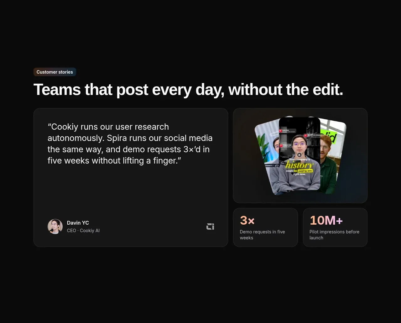
 Customer story and proof points
Spira Maxima · Testimonials
Customer story and proof points
Spira Maxima · Testimonials
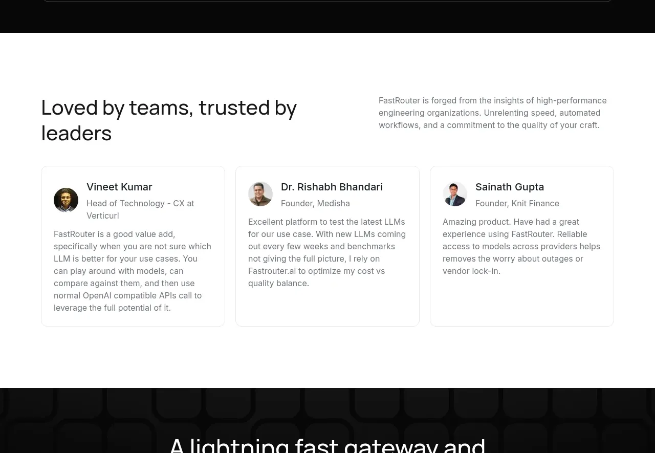
 Customer testimonial cards
FastRouter.ai · Testimonials
Customer testimonial cards
FastRouter.ai · Testimonials
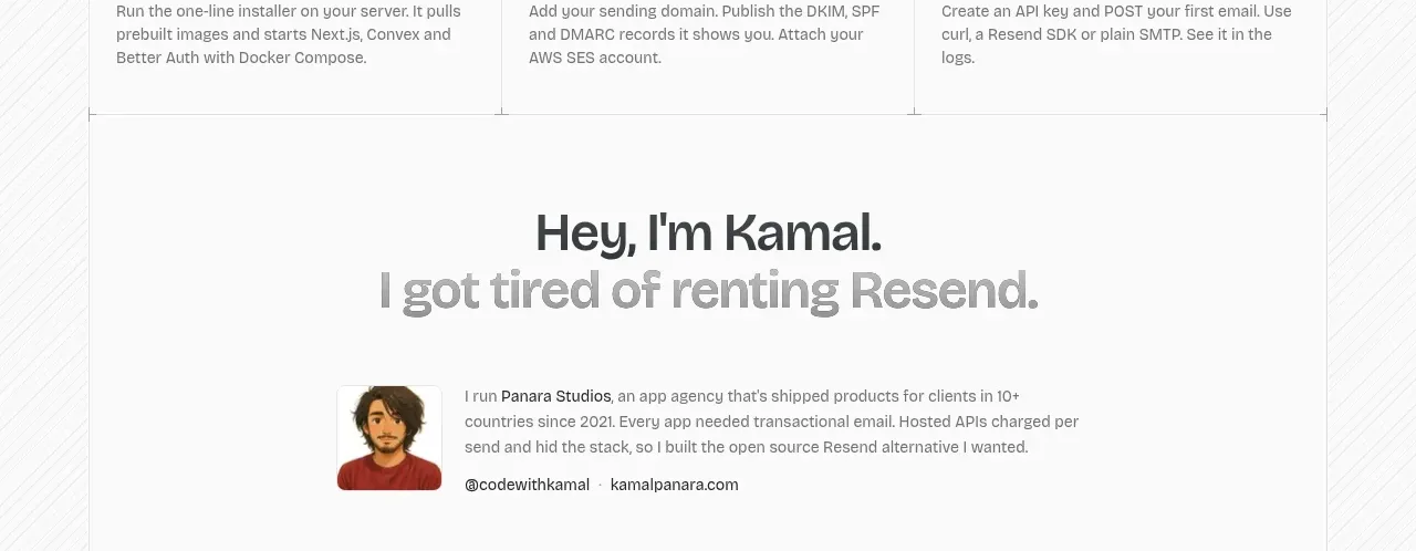
 Founder story
opensend.cc · Testimonials
Founder story
opensend.cc · Testimonials
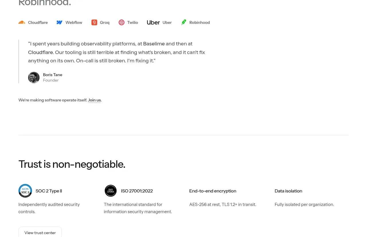
P
Founder testimonial
Polylane · Testimonials