 kage
kage
zernio.link

Design analysis
A narrow transition area pairs a platform-support sentence with a centered customer quote card and attribution.
Prompt preview
## Reference images

Study these alongside the description below: hierarchy, rhythm, spacing, colour. Build for the product you are asked about, using this design language.

- Component: https://kage-design-assets.t3.tigrisfiles.io/components/zernio/c501b537-d018-43e7-982b-563c0d4d1135-1791612291-4.webp
- Full page it was cut from: https://kage-design-assets.t3.tigrisfiles.io/screenshots/zernio/c501b537-d018-43e7-982b-563c0d4d1135-1791612175252-full.webp
- Component on Kage: https://kage.design/component/zernio-testimonials

## Before you start
Ask what the user's product, audience, and brand are, then apply the following principles to that product rather than copying the reference.

Build a restrained testimonial band following a feature panel. Start with a small centered line about supported integrations, then use a bordered quote card with a large quote on the left and a compact attribution block on the right. Use generous whitespace, thin grid-like rules, muted grayscale treatment, and one subtle warm accent for the section label. Typography should be approximately 18–22px for the quote, 11–13px for attribution, and 12px for supporting labels. Keep the card airy rather than card-heavy, and support multiple testimonials with a carousel only if there is enough content.

Never: use logos, product names, copy, illustrations, or imagery from the reference.
More components
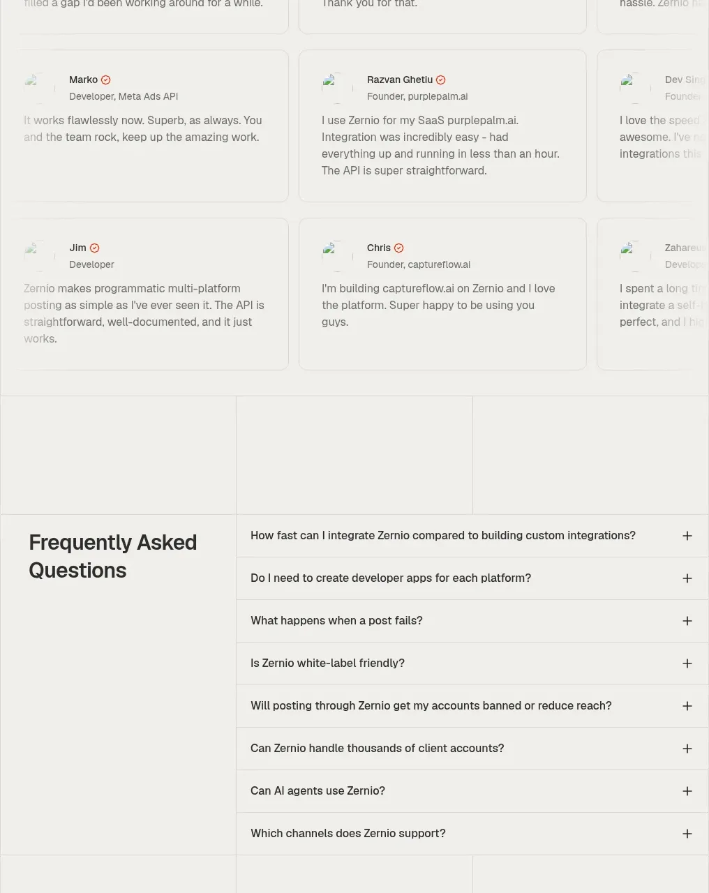
 Developer testimonials grid
Zernio · Testimonials
Developer testimonials grid
Zernio · Testimonials
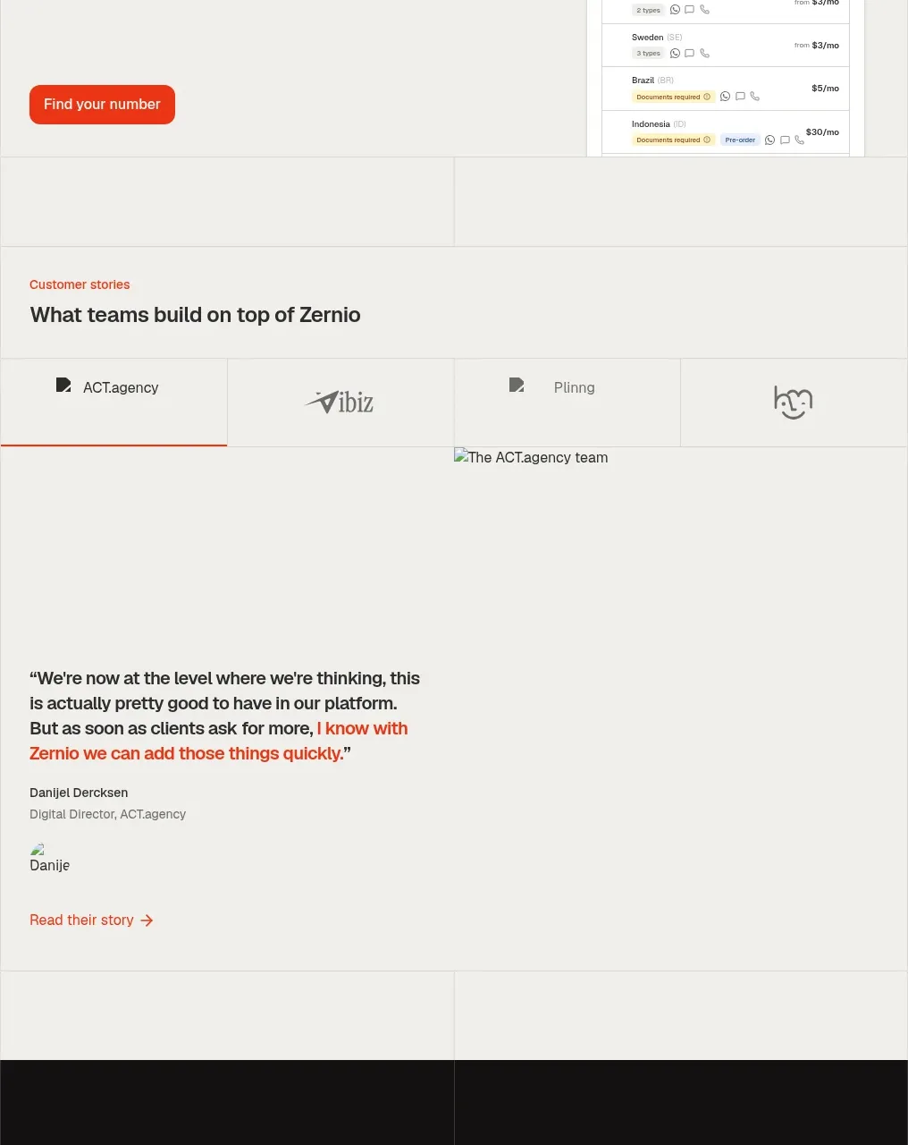 Customer stories
Zernio · Testimonials
Customer stories
Zernio · Testimonials
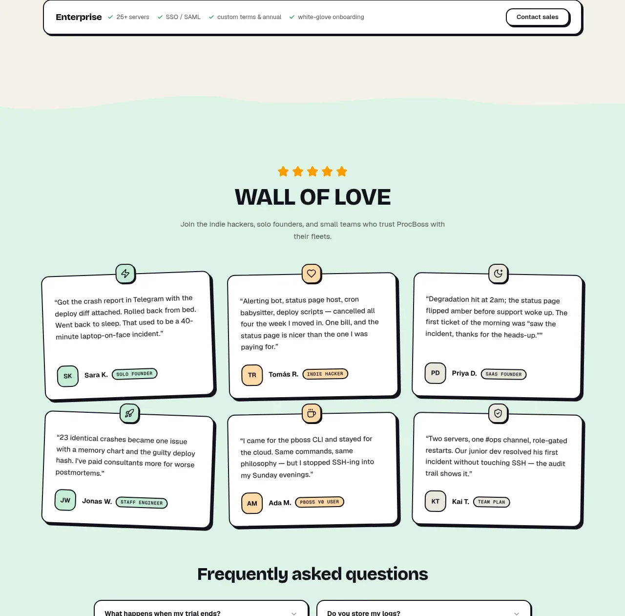
 Wall of love
ProcBoss · Testimonials
Wall of love
ProcBoss · Testimonials

 Customer testimonial grid
NOVA CLI v1.0 · Testimonials
Customer testimonial grid
NOVA CLI v1.0 · Testimonials

 Customer proof and adoption stats
Figma Agent · Testimonials
Customer proof and adoption stats
Figma Agent · Testimonials
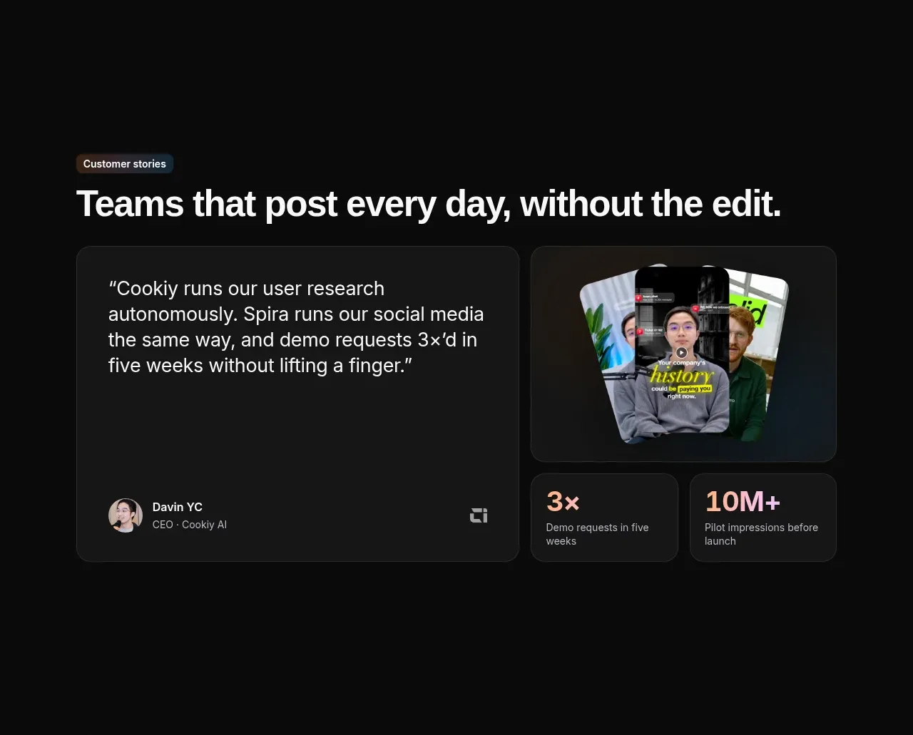
 Customer story and proof points
Spira Maxima · Testimonials
Customer story and proof points
Spira Maxima · Testimonials