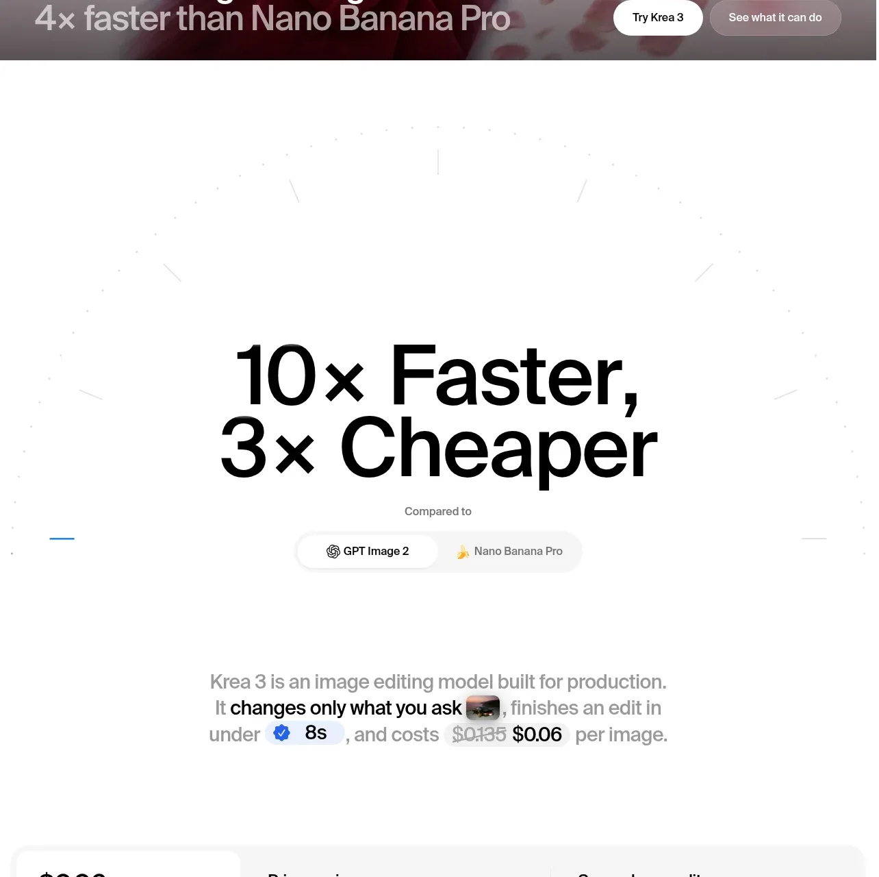
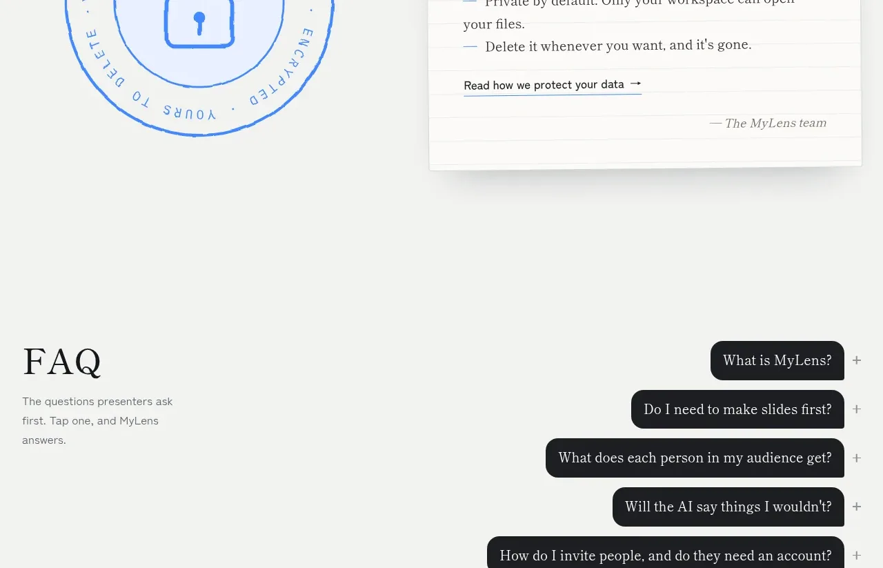
kage
kage
outbid.lol

Design analysis
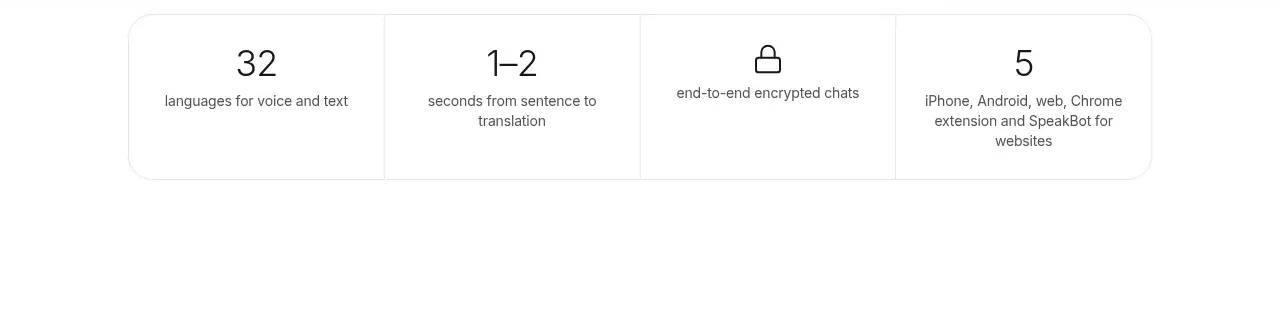
A short centered summary follows the ranking, with a sentence of context and three softly elevated metric cards. The cards use large numbers, tiny labels, and restrained color accents to provide a satisfying endpoint to the data-heavy page.
Prompt preview
## Reference images

Study these alongside the description below: hierarchy, rhythm, spacing, colour. Build for the product you are asked about, using this design language.

- Component: https://kage-design-assets.t3.tigrisfiles.io/components/outbid-lol/7d6cde02-1b78-43c8-adde-d87a2555099d-1789142024-3.webp
- Full page it was cut from: https://kage-design-assets.t3.tigrisfiles.io/screenshots/outbid-lol/7d6cde02-1b78-43c8-adde-d87a2555099d-1789139288987-full.webp
- Component on Kage: https://kage.design/component/outbid-lol-stats

## Before you start
Ask which three metrics best prove the value of the user's product and what time period or context should accompany them. Then create an original stats section using these principles.

Build a centered statistics strip after the main content. Add one short contextual sentence with a single accent-colored phrase, then place three equal-width metric cards in a row. Each card should show a prominent tabular number, an optional tiny colored indicator or currency symbol, and a muted label below. Keep the visual treatment quiet so the numbers feel credible rather than promotional.

Use an off-white #fffdf9 background, cards in #ffffff, text #282522, muted labels #82796f, coral #df765e, and green #2f9d62. Use a soft shadow such as 0 5px 22px rgba(70,45,30,.07), 14–18px corner radius, 22–28px card padding, 24–32px spacing, 24–28px metric type, and 11–12px labels. Collapse to a single column or two-column grid on mobile. Animate values only if it supports comprehension and respect reduced-motion preferences.

Never use the reference's metrics, numbers, product name, copy, logo, or imagery.