kage
kage
ovoplayer.com
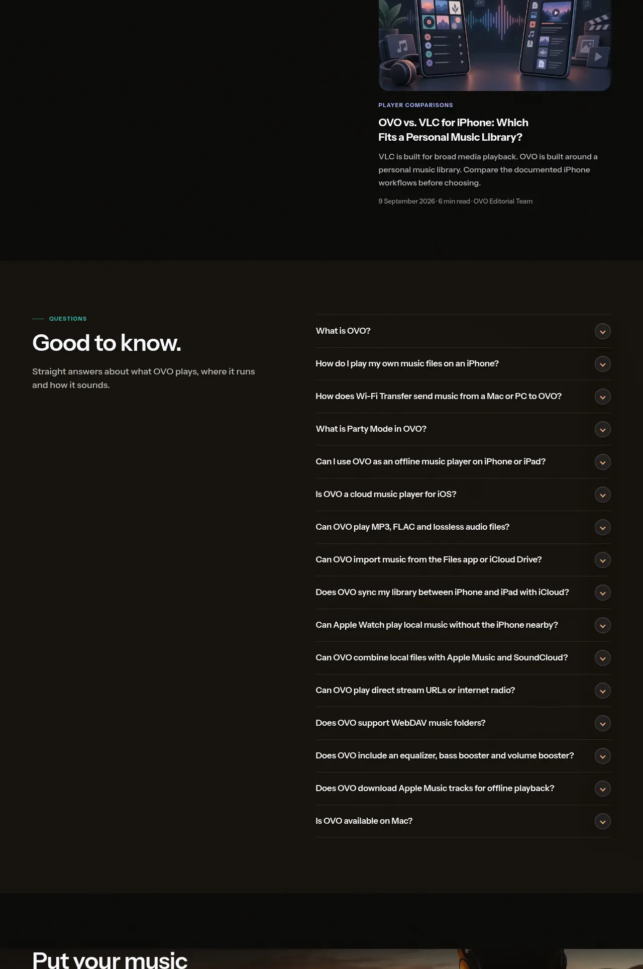
Design analysis
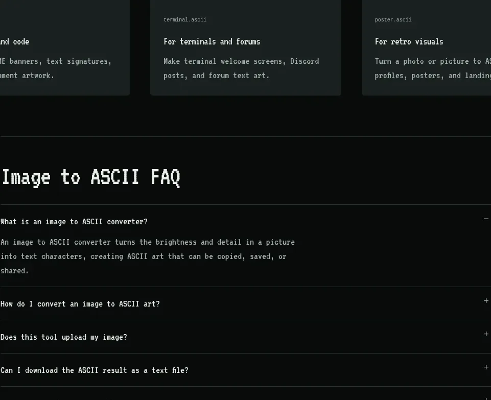
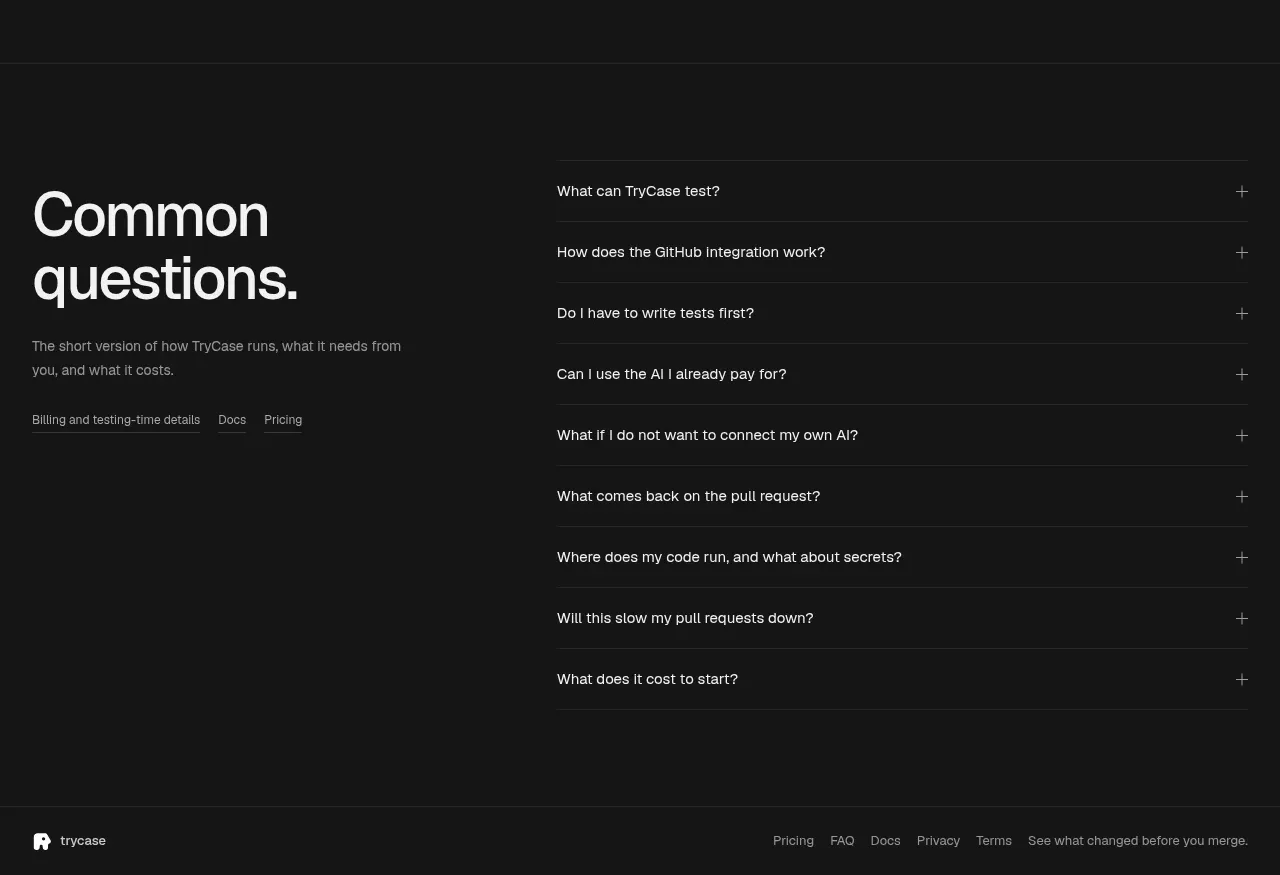
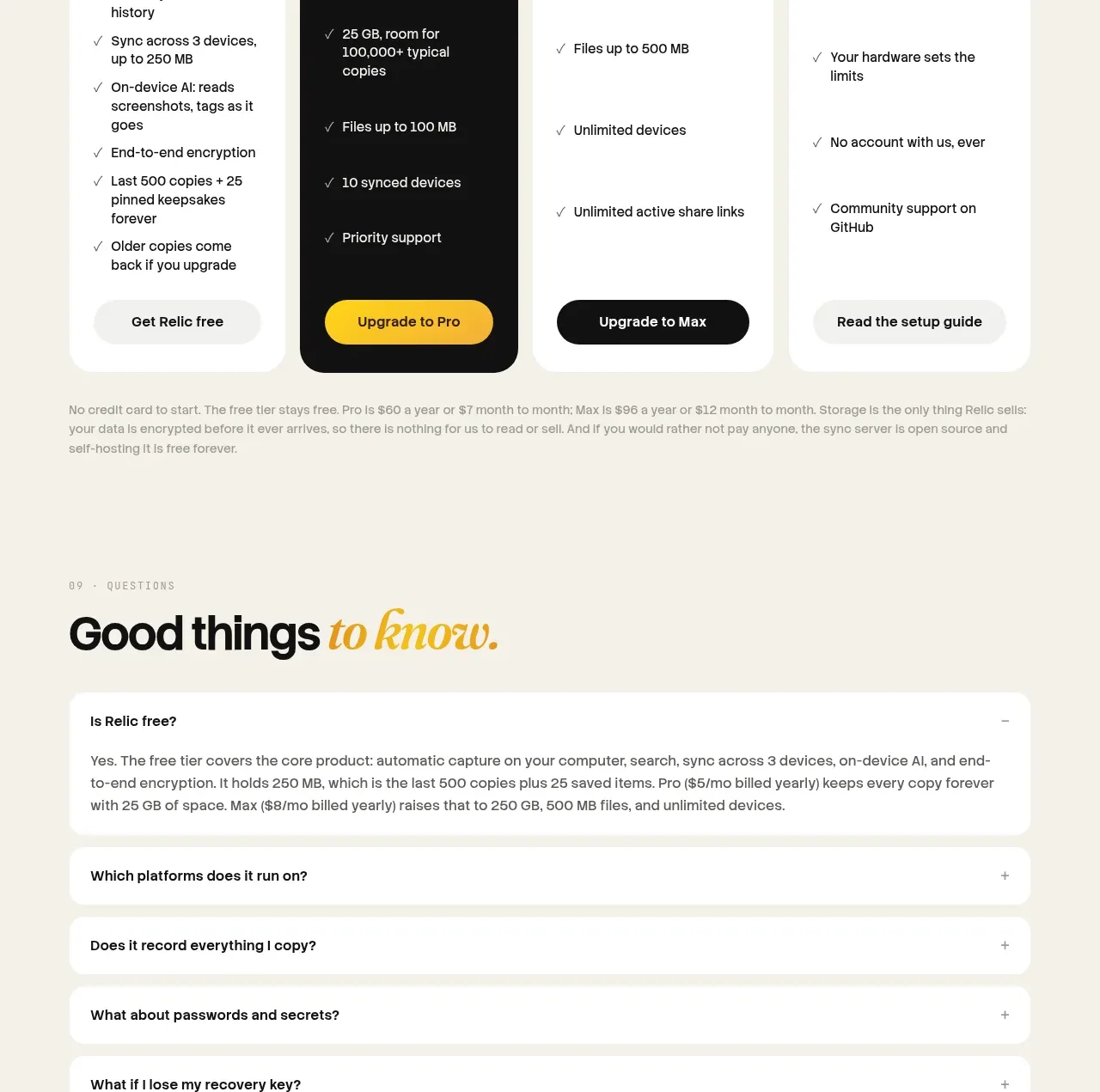
A split FAQ layout keeps the explanatory heading fixed on the left while a long ruled accordion list makes many practical answers scannable.
Prompt preview
## Reference images

Study these alongside the description below: hierarchy, rhythm, spacing, colour. Build for the product you are asked about, using this design language.

- Component: https://kage-design-assets.t3.tigrisfiles.io/components/ovo/3c9ed73d-a170-49d0-8a12-5cf9a4f3d08f-1789452270-9.webp
- Full page it was cut from: https://kage-design-assets.t3.tigrisfiles.io/screenshots/ovo/3c9ed73d-a170-49d0-8a12-5cf9a4f3d08f-1789452172899-full.webp
- Component on Kage: https://kage.design/component/ovo-faq

## Before you start
Ask what recurring objections and support questions users have about the product. Use those real questions, not generic filler, in the component.

Build a spacious FAQ section on a dark warm surface (#171510). Use a two-column desktop grid: an eyebrow, large heading, and short intro on the left; a vertical accordion list on the right. Each question row should have clear 14–16px text, generous 18–22px vertical padding, a thin divider, and a circular chevron control with a subtle darker background. Include keyboard focus states, aria-expanded behavior, smooth height transitions, and a stacked mobile layout. Keep the list visually quiet so the heading establishes hierarchy.

Never use the reference's logos, product names, copy, illustrations, or imagery.