kage
kage
ovoplayer.com

Design analysis
A long-form dark landing page built on a warm near-black canvas with a single peach accent and oversized, tightly tracked display type. It reads editorially: peach uppercase eyebrow labels open every section, mockups alternate left/right to change rhythm, and hairline-ruled three-column strips punctuate the storytelling. The lower page keeps discipline as density rises — a numbered 01–07 source index, an asymmetric journal grid, a long chevron accordion FAQ, then a photo-backed CTA and a three-column footer. Moody low-light photography (desk, concert, listener) blends into the background with gradients, while colourful in-app screenshots supply the only saturated colour.
Prompt preview
## Reference images

Study these alongside the description below: hierarchy, rhythm, spacing, colour. Build for the product you are asked about, using this design language.

- Full page: https://kage-design-assets.t3.tigrisfiles.io/screenshots/ovo/3c9ed73d-a170-49d0-8a12-5cf9a4f3d08f-1789452172899-full.webp
- Above the fold: https://kage-design-assets.t3.tigrisfiles.io/screenshots/ovo/3c9ed73d-a170-49d0-8a12-5cf9a4f3d08f-1789452168563.webp
- Design on Kage: https://kage.design/designs/ovo-landing-page

## Before you start
Ask the user what product they are building, who it is for, and what brand assets they already have (name, colours, type). Wait for the answers before writing any code. Everything below is applied to *their* product, not to the reference site.

## Page structure
Build a single long dark landing page with these sections, top to bottom:

1. **Top nav** — dark bar: wordmark left, 5–6 short text links centre-right, one peach pill CTA far right.
2. **Hero** — centred oversized display headline over two lines, one-line subcopy, primary pill button plus a small secondary badge; below, an overlapping composition of device/app mockups lit in warm dark light so the product is the hero image.
3. **Problem/solution split** — small uppercase eyebrow, large heading and paragraph on the left, a framed app-UI panel on the right, tiny caption under the mock.
4. **Source/capability module** — a vertical list card where one row is highlighted in the accent colour, paired with a moody dark photo; caption line below; then a hairline-ruled three-column strip of short positioning statements.
5. **Flagship feature split (media left)** — phone-UI screenshot left, eyebrow + heading + bold-lead bullet list right (label in white, explanation in gray); a row of small media thumbnails underneath with a disclaimer caption.
6. **Cross-platform section (media right)** — eyebrow, heading and copy left, large app screenshot right; under a hairline, three columns describing one platform each; close with a short paragraph and an inline underlined text link.
7. **Second feature split (media left)** — another device screenshot left, eyebrow + heading + paragraph right; hairline three-column strip of three sub-features with bold names and gray descriptions.
8. **Text-only interlude** — eyebrow, heading, paragraph and three bold-lead bullets. No imagery; lets the page breathe between heavy sections.
9. **Photo-led feature** — copy left, large atmospheric photograph right, bleeding softly into the dark background.
10. **Numbered index** — heading + intro left; right side, an editorial list numbered 01–07, each row a bold name plus gray description, separated by hairlines.
11. **Brand story** — photo left, eyebrow ("Made by …"), heading, two short paragraphs and one outline button right.
12. **Journal/blog teaser** — eyebrow + intro + text link; asymmetric grid: one large feature card left, two stacked cards right; each card has abstract artwork, a small category tag, title, 2-line excerpt, date and read time.
13. **FAQ** — heading + short copy left, a long accordion (12+ rows) right with chevrons and hairline dividers.
14. **Final CTA** — heading, one line of copy and the pill button over a warm atmospheric photo fading to black.
15. **Footer** — wordmark, one-line description and download button left; three link columns (Product / Explore / Legal); hairline; copyright row.

## Design language
- **Canvas**: warm near-black throughout, roughly `#0e0c0a` base with sections shifting to `#161210`; depth comes from large soft radial gradients, not from visible cards.
- **One accent only**: a peach/apricot `#f0ac72` (buttons, eyebrow labels, active list row, highlighted UI states). Button text is near-black `#1a120a`. Everything else is white `#f5f2ee` and warm gray `#a49a90`.
- **Hierarchy**: giant, tightly tracked display headlines in white (sentence-style with a period, ~64–72px hero, ~40–48px sections), a 16px body at generous line-height, and 12–13px muted captions. Big jumps in the scale — never mid sizes.
- **Eyebrow system**: every section opens with an ~11px uppercase, letterspaced peach label, optionally preceded by a short rule. This is the page's main rhythm device.
- **Rhythm down the page**: alternate media side (left, right, left…) between split sections; insert a text-only section and hairline-ruled three-column strips as pacing beats. Density rises toward the bottom (numbered list, blog grid, accordion) before the single-idea CTA.
- **Hairlines over boxes**: separate content with 1px lines at ~8% white instead of borders; radius is generous (~16–24px panels, fully rounded pills); shadows are avoided — layering reads through gradient contrast.
- **Photography**: only dark, low-key, warm-toned images that dissolve into the background via gradient masks; screenshots and photos get a 12px muted caption beneath.
- **Links and buttons**: one solid peach pill as the only filled button; secondary actions are underlined text links or quiet outline pills.
- **Motion**: keep it quiet — gentle fade/slide on section entry, chevron rotation on accordion rows, hover lightening of gray text. Nothing springy or showy.

## Never
- Do not reuse the reference product's name, logo, wordmark, copy, journal article titles, FAQ questions, badge (e.g. the review-site badge) or its album artwork and app screenshots.
- Do not use the peach-on-black palette if the user's brand specifies different colours — apply this layout and rhythm to their brand instead.
- Never present the result as the reference product; it is a design language for the user's own offering.
Components from this page
All components
 Minimal product navigation
OVO · Navigation
Minimal product navigation
OVO · Navigation
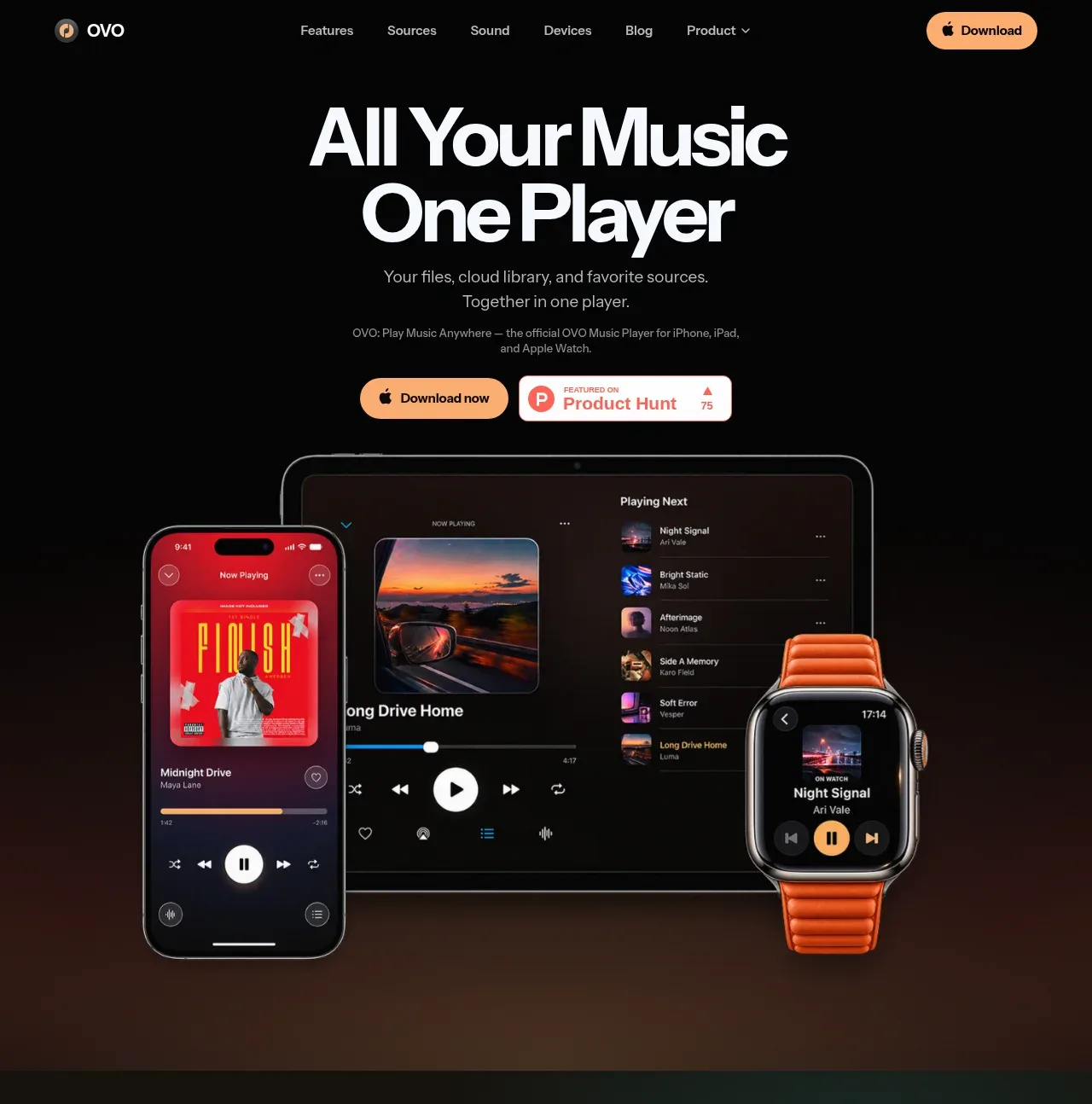 Centered music-player hero
OVO · Hero
Centered music-player hero
OVO · Hero
 Unified library and source collection
OVO · Feature grid
Unified library and source collection
OVO · Feature grid
 Local-first product feature
OVO · Feature grid
Local-first product feature
OVO · Feature grid
 Cross-device experience
OVO · Feature grid
Cross-device experience
OVO · Feature grid
 Playback and personalization showcase
OVO · Feature grid
Playback and personalization showcase
OVO · Feature grid
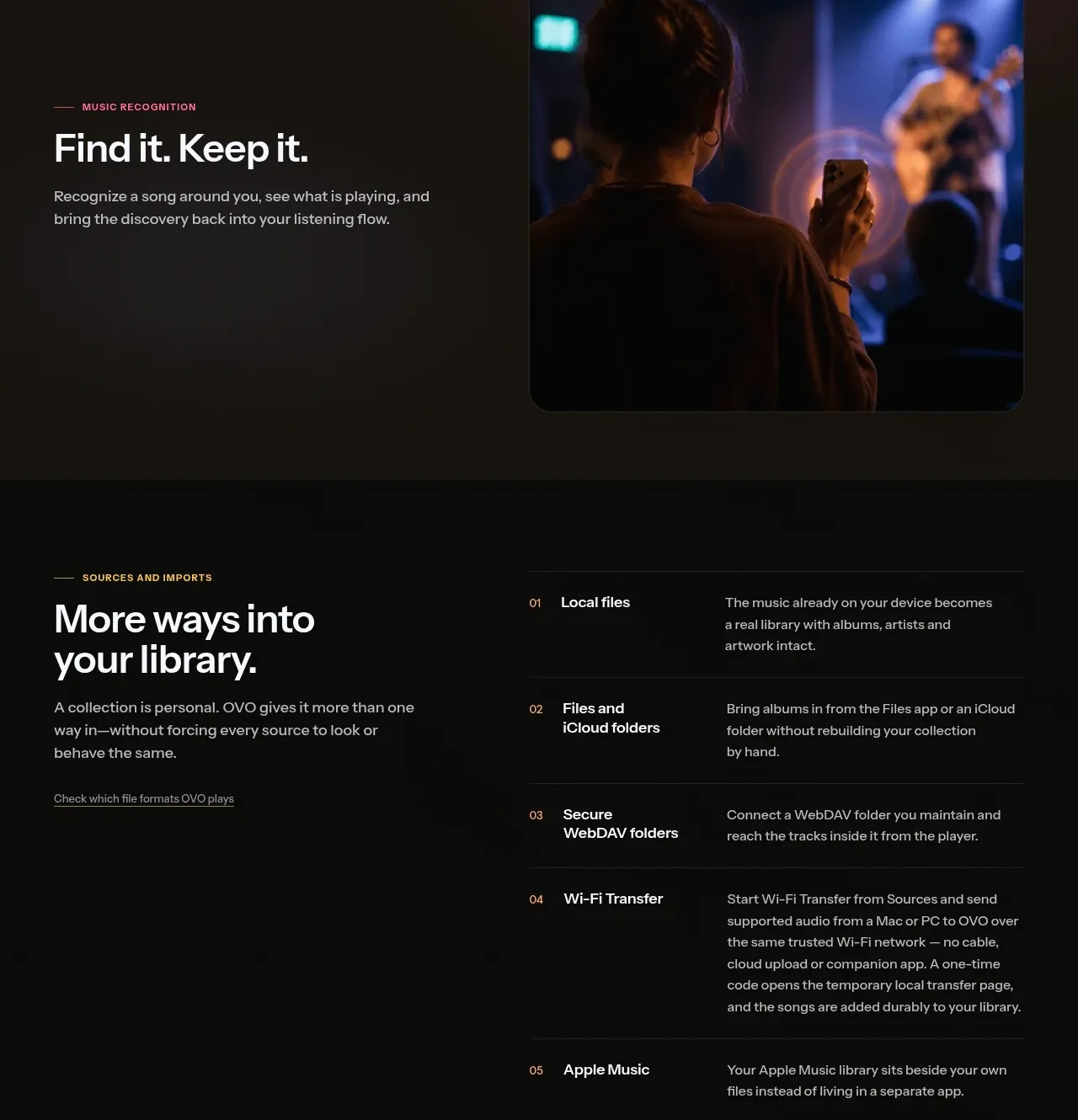 Sources and imports comparison list
OVO · Table
Sources and imports comparison list
OVO · Table
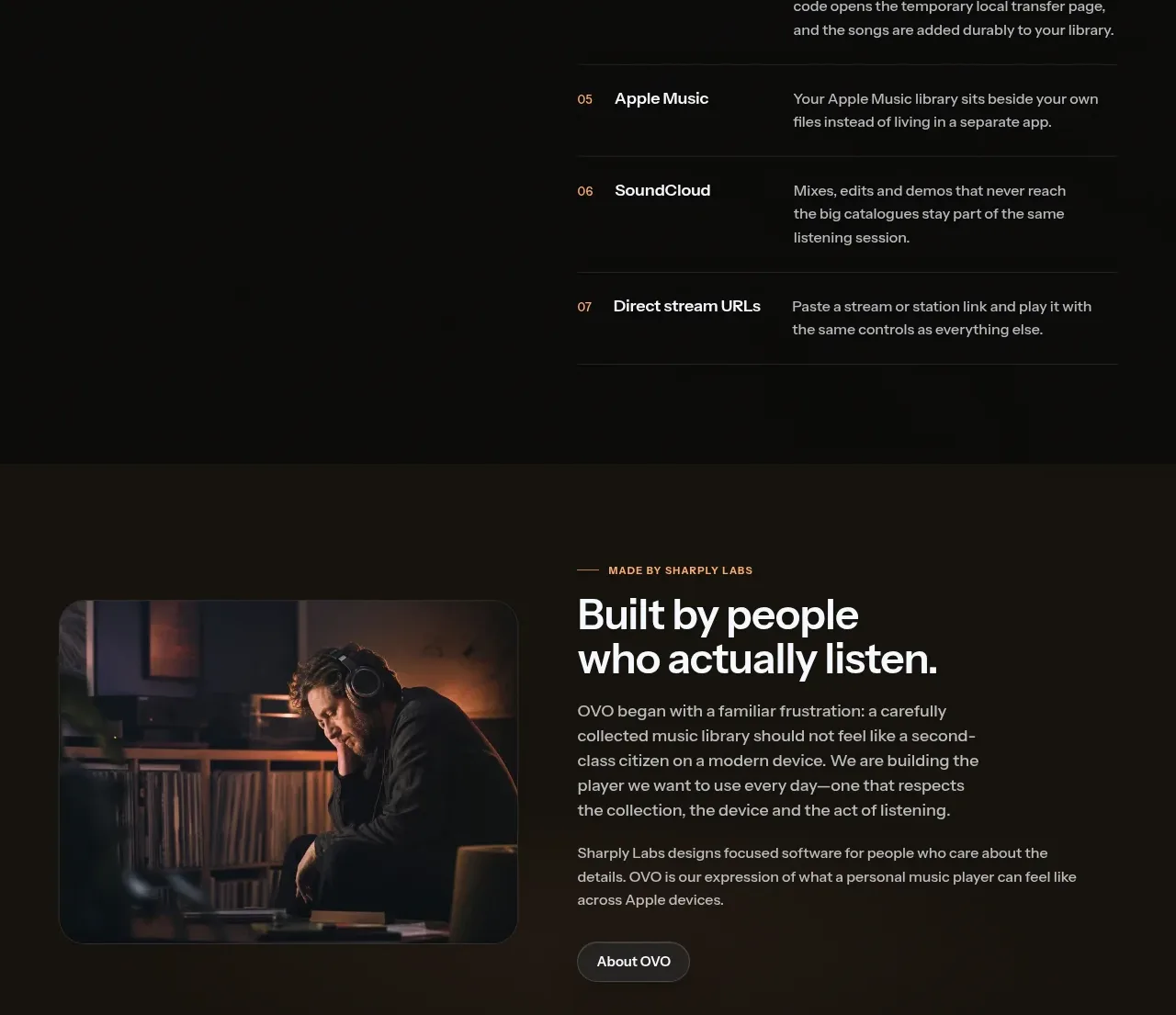 Founder or studio story
OVO · Card
Founder or studio story
OVO · Card
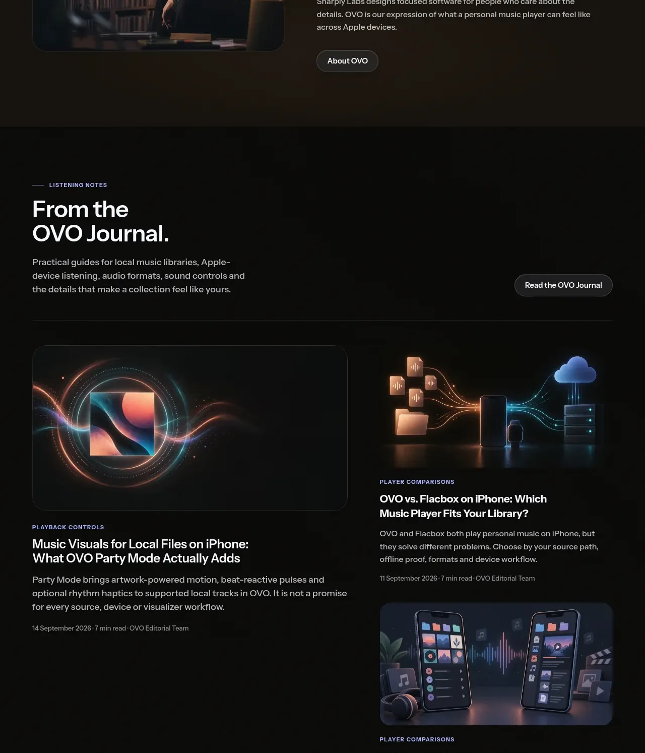 Editorial journal cards
OVO · Gallery
Editorial journal cards
OVO · Gallery
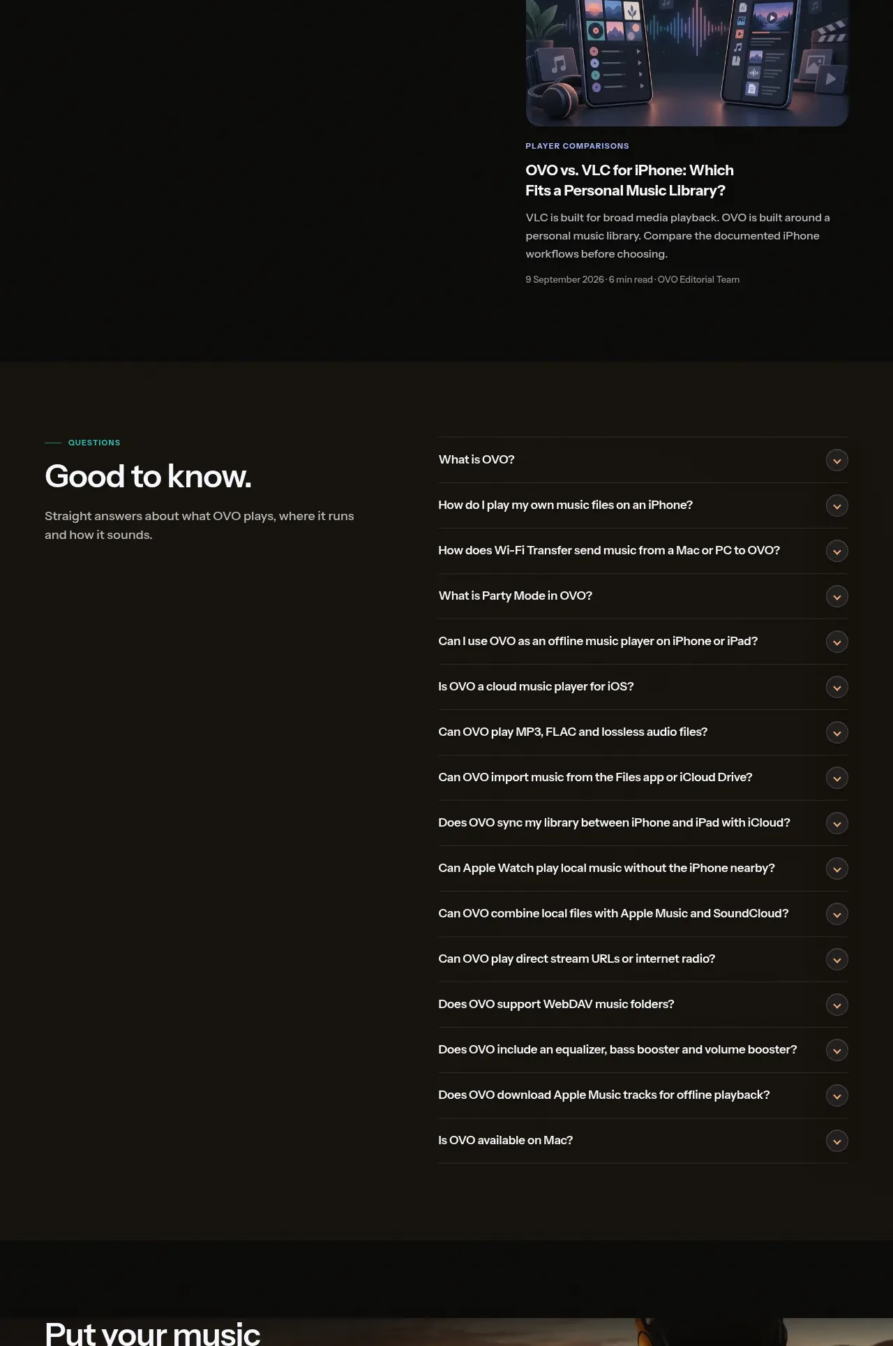 Product questions accordion
OVO · FAQ
Product questions accordion
OVO · FAQ
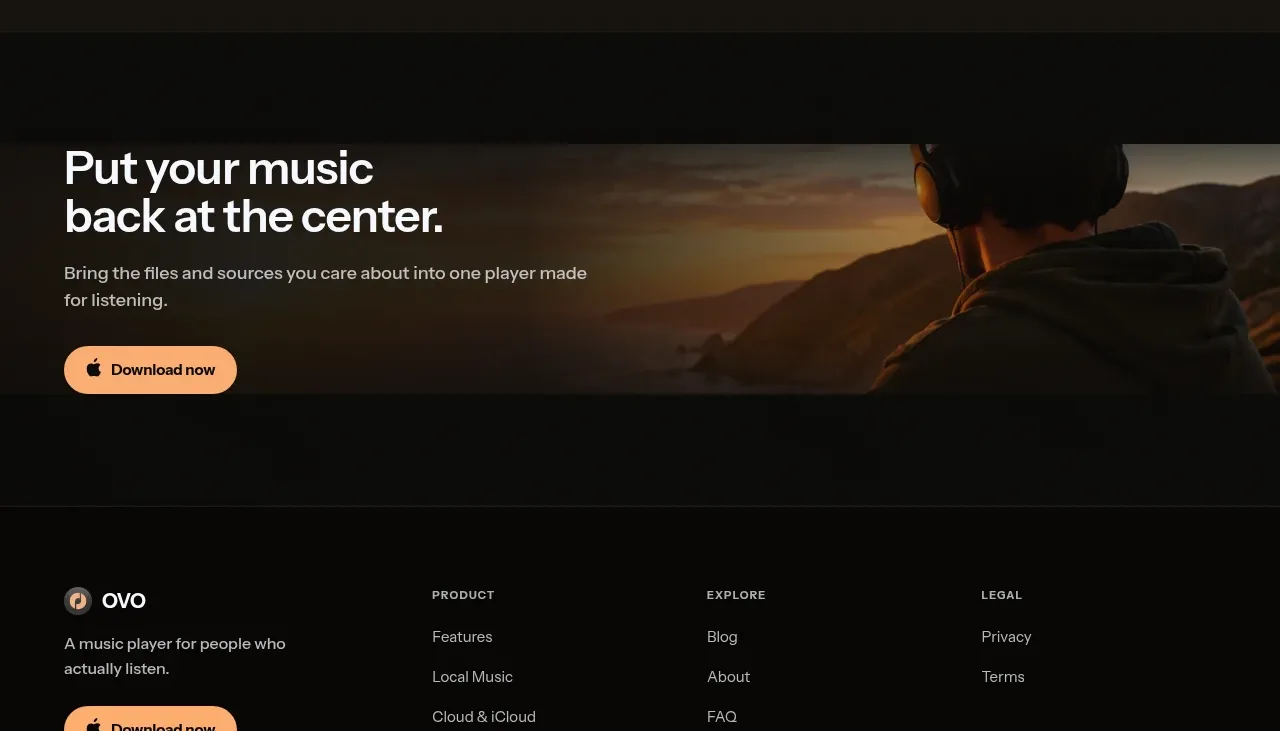 Closing download call to action
OVO · Call to action
Closing download call to action
OVO · Call to action
 Multi-column product footer
OVO · Footer
Multi-column product footer
OVO · Footer