kage
kage
ovoplayer.com

Design analysis
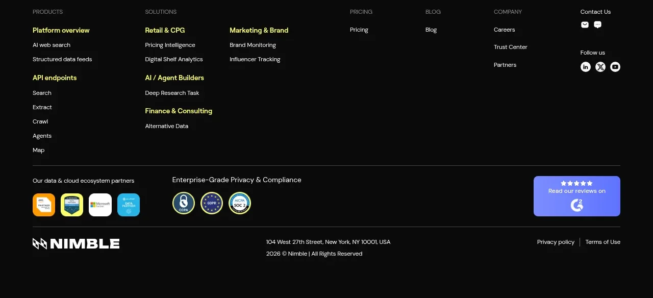
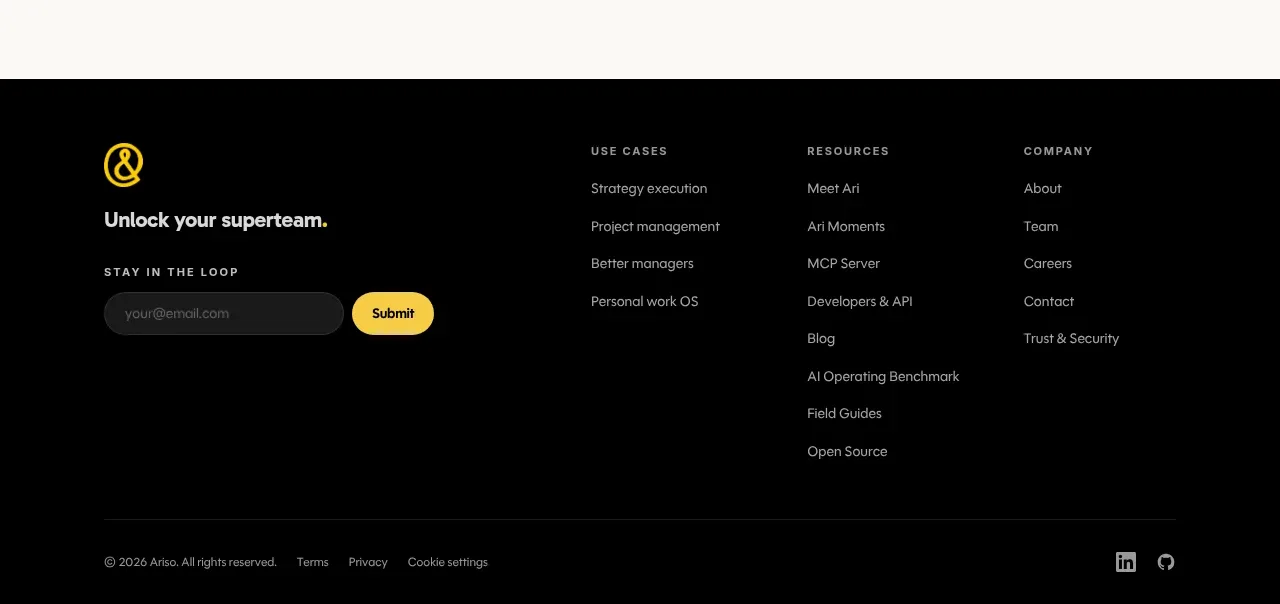
The footer closes with a brand summary and action on the left, grouped navigation columns in the middle, and a thin legal row along the bottom.
Prompt preview
## Reference images

Study these alongside the description below: hierarchy, rhythm, spacing, colour. Build for the product you are asked about, using this design language.

- Component: https://kage-design-assets.t3.tigrisfiles.io/components/ovo/3c9ed73d-a170-49d0-8a12-5cf9a4f3d08f-1789452271-11.webp
- Full page it was cut from: https://kage-design-assets.t3.tigrisfiles.io/screenshots/ovo/3c9ed73d-a170-49d0-8a12-5cf9a4f3d08f-1789452172899-full.webp
- Component on Kage: https://kage.design/component/ovo-footer

## Before you start
Ask what navigation groups, support links, legal requirements, and final brand message the user's product needs. Build a clear footer for that information architecture.

Create a near-black footer (#080807) with a top content row and a thin bottom legal row. Put the brand mark, one-sentence description, and compact primary action in the first column; place three or four link groups beside it with small uppercase headings and vertically spaced links. Use 12–14px muted text, cream group labels, subtle horizontal borders (#232321), and generous but efficient spacing. End with copyright text on the left and a small maker or policy note on the right. Collapse the columns into a readable stacked layout on mobile.

Never use the reference's logos, product names, copy, illustrations, or imagery.