kage
kage
ovoplayer.com
Design analysis
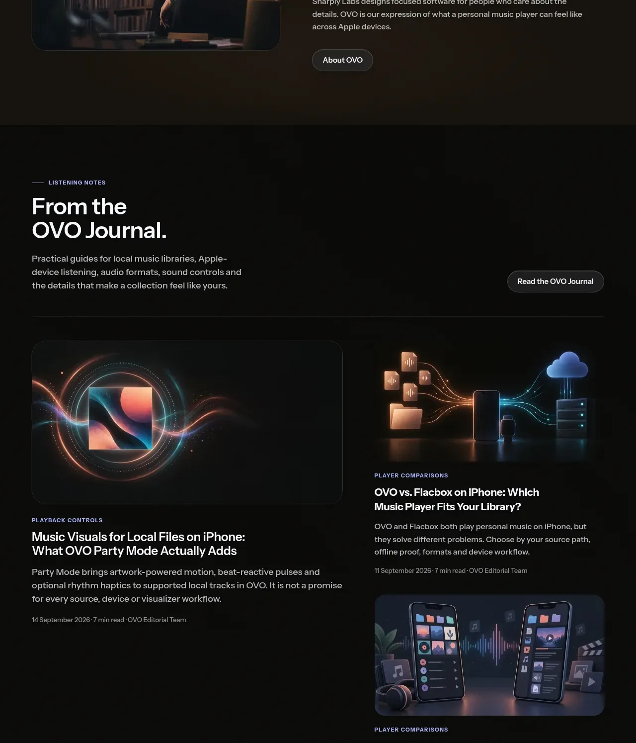
The journal area introduces editorial content with a clear heading and then uses an asymmetric card grid so one lead story receives more visual weight.
Prompt preview
## Reference images

Study these alongside the description below: hierarchy, rhythm, spacing, colour. Build for the product you are asked about, using this design language.

- Component: https://kage-design-assets.t3.tigrisfiles.io/components/ovo/3c9ed73d-a170-49d0-8a12-5cf9a4f3d08f-1789452270-8.webp
- Full page it was cut from: https://kage-design-assets.t3.tigrisfiles.io/screenshots/ovo/3c9ed73d-a170-49d0-8a12-5cf9a4f3d08f-1789452172899-full.webp
- Component on Kage: https://kage.design/component/ovo-gallery

## Before you start
Ask what educational or editorial content the user's audience would value and what story should be featured first. Then build a branded version of this pattern.

Design a dark editorial section with a header row: small eyebrow, large heading, short description, and a right-aligned pill link. Below it, create an asymmetric article grid with one large lead card and two smaller stacked cards. Every card should include a rounded image area, category label, readable title, short excerpt, and quiet metadata. Use nearly black surfaces (#0b0c0b), subtle card borders (#242523), cream headings, muted gray metadata, and 12px image corners. Maintain consistent card gutters and make the grid stack on mobile.

Never use the reference's logos, product names, copy, illustrations, or imagery.