kage
kage
trypalomino.com

Design analysis
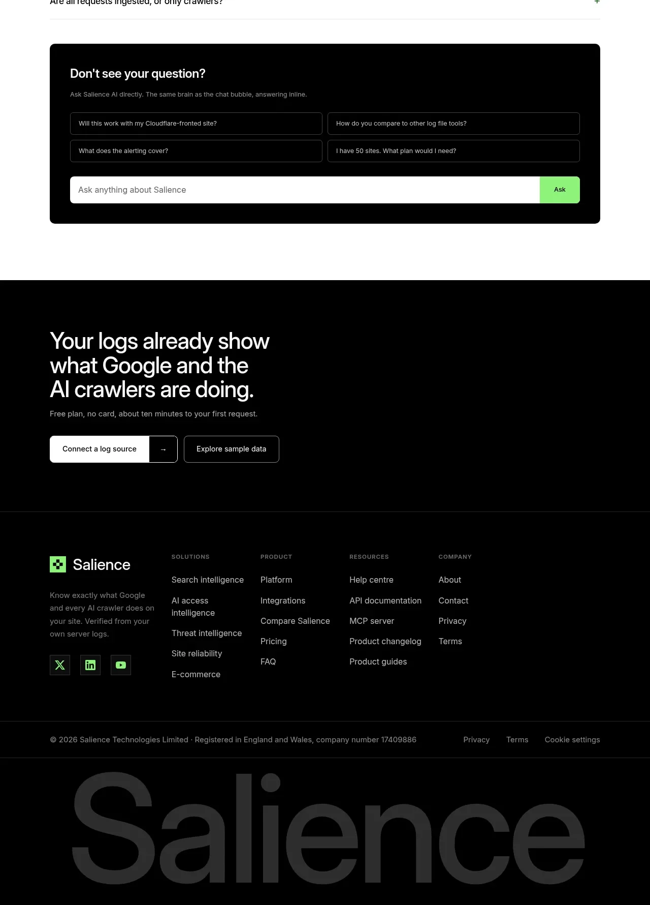
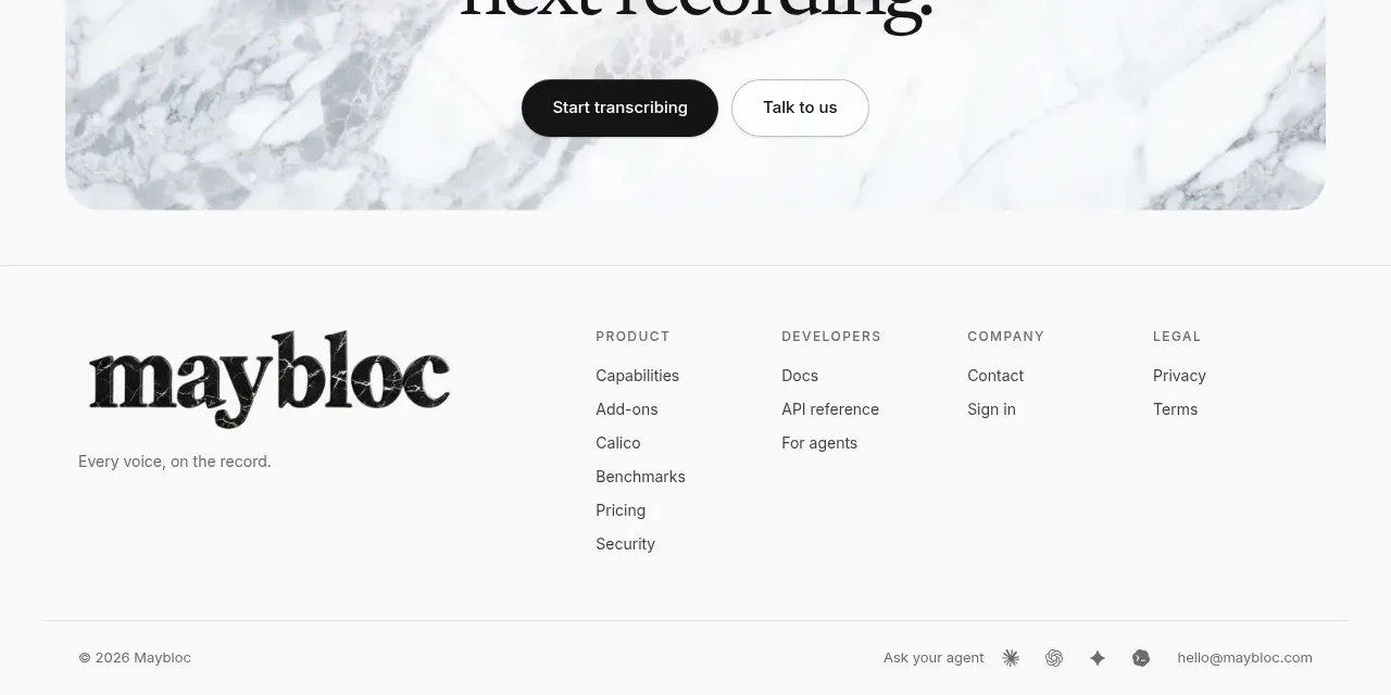
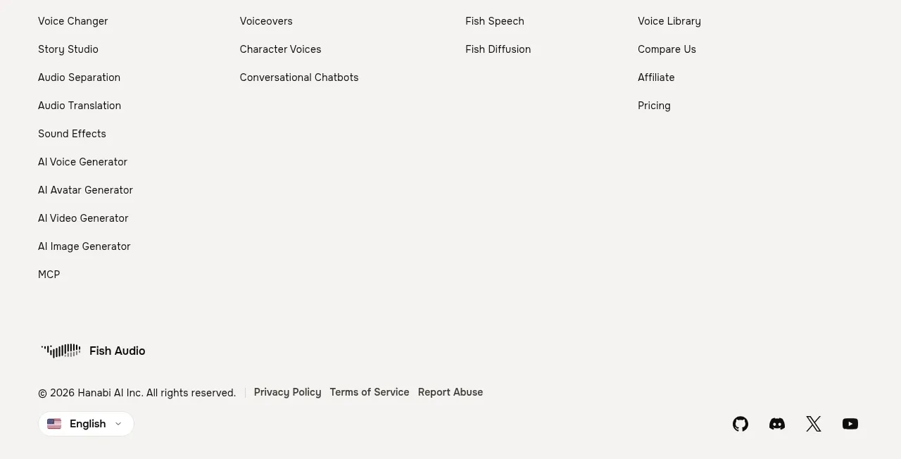
A quiet footer separates utility links and copyright information from a large pixel-inspired brand wordmark at the bottom.
Prompt preview
## Reference images

Study these alongside the description below: hierarchy, rhythm, spacing, colour. Build for the product you are asked about, using this design language.

- Component: https://kage-design-assets.t3.tigrisfiles.io/components/palomino/b08bb039-2732-4831-94dd-d664e600a54a-1792216873-3.webp
- Full page it was cut from: https://kage-design-assets.t3.tigrisfiles.io/screenshots/palomino/b08bb039-2732-4831-94dd-d664e600a54a-1792216834141-full.webp
- Component on Kage: https://kage.design/component/palomino-footer

## Before you start
Ask what the user's product, legal requirements, brand personality, and footer destinations are. Then design an original footer using the following reusable rules.

### Design rules
- Use a centered max-width footer with a thin top divider and generous vertical padding.
- Put copyright or legal text on the left, compact navigation and social links on the right on desktop; stack them cleanly on mobile.
- Use small muted sans-serif text around 11–13px with accessible contrast, approximately `#536274` on a pale blue-gray background near `#eef4f8`.
- Add a large brand treatment or abstract typographic signature below the utility row only if it supports the user's identity; keep it clipped or responsive rather than causing horizontal overflow.
- Use a 1px divider near `#d5e0e8`, 16–24px gaps, and minimal or no card styling.
- Links should have understated hover colour changes and visible keyboard focus.

### Never
- Never reuse logos, product names, copy, illustrations, or imagery from the reference.
- Never hide required legal links or make the footer text too small to read.
- Never let oversized branding overpower the functional footer navigation.