kage
kage
trypalomino.com
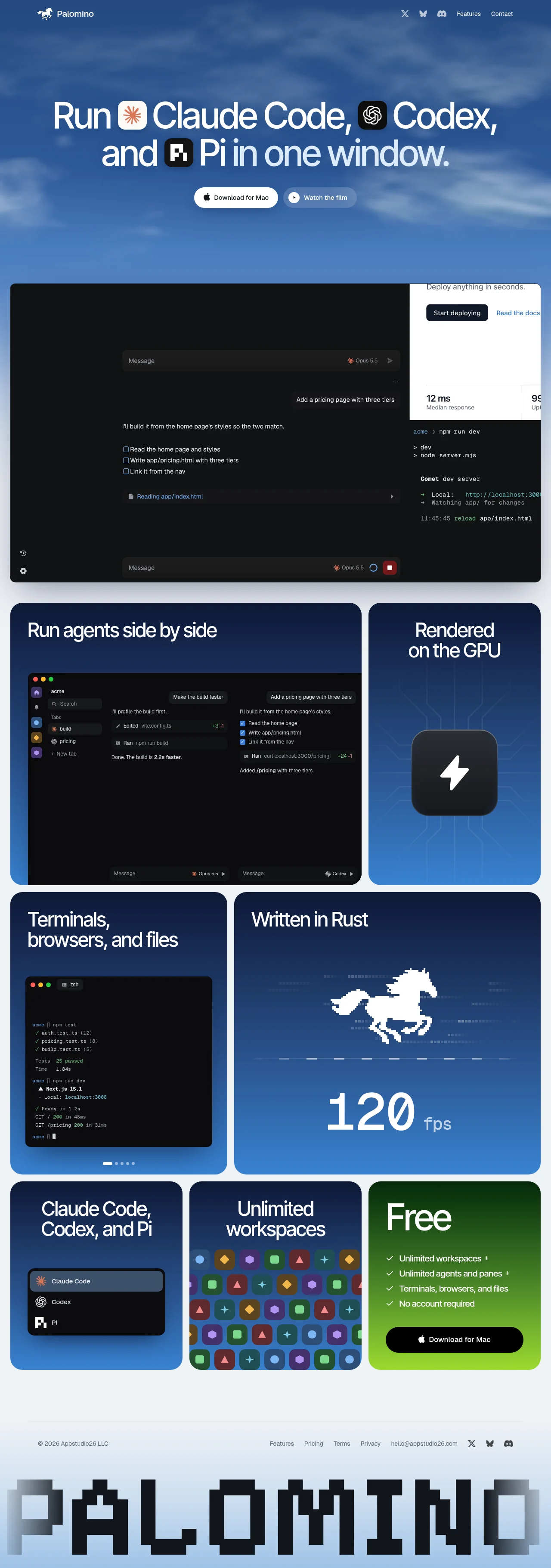
Design analysis
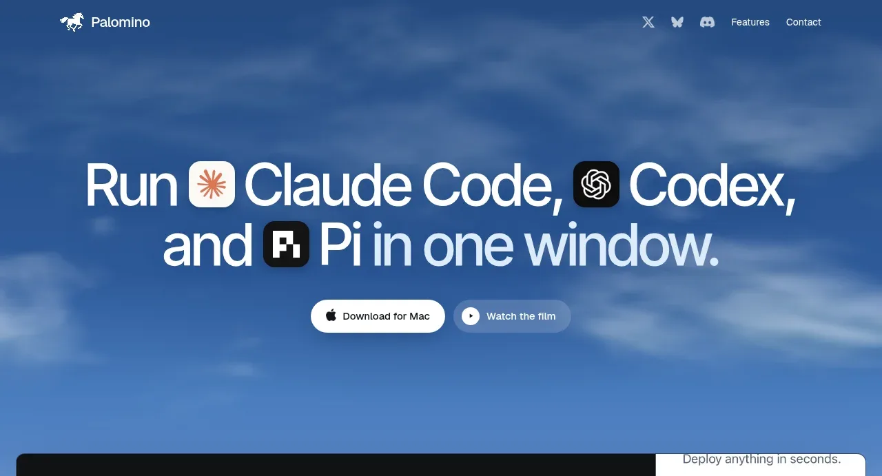
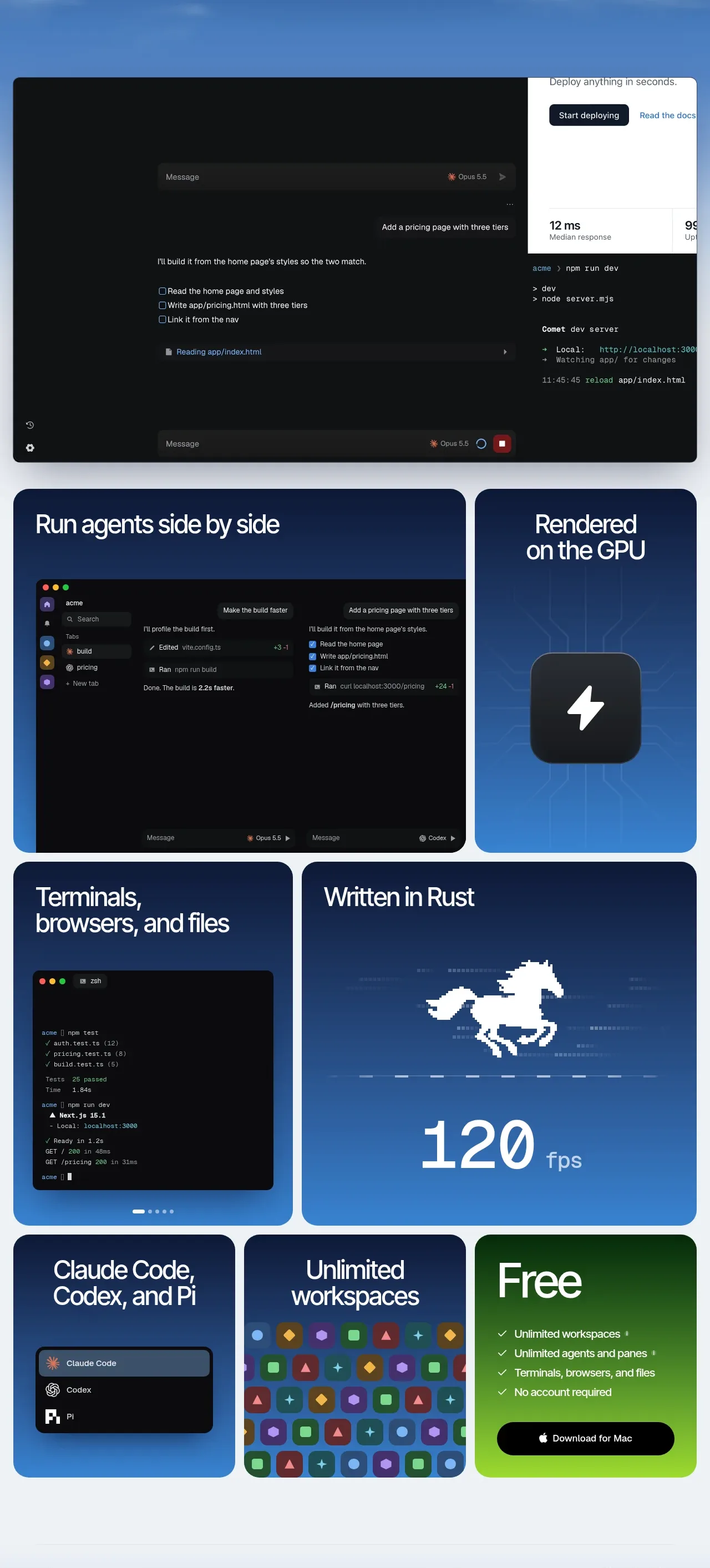
A sky-blue, cloud-textured hero establishes a bright, spacious opening with oversized white typography, inline product marks, and two pill CTAs. Below it, the page shifts into a dense rounded bento grid of dark product demos and blue feature cards, then lands on a vivid green free-plan card before resolving into a sparse footer with a large pixel-style wordmark.
Prompt preview
## Reference images

Study these alongside the description below: hierarchy, rhythm, spacing, colour. Build for the product you are asked about, using this design language.

- Full page: https://kage-design-assets.t3.tigrisfiles.io/screenshots/palomino/b08bb039-2732-4831-94dd-d664e600a54a-1792216834141-full.webp
- Above the fold: https://kage-design-assets.t3.tigrisfiles.io/screenshots/palomino/b08bb039-2732-4831-94dd-d664e600a54a-1792216829743.webp
- Design on Kage: https://kage.design/designs/palomino-landing-page

## Before you start
Ask the user what they are building, who it is for, and what brand assets they already have (name, colours, type). Wait for their answers before proceeding. Apply everything below to their product, not to the reference.

## Page structure
1. **Top navigation** — Place a compact logo/brand mark at the upper left and small utility links plus social icons at the upper right, overlaid on the hero.
2. **Hero statement** — Use a tall, atmospheric blue background with soft cloud or sky texture. Center a very large two-line headline with inline product/tool badges, followed by two pill buttons: a primary download/action and a secondary film/demo action.
3. **Primary product showcase** — Add a wide, rounded, dark interface preview directly below the hero. Make it feel like a real application window with a large agent conversation area, deployment panel, terminal output, and subtle controls.
4. **Feature bento grid, row one** — Use two rounded cards: a wide card showing multiple agents running side by side in a dark workspace, and a narrower blue card showing GPU rendering with a central hardware/lightning motif.
5. **Feature bento grid, row two** — Use a smaller blue card for terminals, browsers, and files with a terminal screenshot and carousel dots, beside a wider blue performance card with a large Rust horse mark and oversized FPS metric.
6. **Feature bento grid, row three** — Add three cards: a blue card listing supported coding agents with a compact dark selector UI, a blue card showing unlimited workspaces as a colourful repeated icon pattern, and a green pricing/action card titled with a short free-plan label, checklist, and black download button.
7. **Footer** — Finish with a thin divider, a small copyright line, compact navigation/legal/contact/social links, and a huge pixelated wordmark treatment spanning the bottom edge.

## Design language
- Build hierarchy with an oversized geometric sans-serif hero headline, short card headings, and sparse supporting copy; keep most text white against saturated backgrounds.
- Change rhythm down the page: begin airy and cinematic, move into tightly packed equal-height bento modules, then reduce density in the footer while enlarging the decorative wordmark.
- Use a cool, high-contrast palette: sky blue around `#4f86c8`, deep navy around `#071b43`, pale page gray around `#edf2f5`, near-black UI around `#101112`, and a vivid lime green around `#74d61b` for the free-plan conversion card.
- Pair a clean modern sans with an extremely large display scale. Use tight line height in headlines, medium-weight card titles, tiny muted metadata, and all-caps or concise labels only where needed.
- Treat cards as the main organizing device: use a consistent 16–20px radius, narrow gutters, and a responsive grid with deliberately varied column spans. Keep borders subtle or absent; rely on colour blocks and contrast rather than heavy shadows.
- Make product screenshots dark, technical, and dense inside otherwise simple cards. Use restrained terminal text, thin dividers, small controls, and a few colourful status accents so the demos read as interfaces rather than illustrations.
- Let blue backgrounds carry soft gradients, cloud texture, faint circuitry, or low-opacity technical patterns. Keep decorative imagery secondary to the large type and functional UI previews.
- Style actions as rounded pills with strong contrast: white primary buttons on blue, black buttons on green, and subdued translucent secondary buttons. Include generous horizontal padding and compact labels.
- Use interaction cues sparingly: support hover brightening and a slight lift on cards/buttons, allow feature media to rotate or slide where carousel dots are shown, and keep motion smooth, quick, and non-distracting.

## Never
- Do not copy the reference's logos, wordmark, product name, copy, illustrations, photography, interface screenshots, or icon sets.
- Do not present the result as Palomino or imply an affiliation with it.
- Do not reuse the exact horse, lightning, agent badges, pixel lettering, or branded social marks; create original assets appropriate to the user's product.