 kage
kage
trypalomino.com
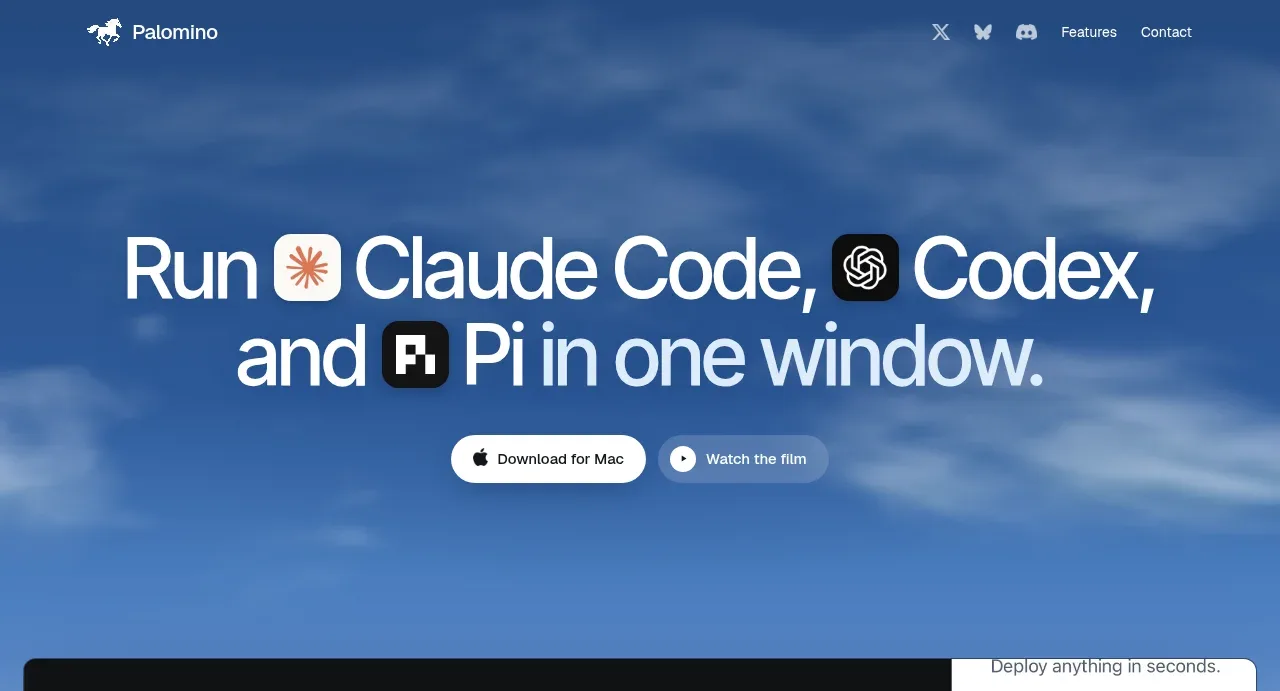
Design analysis
The hero uses a large centered statement, a soft blue cloud-like background, and two pill-shaped actions to establish the product promise immediately.
Prompt preview
## Reference images

Study these alongside the description below: hierarchy, rhythm, spacing, colour. Build for the product you are asked about, using this design language.

- Component: https://kage-design-assets.t3.tigrisfiles.io/components/palomino/b08bb039-2732-4831-94dd-d664e600a54a-1792216872-1.webp
- Full page it was cut from: https://kage-design-assets.t3.tigrisfiles.io/screenshots/palomino/b08bb039-2732-4831-94dd-d664e600a54a-1792216834141-full.webp
- Component on Kage: https://kage.design/component/palomino-hero

## Before you start
Ask what the user's product does, who the target audience is, and what brand personality and palette it should use. Then build an original hero using the rules below rather than reproducing the reference.

### Design rules
- Center a concise, high-impact headline in the upper-middle of a full-width hero; use inline product/tool references only if relevant to the user's product.
- Add one short supporting line if needed, followed by two actions: one high-contrast primary button and one quieter secondary button.
- Make the hero tall enough to breathe, with the next visual section beginning after the CTA and generous bottom space.
- Use a large responsive sans-serif headline, approximately 54–72px on desktop with tight line-height around 0.95–1.05; scale down fluidly on mobile.
- Use white or near-white headline text `#f7fbff` over a deep-to-mid blue atmospheric background, approximately `#17365f` to `#6596c7`.
- Primary buttons may use white `#ffffff` with dark text `#142033`; secondary buttons can use translucent white with a subtle border.
- Use pill radii around 999px, 12–16px vertical padding, and 18–28px horizontal padding.
- Allow a soft blurred sky, gradient, or abstract texture to create depth, but keep text contrast high.
- Buttons should have hover lift/brightness changes and clear focus rings.

### Never
- Never reuse logos, product names, copy, illustrations, or imagery from the reference.
- Never make the headline a generic feature list or bury the primary action.
- Never use decorative texture that competes with legibility.
More components
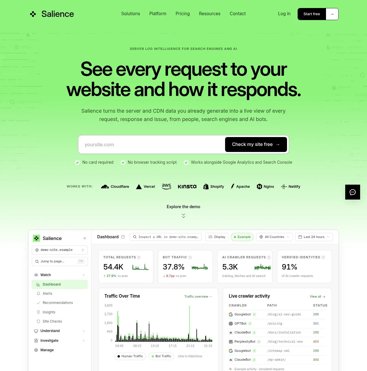
 Product promise and site checker hero
Salience · Hero
Product promise and site checker hero
Salience · Hero
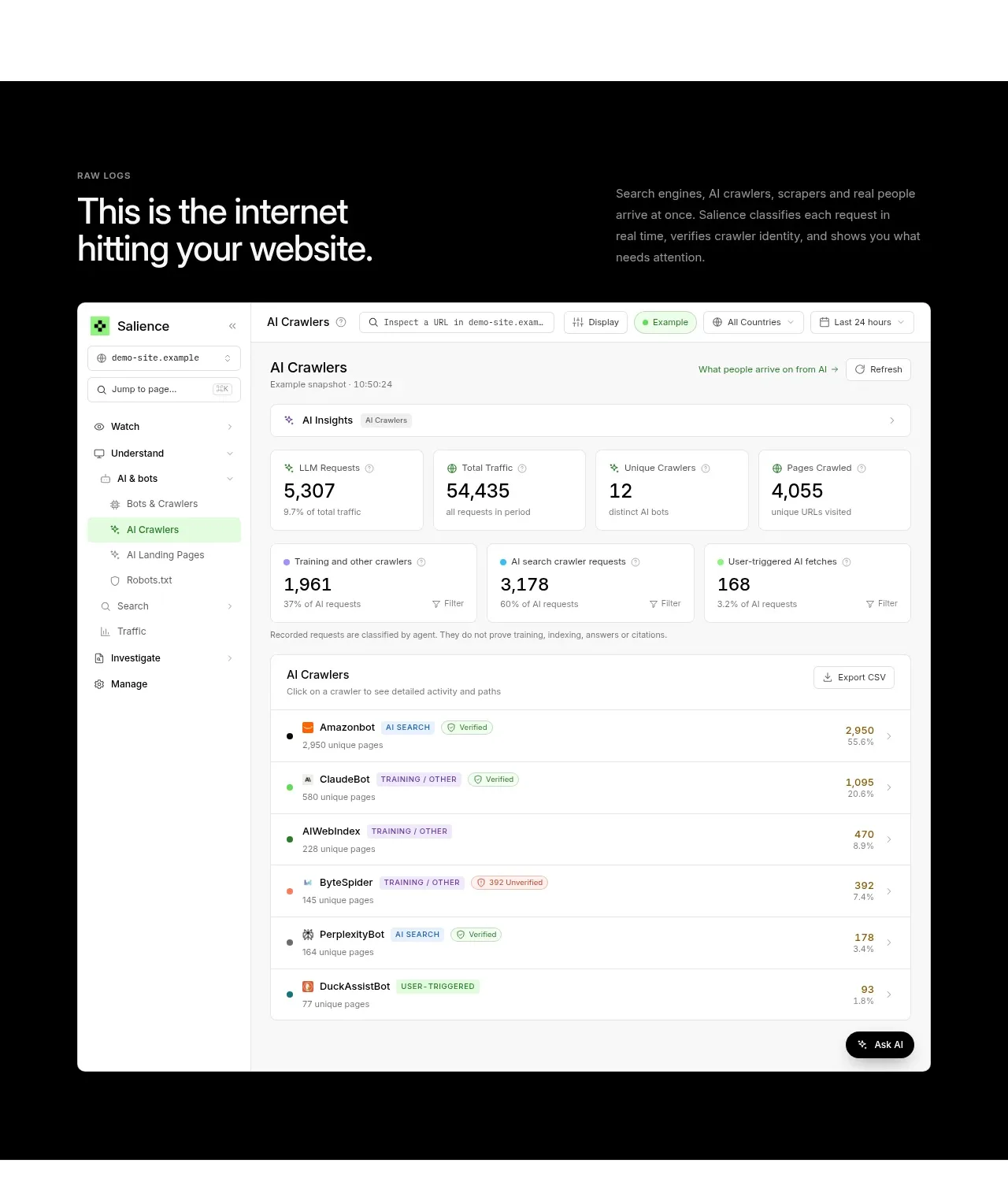 Raw activity dashboard showcase
Salience · Hero
Raw activity dashboard showcase
Salience · Hero
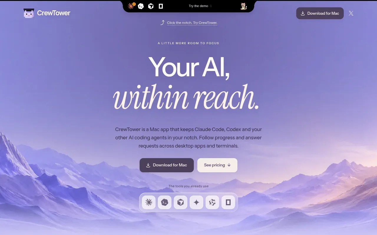
 Focus-oriented hero
CrewTower Mod for Claude Code · Hero
Focus-oriented hero
CrewTower Mod for Claude Code · Hero
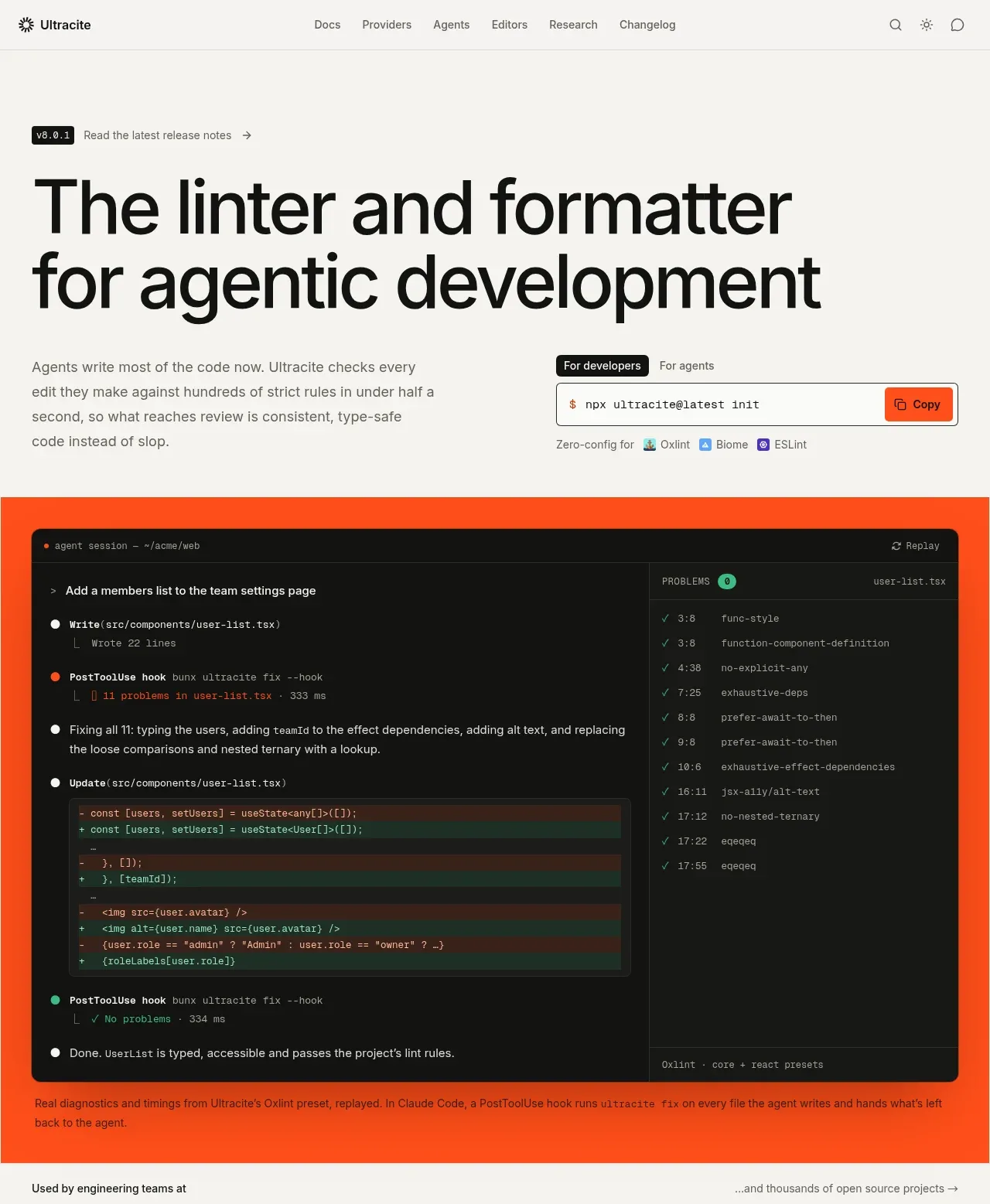
 Agentic development hero with live terminal preview
Ultracite v8 · Hero
Agentic development hero with live terminal preview
Ultracite v8 · Hero
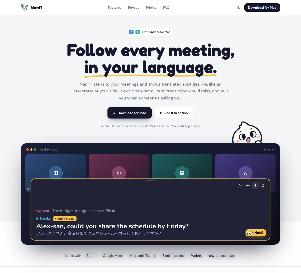
 Translation meeting hero
NANI??? · Hero
Translation meeting hero
NANI??? · Hero
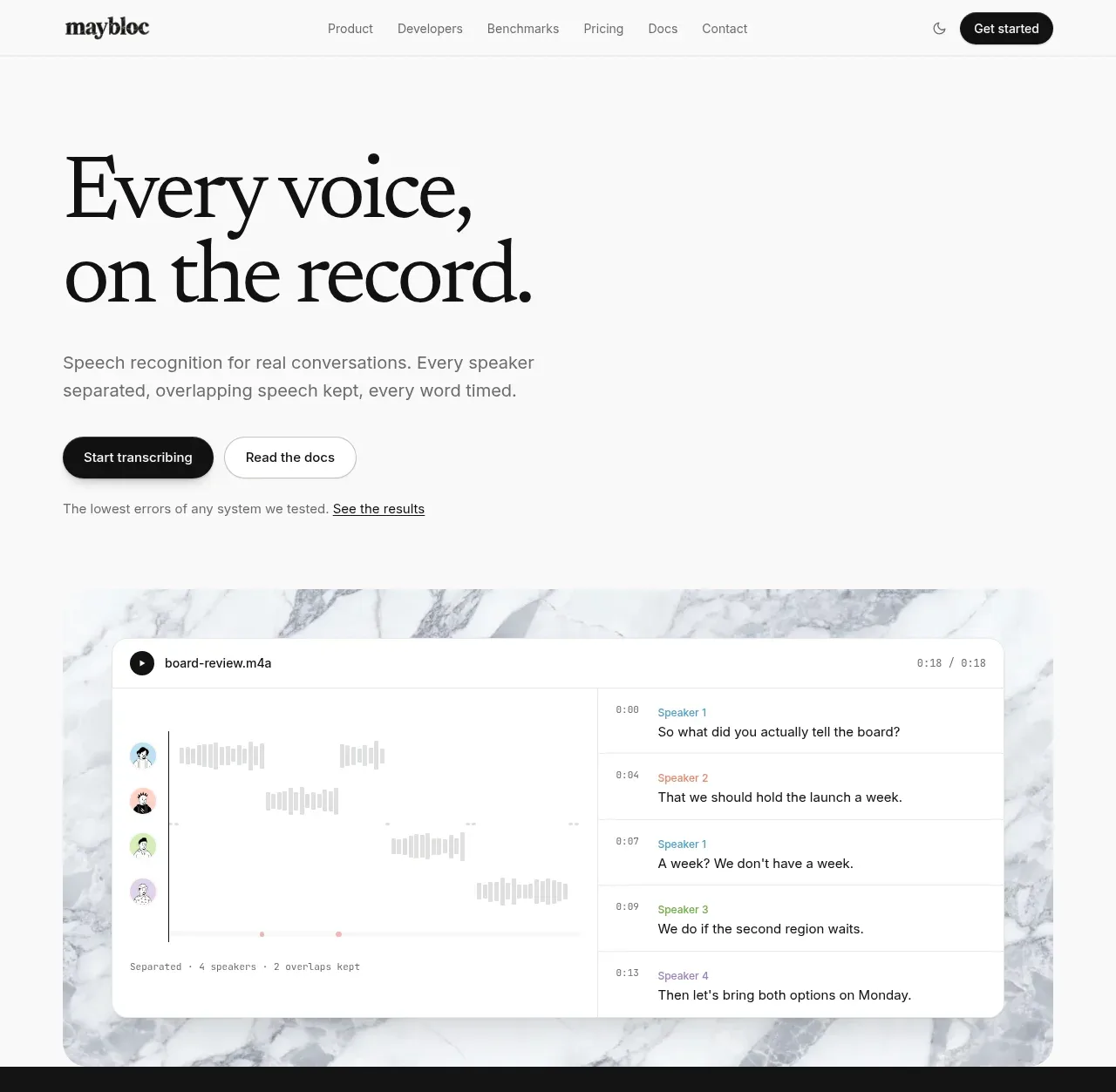
 Editorial speech transcription hero
Maybloc · Hero
Editorial speech transcription hero
Maybloc · Hero