 kage
kage
pancake.ai
Design analysis
A compact trust band uses a quiet eyebrow and two airy rows of monochrome customer marks. It reassures without interrupting the narrative or introducing another competing CTA.
Prompt preview
## Reference images

Study these alongside the description below: hierarchy, rhythm, spacing, colour. Build for the product you are asked about, using this design language.

- Component: https://kage-design-assets.t3.tigrisfiles.io/components/pancake/f2dcc4e1-7584-486e-8c34-37279d03f6e2-1792044191-2.webp
- Full page it was cut from: https://kage-design-assets.t3.tigrisfiles.io/screenshots/pancake/f2dcc4e1-7584-486e-8c34-37279d03f6e2-1792044073540-full.webp
- Component on Kage: https://kage.design/component/pancake-logo-cloud

## Before you start
Ask which customers, partners, or credible proof points the user's product can truthfully show, and what tone the brand should use. Apply the structure without copying the reference brands.

Build a horizontal trust section on a warm ivory background. Center a small muted eyebrow such as a trust statement, then arrange 8–12 customer or partner wordmarks in one or two responsive rows. Render marks in a single dark-plum or charcoal tone with consistent visual height, generous gaps, and enough contrast to remain legible. Use a max-width container around 780–820px, 28–40px vertical padding, and 32–56px column gaps. On mobile, use a two-column or horizontally scrollable arrangement. Keep the section quiet: no cards, gradients, or oversized heading. If actual logos are unavailable, use neutral text placeholders during development and make the logo treatment easy to replace.

Never: use the reference logo, product name, exact copy, illustrations, or imagery.
More components
 Customer trust and brand logos
Retriever AI · Logo cloud
Customer trust and brand logos
Retriever AI · Logo cloud
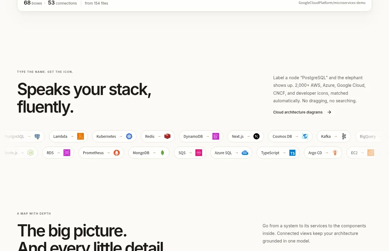
 Technology compatibility
OpenFlowKit 2 · Logo cloud
Technology compatibility
OpenFlowKit 2 · Logo cloud
 Customer logo strip
Scrape Anything by Context.dev · Logo cloud
Customer logo strip
Scrape Anything by Context.dev · Logo cloud
 Supported tools strip
Hypervibe · Logo cloud
Supported tools strip
Hypervibe · Logo cloud
 Customer logo strip
Zernio · Logo cloud
Customer logo strip
Zernio · Logo cloud

 Customer logo strip
capacity.so · Logo cloud
Customer logo strip
capacity.so · Logo cloud