kage
kage
conifer.build

Design analysis
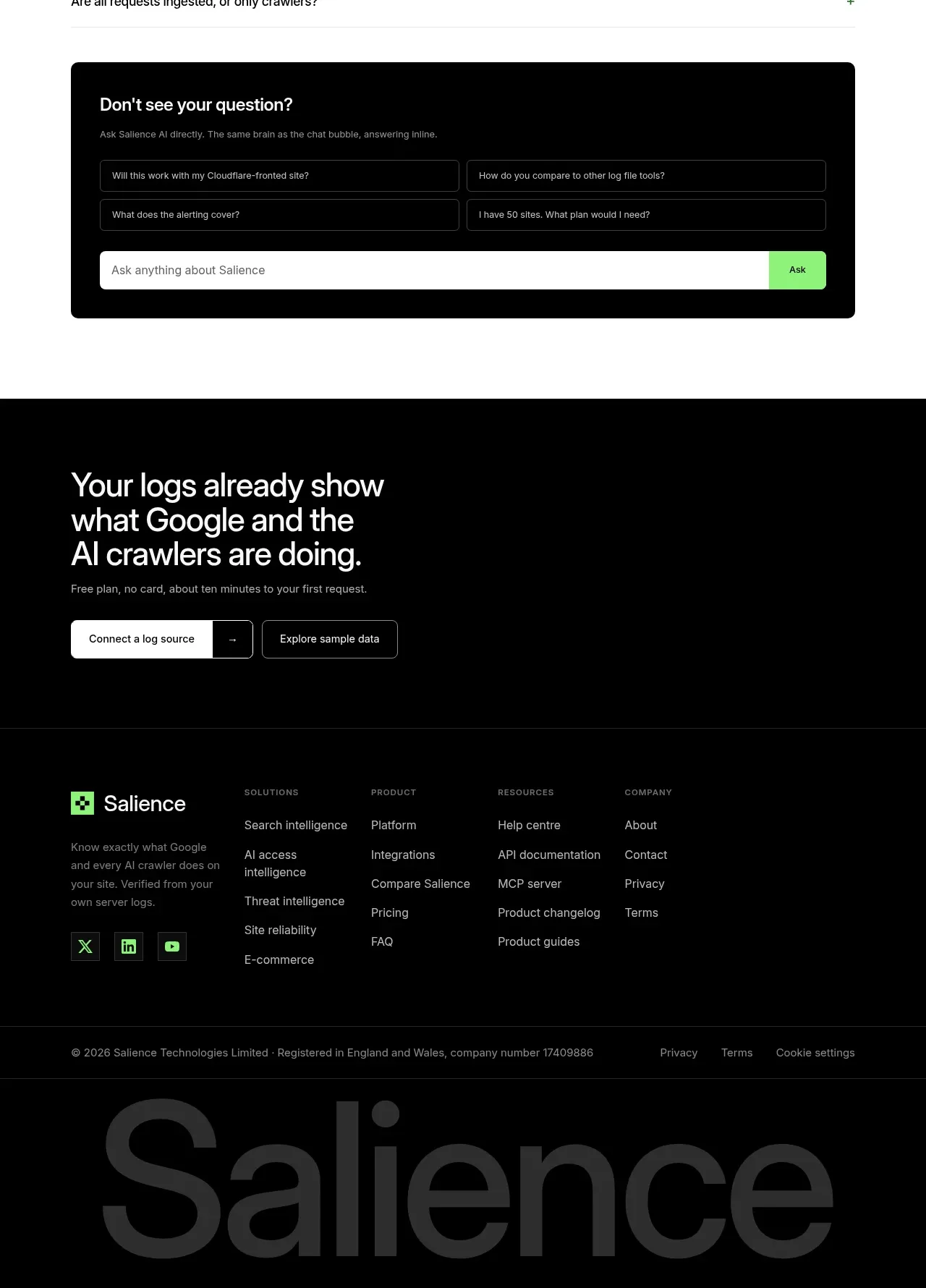
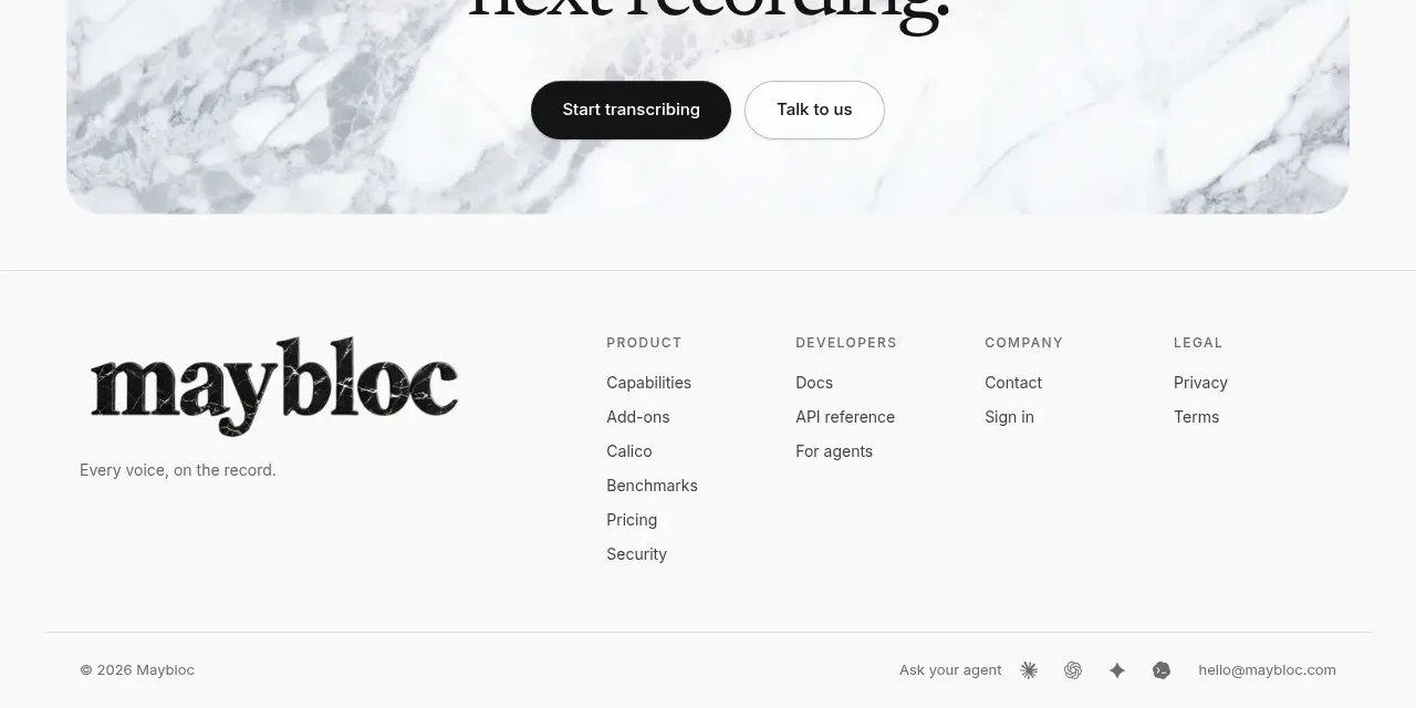
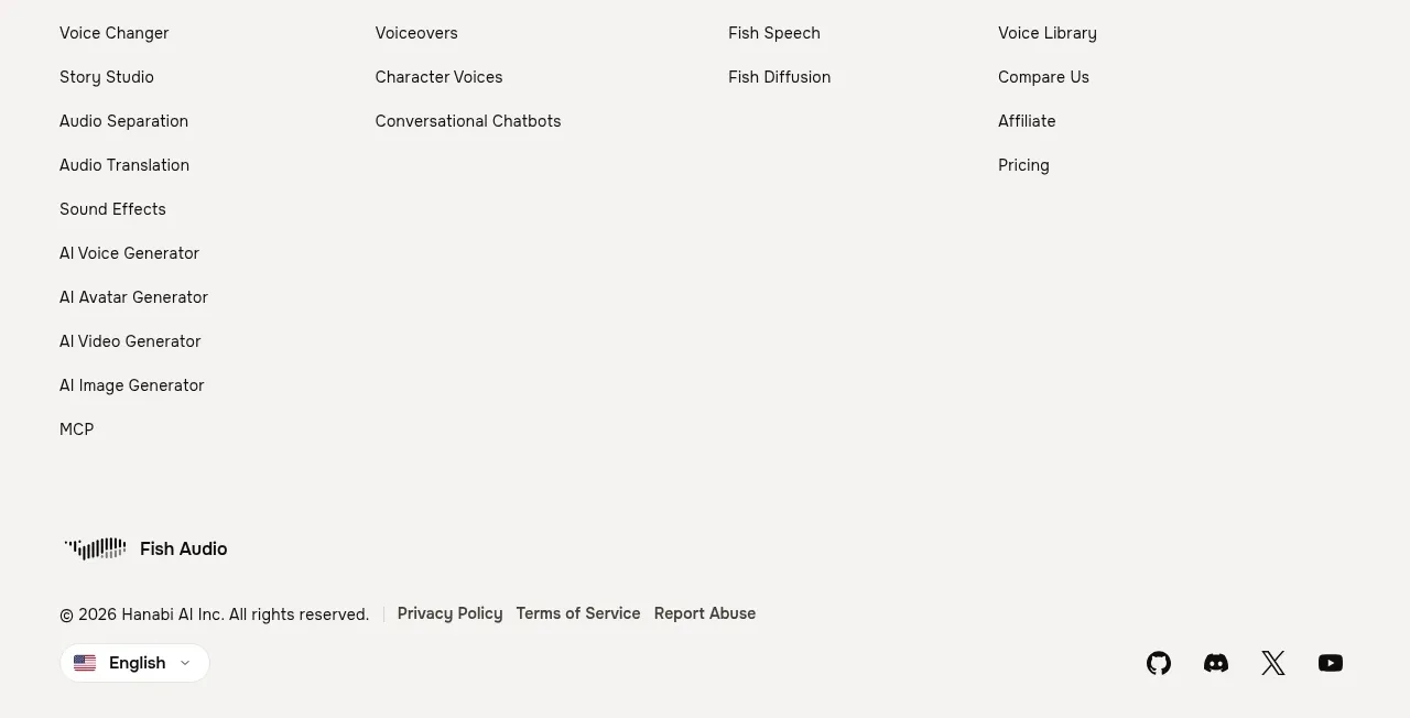
A thin divider introduces a sparse three-column link system with uppercase category labels, low-contrast links, and a small copyright line anchored at the bottom.
Prompt preview
## Reference images

Study these alongside the description below: hierarchy, rhythm, spacing, colour. Build for the product you are asked about, using this design language.

- Component: https://kage-design-assets.t3.tigrisfiles.io/components/parallax/9ca98bac-0bc3-4cc4-b310-031492d1188c-1792216895-7.webp
- Full page it was cut from: https://kage-design-assets.t3.tigrisfiles.io/screenshots/parallax/9ca98bac-0bc3-4cc4-b310-031492d1188c-1792216865980-full.webp
- Component on Kage: https://kage.design/component/parallax-footer

## Before you start
Ask what navigation groups, support links, social channels, and legal details the user's product needs. Then organize those links using this restrained system.

Create a full-width dark footer separated from the CTA by a subtle 1px horizontal rule. Inside a centered max-width container, lay out three evenly spaced columns with tiny uppercase, letter-spaced headings and vertically stacked low-contrast links. Use generous row spacing and plenty of empty space so the footer feels editorial rather than dense. Place a small copyright/legal line near the bottom, aligned with the content container. Use background `#0b0b0b`, headings `#8e898b`, links `#aaa6a6`, muted legal text `#777375`, and border `#242528`. Typography should be compact sans-serif or monospace-like for labels, with visible hover underlines or accent-color transitions. Collapse columns gracefully on mobile.

Never:
- use logos, product names, or copy from the reference
- copy the reference link labels or legal text
- add illustrations or imagery from the reference