kage
kage
conifer.build
Design analysis
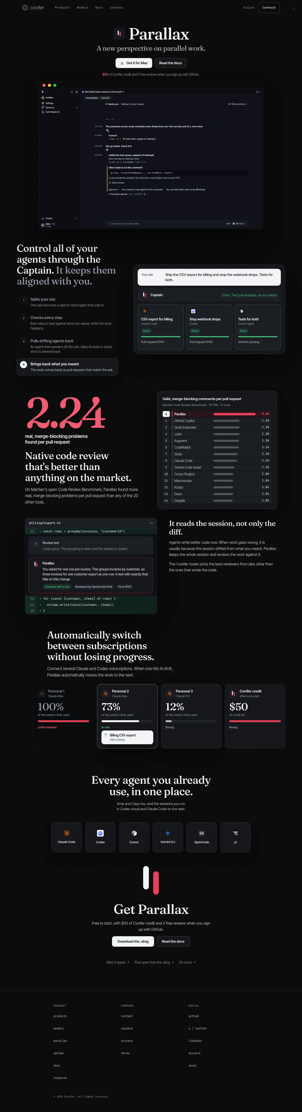
A nearly black, long-form product page pairs oversized editorial serif headlines with restrained sans-serif UI copy and dense, softly bordered product mockups. The hero is centered and sparse, then the page shifts into alternating two-column feature rows, combining numbered explanatory lists, benchmark statistics, code-review visuals, and subscription cards; the rhythm opens up again for the centered agent roster and final download CTA before ending in a compact three-column footer. White and muted gray establish hierarchy while vivid pink marks the product identity, progress bars, benchmark emphasis, and key accents, with low-contrast borders and minimal radius keeping the interface technical rather than glossy.
Prompt preview
## Reference images

Study these alongside the description below: hierarchy, rhythm, spacing, colour. Build for the product you are asked about, using this design language.

- Full page: https://kage-design-assets.t3.tigrisfiles.io/screenshots/parallax/9ca98bac-0bc3-4cc4-b310-031492d1188c-1792216865980-full.webp
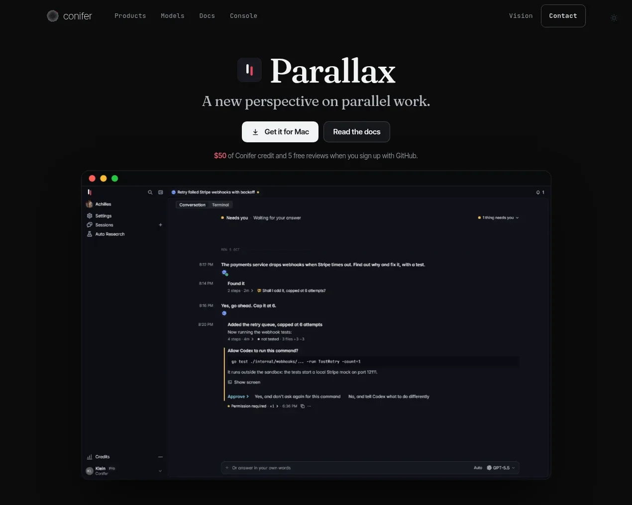
- Above the fold: https://kage-design-assets.t3.tigrisfiles.io/screenshots/parallax/9ca98bac-0bc3-4cc4-b310-031492d1188c-1792216861936.webp
- Design on Kage: https://kage.design/designs/parallax-landing-page

## Before you start
Ask the user what they are building, who it is for, and what brand assets they already have, including the product name, logo or symbol, colours, and type choices. Wait for their answers before designing. Apply the system below to their product and content, not to the reference product.

## Page structure
1. **Global navigation** — Use a slim, dark header with a small brand mark at left, compact text links beside it, and restrained utility links plus an outlined contact/action button at right.
2. **Hero** — Center a small product symbol above a large editorial serif headline, followed by a short supporting line, two compact CTAs, and a small incentive or proof note with one accent-coloured phrase.
3. **Primary product preview** — Place a large, wide dark application screenshot directly beneath the hero, framed by a subtle border, rounded corners, and a faint shadow; let the product UI carry most of the visual detail.
4. **Agent control feature** — Switch to a two-column section: a large serif explanation and numbered list on the left, with a dark orchestration/dashboard mockup on the right showing a request and several agent task cards.
5. **Benchmark feature** — Use another two-column row with a prominent oversized accent statistic and explanatory serif headline on the left, alongside a ranked benchmark panel with horizontal bars on the right.
6. **Session-aware review feature** — Reverse or vary the composition with a code-diff/review mockup on the left and a concise serif heading plus body copy on the right. Show layered review comments and status pills inside the code visual.
7. **Subscription switching feature** — Center a narrower headline and short explanation, then place a horizontal row of subscription/status cards below. Use percentage usage, progress bars, states, and one active task card to explain continuity across accounts.
8. **Supported agents section** — Center a large serif heading with a short caption, then display a row of equal dark tiles for the supported tools or integrations. Keep each tile simple: small symbol, label, and generous internal spacing.
9. **Final download CTA** — Center the product symbol, a large serif call to action, a short supporting sentence, primary and secondary buttons, and a small row of secondary platform/help links.
10. **Footer** — Separate the footer with a thin horizontal rule. Use three sparse link columns with uppercase or widely tracked category labels, compact links, and a small copyright line near the bottom.

## Design language
- Build hierarchy through contrast in type scale rather than decoration: use large, high-contrast editorial serif headlines for section statements, paired with small neutral sans-serif UI copy and metadata.
- Start with a sparse, centered hero, then alternate dense two-column feature rows with more open centered sections. Let screenshots and card groups create local density while keeping generous vertical gaps between sections.
- Use a near-black background around `#090a0a` or `#0b0b0c`, warm white text around `#f3f1ed`, and muted gray copy around `#8b8a8d`. Reserve a vivid coral-pink accent around `#ef4268` for statistics, progress bars, selected states, and small emphasis—not for large background fills.
- Pair an expressive high-contrast serif for display headings with a compact neutral grotesk/sans-serif for navigation, labels, descriptions, buttons, and product UI. Use a clear scale: very large hero and CTA headings, medium section headings, then small dense metadata.
- Treat panels as technical surfaces: use hairline gray borders around `#25272b`, dark charcoal fills around `#15171b`, modest corner radii around 10–16px, and only faint diffuse shadows. Avoid glass blur, heavy gradients, and excessive elevation.
- Make product mockups feel like real software rather than illustrations: include believable sidebars, tabs, code, status indicators, progress bars, cards, timestamps, and short labels, but keep their contrast subordinate to the page headings.
- Use alternating left/right alignment to prevent a repetitive landing-page stack. Keep explanatory copy constrained to readable widths and align supporting visuals to a consistent content grid.
- Buttons should be compact and solid or subtly outlined, with bright off-white primary fills and dark text; secondary buttons use transparent charcoal fills and thin borders. Keep controls rectangular with modest rounding.
- Motion should be quiet and purposeful: use small opacity/translate reveals as sections enter view, gentle hover border or brightness changes on cards and buttons, and avoid distracting parallax or continuous animation.
- Preserve the editorial mood below the fold: statistics may become oversized and expressive, but supporting UI remains small, systematic, and information-dense. Finish with a calm, spacious CTA and an understated footer rather than another visual climax.

## Never
- Do not copy logos, wordmarks, product names, interface copy, illustrations, photography, or icon sets from the reference.
- Do not present the result as the reference product or reproduce its exact screenshots.
- Use the user's own product identity, content, integrations, and brand assets while retaining only the reusable layout and design principles above.
Components from this page
All components
 Minimal dark navigation
Parallax · Navigation
Minimal dark navigation
Parallax · Navigation
 Product introduction with application preview
Parallax · Hero
Product introduction with application preview
Parallax · Hero
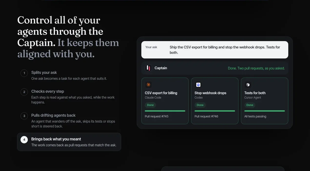 Agent coordination workflow
Parallax · Feature grid
Agent coordination workflow
Parallax · Feature grid
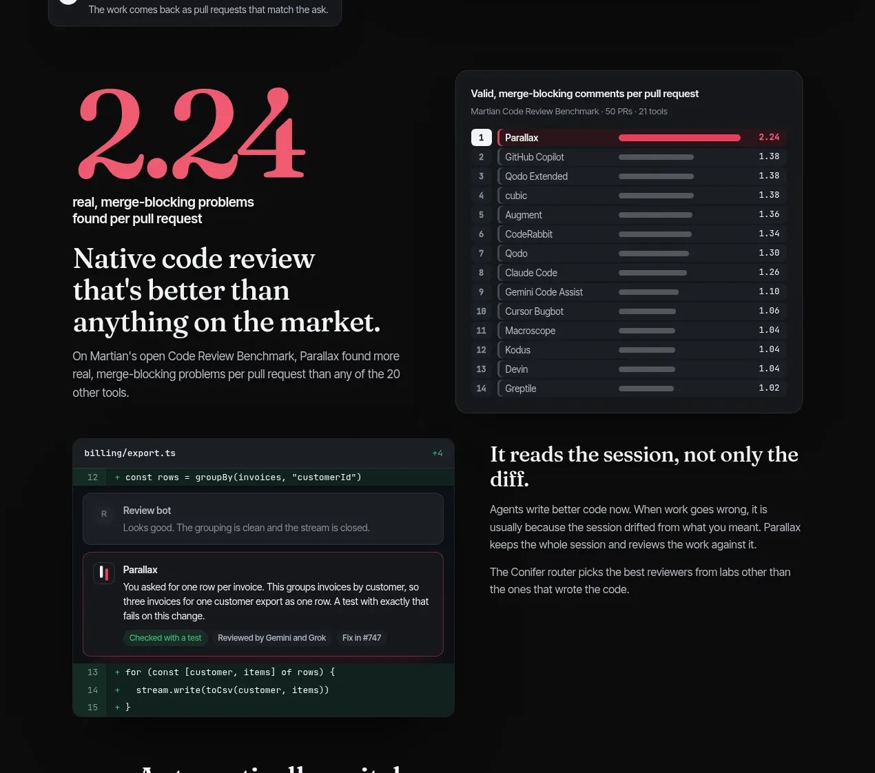 Benchmark and contextual code review
Parallax · Feature grid
Benchmark and contextual code review
Parallax · Feature grid
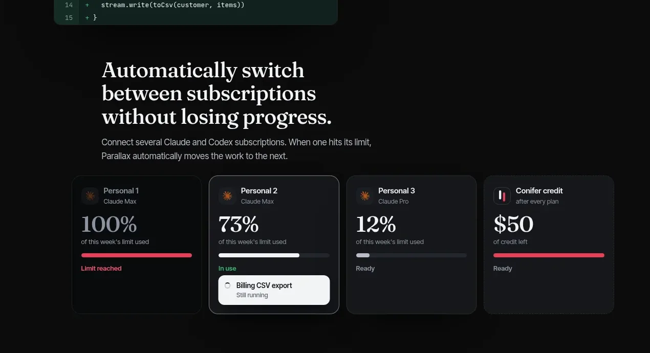 Subscription handoff and progress cards
Parallax · Feature grid
Subscription handoff and progress cards
Parallax · Feature grid
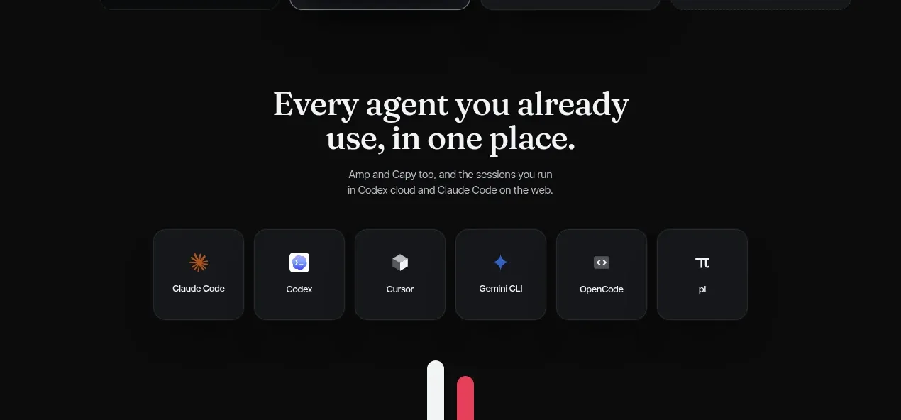 Compatible tools grid
Parallax · Logo cloud
Compatible tools grid
Parallax · Logo cloud
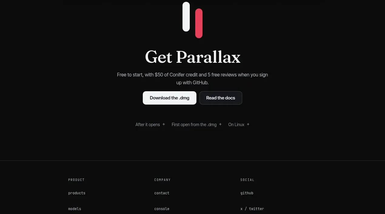 Download-focused closing call to action
Parallax · Call to action
Download-focused closing call to action
Parallax · Call to action
 Three-column site footer
Parallax · Footer
Three-column site footer
Parallax · Footer