 kage
kage
conifer.build
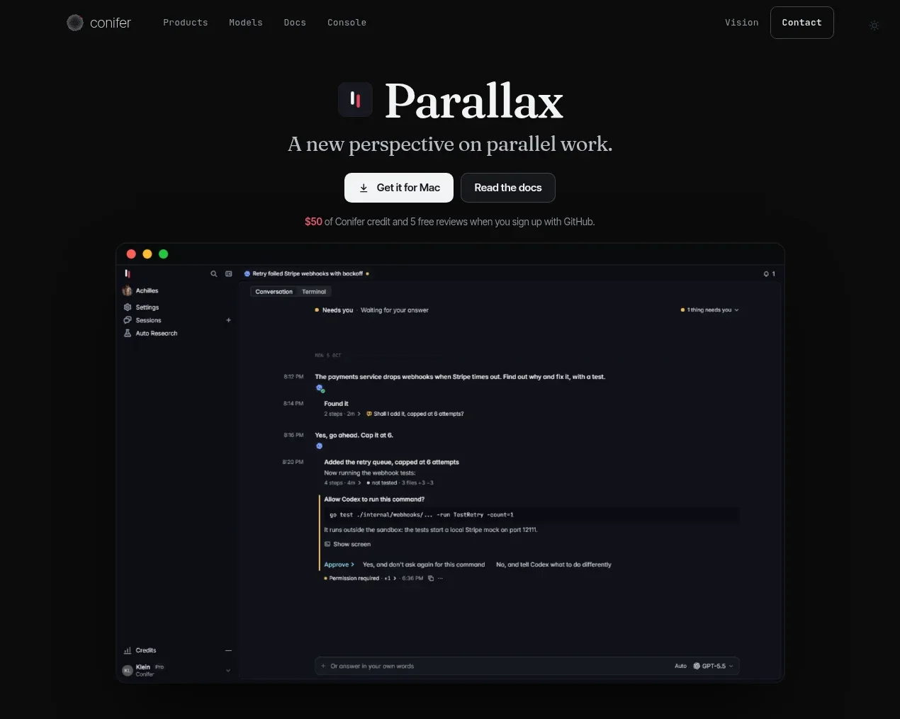
Design analysis
The centered headline and dual CTA establish the promise, while a large framed app preview gives the product immediate credibility and visual weight.
Prompt preview
## Reference images

Study these alongside the description below: hierarchy, rhythm, spacing, colour. Build for the product you are asked about, using this design language.

- Component: https://kage-design-assets.t3.tigrisfiles.io/components/parallax/9ca98bac-0bc3-4cc4-b310-031492d1188c-1792216893-1.webp
- Full page it was cut from: https://kage-design-assets.t3.tigrisfiles.io/screenshots/parallax/9ca98bac-0bc3-4cc4-b310-031492d1188c-1792216865980-full.webp
- Component on Kage: https://kage.design/component/parallax-hero

## Before you start
Ask what the user's product is, what its primary promise is, and what brand tone it should convey. Then design this hero around those answers.

Create a centered dark hero section with generous top whitespace, a small product glyph beside a large editorial serif headline, one concise supporting statement, and two adjacent CTAs. Make the primary CTA light and filled, with a darker secondary outlined CTA. Under the buttons, add a small accent-colored promotional or trust note. Place a large browser/application preview below, centered within the same max-width grid; give it a near-black panel, subtle gray border, 10–14px radius, and a soft shadow. The preview should read as a believable product interface with a narrow top bar, sidebar, content area, and small status details, but it must be original. Use near-black `#0a0a0a`, panel `#111217`, warm white `#f0ece8`, muted gray `#858184`, and a pink-red accent around `#e83f67`. Use an expressive serif display face for the headline and a clean sans-serif for UI. Keep the section responsive: stack the CTAs on narrow screens and let the preview crop or scale without overflowing.

Never:
- use logos, product names, or copy from the reference
- copy the reference application's interface or screenshots
- use its illustrations or imagery
More components
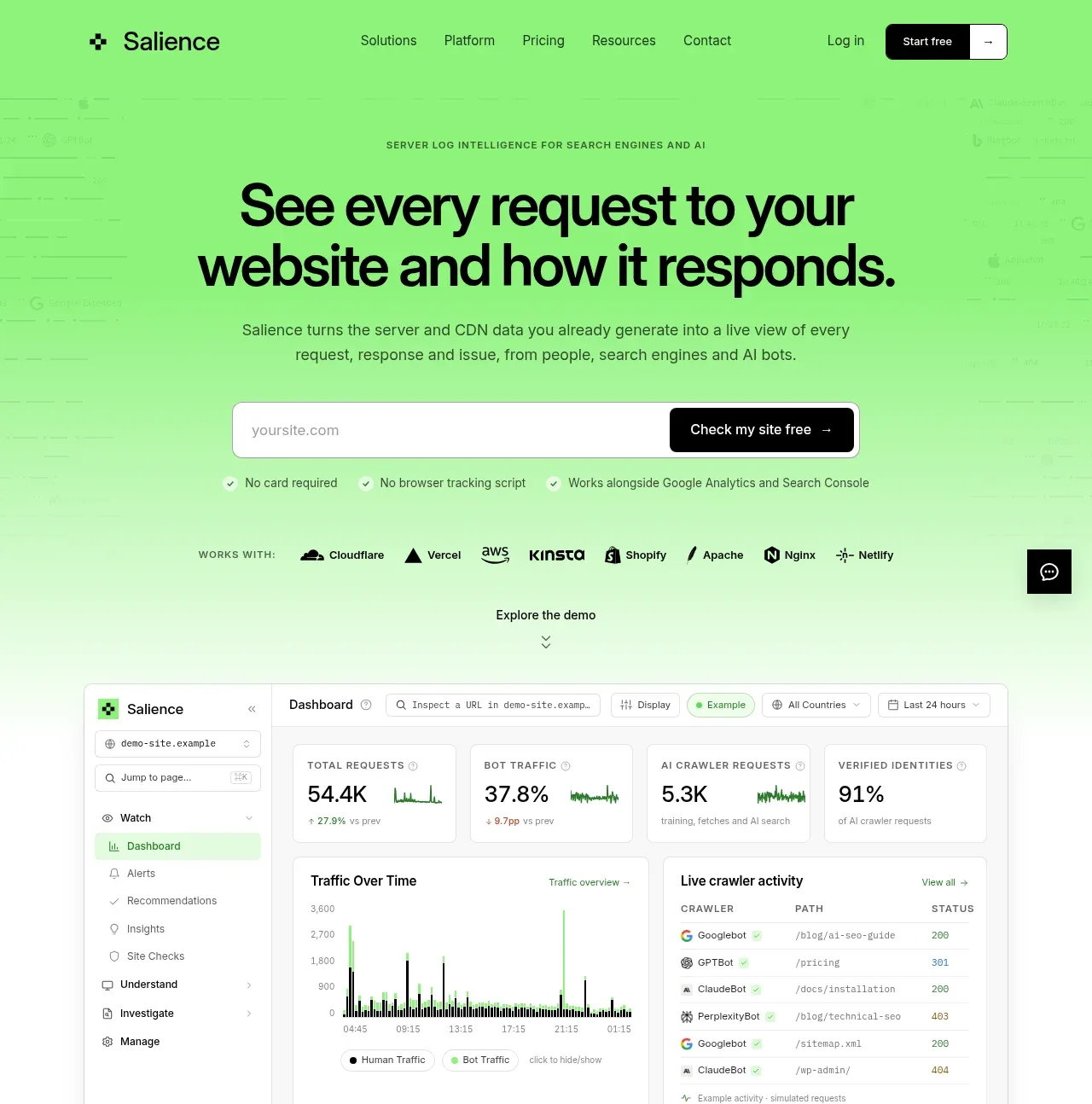
 Product promise and site checker hero
Salience · Hero
Product promise and site checker hero
Salience · Hero
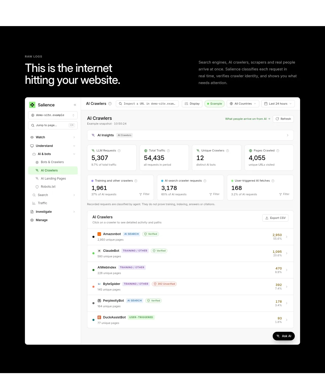 Raw activity dashboard showcase
Salience · Hero
Raw activity dashboard showcase
Salience · Hero
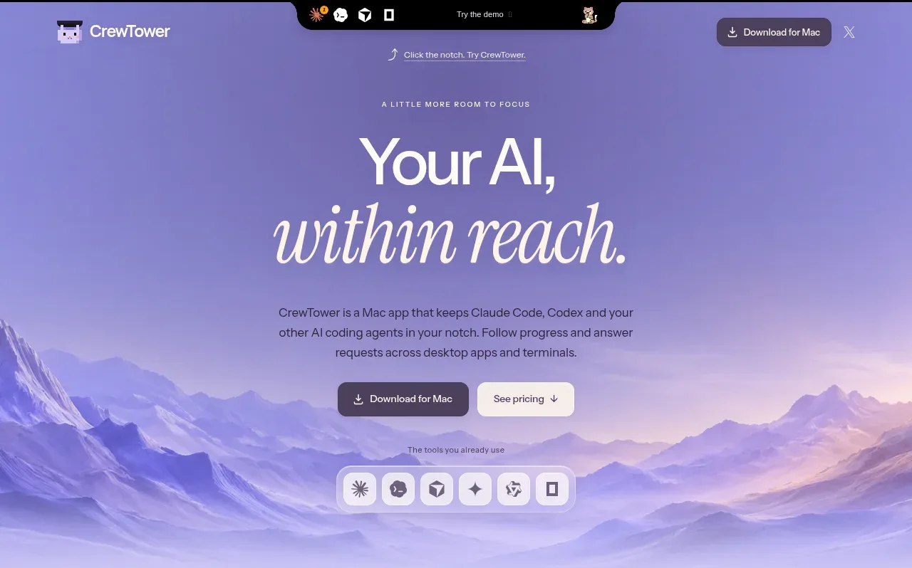
 Focus-oriented hero
CrewTower Mod for Claude Code · Hero
Focus-oriented hero
CrewTower Mod for Claude Code · Hero
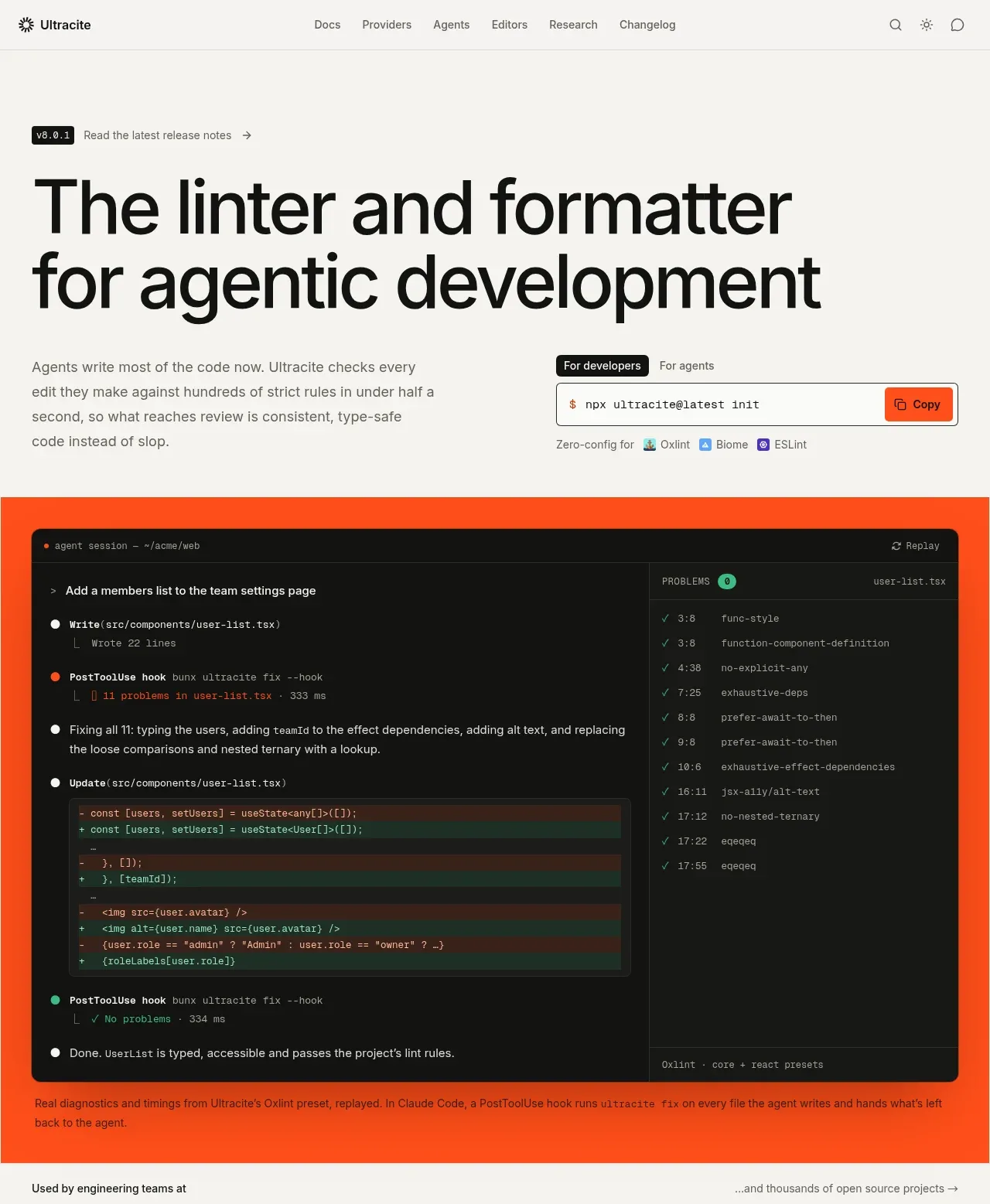
 Agentic development hero with live terminal preview
Ultracite v8 · Hero
Agentic development hero with live terminal preview
Ultracite v8 · Hero
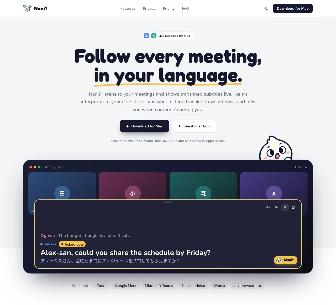
 Translation meeting hero
NANI??? · Hero
Translation meeting hero
NANI??? · Hero
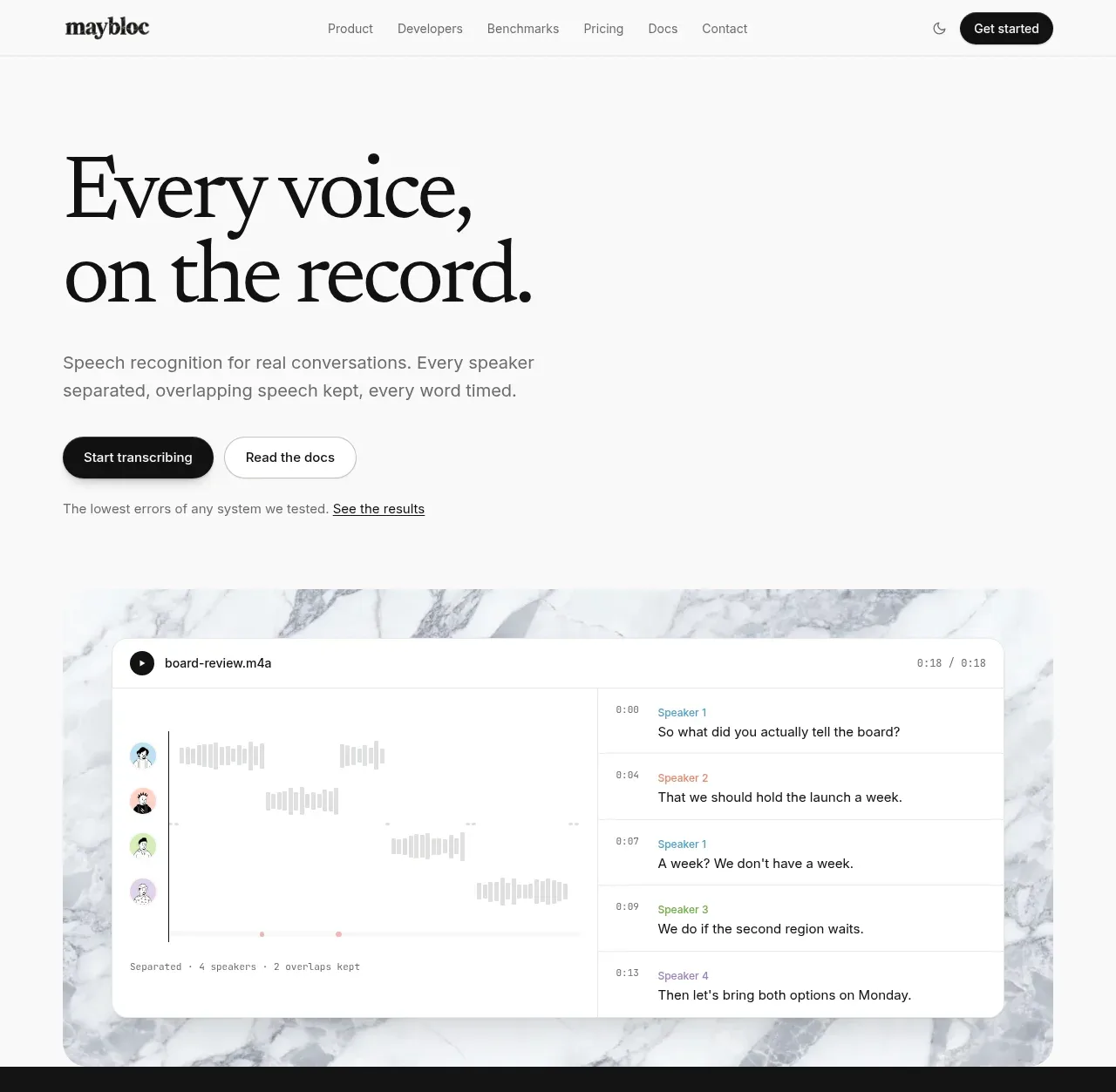
 Editorial speech transcription hero
Maybloc · Hero
Editorial speech transcription hero
Maybloc · Hero