 kage
kage
payflip.xyz

Design analysis
A split conversion band uses a large download message on the left and a floating mobile product mockup on the right, with store buttons and a small navigation cue.
Prompt preview
## Reference images

Study these alongside the description below: hierarchy, rhythm, spacing, colour. Build for the product you are asked about, using this design language.

- Component: https://kage-design-assets.t3.tigrisfiles.io/components/payflip/0e07de96-2e0c-4347-b2be-d38a87386064-1789538773-8.webp
- Full page it was cut from: https://kage-design-assets.t3.tigrisfiles.io/screenshots/payflip/0e07de96-2e0c-4347-b2be-d38a87386064-1789538648080-full.webp
- Component on Kage: https://kage.design/component/payflip-cta

## Before you start
Ask what the user's primary conversion action is, which devices are supported, and what brand mood the CTA should convey.

Build a wide dark CTA section with a subtle olive-to-black atmospheric glow. Use a two-column layout: left side has a small platform/status pill, a very large two-line headline with one lime phrase, a muted supporting sentence, and two app-store or primary-action buttons; right side has a tall rounded mobile-device mockup showing an abstract dashboard with balance, action buttons, and recent activity. Add a small compatibility note under the buttons and, if useful, a restrained row of anchor pills beneath the mockup. Palette: #08090b, #14170e glow, #f4f4f2, #92969f, #d9f21f, device black #020304, borders #272b30.

Give the mockup a believable silhouette and enough contrast to read, but keep it secondary to the headline. Stack the layout on mobile with the device below the CTA copy.

### Never
- Never copy logos, product names, copy, illustrations, or imagery from the reference.
- Never imitate a specific app-store badge exactly if brand assets are unavailable.
- Never let decorative glow reduce text contrast.
More components

 Final conversion banner
tiun. · Call to action
Final conversion banner
tiun. · Call to action

 Final download call to action
Grimo AI · Call to action
Final download call to action
Grimo AI · Call to action
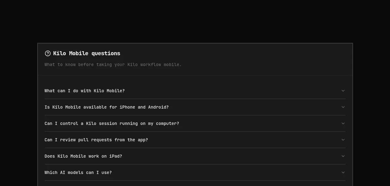
 Download conversion panel
Kilo Code for iOS and Android · Call to action
Download conversion panel
Kilo Code for iOS and Android · Call to action
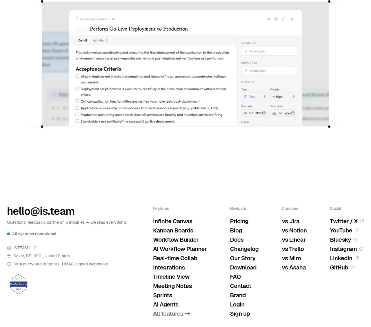
 Final conversion CTA
is.team · Call to action
Final conversion CTA
is.team · Call to action

 Studio closing call to action
FATHER · Call to action
Studio closing call to action
FATHER · Call to action
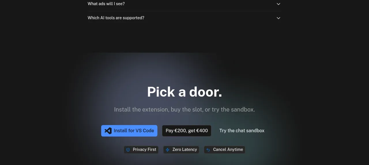
 Final conversion panel
Idlen · Call to action
Final conversion panel
Idlen · Call to action