 kage
kage
payflip.xyz

Design analysis
A long-form fintech landing page uses near-black alternating section backgrounds, compact uppercase eyebrow labels, and oversized white headlines with lime emphasis to establish a technical but approachable tone. The page develops from a product demo hero into increasingly structured proof: thesis cards, receiving-channel examples, a three-step flow, use-case grids, reversible-payment mechanics, agent tooling, then an app download CTA and dense multi-column footer. Thin borders, low-radius dark panels, tiny metadata, and embedded pseudo-product interfaces make the explanation feel like a protocol rather than a conventional marketing page.
Prompt preview
## Reference images

Study these alongside the description below: hierarchy, rhythm, spacing, colour. Build for the product you are asked about, using this design language.

- Full page: https://kage-design-assets.t3.tigrisfiles.io/screenshots/payflip/0e07de96-2e0c-4347-b2be-d38a87386064-1789538648080-full.webp
- Above the fold: https://kage-design-assets.t3.tigrisfiles.io/screenshots/payflip/0e07de96-2e0c-4347-b2be-d38a87386064-1789538643766.webp
- Design on Kage: https://kage.design/designs/payflip-landing-page

## Before you start
Ask the user what they are building, who it is for, and what brand assets they already have (name, colours, type choices, logo, and any existing UI). Wait for their answers before proceeding. Apply the system below to their product, not to the reference product, and replace all example copy with content appropriate to their audience.

## Page structure
1. **Fixed top navigation** — Use a very dark, shallow header with the product mark at left, a compact row of section links in the middle, and one bright lime primary action at right.
2. **Hero / sender-and-recipient demo** — Center a small pill-shaped protocol status label above an oversized headline with one phrase highlighted in lime. Follow with a muted two-line explanation, paired platform-download buttons, a tiny reassurance line, and two large side-by-side dark product mockups showing the sending and receiving states.
3. **Thesis section** — Switch to a slightly lighter charcoal background. Center an eyebrow and a large statement with a lime final line, then place three equal consequence cards in a row. Finish with a full-width bordered callout bar containing a compact icon block, bold thesis sentence, supporting microcopy, and a right-aligned status pill.
4. **Receiving-money section** — Return to the near-black background. Center the eyebrow, headline, and lime instructional subline, then show four narrow channel cards in a four-column grid. Each card should resemble a different notification or message surface and end with a clear action button.
5. **How-it-works section** — Use the lighter charcoal treatment again. Center a short headline and lime formula, then present three numbered cards in a row: identity/name, amount/parameters, and send/claim. Include miniature interface snippets inside each card and a centered explanatory note below the grid.
6. **The-shift / surfaces section** — Introduce the idea of multiple payment surfaces with a centered headline and supporting sentence. Show six cards in a three-column by two-row grid, each with a lime number, small utility icon, title, and short description. End with a full-width dark strip that compresses the behavior into a simple token-and-arrow sequence.
7. **Return-guarantee section** — Use the charcoal background and a centered headline with a lime phrase. Below it, create a wide two-column proof area: a larger lifecycle/state-machine panel on the left and a market-opportunity/statistic panel on the right. Add four compact use-case cards beneath, followed by a bordered positioning statement bar.
8. **AI-agent section** — On near-black, center a small technical eyebrow, a two-line headline with lime emphasis, and a short explanation. Place two large panels side by side: an agent allowance/activity console with rows and toggles, and a comparison/protocol panel with highlighted additions and compact metrics.
9. **Mobile app CTA** — Use a subtle lime-tinted radial glow behind a split layout. Put the eyebrow, large left-aligned headline, supporting copy, download buttons, and compatibility note on the left; place a tall phone mockup with a dark app screen on the right. Add small pill-like screen navigation labels beneath or beside the phone.
10. **Footer** — Use the darkest background and a generous top border. Put the mark, short positioning sentence, legal disclaimer, and contact/social buttons in the left column; place Product, Use cases, and Legal link groups in three columns. Finish with a small copyright and company/legal line along the bottom.

## Design language
- Build hierarchy with a very large, heavy sans-serif display face for section headlines, compact medium-weight body text, and tiny uppercase monospace-like metadata labels with generous letter spacing.
- Keep the page technical and high-contrast: use near-black backgrounds around `#070809` and alternate charcoal sections around `#111318`; use off-white text near `#F2F3F1`, muted gray text around `#858990`, and a vivid lime accent around `#D9F522` for emphasis, status, numbers, and primary actions.
- Make lime selective rather than decorative: reserve it for the key word in headlines, active states, status indicators, borders on important callouts, buttons, and small data highlights. Do not flood whole sections with accent colour.
- Change rhythm down the page: begin with spacious centered hero composition and large mockups, move into medium-density explanatory card grids, then increase information density in the state-machine and agent-console sections before relaxing again for the app CTA and footer.
- Use a broad centered container, roughly 1100–1250px on desktop, with consistent horizontal gutters and generous vertical section padding. Use three- and four-column grids with equal card widths and strong alignment.
- Treat cards as dark instrument panels: use `#12151D` or `#151820` fills, 1px borders around `#252A32`, subtle inner highlights, and little or no shadow. Keep corners restrained, generally 3–8px, instead of using soft rounded SaaS cards.
- Use thin separators, compact labels, tiny status dots, terminal-style headers, segmented controls, data rows, and miniature UI mockups to communicate a payment protocol. Favor visible structure over decorative illustration.
- Make buttons dense and rectangular-to-softly-rounded, with bright lime primary buttons using dark text and charcoal secondary buttons with light borders. Include small platform icons only when they are appropriate to the user's own product.
- Pair bold display typography with restrained gray supporting copy. Use short line lengths, intentional line breaks in hero and section headlines, and lime-highlighted phrases to create a repeated verbal rhythm.
- Use simple line or utility icons in muted gray or lime inside cards; keep them subordinate to text and data. Avoid large illustrations and photography unless the user's product requires them.
- Where interaction is visible, provide restrained hover brightening, a thin lime border or glow on focused cards, button color transitions, and subtle status/toggle changes. Avoid bouncy animation; use short 150–220ms transitions and optional low-key reveal animations as sections enter the viewport.
- Make the long page responsive: collapse multi-column cards to one column on narrow screens, keep the hero mockups readable by stacking them, preserve the accent hierarchy, and turn the desktop navigation into a compact menu without losing the primary action.

## Never
- Do not copy the reference product's logo, wordmark, product name, tagline, copy, claims, interface text, numbers, or brand-specific navigation.
- Do not reuse the reference's payment mockups, phone screen, protocol diagrams, illustrations, photography, or icon set; create new product-specific UI examples and use a neutral icon library or simple CSS shapes where needed.
- Never present the result as Payflip or imply affiliation with it. Use the user's own product identity, content, terminology, and brand assets throughout.
Components from this page
All components
 Dark utility navigation
Payflip · Navigation
Dark utility navigation
Payflip · Navigation
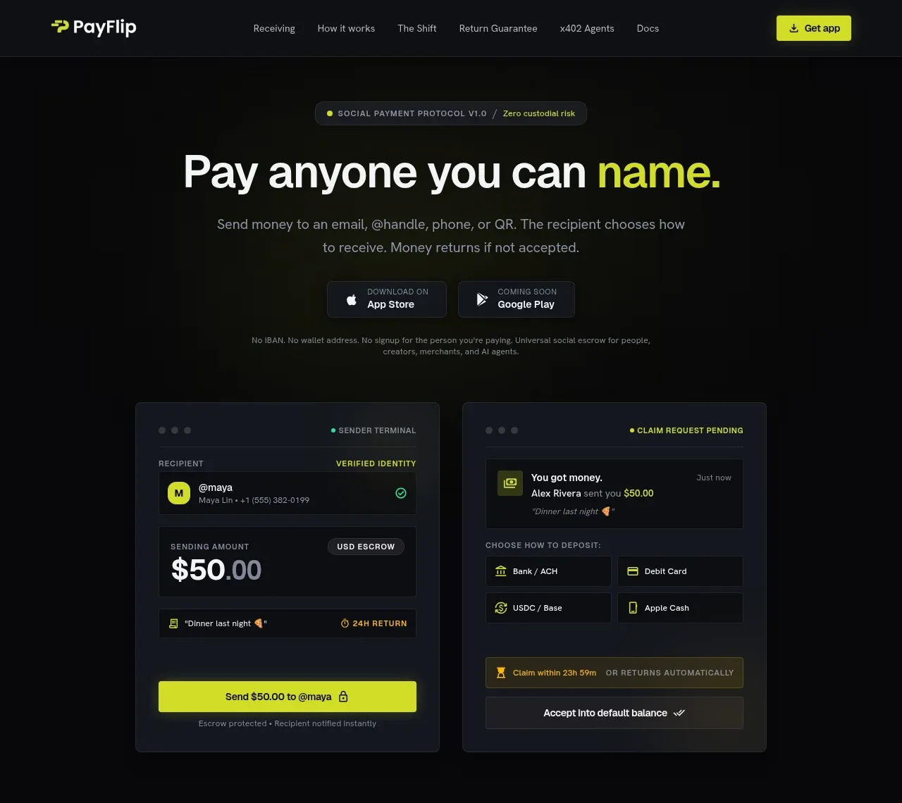 Identity-first payment hero
Payflip · Hero
Identity-first payment hero
Payflip · Hero
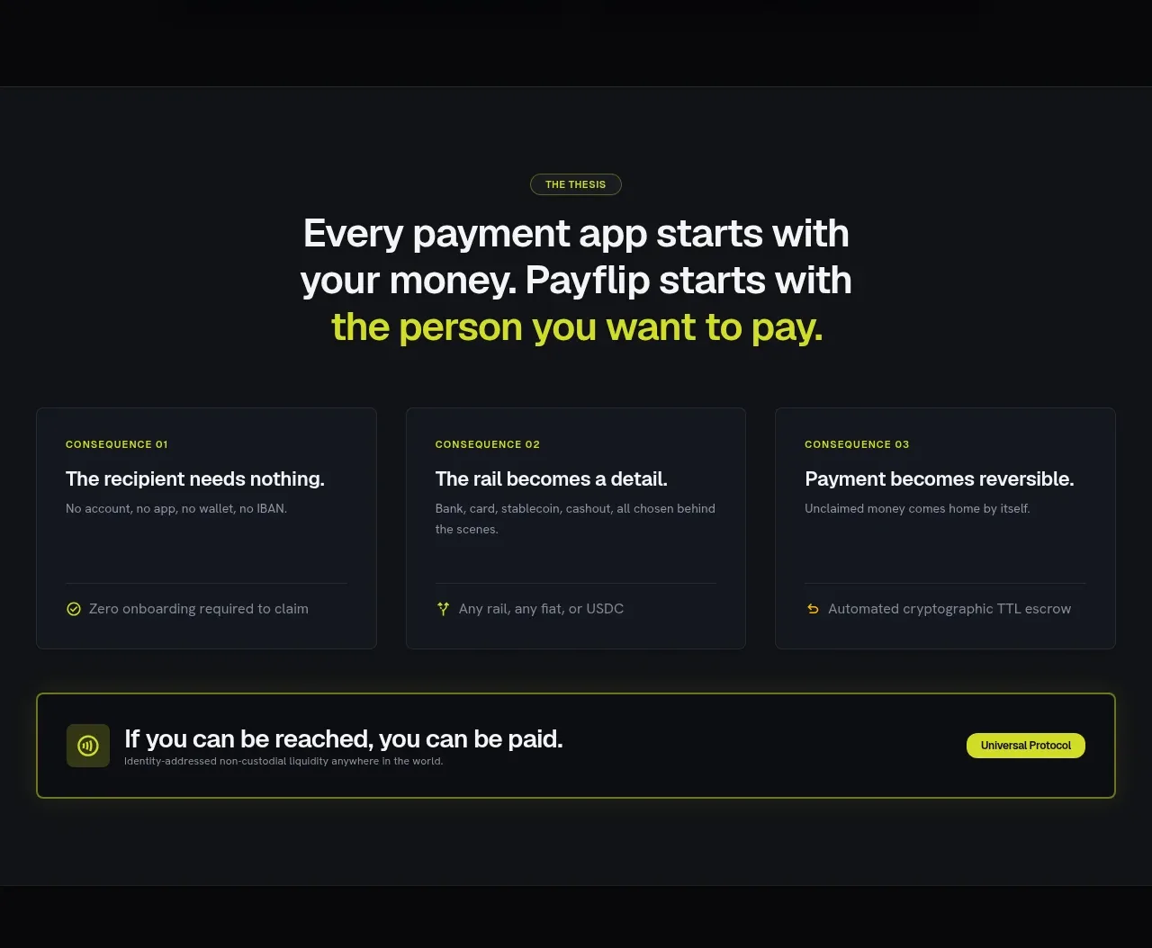 Thesis consequence cards
Payflip · Feature grid
Thesis consequence cards
Payflip · Feature grid
 Receiving money channels
Payflip · Feature grid
Receiving money channels
Payflip · Feature grid
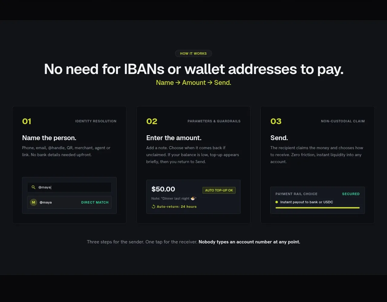 Three-step payment flow
Payflip · Feature grid
Three-step payment flow
Payflip · Feature grid
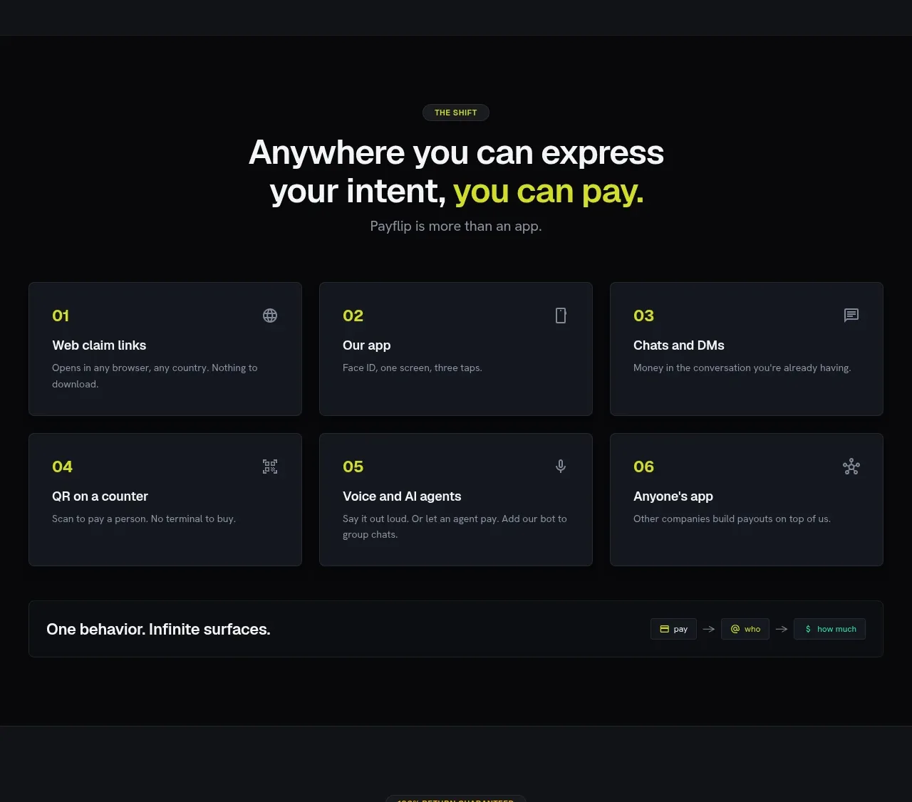 Payment surfaces grid
Payflip · Feature grid
Payment surfaces grid
Payflip · Feature grid
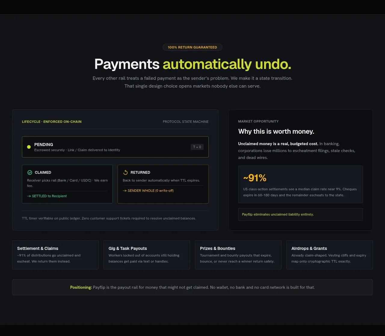 Automatic return guarantee
Payflip · Feature grid
Automatic return guarantee
Payflip · Feature grid
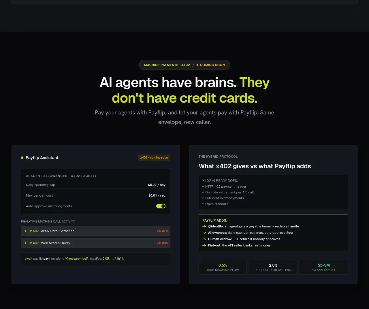 AI agent payments
Payflip · Feature grid
AI agent payments
Payflip · Feature grid
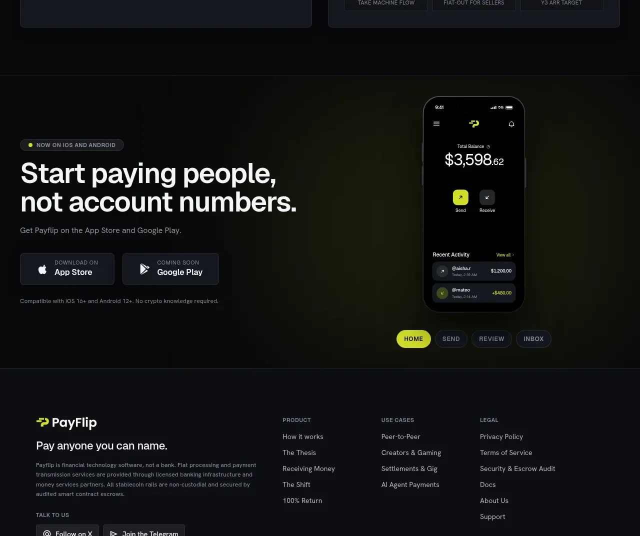 Mobile app conversion CTA
Payflip · Call to action
Mobile app conversion CTA
Payflip · Call to action
 Multi-column product footer
Payflip · Footer
Multi-column product footer
Payflip · Footer


