kage
kage
payflip.xyz

Design analysis
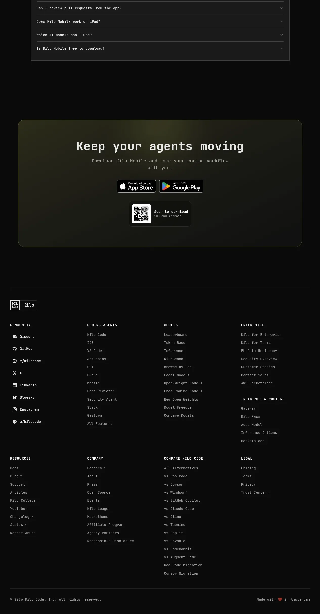
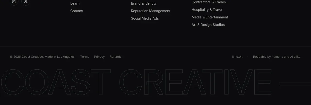
The footer closes with a brand statement, grouped navigation and legal links, contact buttons, and a restrained copyright line.
Prompt preview
## Reference images

Study these alongside the description below: hierarchy, rhythm, spacing, colour. Build for the product you are asked about, using this design language.

- Component: https://kage-design-assets.t3.tigrisfiles.io/components/payflip/0e07de96-2e0c-4347-b2be-d38a87386064-1789538773-9.webp
- Full page it was cut from: https://kage-design-assets.t3.tigrisfiles.io/screenshots/payflip/0e07de96-2e0c-4347-b2be-d38a87386064-1789538648080-full.webp
- Component on Kage: https://kage.design/component/payflip-footer

## Before you start
Ask what pages, legal links, contact channels, and brand statement the user's product needs, then apply this information to the structure below.

Build a dark footer with a centered max-width container and a four-column desktop layout. The first column contains the brand mark, a short one-line positioning statement, a compact description, and small contact buttons. The other columns group links under clear uppercase labels such as Product, Use cases, and Legal. Use #101114 background, #e9eaeb primary text, #8b9098 secondary text, #d7ef1f accent, subtle top border #25282e, and small 4–6px button radii. Add a thin bottom row with copyright and support metadata.

Make links keyboard accessible and brighten them on hover. Collapse columns into readable stacked groups on small screens.

### Never
- Never copy logos, product names, copy, illustrations, or imagery from the reference.
- Never hide essential legal or support links behind inaccessible interactions.
- Never use tiny low-contrast text for required information.