 kage
kage
peerspace.com

Design analysis
A dark directory section presents a short statement and a vertically ruled list of major cities, with country codes and a low-friction view-all action.
Prompt preview
## Reference images

Study these alongside the description below: hierarchy, rhythm, spacing, colour. Build for the product you are asked about, using this design language.

- Component: https://kage-design-assets.t3.tigrisfiles.io/components/peerspace-com/2a6d29c3-21bf-4d34-8c1e-93824205de9d-1789146241-5.webp
- Full page it was cut from: https://kage-design-assets.t3.tigrisfiles.io/screenshots/peerspace-com/2a6d29c3-21bf-4d34-8c1e-93824205de9d-1789146208431-full.webp
- Component on Kage: https://kage.design/component/peerspace-sidebar

## Before you start
Ask what the user's product, audience, and brand are, then use this directory structure for their locations or service areas.

Create a dark directory section with a narrow content column offset from the left. Use a large two-line introductory heading, followed by a vertical list of cities or regions separated by subtle #2A2A2A rules. Pair each location with a small uppercase country or region code, keep the list typography large and tactile, and finish with a small light button. Leave the right side mostly open for editorial breathing room or optional contextual media. Use #111111 background, white or soft-gray text, 32–48px heading scale, 16–24px row spacing, and keyboard-focus states for each row.

Never: use the reference logo, product name, exact copy, illustrations, imagery, or distinctive brand assets.
More components

 Advanced data-room features
Papermark Data Rooms · Feature grid
Advanced data-room features
Papermark Data Rooms · Feature grid
 Customer proof and use-case cards
Papermark Data Rooms · Logo cloud
Customer proof and use-case cards
Papermark Data Rooms · Logo cloud
 Conversion banner
Papermark Data Rooms · Call to action
Conversion banner
Papermark Data Rooms · Call to action
 Secure virtual data room hero
Papermark Data Rooms · Hero
Secure virtual data room hero
Papermark Data Rooms · Hero
 Product interface showcase
Papermark Data Rooms · Gallery
Product interface showcase
Papermark Data Rooms · Gallery
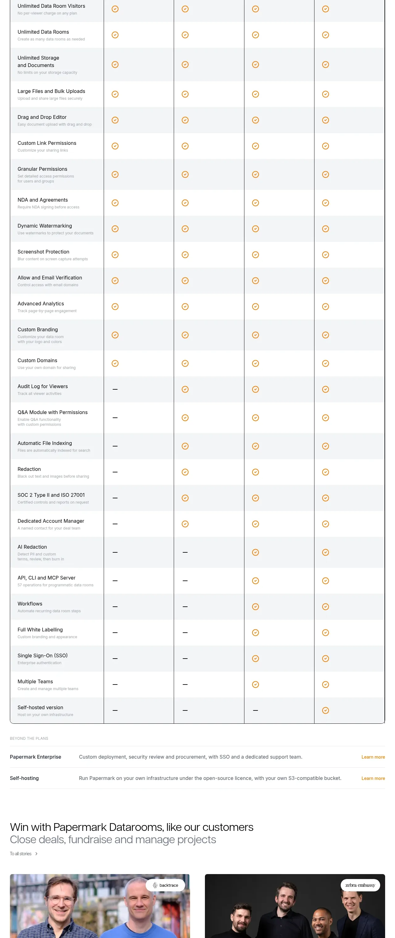 Plan comparison table
Papermark Data Rooms · Pricing table
Plan comparison table
Papermark Data Rooms · Pricing table