kage
papermark.com
Design analysis
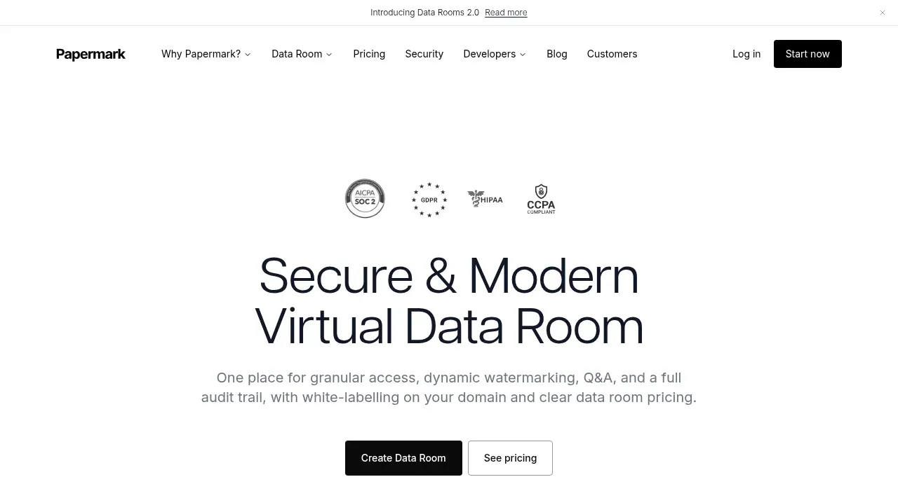
The hero uses a centered security-proof row, an oversized two-line promise, concise supporting copy, and paired actions. A secondary trial strip below creates another conversion opportunity without competing with the main message.
Prompt preview
## Reference images

Study these alongside the description below: hierarchy, rhythm, spacing, colour. Build for the product you are asked about, using this design language.

- Component: https://kage-design-assets.t3.tigrisfiles.io/components/papermark-data-rooms/d90c2ffc-2788-45c6-a044-36fe7b171e0c-1792994576-1.webp
- Full page it was cut from: https://kage-design-assets.t3.tigrisfiles.io/screenshots/papermark-data-rooms/d90c2ffc-2788-45c6-a044-36fe7b171e0c-1792994482140-full.webp
- Component on Kage: https://kage.design/component/papermark-data-rooms-hero

## Before you start
Ask what the user's product is, what outcome it promises, and which brand colors and proof points are credible. Apply the principles below to that product.

Create a centered SaaS hero immediately below the navigation. Start with a small horizontal row of trust or compliance badges, then a large two-line headline focused on the user's primary outcome, followed by one concise explanatory paragraph. Place a filled primary CTA beside a quiet outlined secondary CTA. Beneath the hero, add a full-width slim trial or contact strip with a short prompt on the left and two compact actions on the right. Use a max-width of roughly 760px for the headline and copy, with 24–40px vertical spacing between layers. Use a clean sans serif, headline around 48–64px desktop and 34–42px mobile, normal-to-medium weight, line-height 0.95–1.05. Keep the palette white with near-black text (#171717), muted gray copy (#737373), and one brand accent such as vivid orange (#FF7A00). Use modest 3–5px button radii, thin neutral borders, and a soft shadow only on the trial strip. The hierarchy should make the primary action obvious without making the page feel aggressive.

Never: use logos, product names, copy, illustrations, or imagery from the reference.