 kage
kage
world.pixverse.video
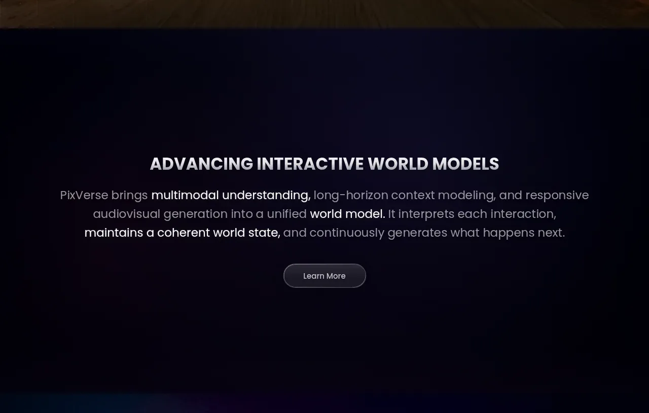
Design analysis
A spacious dark statement section explains the product's underlying capability with a strong all-caps heading, three-line paragraph, and centered Learn More action.
Prompt preview
## Reference images

Study these alongside the description below: hierarchy, rhythm, spacing, colour. Build for the product you are asked about, using this design language.

- Component: https://kage-design-assets.t3.tigrisfiles.io/components/pixverse-r2/7176eddd-e6f3-4887-9746-7bf2cc36c14b-1790402470-2.webp
- Full page it was cut from: https://kage-design-assets.t3.tigrisfiles.io/screenshots/pixverse-r2/7176eddd-e6f3-4887-9746-7bf2cc36c14b-1790402442610-full.webp
- Component on Kage: https://kage.design/component/pixverse-r2-cta

## Before you start
Ask what the user's product, audience, and brand are, then adapt this explanatory section to their message and voice.

Build a spacious centered introduction section on a nearly black midnight background. Use a compact all-caps or small-caps heading at 24–30px, bold weight, followed by a readable 17–20px paragraph constrained to roughly 760px so it forms a deliberate multi-line statement. Emphasize one or two key phrases through brighter text or weight, but avoid excessive decoration. Place a single pill-shaped secondary CTA below with ample vertical separation. Align everything to the page center and allow generous whitespace above and below so the section feels editorial and premium. Use #070714 or #090817 as the base, #f2f0f4 for the heading, #a7a3ae for body copy, and a faint indigo/violet ambient radial glow (#17152d) near the lower edge. Use 1px rgba(255,255,255,.22) borders, 999px button radius, and 14–18px button padding. Buttons need hover, focus, and disabled states.

Never use logos, product names, copy, illustrations, or imagery from the reference.
More components
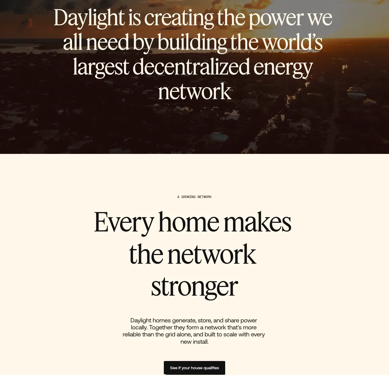
 Network growth CTA
godaylight.com · Call to action
Network growth CTA
godaylight.com · Call to action
 Split closing CTA
godaylight.com · Call to action
Split closing CTA
godaylight.com · Call to action

 Closing conversion banner
FastRouter.ai · Call to action
Closing conversion banner
FastRouter.ai · Call to action
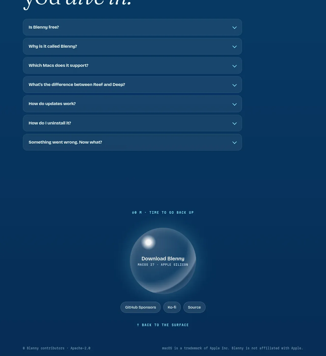
 Final download call to action
Blenny · Call to action
Final download call to action
Blenny · Call to action
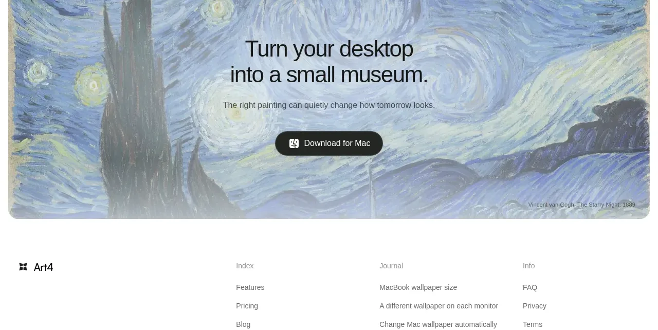
 Visual download call to action
Art4 · Call to action
Visual download call to action
Art4 · Call to action
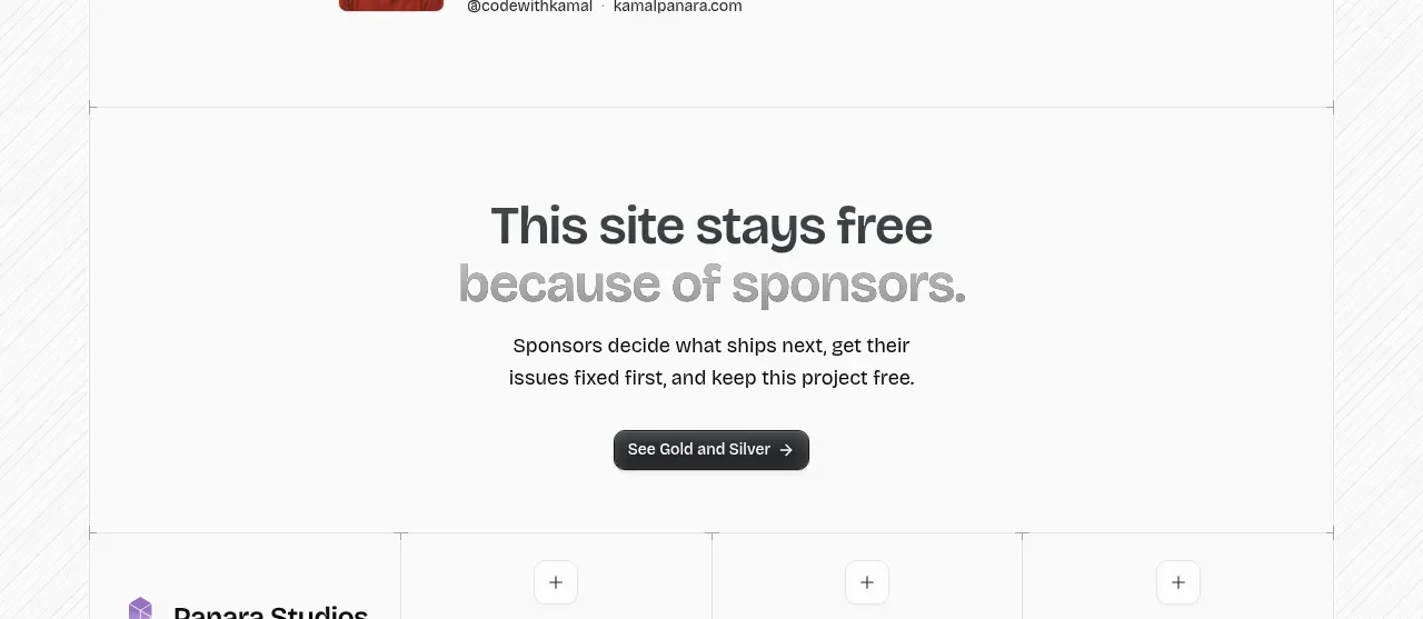
 Sponsor call to action
opensend.cc · Call to action
Sponsor call to action
opensend.cc · Call to action