kage
kage
world.pixverse.video
Design analysis
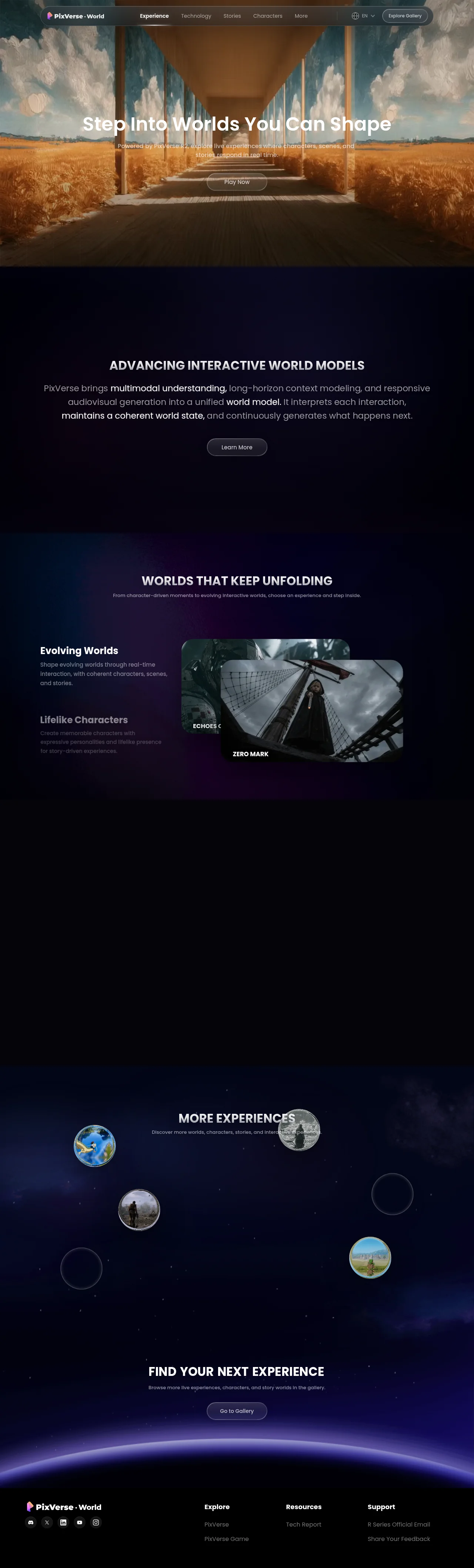
A cinematic dark landing page that sells an AI world model through atmosphere rather than feature lists: a floating glass capsule nav overlays a full-bleed painterly hero, and everything below sits on one near-black canvas where centred uppercase headings and grey paragraphs with bold white inline phrases carry the hierarchy. Density alternates deliberately — tall sparse statement bands against a tabbed showcase of overlapping cinematic media cards, then an asymmetric scatter of planet-like circular discs on a starfield, closing on a glowing planet-horizon footer. Warm gold exists only inside imagery; the chrome stays white-on-black with violet radial glows as the sole accent.
Prompt preview
## Reference images

Study these alongside the description below: hierarchy, rhythm, spacing, colour. Build for the product you are asked about, using this design language.

- Full page: https://kage-design-assets.t3.tigrisfiles.io/screenshots/pixverse-r2/7176eddd-e6f3-4887-9746-7bf2cc36c14b-1790402442610-full.webp
- Above the fold: https://kage-design-assets.t3.tigrisfiles.io/screenshots/pixverse-r2/7176eddd-e6f3-4887-9746-7bf2cc36c14b-1790402436156.webp
- Design on Kage: https://kage.design/designs/pixverse-r2-landing-page

## Before you start
Ask the user what they are building, who it is for, and what brand assets they already have (name, logo, colours, typeface). Wait for their answers before writing any code — everything below is applied to their product, not to the reference site.

## Page structure
Build a single dark, immersive landing page with these sections, top to bottom:

1. **Floating pill navbar** — a rounded capsule bar floating over the hero (not a full-width strip): logo + wordmark left, 4–5 centred nav links, right side a small globe/language selector and one white pill CTA. Semi-transparent dark glass with backdrop blur.
2. **Full-bleed cinematic hero** — an edge-to-edge image or looping video fills the viewport; a centred stack of large sentence-case headline, two-line subcopy, and one white pill button, placed low-centre with a soft text shadow for legibility.
3. **Mission statement section** — near-black band, huge vertical padding, centred uppercase section heading, a 3-line centred paragraph in muted grey with 2–3 bold full-white inline key phrases, and one dark pill button with a faint border. No imagery at all.
4. **Feature showcase** — violet radial glow behind the section; centred heading plus one-line subcopy; then a two-column split: left a vertical list of 2–3 feature titles with short descriptions where only the active item is full-white and the rest are dimmed; right a diagonal stack of 2–3 overlapping rounded media cards (video stills), each with a small uppercase caption pinned to a corner. This section behaves like a scroll- or click-driven tab showcase.
5. **Scroll staging space** — an intentionally tall, mostly empty dark band after the showcase that gives scroll animations room to breathe; treat it as deliberate negative space, never remove it or fill it.
6. **Orbital discovery section** — starfield/space background; centred heading plus subcopy; then a wide asymmetric scatter of circular elements: a few real circular image "planet" discs of varying sizes plus some outline-only rings, absolutely positioned rather than gridded.
7. **Final CTA** — centred uppercase heading, one-line subcopy, one violet-gradient pill button; directly beneath it a glowing curved planet-horizon arc (large radial gradient clipped to a curve) that transitions into the footer.
8. **Footer** — dark strip sitting under the horizon glow: logo plus a row of circular outlined social icon buttons on the left; three link columns (Explore / Resources / Support-style groupings) on the right.

## Design language
- **Canvas**: one continuous near-black world, base `#05060f`–`#0b0c1c`. Sections are separated by atmosphere (glows, starfields, image bands), never by borders or hard background switches.
- **Colour rule**: UI chrome is strictly monochrome — white text, `rgba(255,255,255,0.55–0.7)` grey secondary text, white or translucent-dark buttons. The only accent is violet-indigo light: radial glows around `#6d4aff` and `#7b3fe4` with deep blue `#2b3a8f`. Warm colour (gold/orange) is allowed only inside photography/video, never in UI elements.
- **Type**: one rounded geometric sans throughout (Poppins/Manrope feel). Hero headline sentence case, ~64–72px, medium weight, white with a soft drop shadow. Section headings ALL-CAPS, bold, 32–40px, centred. Body 16–18px at reduced opacity. Emphasis inside paragraphs comes from bolding individual phrases in full white against grey text. Media captions are 12–14px uppercase bold.
- **Shape**: everything is a pill — the nav capsule, all buttons, the language selector. Cards use 16–24px radius; social icons are 1px-outlined circles. No sharp corners anywhere.
- **Rhythm**: alternate density on purpose — full-bleed media hero → sparse tall text section → media-card showcase → empty staging band → sparse scattered section → CTA → footer. Text sections get 120–200px vertical padding; let the page breathe more as it descends.
- **Depth & atmosphere**: build hierarchy with light, not lines — radial violet glows behind headings, starfields, overlapping cards with slight diagonal offsets, soft large shadows, and a glow arc on the horizon. The only borders are faint `rgba(255,255,255,0.1)` outlines on pills and icon circles.
- **Composition**: almost everything is centre-aligned and symmetric; the orbital section is the single deliberate asymmetry — absolute positioning with disc sizes from ~60px to ~160px and outline-only rings as filler.
- **Motion**: expect scroll-driven behaviour — the feature list highlights one item at a time while cards stack and overlap; discs drift slowly; buttons hover to slight brightness/scale. Keep transitions smooth and cinematic, 300ms+ with ease-out.
- **Media treatment**: film-like cinematic imagery does the emotional work; captions sit in small uppercase type on card corners, and all warm colour lives inside the media.

## Never
- Do not copy the PixVerse name, wordmark, logo, "R2" branding, taglines, nav labels, section headings, or any visible copy from the reference.
- Do not reuse the wheat-field pier, ship/character stills, planet disc images, or any other imagery, illustration or icon set from the page — source or generate neutral placeholder media for the user's own product.
- Never present the result as PixVerse or imply affiliation; the design language transfers, not the content.
Components from this page
All components
 Floating glass navigation
PixVerse R2 · Navigation
Floating glass navigation
PixVerse R2 · Navigation
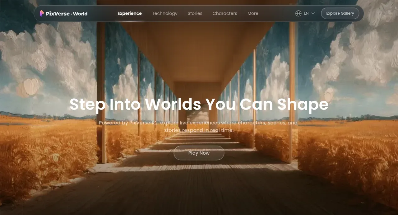 Cinematic world-shaping hero
PixVerse R2 · Hero
Cinematic world-shaping hero
PixVerse R2 · Hero
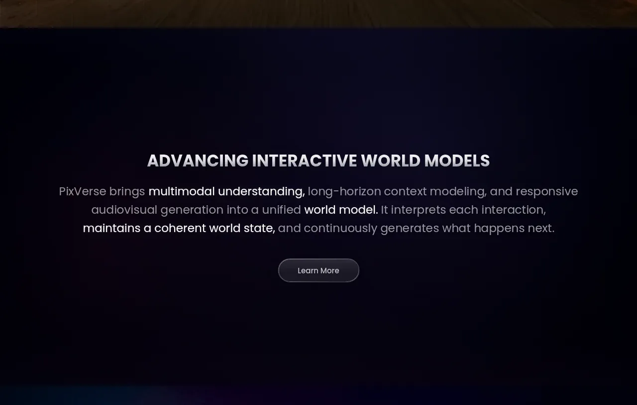 World-model introduction CTA
PixVerse R2 · Call to action
World-model introduction CTA
PixVerse R2 · Call to action
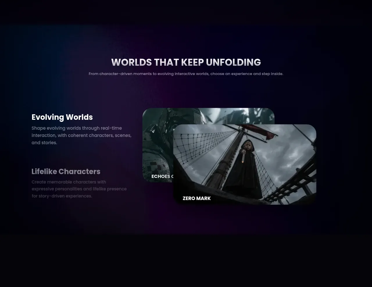 Unfolding worlds experience selector
PixVerse R2 · Feature grid
Unfolding worlds experience selector
PixVerse R2 · Feature grid
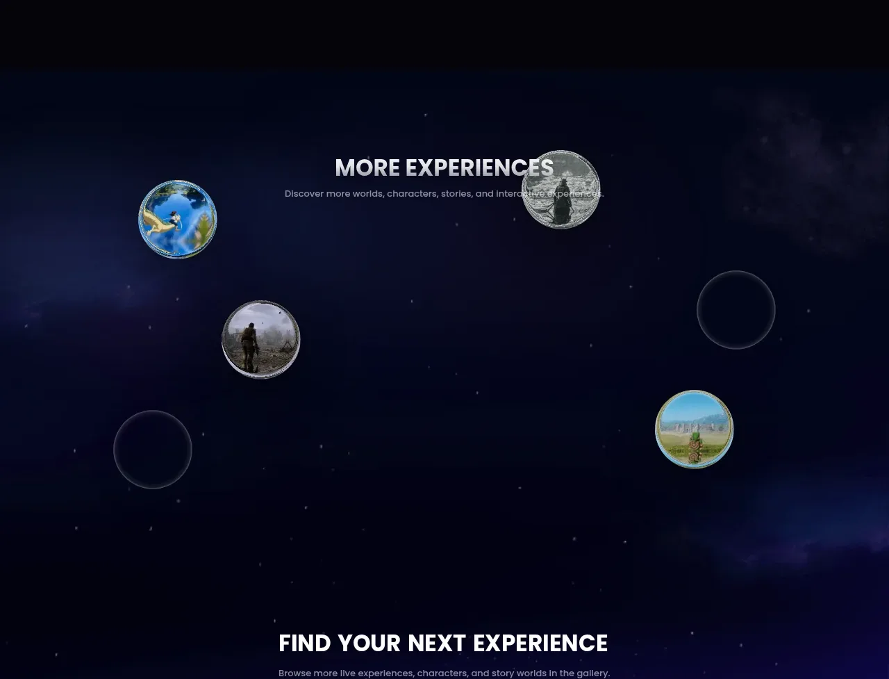 Orbital experiences gallery
PixVerse R2 · Gallery
Orbital experiences gallery
PixVerse R2 · Gallery
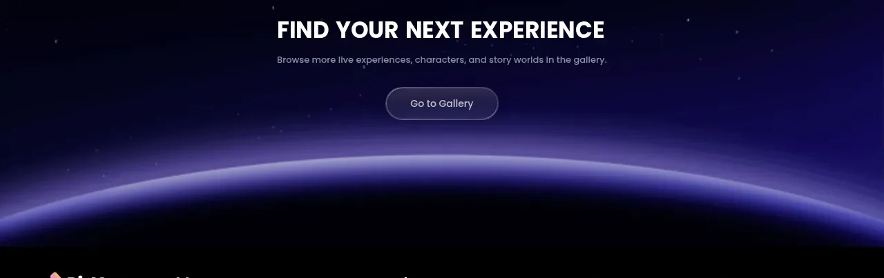 Gallery conversion CTA
PixVerse R2 · Call to action
Gallery conversion CTA
PixVerse R2 · Call to action
 Minimal multi-column footer
PixVerse R2 · Footer
Minimal multi-column footer
PixVerse R2 · Footer