kage
kage
world.pixverse.video

Design analysis
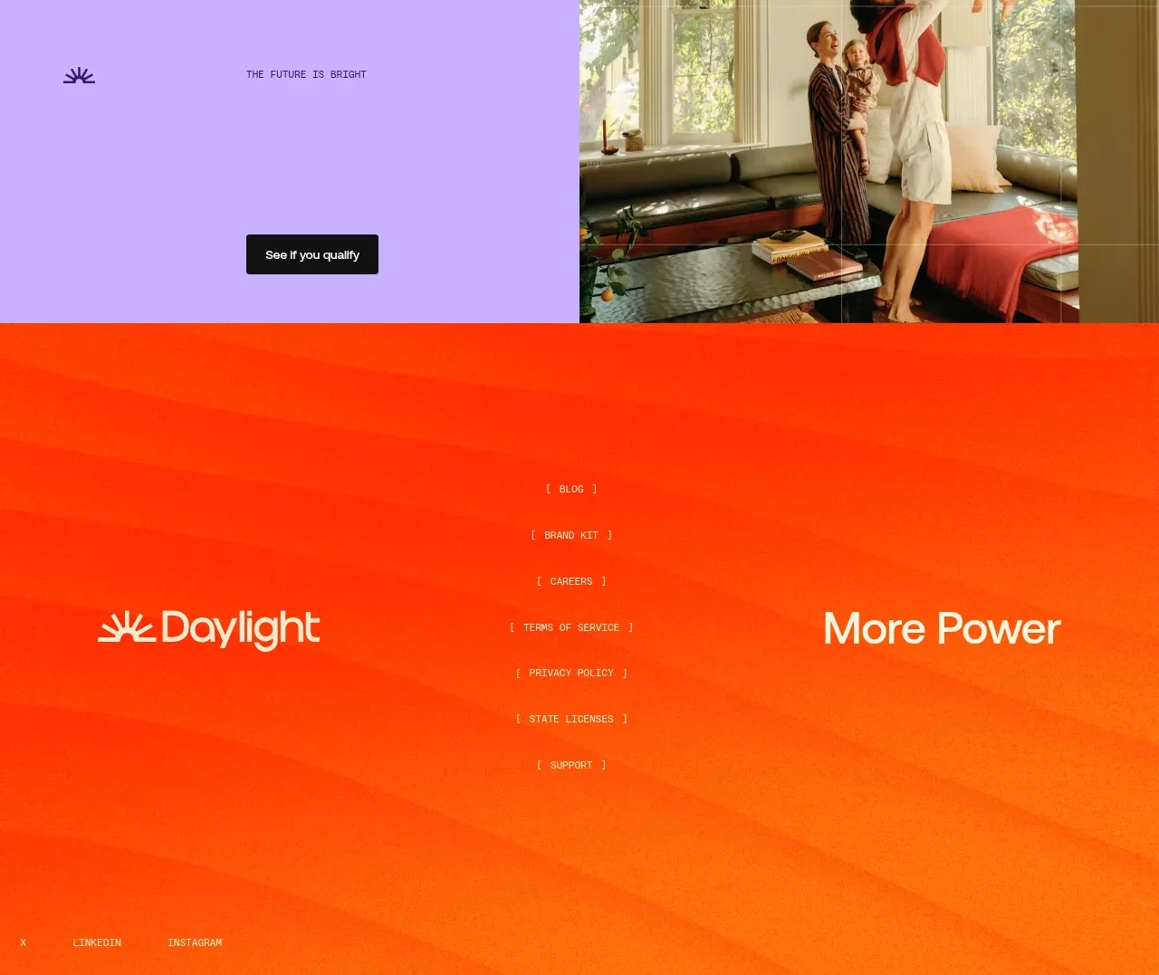
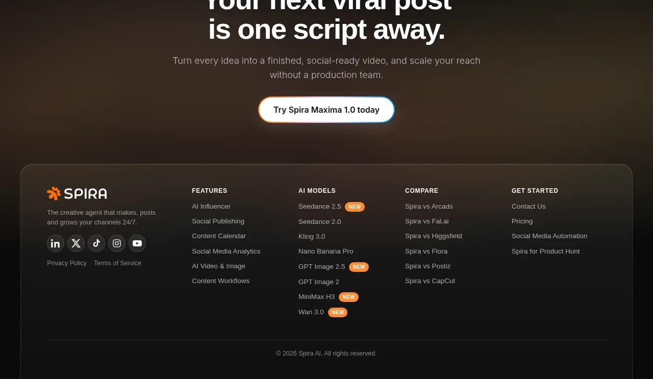
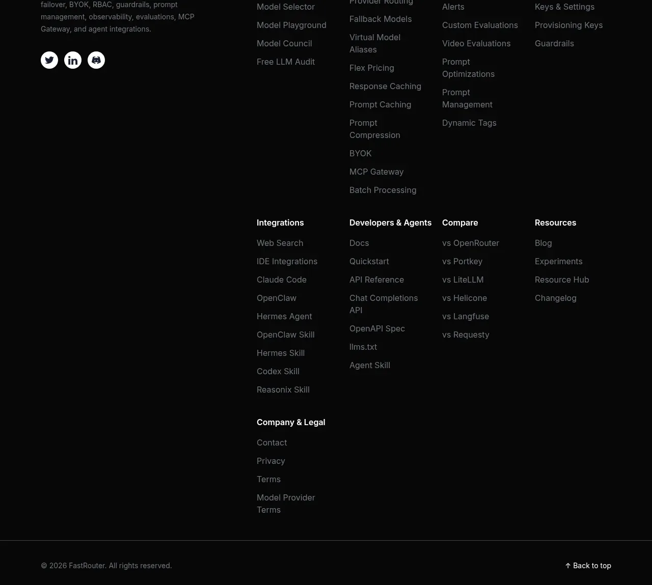
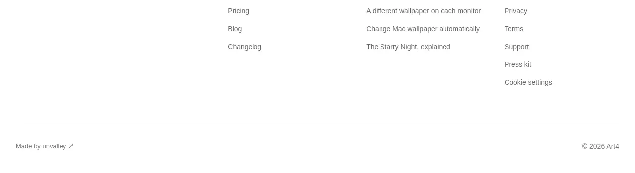
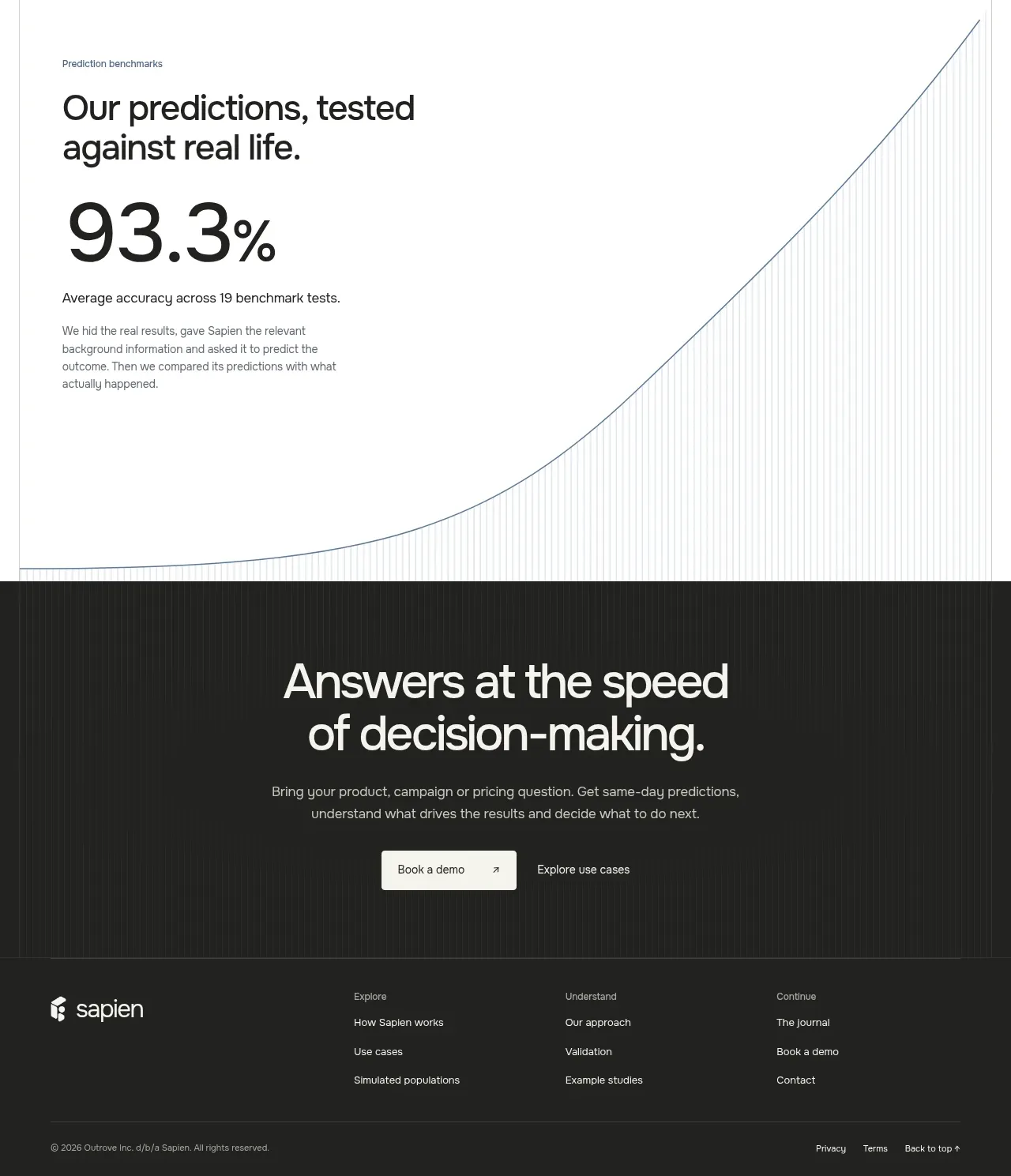
The footer switches to solid black and uses a brand block with social icons alongside compact grouped navigation columns for exploration, resources, and support.
Prompt preview
## Reference images

Study these alongside the description below: hierarchy, rhythm, spacing, colour. Build for the product you are asked about, using this design language.

- Component: https://kage-design-assets.t3.tigrisfiles.io/components/pixverse-r2/7176eddd-e6f3-4887-9746-7bf2cc36c14b-1790402471-6.webp
- Full page it was cut from: https://kage-design-assets.t3.tigrisfiles.io/screenshots/pixverse-r2/7176eddd-e6f3-4887-9746-7bf2cc36c14b-1790402442610-full.webp
- Component on Kage: https://kage.design/component/pixverse-r2-footer

## Before you start
Ask what the user's product, legal needs, social channels, and brand are, then build a footer suited to those answers.

Build a compact responsive footer on solid black. Use a max-width inner container with a left brand/social block and 2–4 link columns on the right. The brand area should include a text treatment or neutral placeholder mark, followed by a small row of circular or rounded social buttons. Group links under concise 13–15px semibold headings with 12–14px muted links beneath. Use #000000 or #030305 background, #f4f2f6 for headings, #87838e for links, and a very subtle top border rgba(255,255,255,.08). Keep 24–40px padding and 24–56px column gaps; stack into an orderly layout on mobile. Social controls and links need hover and keyboard focus states, and the footer should reserve room for copyright/legal links if the product needs them.

Never use logos, product names, copy, illustrations, or imagery from the reference.