 kage
kage
plaid.com

Design analysis
A dark, oversized code panel creates a technical focal point above a pale editorial carousel. The strong contrast, restrained syntax accents, clipped horizontal cards, and circular navigation controls make the section feel both developer-focused and polished.
Prompt preview
## Reference images

Study these alongside the description below: hierarchy, rhythm, spacing, colour. Build for the product you are asked about, using this design language.

- Component: https://kage-design-assets.t3.tigrisfiles.io/components/plaid-com/7f22fbce-e808-4b19-99a1-7dcb31fbfb56-1789060800-5.webp
- Full page it was cut from: https://kage-design-assets.t3.tigrisfiles.io/screenshots/plaid-com/7f22fbce-e808-4b19-99a1-7dcb31fbfb56-1789060772-full.webp
- Component on Kage: https://kage.design/component/plaid-code-block

# Before you start
Ask the user what their product does, who it is for, and what their brand personality, colours, and type choices are. Then apply the principles below to their product rather than reproducing this reference literally.

## Build a technical showcase section
Create a responsive website section that pairs a large code preview with a horizontally browsable set of customer, use-case, or capability cards. The section should communicate technical credibility first, then provide a visual way to explore outcomes or stories.

### Layout and alignment
- Use a soft, very pale blue-white section background, approximately `#F2FBFF` or a colour adapted from the user’s brand.
- Place a large dark code panel near the top of the section, centered within a wide content container. Let it feel oversized and slightly cropped by the viewport or section edge on smaller screens.
- Make the code panel approximately 75–90% of the available desktop width, with a generous maximum width around 1100–1200px and a height around 330–420px.
- Give the area behind the code panel a deep, atmospheric blue-to-indigo gradient, approximately `#173C68` through `#17145D`, with a subtle blurred glow. Keep the effect abstract and restrained.
- Position the panel so it overlaps or visually emerges from the gradient field. Use a dark near-black surface around `#0B1115`, with a large rounded top radius of roughly 24–28px.
- Below the code preview, add a generous vertical gap, then align a section heading and carousel controls on one horizontal row inside the same content grid.
- The heading should sit on the left; controls should sit on the right. On narrow screens, stack them while preserving a clear relationship between title and navigation.
- Put the cards in a horizontal track that extends beyond the right edge of the viewport. Show a partial next card to signal that more content is available. Avoid forcing all cards into equal-width columns.
- Use a desktop card width of roughly 390–430px with 24–40px gaps. On mobile, use a width around 78–88vw so the next item remains discoverable.

### Code panel
- Add a compact route, command, or endpoint label in the panel header using a monospace font, medium size, and muted light grey such as `#B7C0C7`.
- Separate the header from the code body with a thin blue-grey divider, approximately `#234A65`.
- In the body, use a two-column layout: a narrow line-number rail and a flexible code area. Add a vertical divider between them.
- Use line numbers in muted grey, approximately `#A8B0B7`, aligned consistently with the code baseline.
- Use a readable monospace font at approximately 16–18px desktop, with generous line height around 1.8. On mobile, reduce the size slightly but preserve horizontal scrolling or purposeful truncation rather than wrapping long code lines.
- Keep the code mostly light grey `#C6CCD0`, with one restrained syntax accent such as cyan-blue `#3FA7DA` and a small warm yellow accent around `#D8C24A`.
- If the preview is intentionally clipped, fade or truncate long lines at the right edge so the result feels designed rather than broken.

### Typography
- Use a modern sans-serif with a clean, slightly geometric feel, or the user’s existing brand typeface.
- Make the section heading prominent but not oversized: approximately 42–52px on desktop, 32–38px on mobile, with tight line height around 1.05–1.1 and a dark navy colour such as `#071A34`.
- Keep card titles around 26–30px desktop and 22–26px mobile, with a compact line height and medium-to-semibold weight.
- Use text hierarchy clearly: code label, section heading, card image/label, then card title. Avoid adding unnecessary body copy.

### Cards and imagery
- Use editorial case-study or capability cards with a rounded image area, approximately 18–22px radius. If the product does not use customer imagery, substitute an abstract product visual, interface crop, or branded colour field.
- Keep card visuals relatively short and wide, around a 1.55–1.8:1 aspect ratio.
- Add a dark translucent overlay or gradient when text must sit over the image, but prefer placing the card title beneath the image for readability.
- Use a small overline or label above the title only when useful. It should be understated and brand-specific.
- Keep the card track visually open: do not put every item inside a heavy bordered container.

### Controls and interaction
- Provide previous and next circular buttons at the right of the heading row. Use a pale background close to `#E7F4FA`, a thin blue-violet border around `#5F6BD1`, and dark blue arrow icons.
- Buttons should be approximately 54–58px square on desktop and at least 44px square on mobile.
- Add hover and focus states: slightly deepen the background, strengthen the border, and show a visible keyboard focus ring.
- The carousel should support pointer dragging or touch swiping, keyboard navigation, and disabled states at the beginning/end when the track is not infinite.
- Keep motion subtle: use a smooth 300–450ms translate transition and avoid autoplay.

### Spacing, borders, and radius
- Use a generous section rhythm: approximately 72–104px horizontal padding and 80–128px vertical padding on desktop; reduce to 24px horizontal padding and 56–80px vertical padding on mobile.
- Use a consistent 8px spacing scale, with larger gaps between the code panel, heading row, and carousel.
- Keep borders thin and low-contrast. The code panel uses a divider rather than an outer border; cards generally have no border.
- Use large rounded corners on the code panel and image cards, but avoid rounding every text container.
- Add a soft, broad shadow or glow behind the code panel only, with low opacity and a cool blue tint.

### Accessibility and responsive behaviour
- Use semantic headings, a labelled carousel region, and accessible names for previous/next buttons.
- Ensure code contrast is readable and never rely on syntax colour alone.
- Respect reduced-motion preferences by removing carousel transitions and decorative glow animations.
- On small screens, keep the code panel legible with horizontal scrolling or a deliberate clipped preview, stack the heading and controls, and let the carousel remain horizontally scrollable.

## Never
- Never copy the reference’s logos, product names, endpoint names, code content, customer names, or marketing copy.
- Never reuse the reference’s exact imagery, illustrations, card subjects, or brand marks.
- Never make the section dependent on Plaid’s colours, typography, or visual identity; adapt the rules to the user’s product and brand.
- Never hide essential code behind unreadable tiny text, remove keyboard access, or use carousel controls without an accessible label.
- Never reproduce the exact composition as a pixel-for-pixel clone; preserve the underlying pattern of technical preview plus outcome-focused browsing instead.
More components
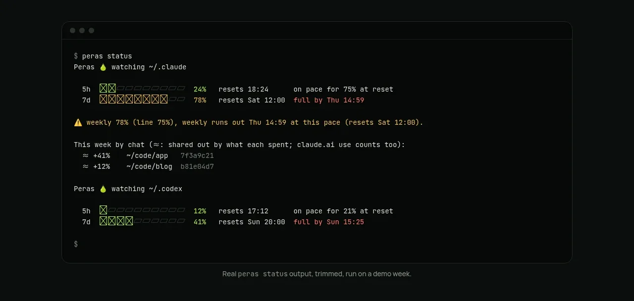
 Terminal status proof
Peras · Code block
Terminal status proof
Peras · Code block
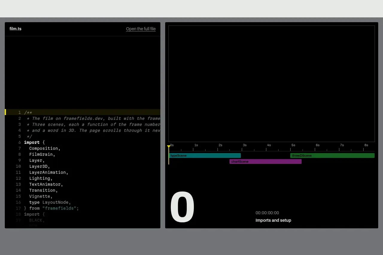
 Live render and code preview
Framefields · Code block
Live render and code preview
Framefields · Code block
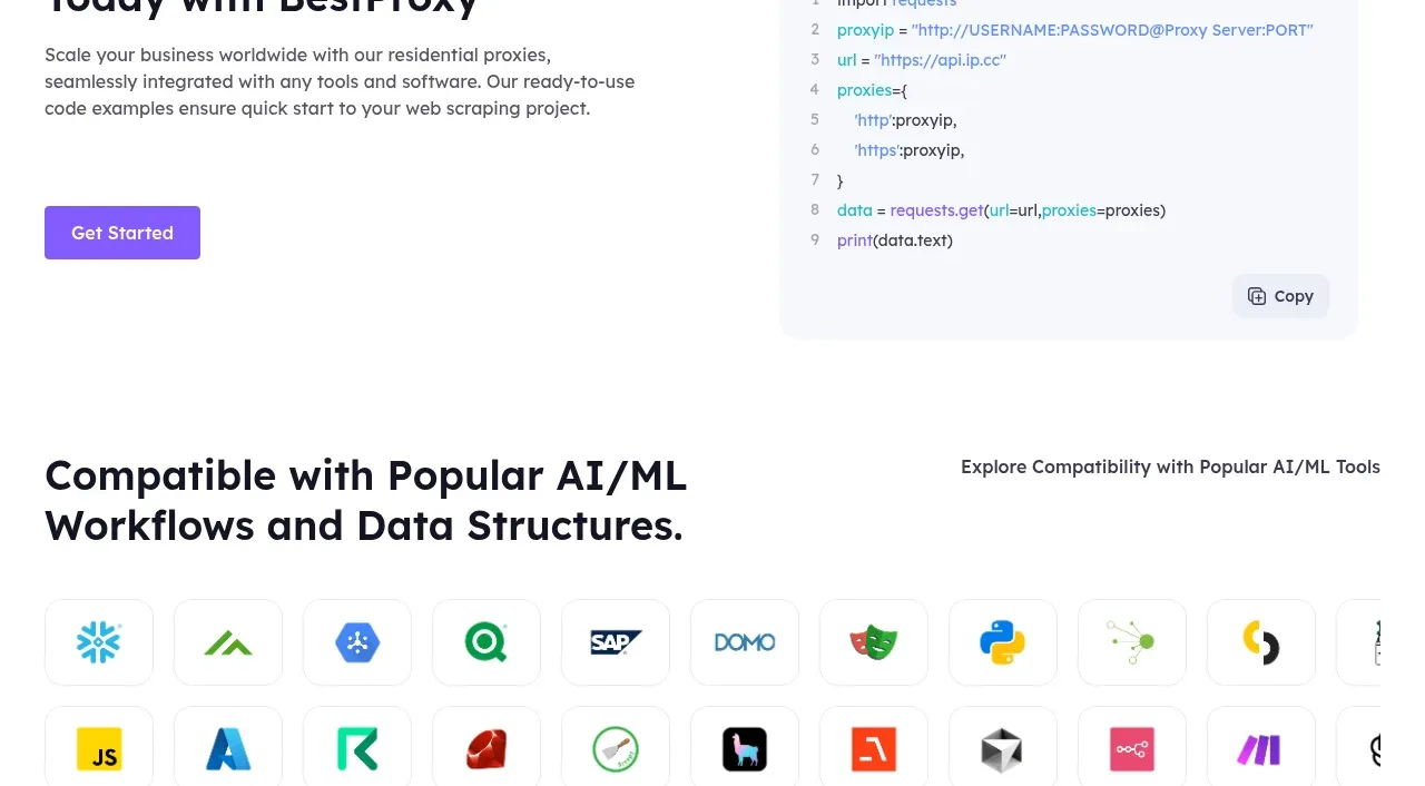
 Developer integration
bestproxy.com · Code block
Developer integration
bestproxy.com · Code block
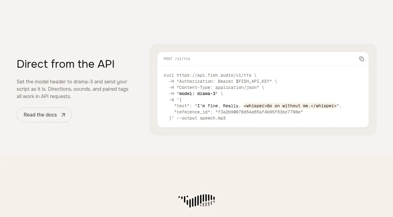
 API integration example
Fish Audio Drama 3 · Code block
API integration example
Fish Audio Drama 3 · Code block
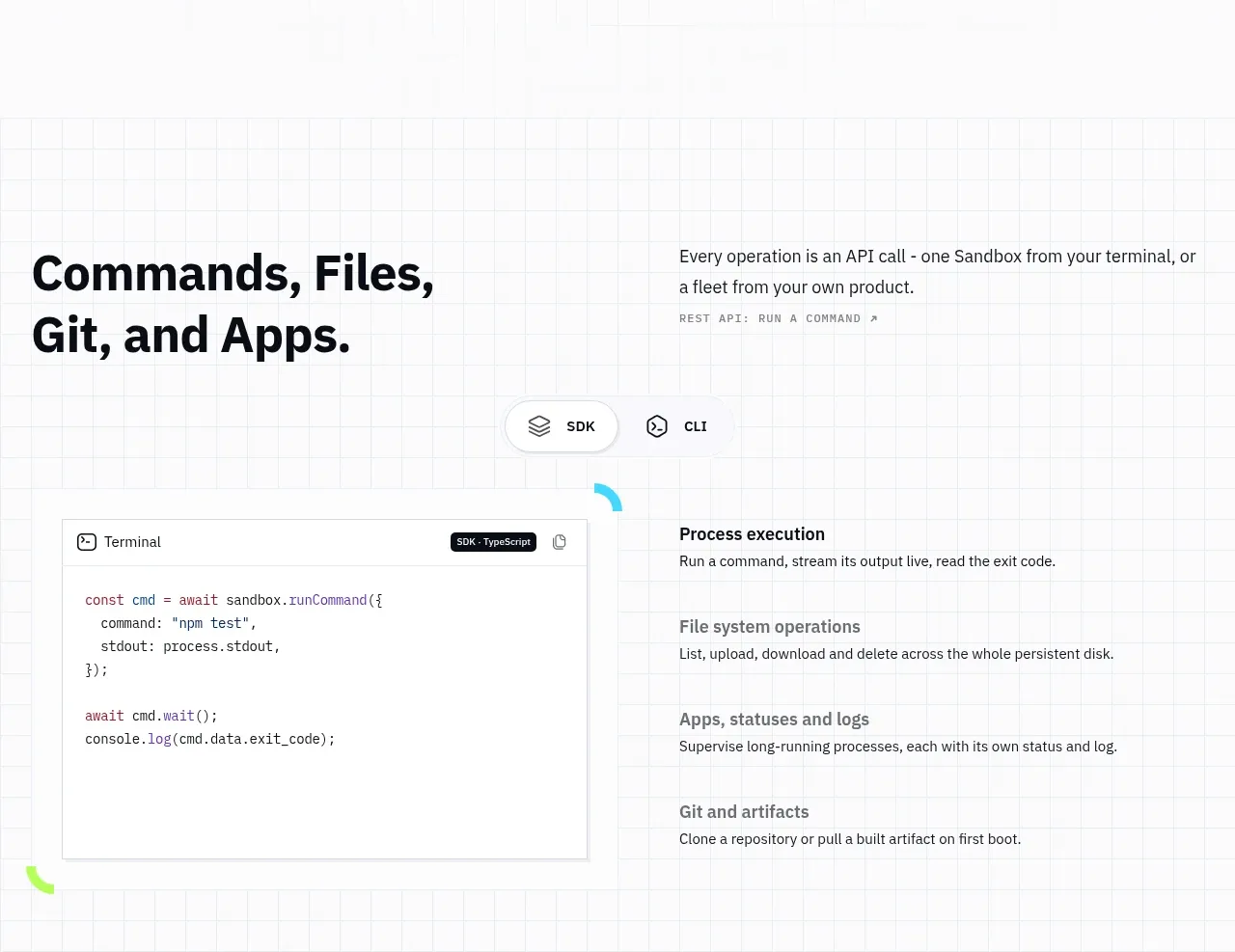
 Commands and API surface
AI Sandboxes by Buddy · Code block
Commands and API surface
AI Sandboxes by Buddy · Code block
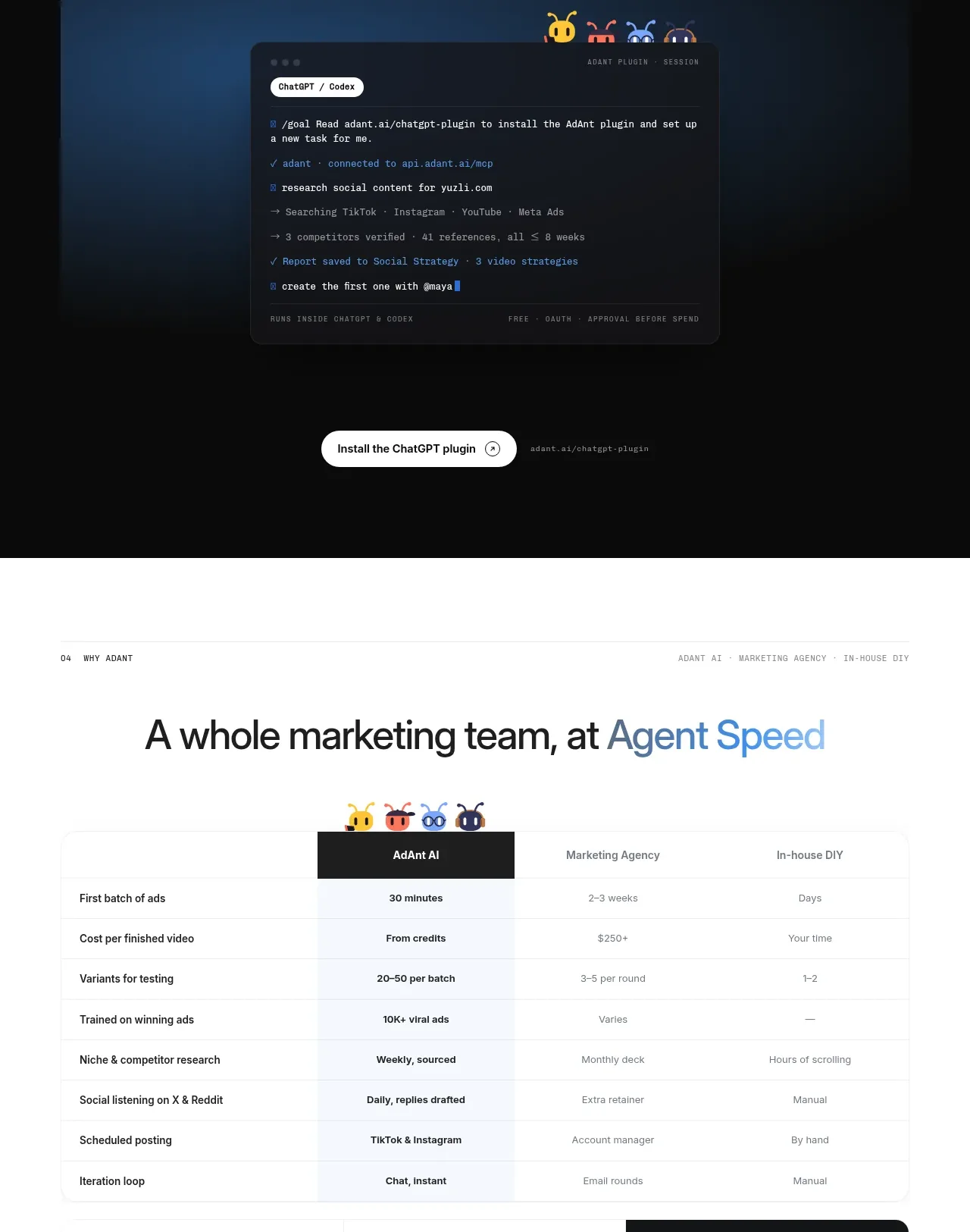
 Chat workspace plugin showcase
AdAnt 2.0 · Code block
Chat workspace plugin showcase
AdAnt 2.0 · Code block