 kage
kage
plane.so
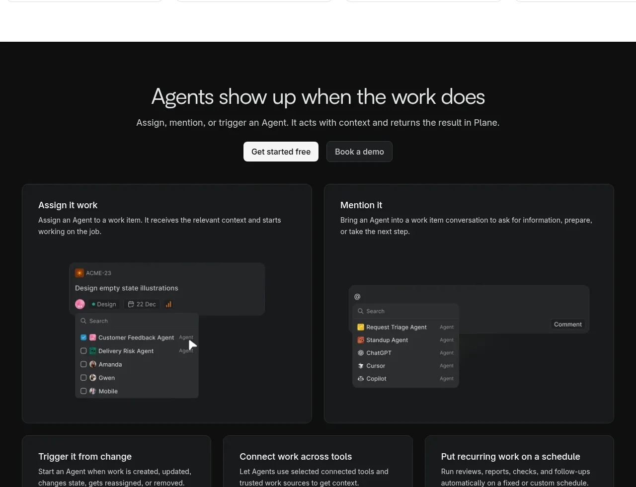
Design analysis
A black section leads with a centered conversion message and then demonstrates several ways the product can be activated through large and small dark cards.
Prompt preview
## Reference images

Study these alongside the description below: hierarchy, rhythm, spacing, colour. Build for the product you are asked about, using this design language.

- Component: https://kage-design-assets.t3.tigrisfiles.io/components/plane-agents/6cd7606f-e6b6-4968-a1a7-76c61b9969ac-1790143342-5.webp
- Full page it was cut from: https://kage-design-assets.t3.tigrisfiles.io/screenshots/plane-agents/6cd7606f-e6b6-4968-a1a7-76c61b9969ac-1790143303447-full.webp
- Component on Kage: https://kage.design/component/plane-agents-cta

## Before you start
Ask what the user's product, audience, and brand are, then apply the principles below to that product rather than copying the reference.

Create a dark, high-contrast activation section on a background around #101112. Center a concise heading, supporting sentence, and paired CTA buttons at the top. Beneath it, use a responsive grid of dark charcoal cards (#181a1c) with subtle borders #2b2e31: two wide cards for primary interaction modes and three smaller cards for additional triggers, integrations, or scheduling. Each card needs a clear title, short explanatory copy, and a realistic but simplified UI mockup or diagram inside. Use white headings, muted gray body text #b9bdc1, 12–16px radii, and generous internal padding. Accent UI elements may use small saturated colors, but keep the overall visual system restrained and technical. On mobile, stack wide cards first, then the smaller cards.

Never: use logos, product names, copy, illustrations, or imagery from the reference.
More components
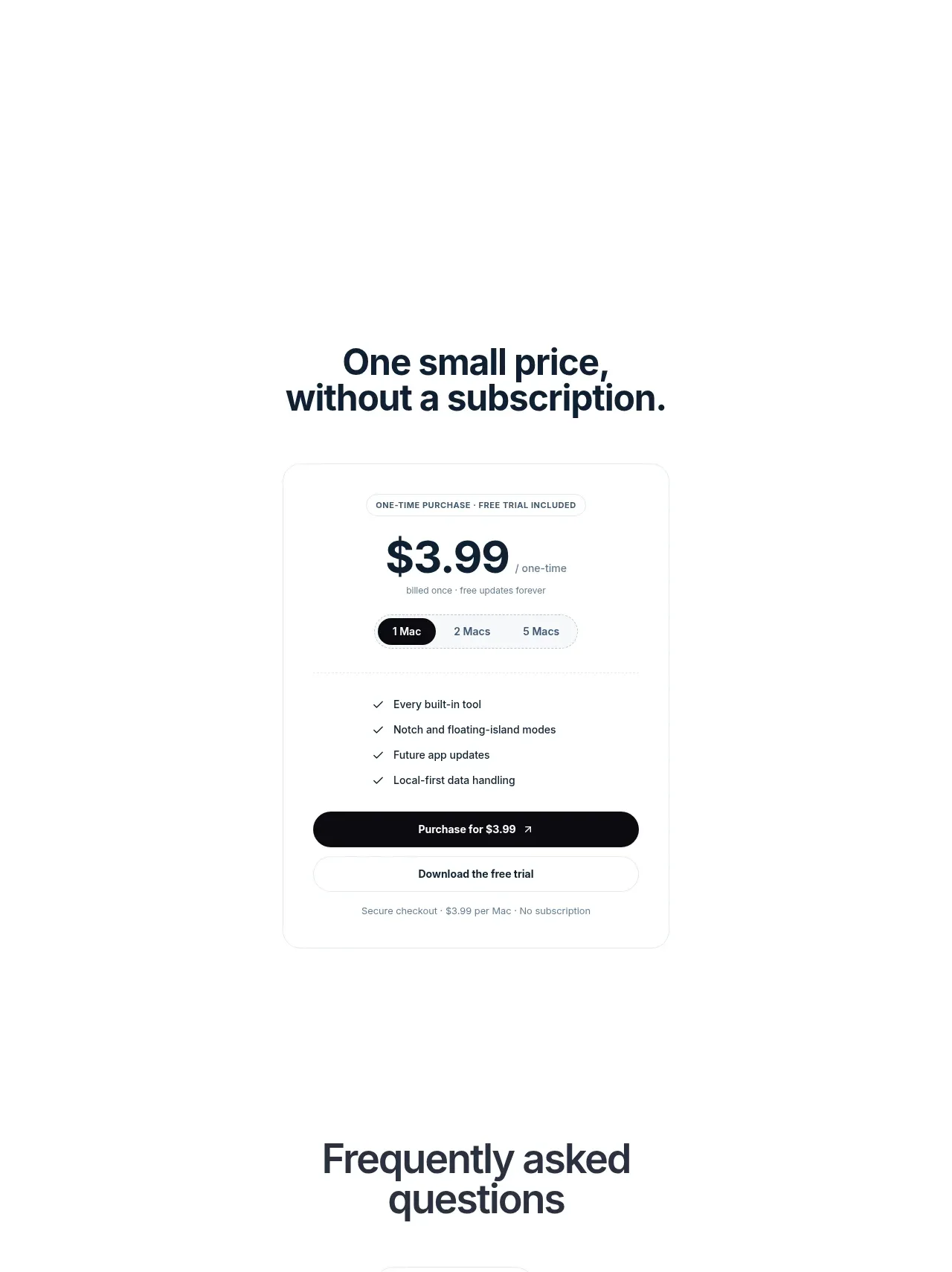
 Visual closing product statement
NotchPop · Call to action
Visual closing product statement
NotchPop · Call to action
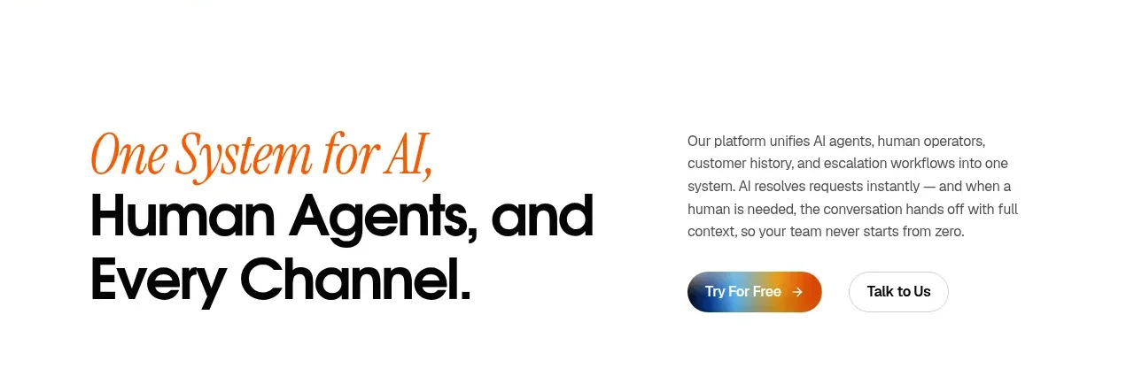
 System positioning statement
IntellAgents.io · Call to action
System positioning statement
IntellAgents.io · Call to action
 Final conversion banner
IntellAgents.io · Call to action
Final conversion banner
IntellAgents.io · Call to action
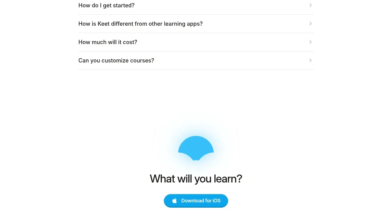
 Final app-download call to action
Keet · Call to action
Final app-download call to action
Keet · Call to action
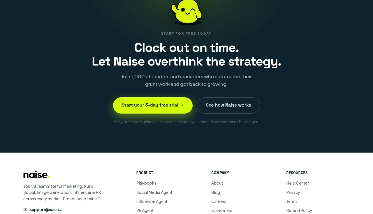
 Dark conversion call to action
Naise AI · Call to action
Dark conversion call to action
Naise AI · Call to action
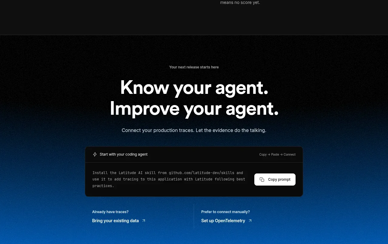
 Connect data and start improving
AgentScore · Call to action
Connect data and start improving
AgentScore · Call to action