 kage
kage
plane.so
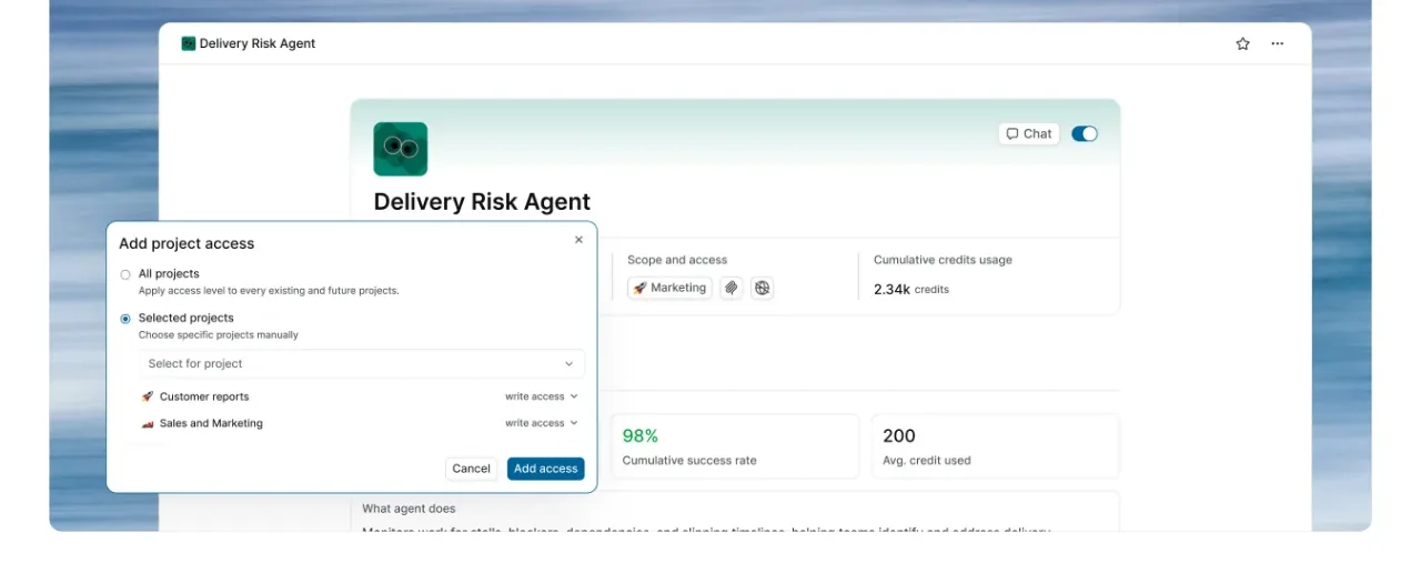
Design analysis
A dark closing CTA uses a centered two-line message, paired buttons, and a curved sequence of colorful abstract tiles to add energy without distracting from conversion.
Prompt preview
## Reference images

Study these alongside the description below: hierarchy, rhythm, spacing, colour. Build for the product you are asked about, using this design language.

- Component: https://kage-design-assets.t3.tigrisfiles.io/components/plane-agents/6cd7606f-e6b6-4968-a1a7-76c61b9969ac-1790143342-7.webp
- Full page it was cut from: https://kage-design-assets.t3.tigrisfiles.io/screenshots/plane-agents/6cd7606f-e6b6-4968-a1a7-76c61b9969ac-1790143303447-full.webp
- Component on Kage: https://kage.design/component/plane-agents-cta-2

## Before you start
Ask what the user's product, audience, and brand are, then apply the principles below to that product rather than copying the reference.

Create a full-width dark closing CTA banner with a centered, concise two-line statement and two buttons beneath it. Add a decorative wave or loose arc of small rounded colorful tiles around the text, keeping the content readable and ensuring the decoration does not become the focal point. Use background #101112, white heading text, muted light-gray supporting text if needed, and a light filled primary button paired with a dark outlined or translucent secondary button. Give the banner generous vertical padding, keep the content max-width around 700px, and make the tile decoration responsive by reducing count and opacity on mobile.

Never: use logos, product names, copy, illustrations, or imagery from the reference.
More components
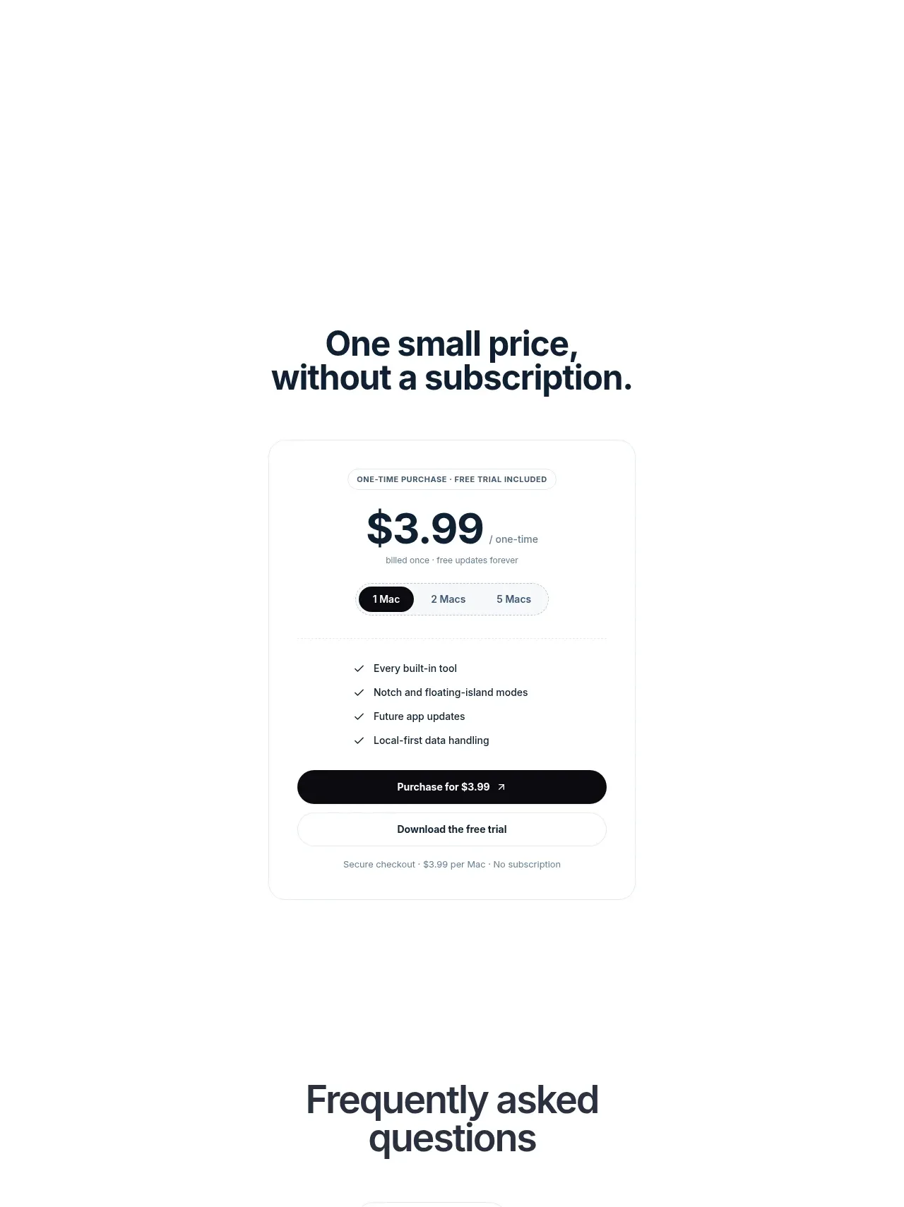
 Visual closing product statement
NotchPop · Call to action
Visual closing product statement
NotchPop · Call to action
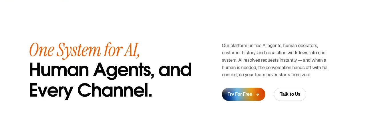
 System positioning statement
IntellAgents.io · Call to action
System positioning statement
IntellAgents.io · Call to action
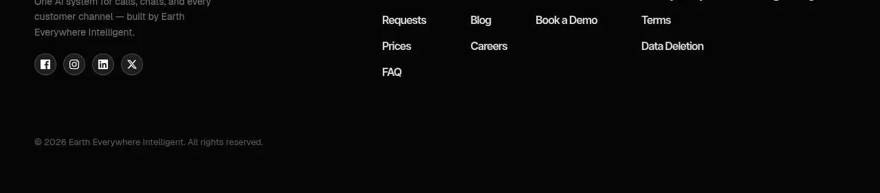 Final conversion banner
IntellAgents.io · Call to action
Final conversion banner
IntellAgents.io · Call to action
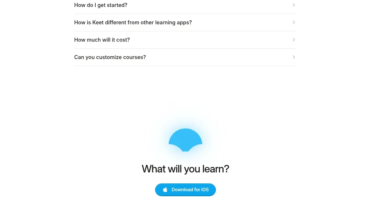
 Final app-download call to action
Keet · Call to action
Final app-download call to action
Keet · Call to action
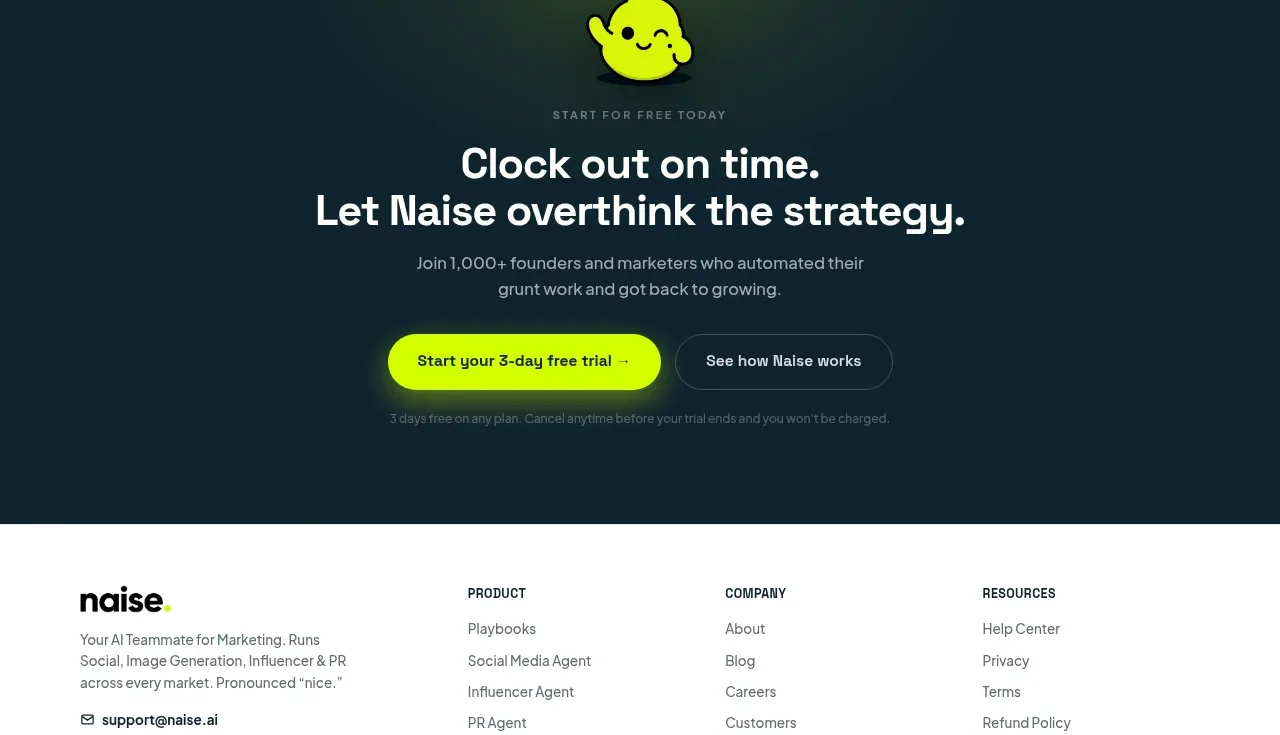
 Dark conversion call to action
Naise AI · Call to action
Dark conversion call to action
Naise AI · Call to action
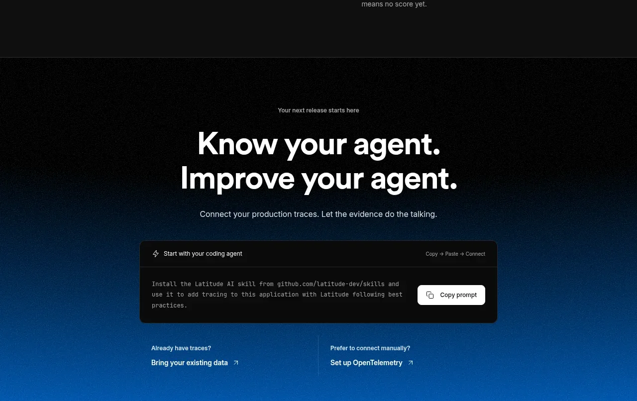
 Connect data and start improving
AgentScore · Call to action
Connect data and start improving
AgentScore · Call to action