kage
kage
plane.so
Design analysis
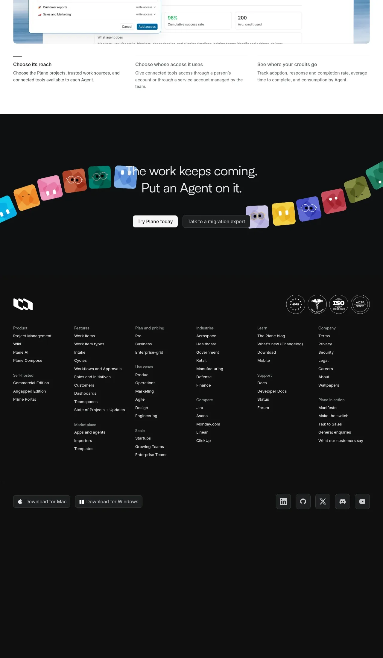
The footer uses a dark background with a brand mark and trust badges, many organized link columns, download buttons, social icons, and substantial breathing room below.
Prompt preview
## Reference images

Study these alongside the description below: hierarchy, rhythm, spacing, colour. Build for the product you are asked about, using this design language.

- Component: https://kage-design-assets.t3.tigrisfiles.io/components/plane-agents/6cd7606f-e6b6-4968-a1a7-76c61b9969ac-1790143342-8.webp
- Full page it was cut from: https://kage-design-assets.t3.tigrisfiles.io/screenshots/plane-agents/6cd7606f-e6b6-4968-a1a7-76c61b9969ac-1790143303447-full.webp
- Component on Kage: https://kage.design/component/plane-agents-footer

## Before you start
Ask what the user's product, audience, and brand are, then apply the principles below to that product rather than copying the reference.

Build a dark, information-rich SaaS footer. Start with a top row containing a simple brand area on the left and optional compliance or trust badges on the right. Below, organize links into five or six clearly labeled columns grouped by product, solutions, resources, company, and support. Add a lower utility row with desktop download buttons on the left and social icon buttons on the right, followed by a quiet bottom area for legal or copyright details. Use #101112 or #111111 as the background, #f4f4f4 for headings, #a8abad for links, and #2b2e31 for dividers and button borders. Keep typography compact but readable, use consistent 24–40px column gaps, and allow columns to collapse into stacked groups or accordions on mobile. Preserve generous bottom padding so the footer feels like a true page ending.

Never: use logos, product names, copy, illustrations, or imagery from the reference.