 kage
kage
getpolyglot.io
Design analysis
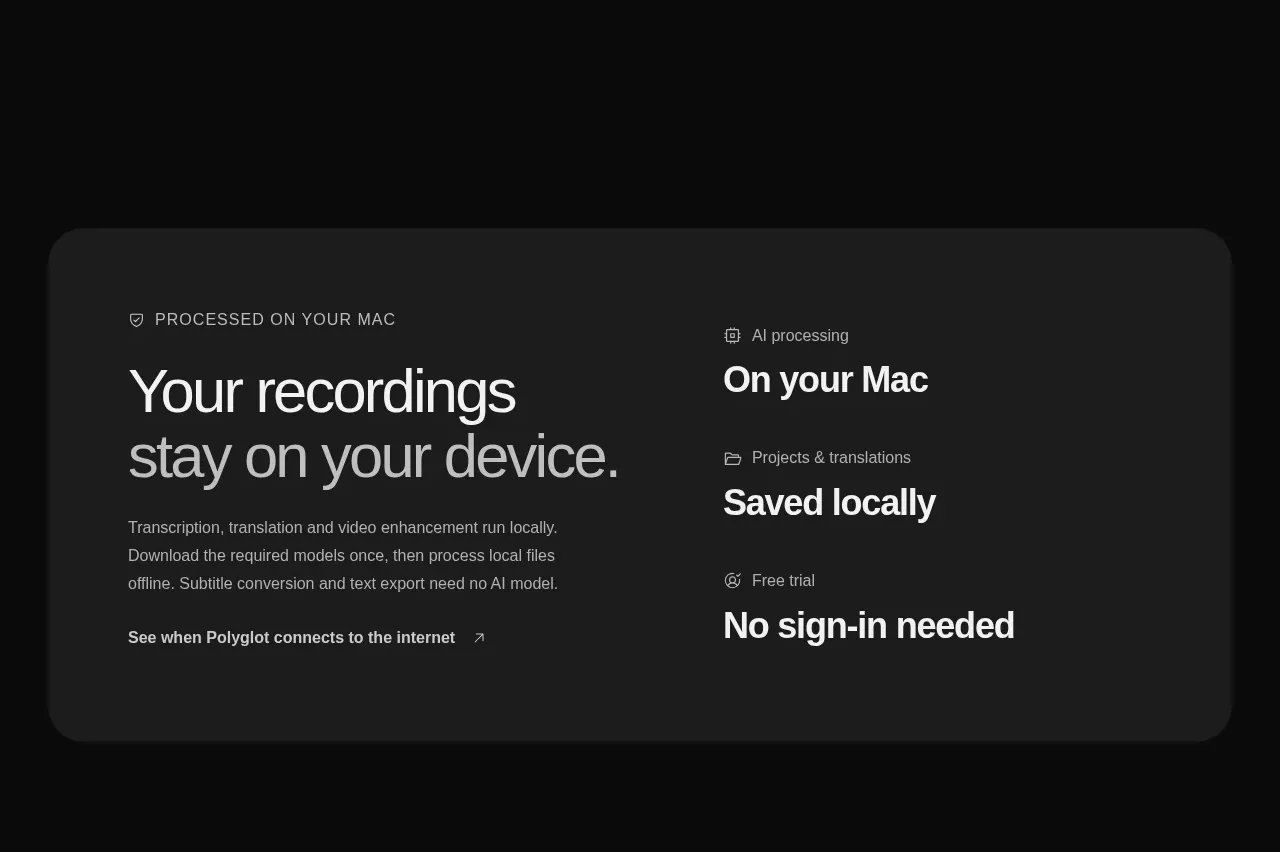
A wide inset panel turns the product's privacy and offline-processing promise into a memorable two-column reassurance block.
Prompt preview
## Reference images

Study these alongside the description below: hierarchy, rhythm, spacing, colour. Build for the product you are asked about, using this design language.

- Component: https://kage-design-assets.t3.tigrisfiles.io/components/polyglot/16feff4e-ce5f-4860-8cf6-49c37e8ed17f-1790402684-7.webp
- Full page it was cut from: https://kage-design-assets.t3.tigrisfiles.io/screenshots/polyglot/16feff4e-ce5f-4860-8cf6-49c37e8ed17f-1790402570740-full.webp
- Component on Kage: https://kage.design/component/polyglot-cta

## Before you start
Ask what the user's product is, who it serves, and what brand personality and visual identity it should use. Apply these principles to that product rather than copying the reference.

Build a wide inset trust panel with a slightly lighter charcoal surface (#1c1c1c), 26–32px rounded corners, and generous 56–64px padding. Use two columns: the left has a small eyebrow, a large privacy or reliability statement, a concise explanation, and an understated text link; the right presents three stacked proof points with small icons or labels and bold outcomes. Keep contrast high but avoid loud decoration: #f1f1f1 headings, #a0a0a0 supporting text, and a very subtle border. Collapse to one column on mobile and preserve the proof-point hierarchy.

Never use logos, product names, copy, illustrations, or imagery from the reference.
More components

 Split closing CTA
godaylight.com · Call to action
Split closing CTA
godaylight.com · Call to action
 Network growth CTA
godaylight.com · Call to action
Network growth CTA
godaylight.com · Call to action

 Closing conversion banner
FastRouter.ai · Call to action
Closing conversion banner
FastRouter.ai · Call to action

 Final download call to action
Blenny · Call to action
Final download call to action
Blenny · Call to action

 Visual download call to action
Art4 · Call to action
Visual download call to action
Art4 · Call to action

 Sponsor call to action
opensend.cc · Call to action
Sponsor call to action
opensend.cc · Call to action