kage
kage
getpolyglot.io

Design analysis
A near-black single-page product site where one lavender accent and chrome-iridescent artwork do all the colour work. The hero pairs a 3D liquid-metal wordmark with a restrained sentence-case headline, then the page settles into a repeating rhythm: uppercase eyebrow + two-column split heading (display left, grey support copy right) followed by full-width framed app screenshots over blurred colour fields. Feature cards, a privacy statement built from label/value stacks, a hairline-bordered FAQ accordion, and a multi-column footer keep density low and typography-led throughout.
Prompt preview
## Reference images

Study these alongside the description below: hierarchy, rhythm, spacing, colour. Build for the product you are asked about, using this design language.

- Full page: https://kage-design-assets.t3.tigrisfiles.io/screenshots/polyglot/16feff4e-ce5f-4860-8cf6-49c37e8ed17f-1790402570740-full.webp
- Above the fold: https://kage-design-assets.t3.tigrisfiles.io/screenshots/polyglot/16feff4e-ce5f-4860-8cf6-49c37e8ed17f-1790402568425.webp
- Design on Kage: https://kage.design/designs/polyglot-landing-page

## Before you start
Ask the user what product they are building, who it is for, and which brand assets they already have (name, colours, typefaces, logo). Wait for the answers. Everything below is applied to their product, not to the reference site.

## Page structure
Build the page top to bottom in this order:

1. **Nav** — slim dark bar: wordmark + logomark left; text links right (e.g. Features with dropdown chevron, Use cases, Pricing, Journal) plus one accent pill button with a small inline icon.
2. **Hero** — centred stack: tiny uppercase eyebrow with a small icon ("LOCAL AI. BUILT FOR MAC." style claim), a large decorative 3D/chrome treatment of the product wordmark, then a two-line display headline in sentence case, a short grey paragraph, two pill CTAs (accent primary + ghost secondary with arrow), and two lines of small grey microcopy (platform requirements, trial/pricing one-liner).
3. **Trust strip** — three equal columns, each: small icon, bold short heading ending in a period, one grey supporting sentence. No cards, no borders.
4. **Product tour intro** — uppercase eyebrow with icon, then a split row: large two-line heading left, explanatory paragraph right. Below it a row of pill tab filters (one active in accent, the rest ghost), then a full-width framed screenshot of the app inside a rounded container over a blurred colourful backdrop, with a tiny grey caption underneath ("Polyglot 1.1.0 · Prepared sample project" style: version + what is shown).
5. **Three feature cards** — split heading left ("From the first draft to the final file." style) and one grey sentence right. Three equal cards: icon, bold title ending in a period, grey body, then 4–5 link rows separated by hairlines, each with an ↗ arrow.
6. **Showcase A** — eyebrow ("NEW · FILES & PROJECTS" style), split heading + right-hand paragraph, full-width framed screenshot, then a row with an accent pill link (↗) left and a small grey reassurance note right.
7. **Showcase B** — same pattern for a second capability: eyebrow, split heading/paragraph, framed screenshot, pill link left + grey note right.
8. **Privacy/trust block** — eyebrow with shield icon, then two columns: left, display heading + paragraph + arrow link; right, three stacked rows each pairing a small grey label with a large bold white value ("AI processing / On your Mac" pattern).
9. **FAQ** — display heading ("Before you download." style), then 6–7 full-width accordion rows: question left, plus icon right, generous padding, hairline borders, rounded corners.
10. **Final CTA** — centred: eyebrow with icon, very large display heading, one grey line, accent pill button, one microcopy line.
11. **Footer** — left column: chrome/iridescent wordmark echo, tagline, "Download now ↗" link, microcopy; right: three link columns (product features, audiences/use cases, content/resources); bottom legal row: copyright left, small utility links right, one link rendered as a pill button (e.g. analytics preferences).

## Design language
- **Base palette:** near-black page background (#0a0a0c–#101014), raised surfaces for cards and accordion rows at #141418–#1a1a1f, hairline borders at rgba(255,255,255,0.08). Body text grey #9a9aa3; headings pure white.
- **One accent only:** a soft lavender/violet (#b9a6f5–#c9b8fa) reserved for primary pills, active tab states and key links. Dark charcoal text on the accent pill. Nothing else on the page competes with it.
- **Chromatic exception:** vivid iridescent gradients (blue→violet→silver chrome) appear only in decorative artwork — the hero wordmark, product imagery inside screenshots, footer wordmark. Never use these gradients for UI chrome, buttons or text.
- **Type:** a single neutral grotesque throughout. Scale: uppercase eyebrows 12–13px with wide tracking; display headings 56–80px with tight leading (−0.02em) and sentence case; card titles 18–20px semibold; body 15–16px; captions 12px grey. Headlines end in a period for an editorial, declarative voice.
- **Section rhythm:** every section opens with eyebrow → split two-column header (display heading left ~55%, supporting paragraph right ~40%, top-aligned) → full-width content. Alternate text-led sections with screenshot showcases so density stays low; use 120–160px vertical padding between sections.
- **Buttons and pills:** fully rounded (999px). Primary: accent fill. Secondary: transparent with 1px white/10 border. Inline icons inside buttons at 16px. Small meta links also rendered as pills.
- **Cards:** large radius (20–24px), flat dark fill, 1px hairline border, no shadows. Inside: icon top-left, title, grey body, then a stack of link rows divided by hairlines with ↗ arrows right-aligned.
- **Screenshots:** place real-UI mockups inside rounded containers; behind each window, a heavily blurred photographic colour field (dark blues/violets) so the vivid chrome only lives in the artwork. Caption every screenshot in 12px grey: version number + what is being shown.
- **Accordion:** full-width rows, 20–24px padding, question left in 16–17px medium, "+" right, hairline separators, slight rounding on each row.
- **Motion:** restrained — subtle hover brightening on pills and link rows, gentle accordion expand. No parallax or heavy animation.
- **Footer:** echoes the hero wordmark treatment at small scale, tagline underneath, then 3–4 columns of small grey links with white hover; legal row in 12px grey.

## Never
- Never reuse the Polyglot name, chrome wordmark, or the metallic loop/knot artwork, and never present the result as that product.
- Never copy its headline, feature copy, FAQ questions or microcopy text — write new copy for the user's product in the same voice (short sentence-case lines ending with periods).
- Never apply the iridescent chrome gradient to buttons, headings or UI surfaces; it stays decorative artwork only.
- Never fabricate macOS-window screenshots of the user's product with invented UI details; use the user's real assets or clearly placeholder frames.
Components from this page
All components
 Dark product navigation
Polyglot · Navigation
Dark product navigation
Polyglot · Navigation
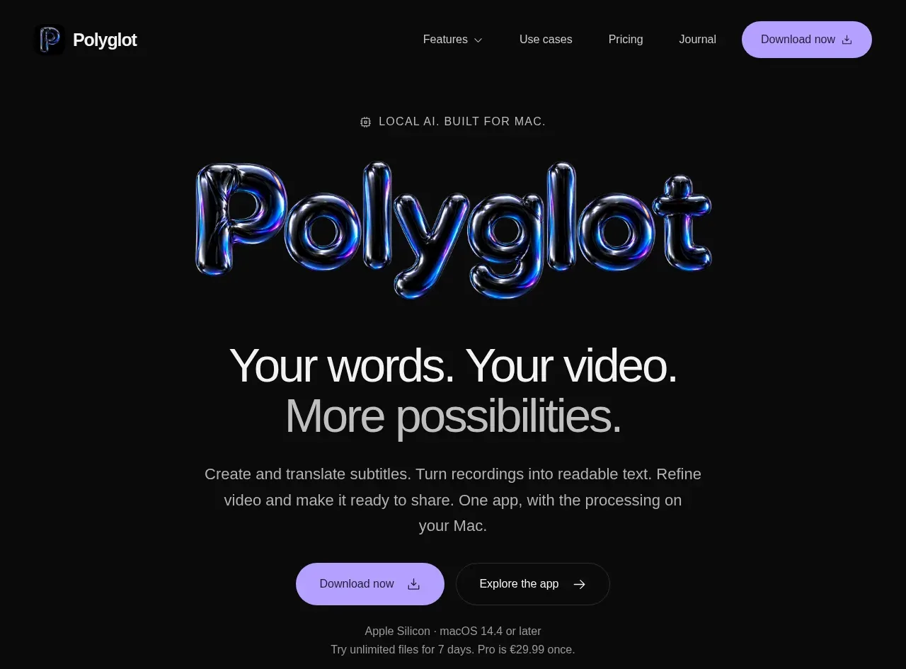 Local-first product hero
Polyglot · Hero
Local-first product hero
Polyglot · Hero
 Product reassurance strip
Polyglot · Stats
Product reassurance strip
Polyglot · Stats
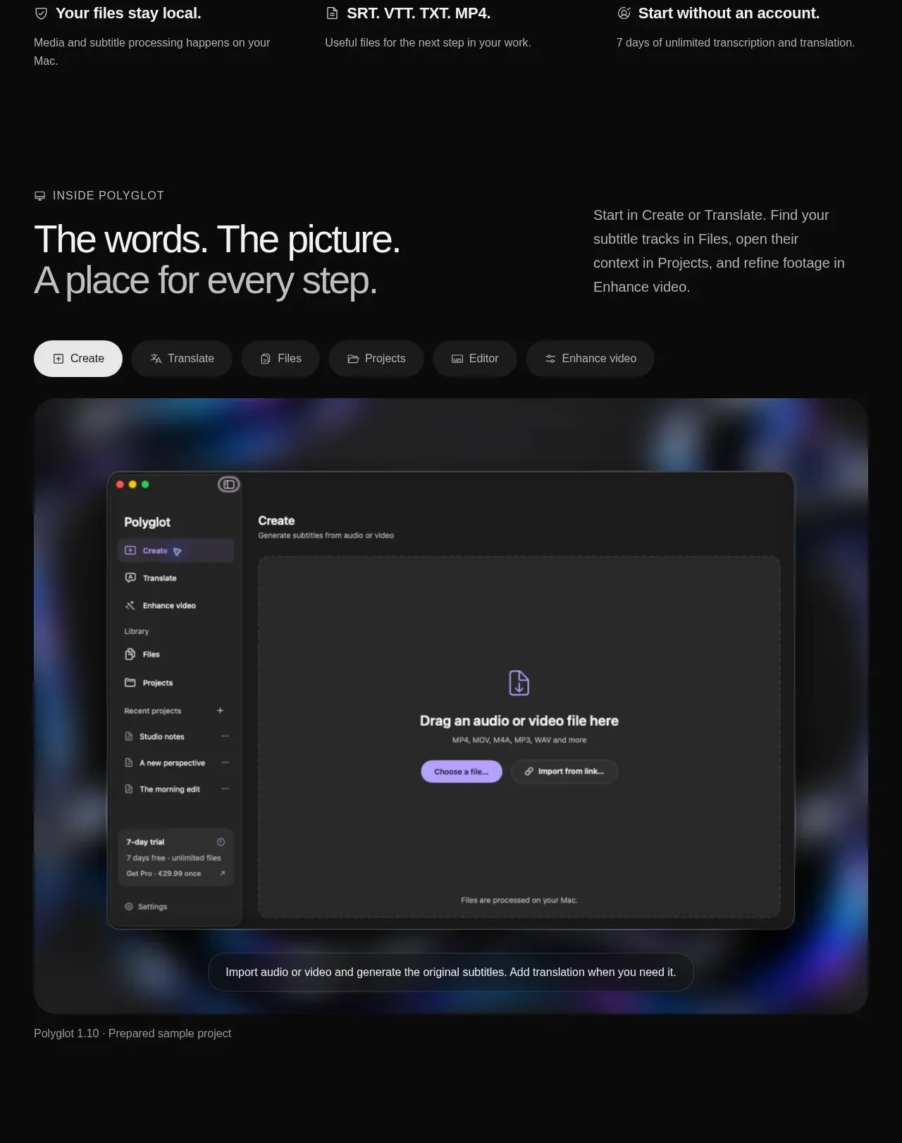 Product overview showcase
Polyglot · Feature grid
Product overview showcase
Polyglot · Feature grid
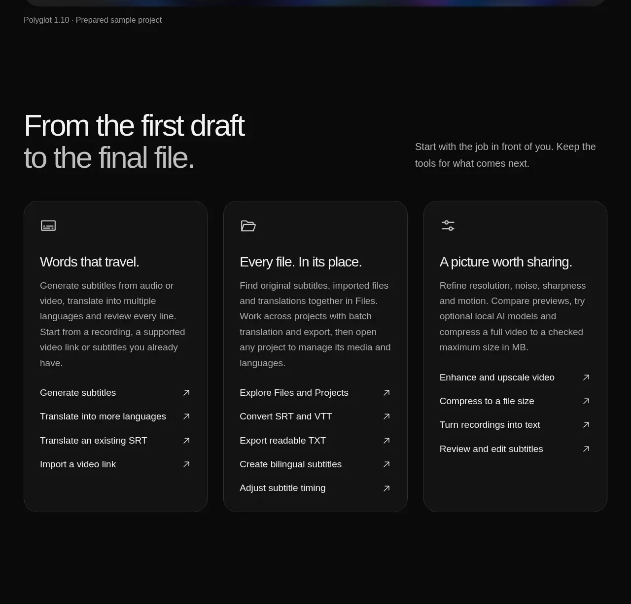 Workflow capability cards
Polyglot · Feature grid
Workflow capability cards
Polyglot · Feature grid
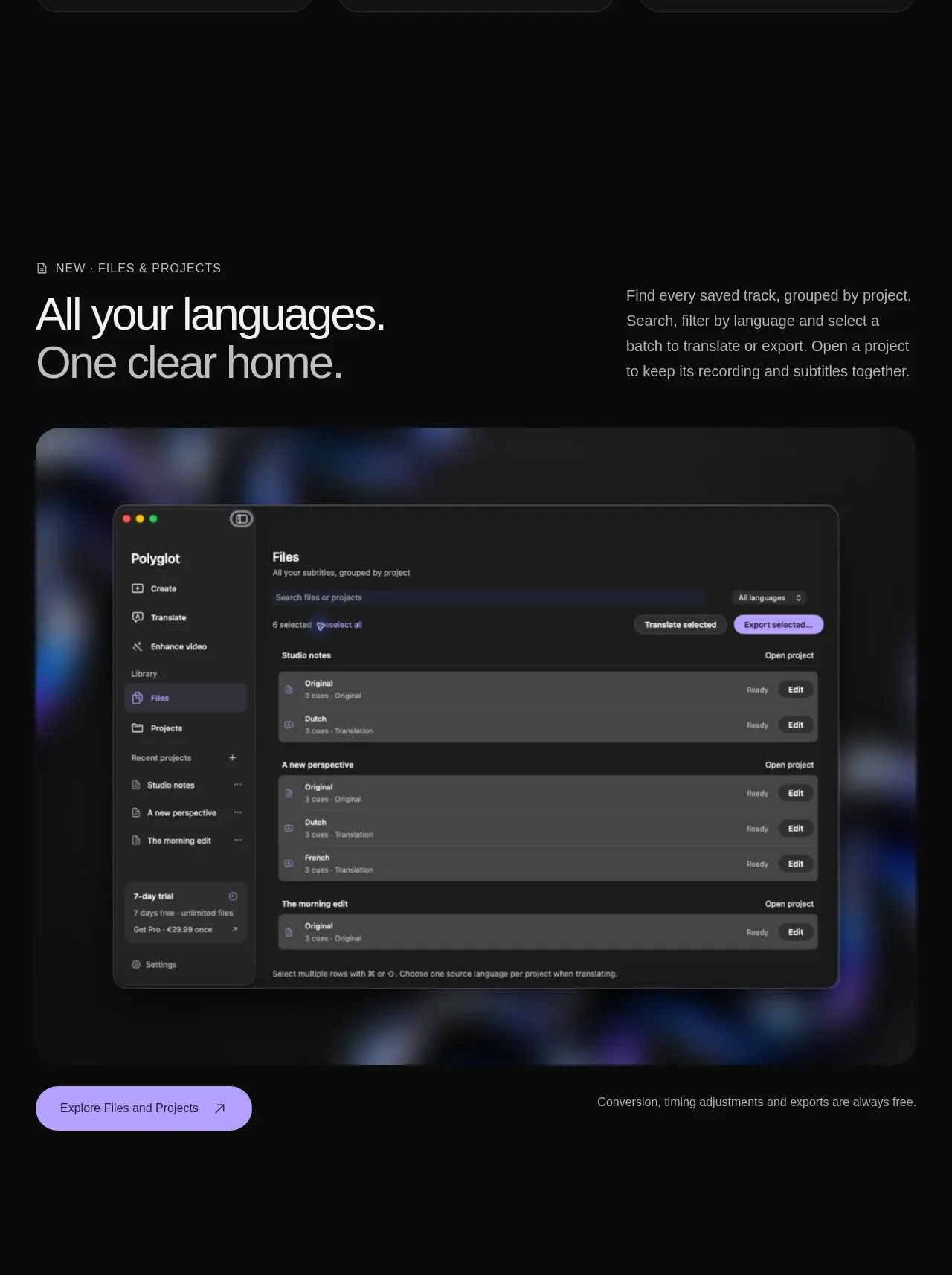 Files and projects showcase
Polyglot · Feature grid
Files and projects showcase
Polyglot · Feature grid
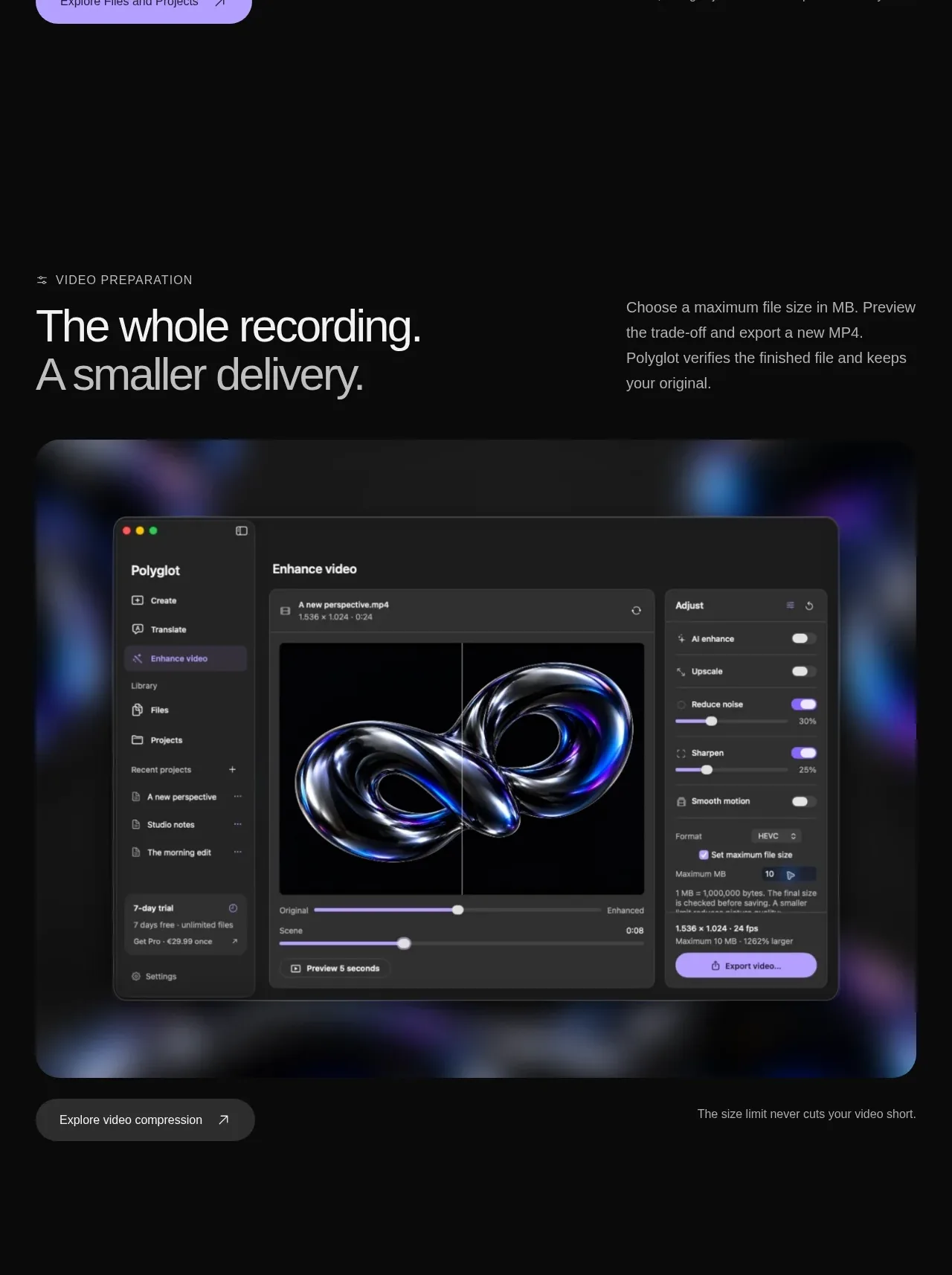 Video preparation showcase
Polyglot · Feature grid
Video preparation showcase
Polyglot · Feature grid
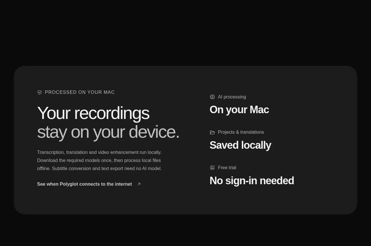 Local processing promise
Polyglot · Call to action
Local processing promise
Polyglot · Call to action
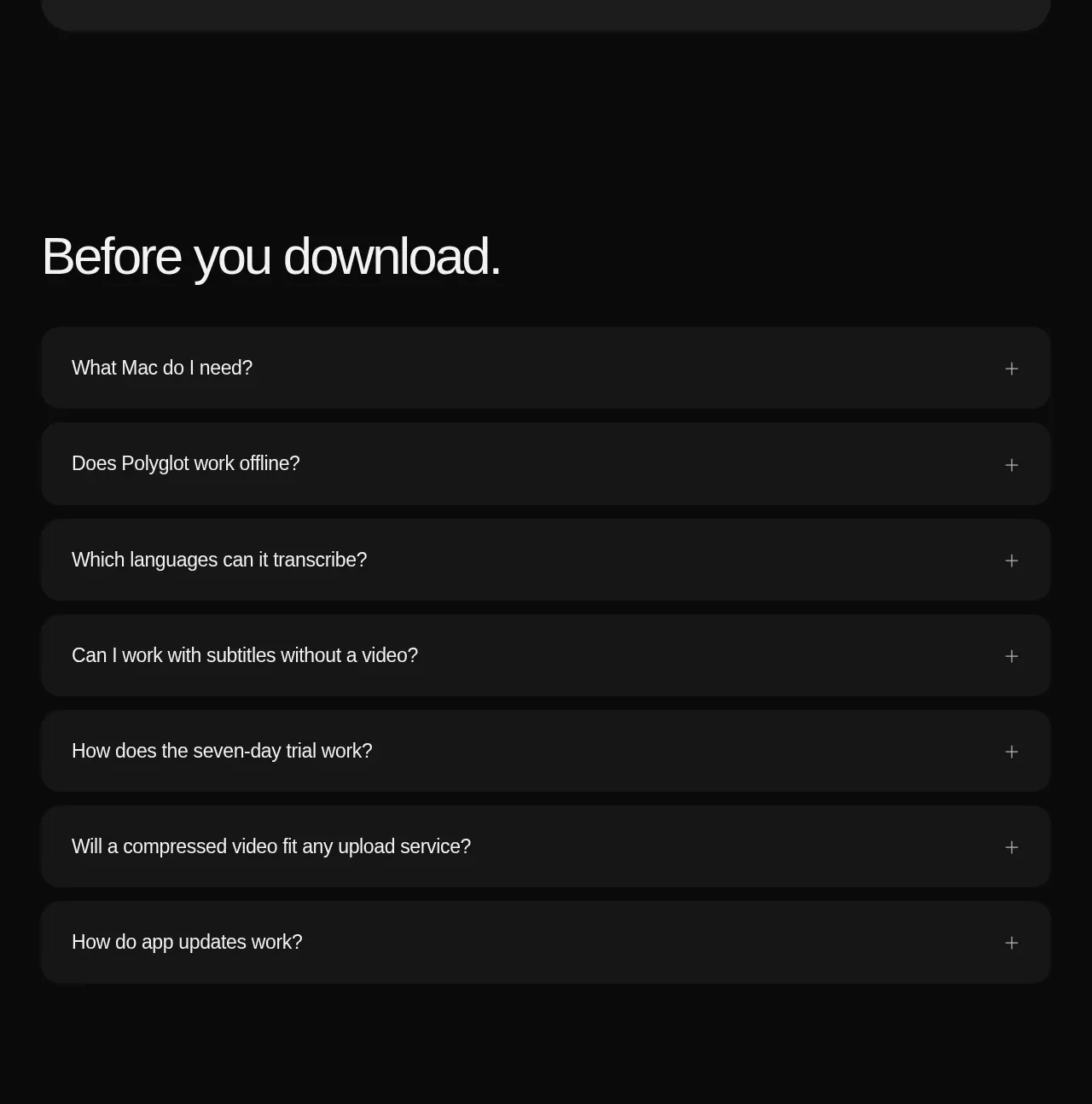 Download questions FAQ
Polyglot · FAQ
Download questions FAQ
Polyglot · FAQ
 Final download call to action
Polyglot · Call to action
Final download call to action
Polyglot · Call to action
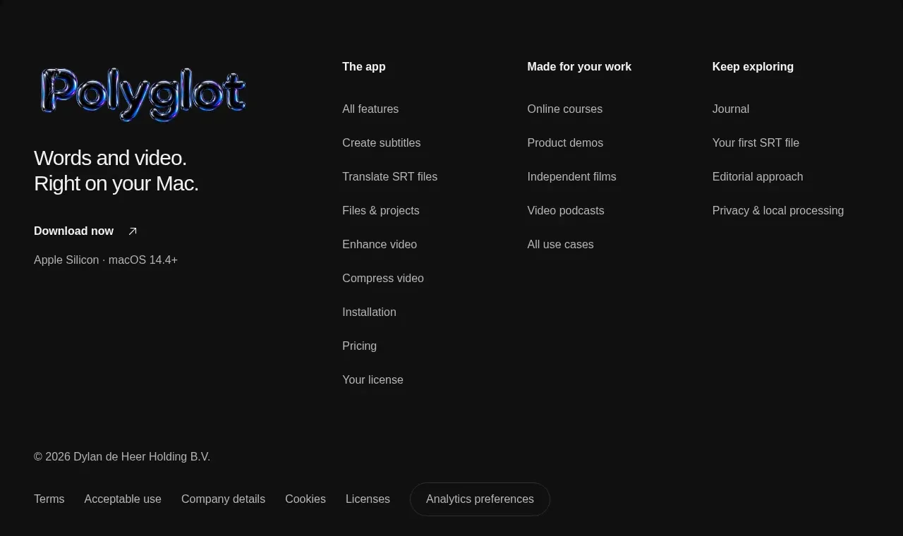 Multi-column product footer
Polyglot · Footer
Multi-column product footer
Polyglot · Footer